
Your landing page’s weakest score is Trust.
How Chamber ranks
71Growth scoreupdated
category scores
category scoresShowHide
Score over time
Trust
66FairProof that the product is real, competent, and safe to try.
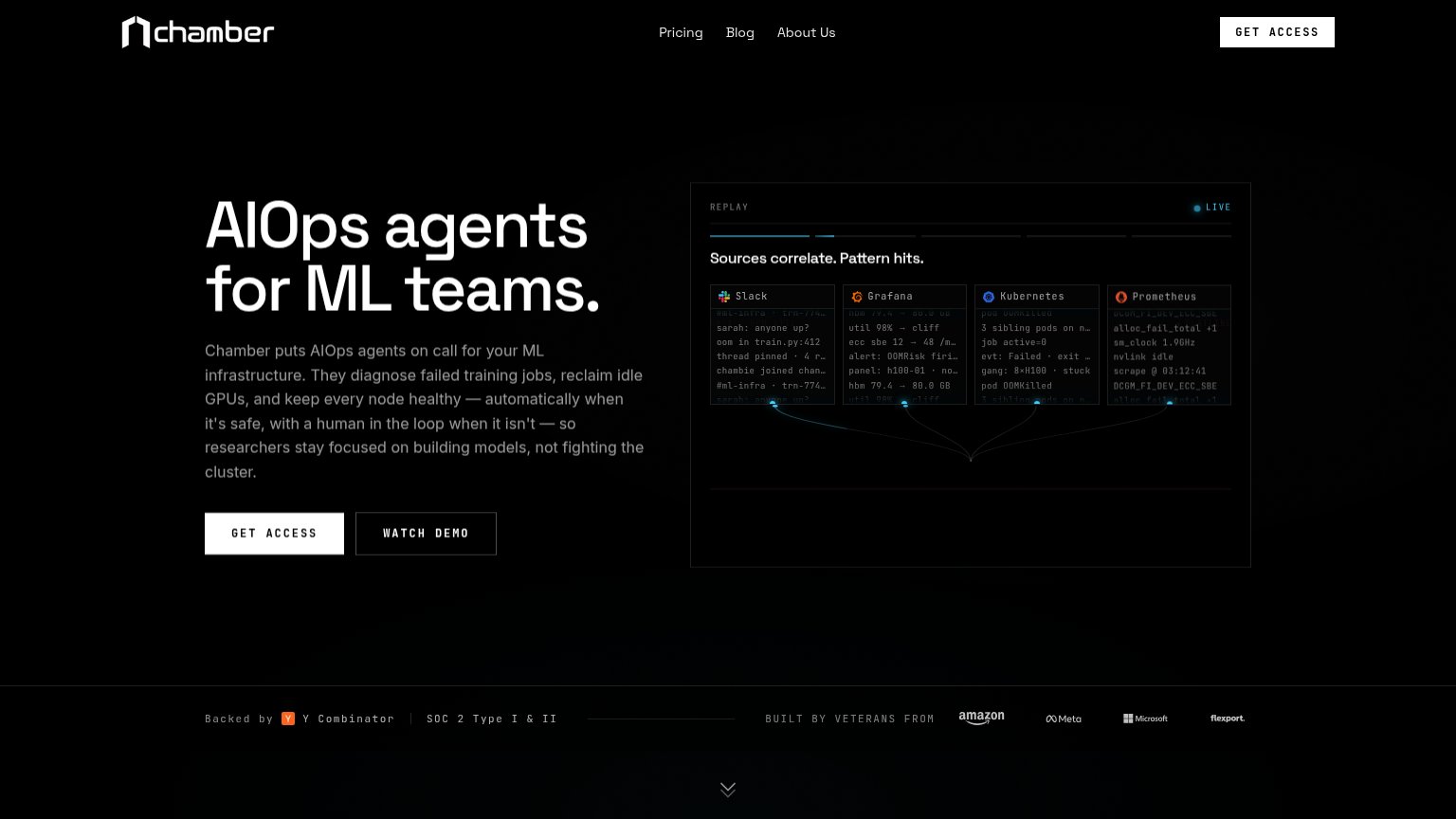
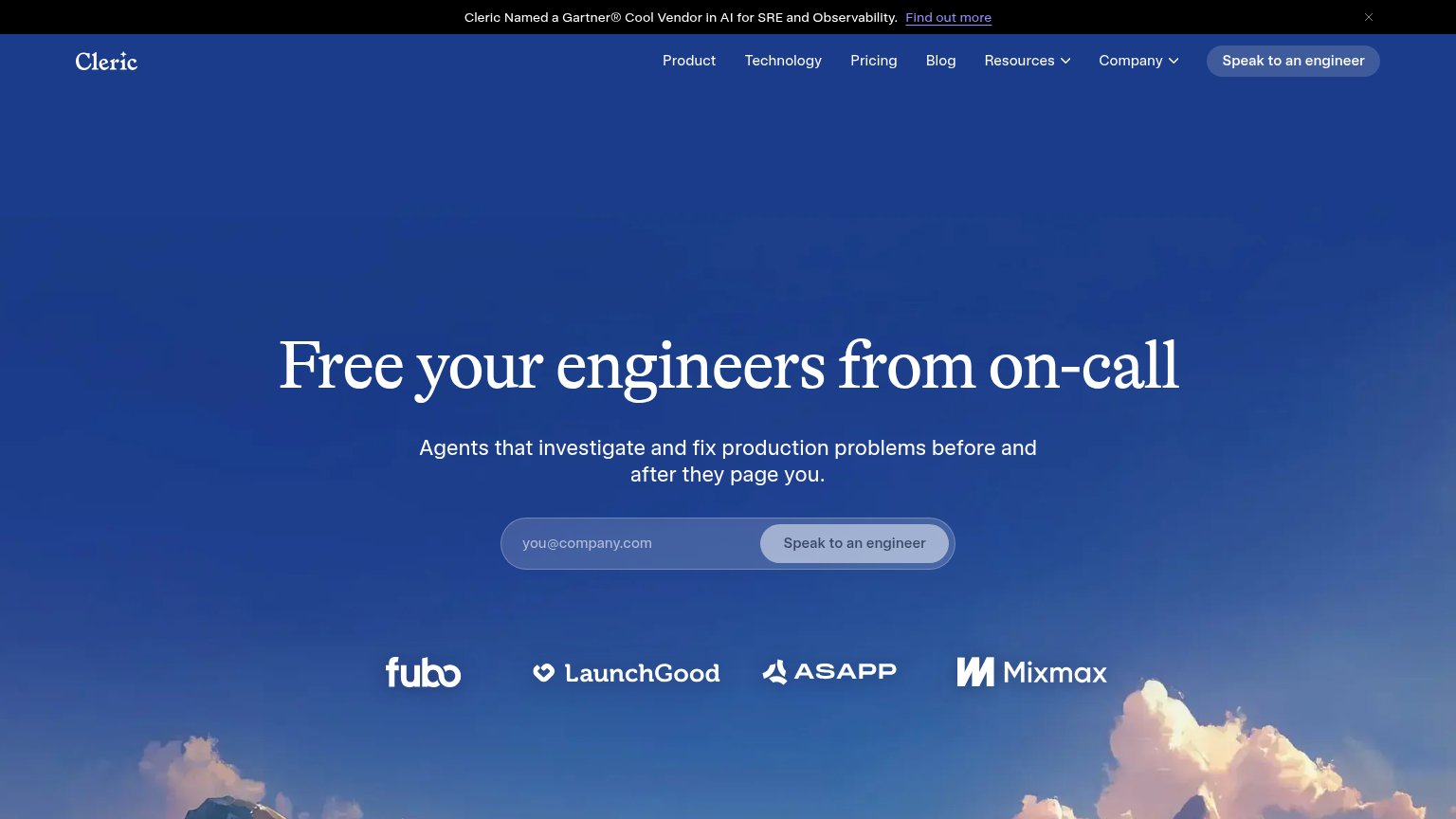

| Trust read | |
|---|---|
| Chamber | "Backed by Y Combinator | SOC 2 Type I & II" trust bar with founder-pedigree logos (Amazon, Meta, Microsoft, Flexport) |
| Banner: 'Cleric Named a Gartner® Cool Vendor in AI for SRE and Observability' | |
| Customer logo wall: Coinbase, DoorDash, Expedia Group, Snowflake, Zscaler | |
| Incident timeline panel captioned "Real predictive detection on Herald production; sensitive details redacted." | |
| Product UI screenshot: 'Production World Model™ — 1,749,612 total nodes, 30 node types' with details panel | |
| Banner: "Excited to announce that Deductive AI is joining forces with Elastic" |
CTA
68FairCopy, size, verb, cost-feel — does the primary CTA earn the click?

Problems
- 'access' feels gated, permission-y
- no product value in the label
- no echo of headline promise
Value props
72FairTitle, subtitle, hero — do they sell the product's true value?
Chamber’s headline undersells
AIOps agents for ML teams.
Chamber puts AIOps agents on call for your ML infrastructure. They diagnose failed training jobs, reclaim idle GPUs, and keep every node healthy — automatically when it's safe, with a human in the loop when it isn't — so researchers stay fo
Working
- Subhead names concrete outcomes
- "not fighting the cluster" hits emotion
- Hero demo shows real correlation
Could improve
- H1 is a category label, no payoff
- No numbers anywhere in the fold
- Subhead runs long on mobile
Mobile web
72FairThe phone experience as a first-class citizen.
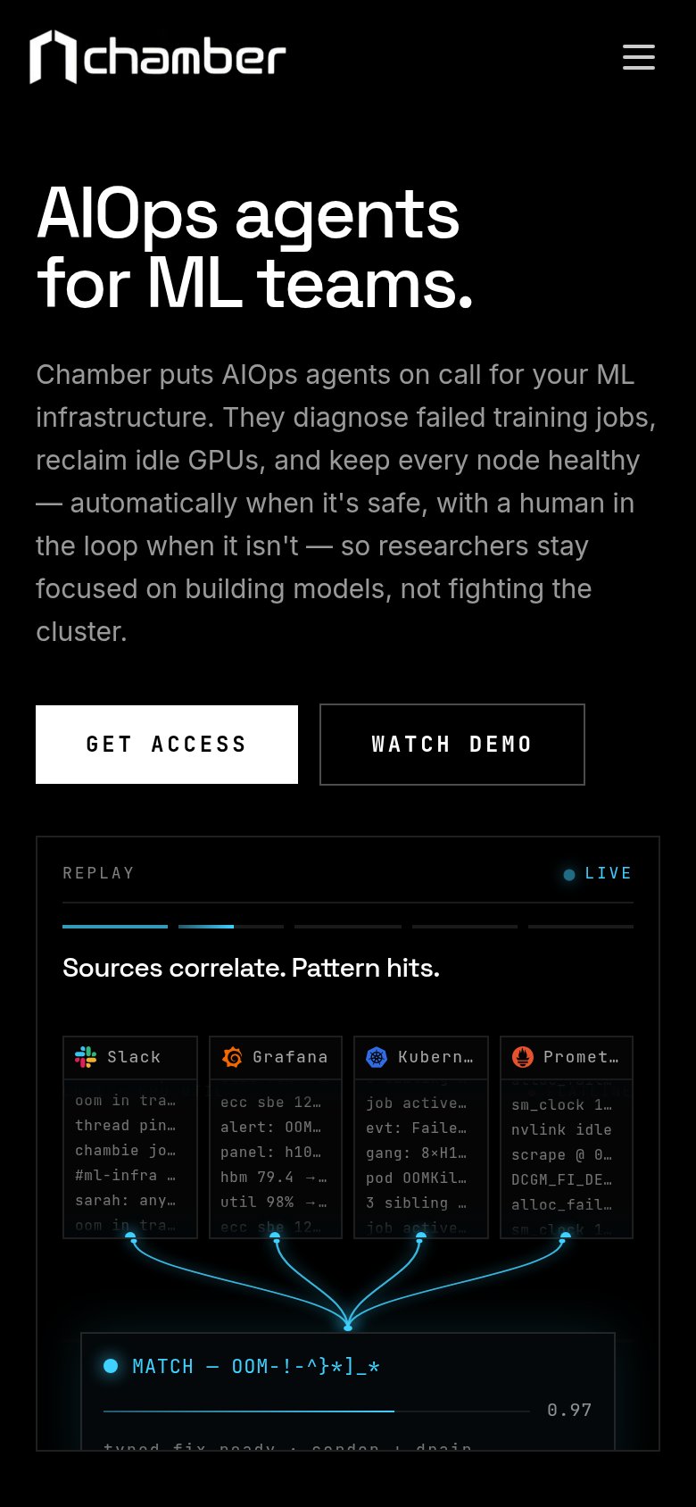 123
- Long body paragraph — Nine lines of desktop-length copy push the CTAs deep into the fold and dilute the single value statement.
- GET ACCESS button — Half-width desktop proportions instead of a full-bleed thumb target; it splits attention with WATCH DEMO on the same row.
- Truncated integration cards — Four desktop columns squeezed into the phone width leave labels like 'Kubern…' and 'Promet…' clipped and unreadable.
Information hierarchy
78FairDoes the design help or inhibit what the page is trying to say?
1234- Duplicate GET ACCESS CTAs — The nav's GET ACCESS repeats the hero button at similar white-on-black weight, splitting focus between two identical actions.
- WATCH DEMO button — The outlined secondary sits at nearly the same footprint as GET ACCESS, so the two buttons read as equal-weight choices.
- Hero paragraph block — Five lines of small gray body copy carry the whole pitch; the key outcomes (diagnose, reclaim, keep healthy) are buried mid-sentence.
- Telemetry panel micro-text — Four log columns of near-illegible terminal text add visual noise without a readable takeaway beyond the caption.