
Your landing page’s weakest score is CTA.
How Cleric ranks
78Growth scoreupdated
category scores
category scoresShowHide
CTA
63FairCopy, size, verb, cost-feel — does the primary CTA earn the click?
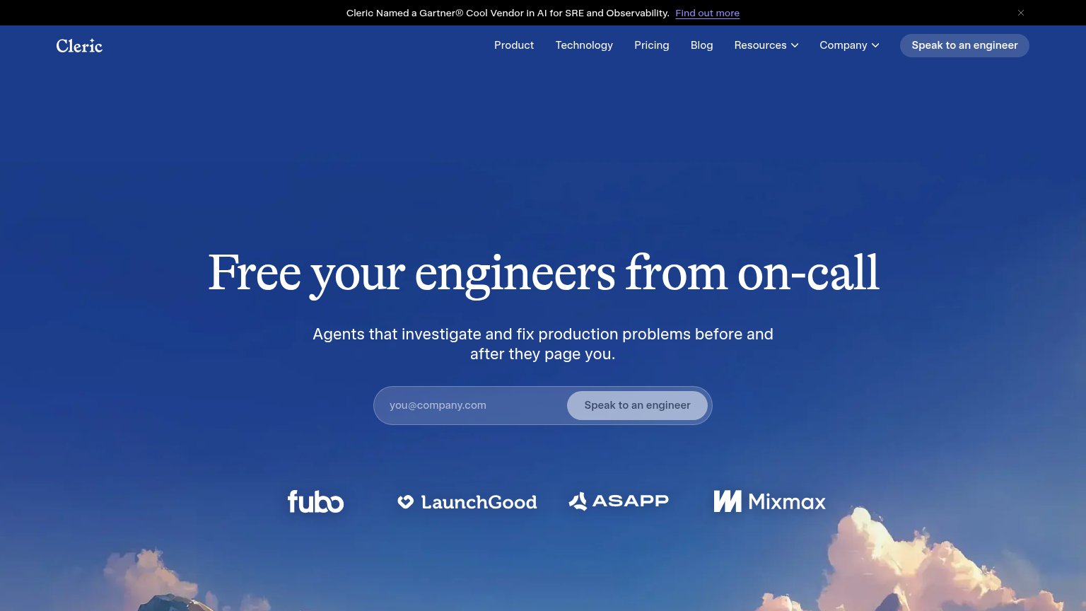

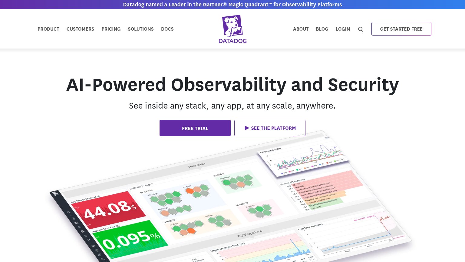
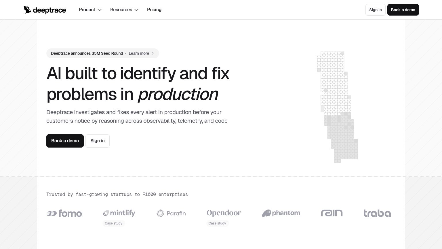


Problems
- sales-call framing feels costly
- 4 words, over 3-word limit
- email gate before any value
- no self-serve or demo path
Information hierarchy
78FairDoes the design help or inhibit what the page is trying to say?
123- Speak to an engineer button — Translucent grey-on-blue styling makes the primary CTA the lowest-contrast element in the fold; a visitor's eye slides past it.
- Find out more link — The banner's underlined exit link sits at the very top of the scan path, pulling first clicks away from conversion before the headline is read.
- Nav links row — Six equal-weight links (Product through Company) offer more exits than the fold has arguments, competing with the single conversion action.
Trust
79FairProof that the product is real, competent, and safe to try.
How Cleric compares
Trust read
Value props
82StrongTitle, subtitle, hero — do they sell the product's true value?
Cleric’s headline
Free your engineers from on-call
Agents that investigate and fix production problems before and after they page you.
Working
Could improve
Mobile web
86StrongThe phone experience as a first-class citizen.
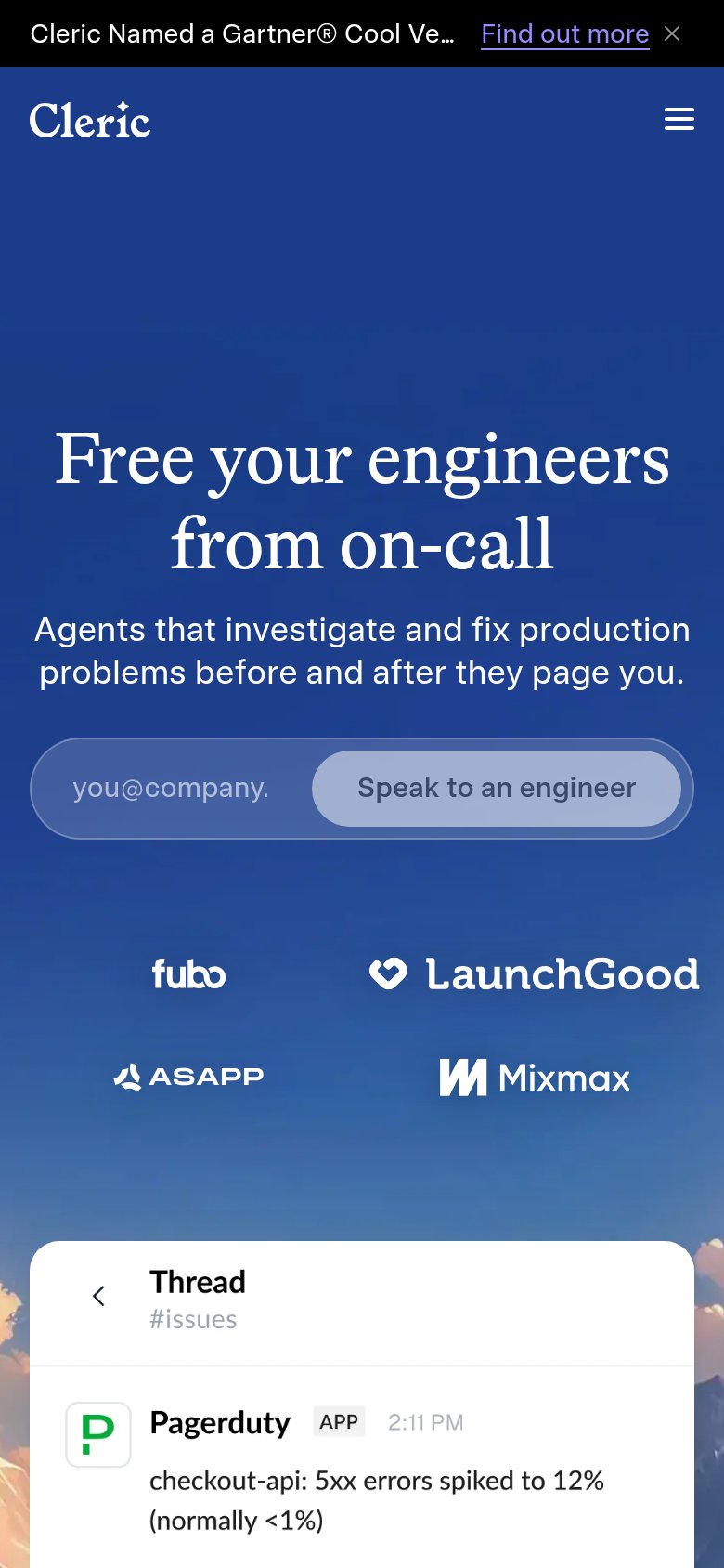
What works
What to improve