
Your landing page’s weakest score is Trust.
How Caretta ranks
72Growth scoreupdated
category scores
category scoresShowHide
Score over time
Trust
62FairProof that the product is real, competent, and safe to try.
| Trust read | |
|---|---|
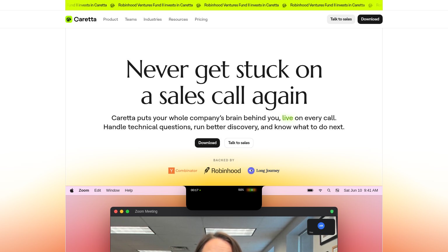
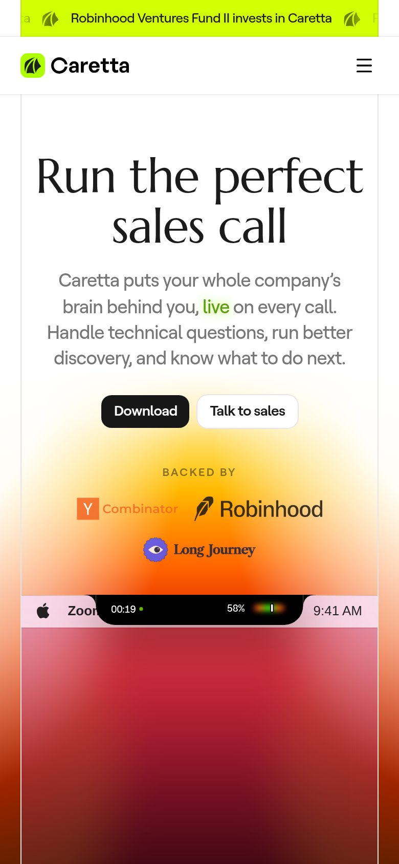
| Caretta | "BACKED BY" row with Y Combinator, Robinhood, and Long Journey logos |
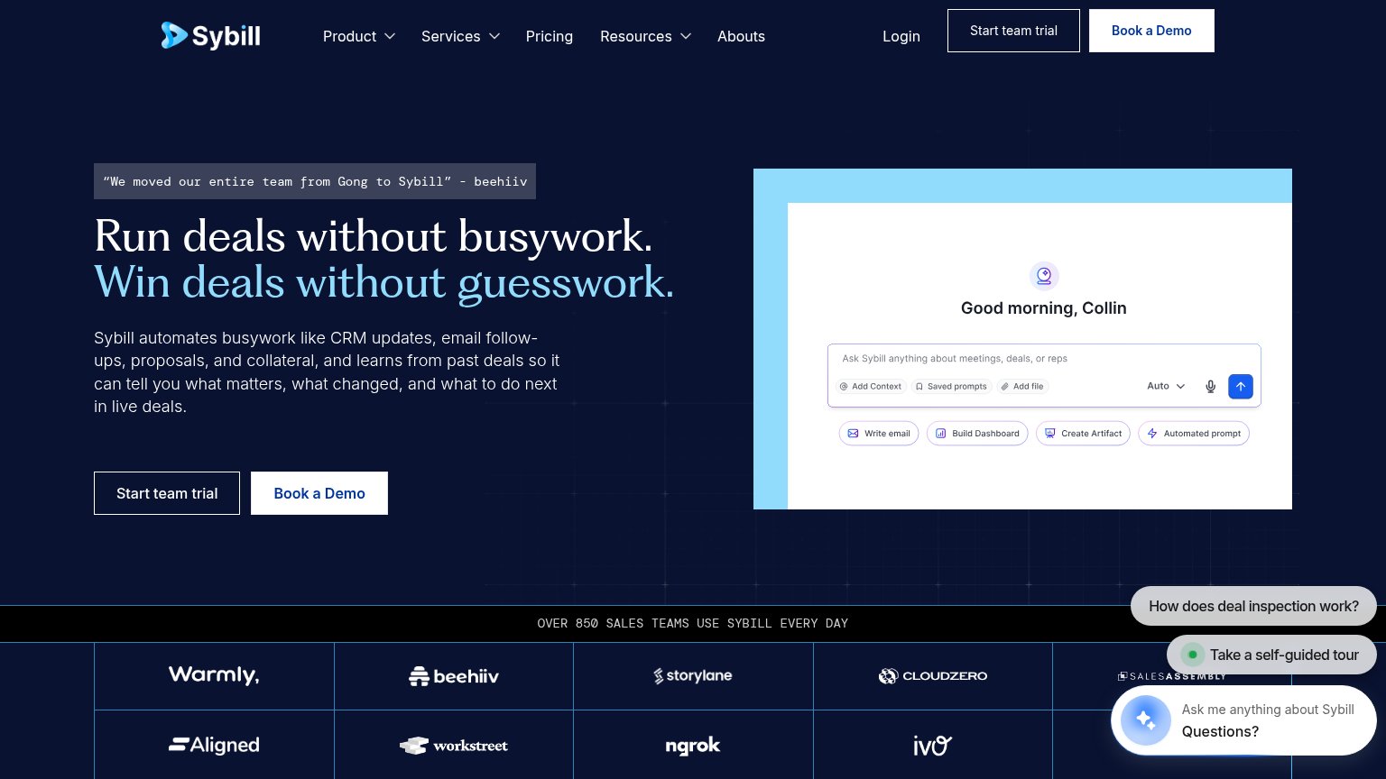
| “We moved our entire team from Gong to Sybill” - beehiiv | |
| No visible trust signal identified. | |
| Detailed product dashboard screenshot showing "Ramp-up Analytics" with milestone charts and training cards ("Multi-threa | |
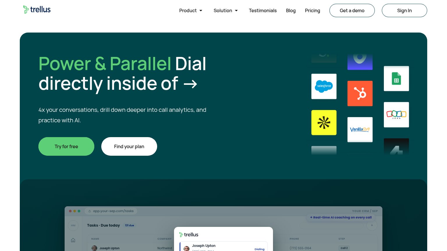
| Product UI mockup showing "Conversation Data Sources" with Gmail, Slack, and Teams integrations and an opportunity panel | |
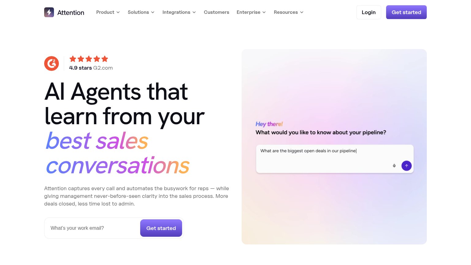
| "4.9 stars G2.com" rating badge in the desktop hero |
CTA
68FairCopy, size, verb, cost-feel — does the primary CTA earn the click?
Problems
- install feels costly, no payoff
- button small vs huge headline
- nav order favors Talk to sales
- no free/value signal in copy
Information hierarchy
76FairDoes the design help or inhibit what the page is trying to say?
1234- Duplicate CTA pairs — "Download" and "Talk to sales" appear twice at equal prominence (nav and hero), splitting the visitor between two actions in two places.
- Scrolling news ticker — The animated lime marquee repeating "Robinhood Ventures Fund II invests in Caretta" is the brightest element on the page and outranks the headline for attention.
- Hero Talk to sales — White pill sits directly beside the primary Download button at nearly identical size, forcing a choice before the primary action registers.
- Cropped Zoom demo — The product demo enters the fold as a blurry face and a Mac menu bar, communicating nothing about what Caretta does at this crop.
Value props
78FairTitle, subtitle, hero — do they sell the product's true value?
Caretta’s headline sells
Never get stuck on a sales call again
Caretta puts your whole company’s brain behind you, live on every call. Handle technical questions, run better discovery, and know what to do next.
Working
- Names a visceral rep pain: freezing on calls
- "live on every call" nails the real-time value
- Hero shows actual Zoom call context
Could improve
- Zero numbers or proof stats in fold
- Mobile headline drops the pain hook
- Product UI not visible in hero yet
Mobile web
78FairThe phone experience as a first-class citizen.
 123
- Download button too small — Primary CTA sits at desktop width beside 'Talk to sales' instead of a full-bleed thumb target.
- Investor ticker banner — Repeating 'Robinhood Ventures' promo bar with clipped text takes the top of the fold and adds no conversion path.
- Zoom demo strip clipped — The product demo renders as a blurred gradient block with an overlapping status bar, showing nothing legible of the product.