
Your landing page’s weakest score is Trust.
How Burt ranks
61Growth scoreupdated
category scores
category scoresShowHide
Score over time
Trust
32PoorProof that the product is real, competent, and safe to try.
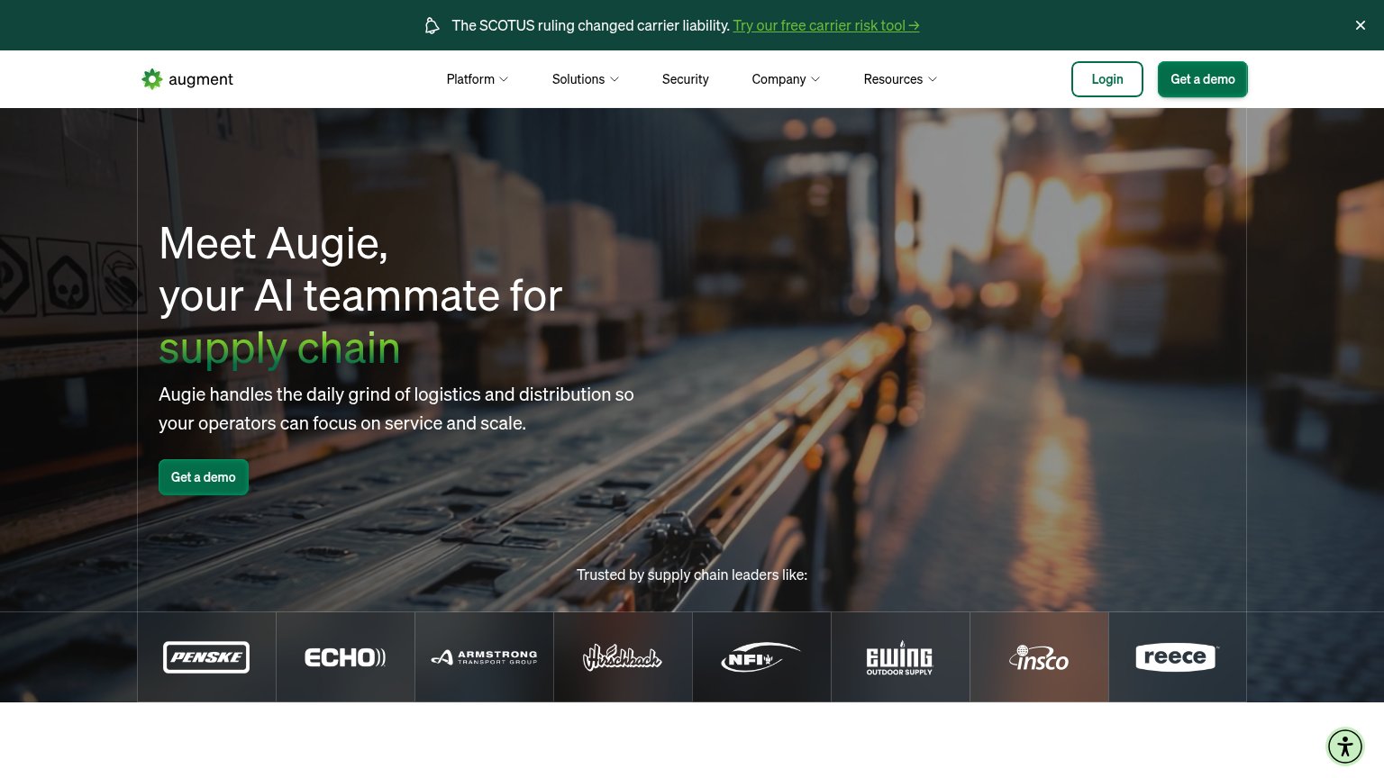
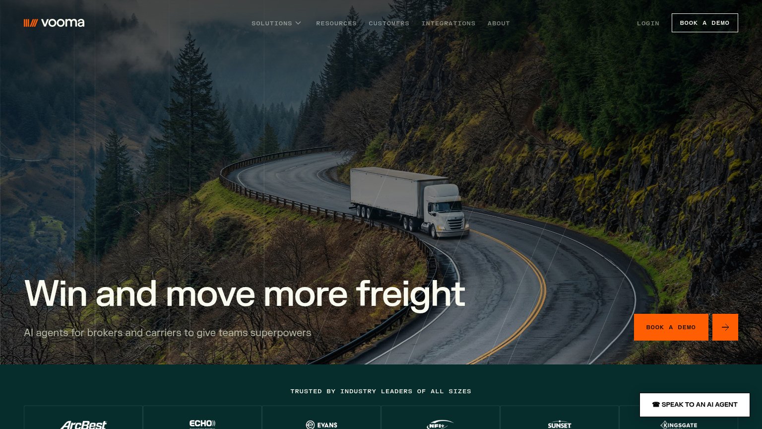
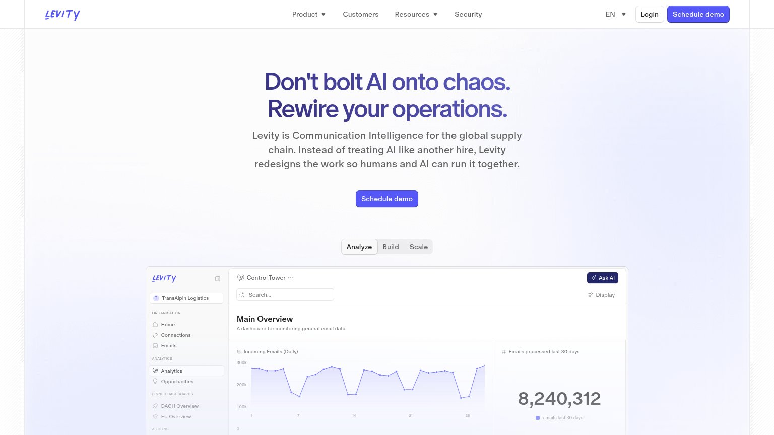
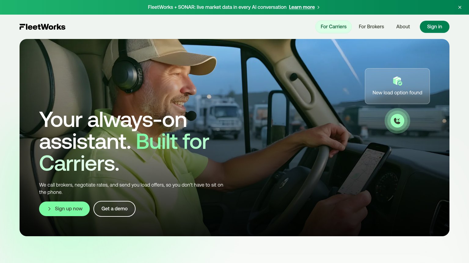

| Trust read | |
|---|---|
| Burt | No visible trust signal identified. |
| "HAPPYROBOT RAISES ITS SERIES C TO PUT AI WORKERS TO WORK ACROSS THE REAL ECONOMY" announcement banner | |
| "TRUSTED BY INDUSTRY LEADERS OF ALL SIZES" logo band with ArcBest, Echo, Evans, NFI, Sunset, and Kingsgate | |
| "FleetWorks + SONAR: live market data in every AI conversation" partnership banner | |
| Logo wall labeled "Trusted by supply chain leaders like:" with Penske, Schneider, NFI, Echo, Hirschbach, Armstrong Trans | |
| 'Control Tower' product dashboard showing 'Incoming Emails (Daily)' chart and 'Emails processed last 30 days' panel |
Value props
56FairTitle, subtitle, hero — do they sell the product's true value?
Burt’s headline vague
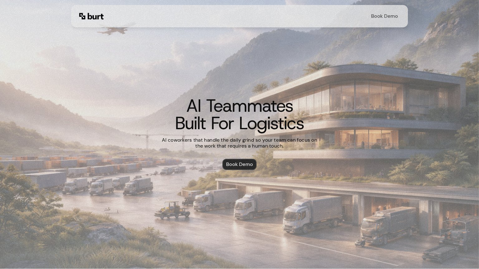
AI Teammates Built For Logistics
AI coworkers that handle the daily grind so your team can focus on the work that requires a human touch.
Working
- Names the vertical: logistics
- Human-touch framing hits ops pain
- Clean, single-message fold
Could improve
- No concrete task the AI handles
- Zero numbers or proof points
- Hero image decorates, not demos
CTA
62FairCopy, size, verb, cost-feel — does the primary CTA earn the click?
Problems
- click feels costly — sales call
- small footprint vs huge headline
- no low-commitment alternative
Information hierarchy
78FairDoes the design help or inhibit what the page is trying to say?
12- Hero Book Demo button — Small dark pill sinks into the busy mid-tone scenery; contrast and footprint are too weak for a one-second find.
- Headline over building — "AI Teammates Built For Logistics" is set directly over the glass facade, costing legibility where the letterforms cross window edges.
Mobile web
78FairThe phone experience as a first-class citizen.
 12
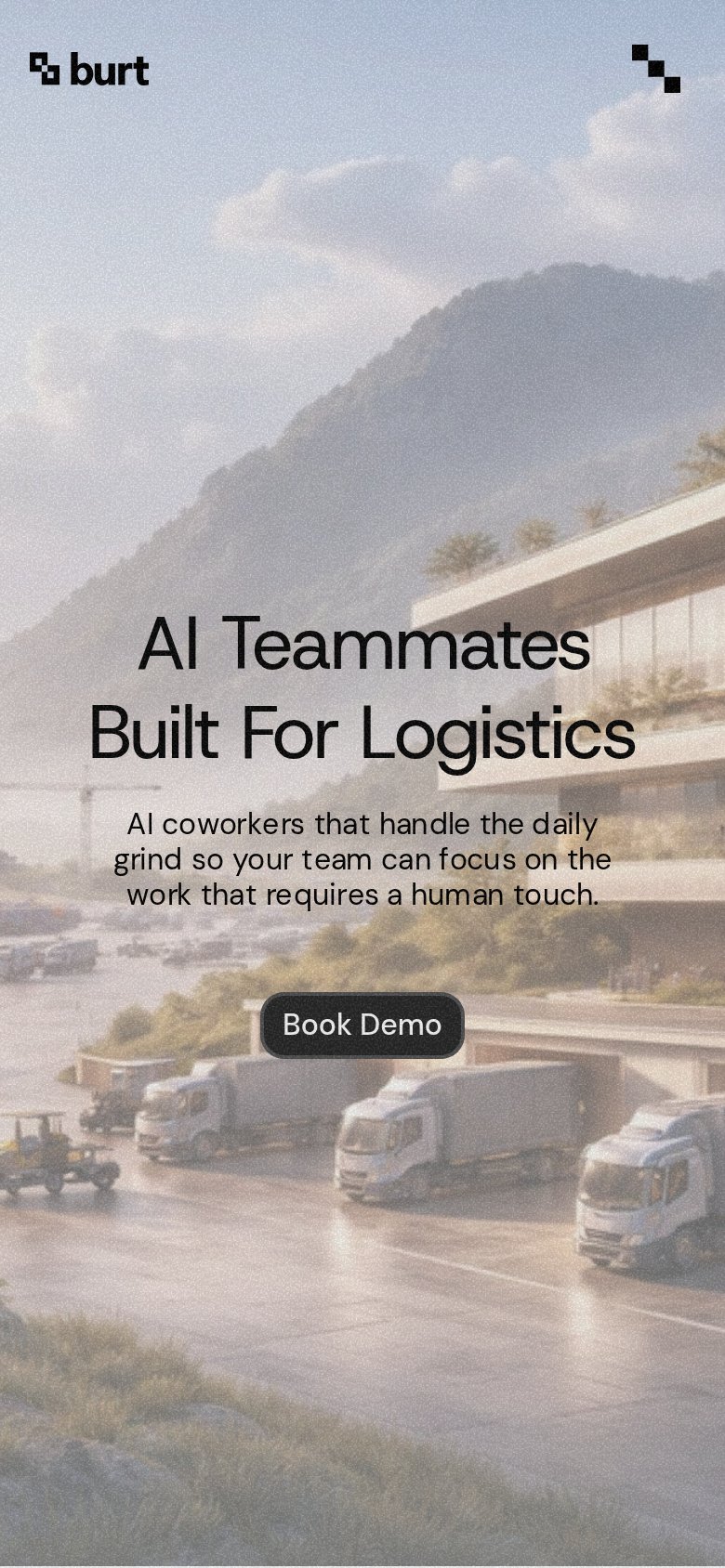
- Book Demo button — Desktop-sized pill floating small in the column — should be a near-full-width thumb target.
- Top-right icon glyph — Ambiguous mark that doesn't read as a menu button, leaving no obvious navigation affordance.