
Your landing page’s weakest score is Trust.
How Beacon Health ranks
- 1.
Notable76
- 2.
Beacon Health74
- 3.
Infinitus Systems73
- 4.
Tennr63
- 5.
Hippocratic AI60
74Growth scoreupdated
category scores
category scoresShowHide
Score over time
Trust
64FairProof that the product is real, competent, and safe to try.
| Trust read | |
|---|---|
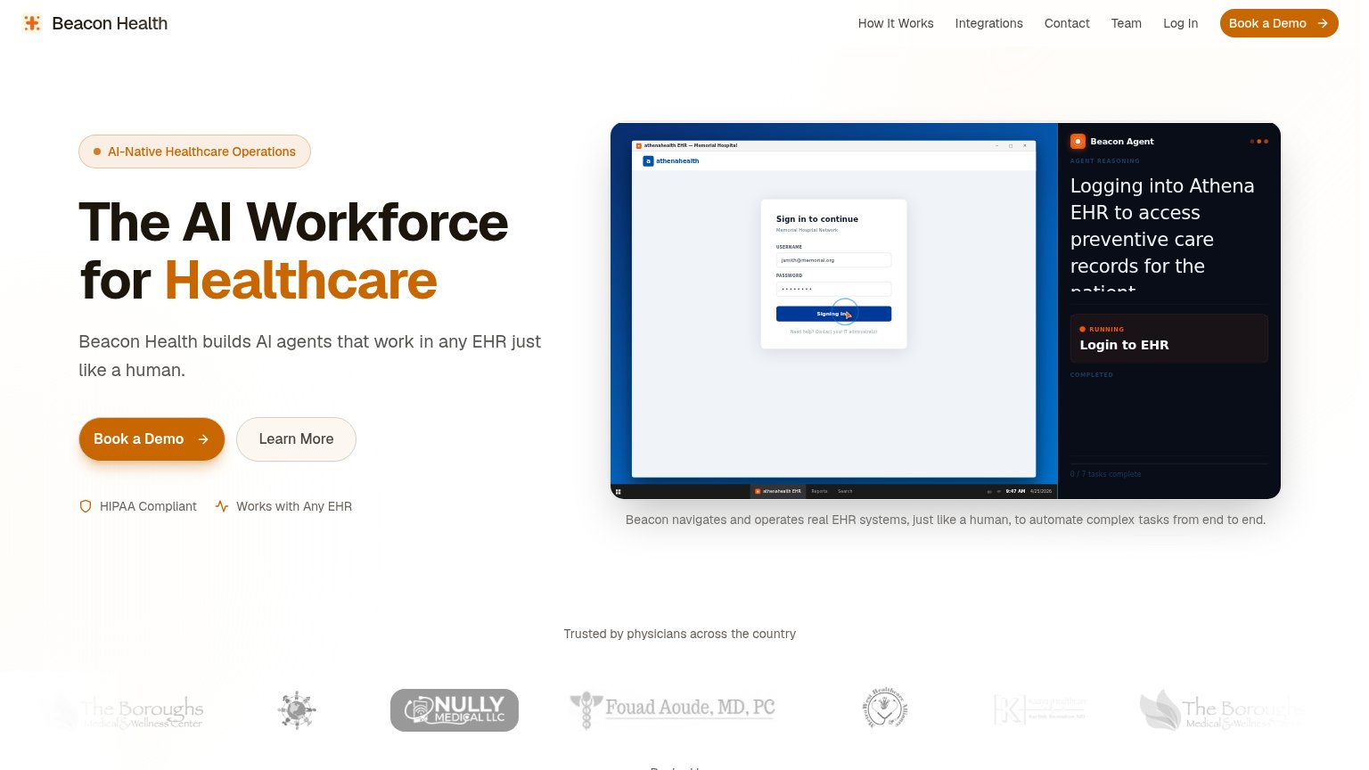
| Beacon Health | Beacon Agent demo UI showing "Logging into Athena EHR to access preventive care records" inside a real athenahealth EHR |
| "Listen to four real, de-identified patient calls and hear clinical abundance in action" with the RPM Adherence call dem | |
| No visible trust signal identified. | |
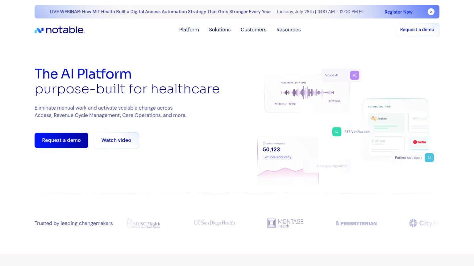
| "Trusted by leading changemakers" logo strip with MUSC Health, UC San Diego Health, Montage Health, and Presbyterian | |
| ">90% positive ratings from patients" metric strip beneath the hero CTA |
CTA
72FairCopy, size, verb, cost-feel — does the primary CTA earn the click?

Problems
- demo click feels costly, no payoff
- no self-serve or product path
- generic label, no product echo
Value props
72FairTitle, subtitle, hero — do they sell the product's true value?
Beacon Health’s headline sells
The AI Workforce for Healthcare
Beacon Health builds AI agents that work in any EHR just like a human.
Working
- Subhead names the real mechanism: works in any EHR
- Hero demo shows agent operating a live EHR
- HIPAA + any-EHR badges kill top objections
Could improve
- No numbers anywhere in the fold
- Headline is a generic category claim
- No named outcome: which tasks get done
Information hierarchy
80StrongDoes the design help or inhibit what the page is trying to say?
1234- Five-link navigation row — How It Works, Integrations, Contact, Team, and Log In give attention five exits before the demo CTA.
- Agent reasoning text — Copy clips mid-sentence at 'the patient' making the hero's proof panel look broken.
- Learn More button — Outlined pill sits at near-equal size beside Book a Demo, splitting the hero click.
- Client logo strip — Low-contrast, inconsistently sized grayscale logos read as noise instead of trust proof.
Mobile web
82StrongThe phone experience as a first-class citizen.
 123
- Book a Demo button — Desktop-proportioned width floats at ~half the column instead of a full-bleed, thumb-friendly bar.
- AI-Native badge pill — Oversized pill spans the column and competes with the headline for attention.
- EHR screenshot text — Desktop screenshot shrunk to phone width makes the agent-panel copy illegibly small.