
Your landing page’s weakest score is Trust.
How Aemon ranks
60Growth scoreupdated
category scores
category scoresShowHide
Score over time
Trust
32PoorProof that the product is real, competent, and safe to try.
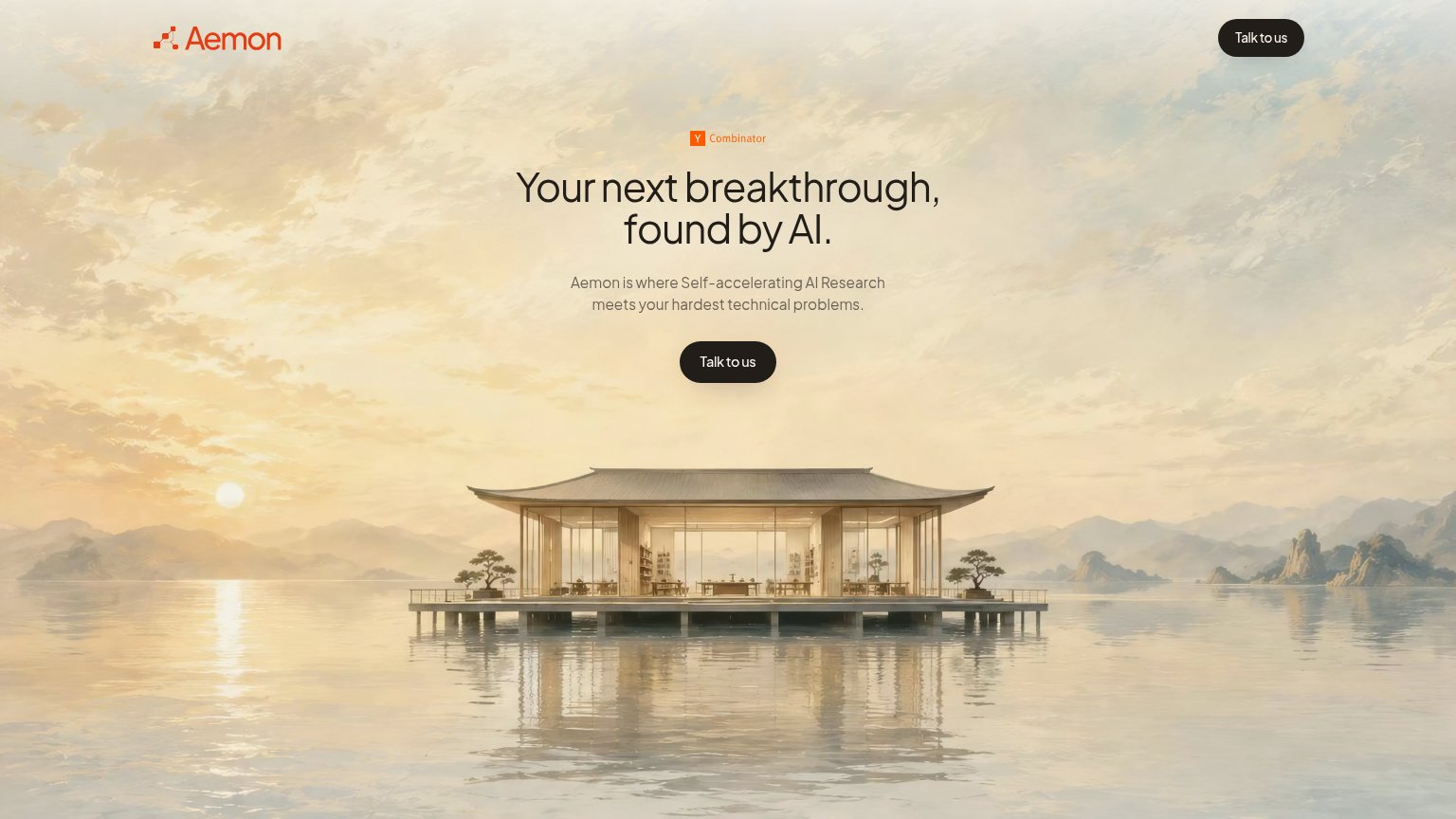
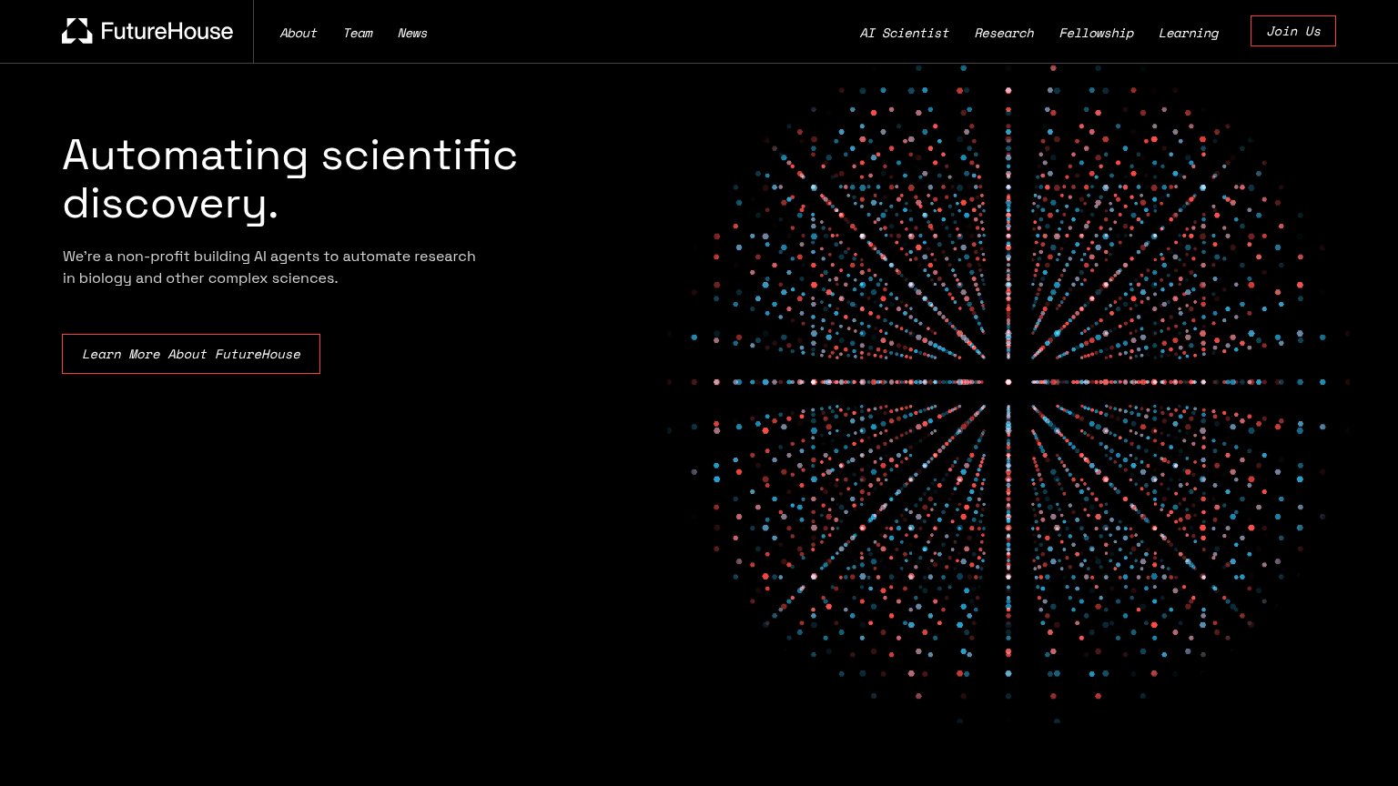
| Trust read | |
|---|---|
| Aemon | Y Combinator badge above the headline |
| implicit context Sakana AI may benefit from pre-existing familiarity among its target audience. | |
| "We're a non-profit building AI agents to automate research in biology and other complex sciences." | |
| No visible trust signal identified. | |
| No visible trust signal identified. |
Value props
44PoorTitle, subtitle, hero — do they sell the product's true value?
Aemon’s headline vague
Your next breakthrough, found by AI.
Aemon is where Self-accelerating AI Research meets your hardest technical problems.
Working
- Outcome-framed: promises a breakthrough
- YC badge lends early credibility
- Clean, confident tone
Could improve
- No concrete domain, user, or use case
- Jargon: 'Self-accelerating AI Research'
- Hero image decorates, shows no product
CTA
62FairCopy, size, verb, cost-feel — does the primary CTA earn the click?
Problems
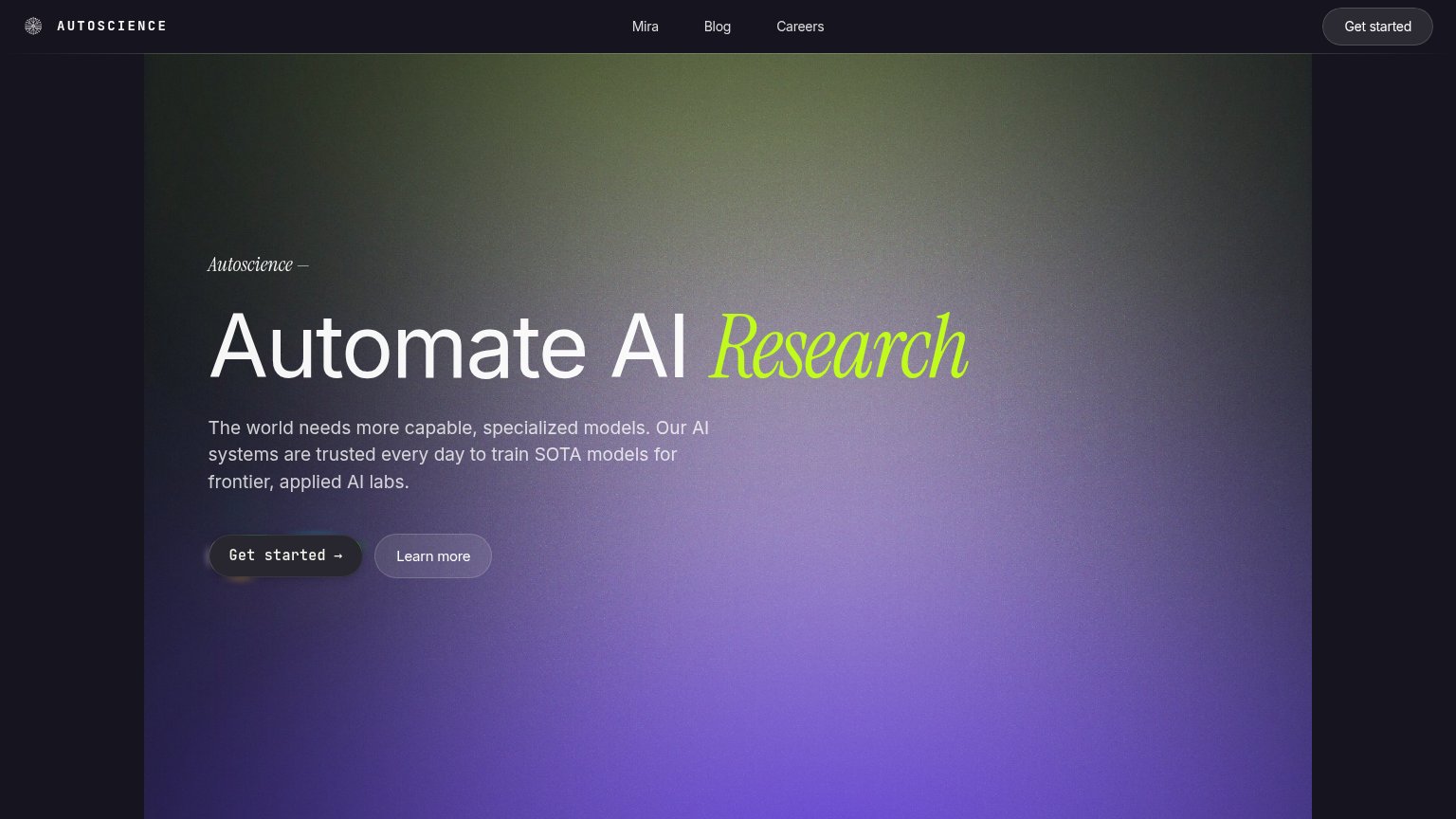
- click feels like a sales call
- no value promised for the click
- no product access or demo path
Mobile web
78FairThe phone experience as a first-class citizen.
 1
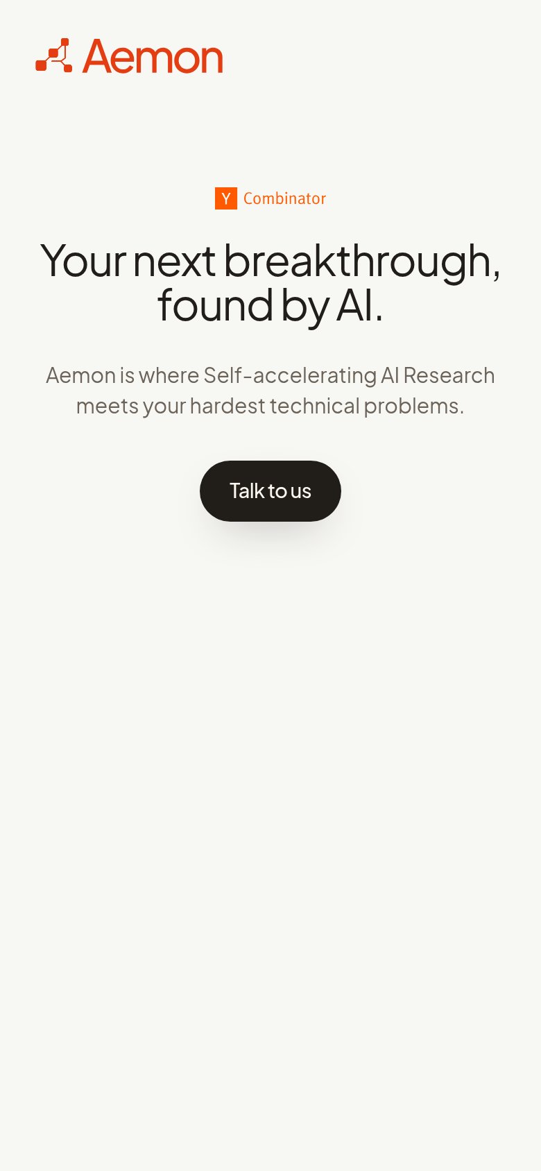
- Talk to us button — Desktop-sized pill floating in the column; the sole CTA should be near full-bleed for the thumb.
Information hierarchy
86StrongDoes the design help or inhibit what the page is trying to say?
123- Duplicate header CTA — Same-weight second "Talk to us" competes with the hero button and splits the single action.
- Hero Talk to us — Small footprint and dark-on-warm-beige placement give the primary action less presence than the headline deserves.
- Y Combinator badge — Tiny orange text at 12px reads as clutter above the headline rather than a legible trust signal.