
Your landing page’s weakest score is Trust.
How Trata ranks
71Growth scoreupdated
category scores
category scoresShowHide
Trust
62FairProof that the product is real, competent, and safe to try.
| Trust read | |
|---|---|
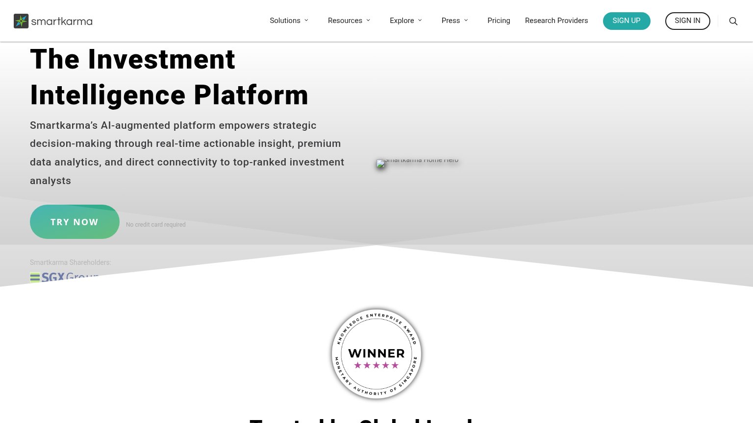
| Trata | >$175B AUM from active contributors |
| No visible trust signal identified. | |
| implicit context Value Investors Club may benefit from pre-existing familiarity among its target audience. | |
| "Smartkarma Shareholders:" logo strip (SGX Group, Peak XV, Jungle, Wavemaker, Enterprise Singapore) |
CTA
68FairCopy, size, verb, cost-feel — does the primary CTA earn the click?

Problems
- demo booking feels costly
- no product taste before sales call
- 'click me!' points away from CTA
Value props
72FairTitle, subtitle, hero — do they sell the product's true value?
Trata’s headline undersells
We host conversations that drive public markets.
The fastest-growing library of investment research, centered on anonymous hedge fund debate.
Working
- Numeric proof: 2,000+ tickers, >$175B AUM
- Subhead names the niche precisely
- YC badge adds credibility
Could improve
- Headline is company-first, not buyer-first
- Hero art decorates, never shows product
- No stated outcome for the reader
Information hierarchy
76FairDoes the design help or inhibit what the page is trying to say?
1234- Duplicate Book a Demo — Header 'Book a Demo' repeats the hero CTA at identical weight, splitting the eye between two equal targets.
- click me sticker — The orange 'click me!' arrow pulls the eye off the headline toward an unclear interaction that competes with the demo CTA.
- Hero Book a Demo — Outlined ghost styling on cream gives the primary CTA no fill contrast, so it reads as weakly as the header buttons.
- Stat pills row — Three same-weight bordered pills mimic the CTA's outlined-button styling, adding pseudo-clickable noise at the fold's base.
Mobile web
78FairThe phone experience as a first-class citizen.
 123
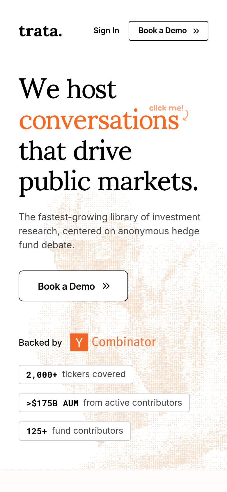
- Five-line hero headline — Headline wraps into five oversized lines, pushing the primary CTA to the bottom third of the fold.
- Half-width demo button — "Book a Demo" floats at roughly half the column width instead of a thumb-friendly full-bleed button.
- Click me annotation — The "click me!" sticker crowds the headline and offers no obvious tappable target on a phone.