RivieraYC W25 landing page report.
← Back to YC W25

Your landing page’s weakest score is Trust.

Fix Trust

Score over time

8075706560Slang.ai 65 on May 4 (Wayback)Slang.ai 65 on May 18 (Wayback)Slang.ai 68 on Jun 12 (Wayback)Slang.ai 68 on Jun 22 (Wayback)Slang.ai 69 on Aug 21 (Wayback)Slang.ai 70 on Sep 10 (Wayback)Hostie 69 on Jun 12 (Wayback)Hostie 70 on Sep 22 (Live)RestoHost 73 on Sep 22 (Live)Numa 69 on Apr 14 (Wayback)Numa 67 on Apr 22 (Wayback)Numa 69 on May 8 (Wayback)Numa 69 on May 18 (Wayback)Numa 70 on Aug 19 (Wayback)Numa 70 on Aug 21 (Live)Riviera 71 on May 18 (Wayback)Riviera 70 on Jun 17 (Wayback)Riviera 70 on Sep 22 (Live)May 18Jun 17Sep 22
Past reportsShow past reportsHide past reports
  1. Sep 22, 202670LiveTrust −8 · Information hierarchy +6Viewing
  2. Jun 17, 202670Overall −1 · Information hierarchy −4 · Trust +4View →
  3. May 18, 202671First tracked report — strongest Information hierarchy 82, weakest Trust 48View →

Trust

44Poor

Proof that the product is real, competent, and safe to try.

Riviera
Hostie
Numa
Trust read
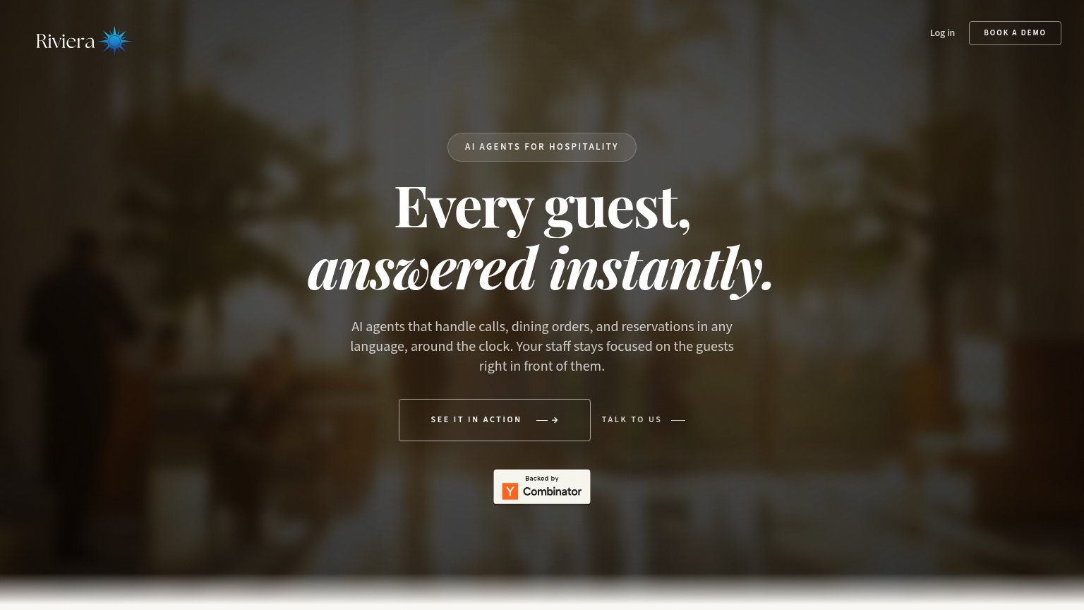
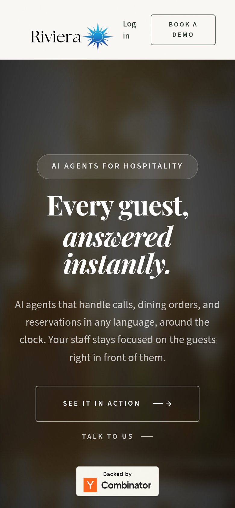
Riviera"Backed by Y Combinator" badge below the hero CTAs
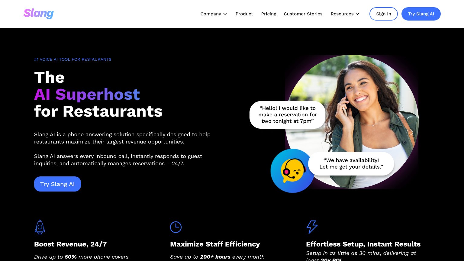
Slang.ai"Setup in as little as 30 mins, delivering at least 20x ROI" benefit claim
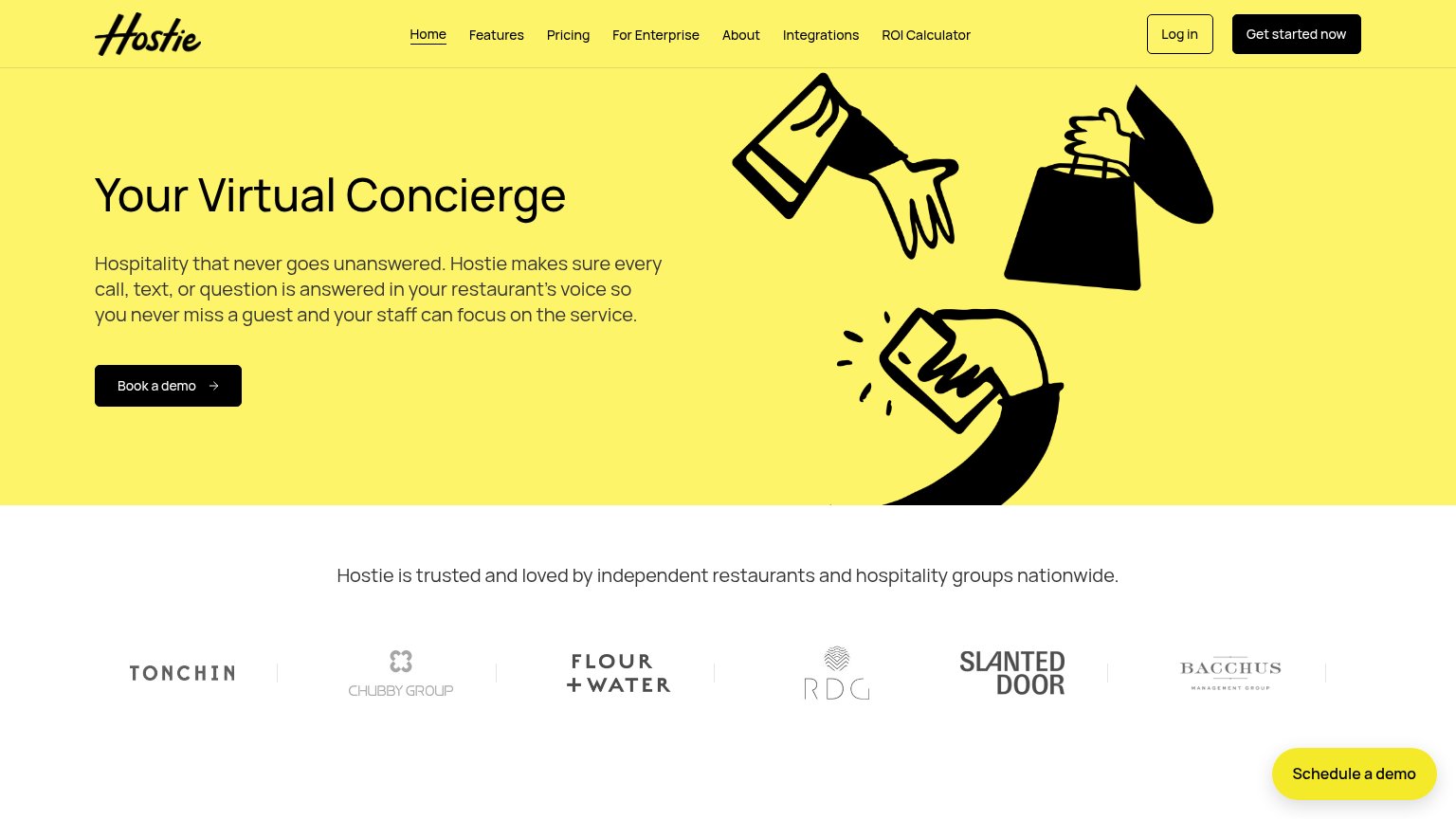
HostieCustomer logo strip: Tonchin, Chubby Group, Flour + Water, RDG, Slanted Door, Bacchus Management Group
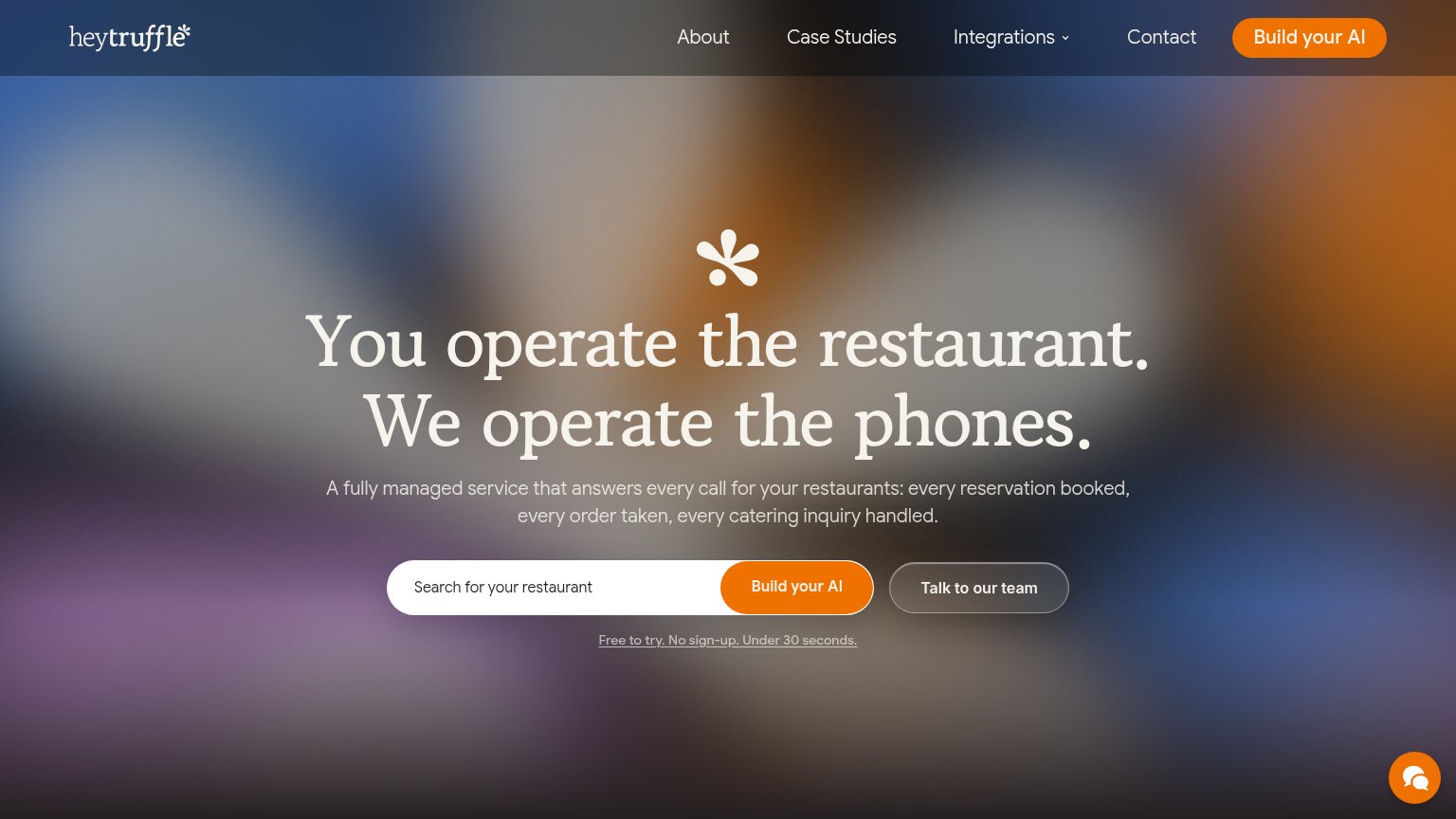
RestoHost"Free to try. No sign-up. Under 30 seconds." microcopy under the CTA
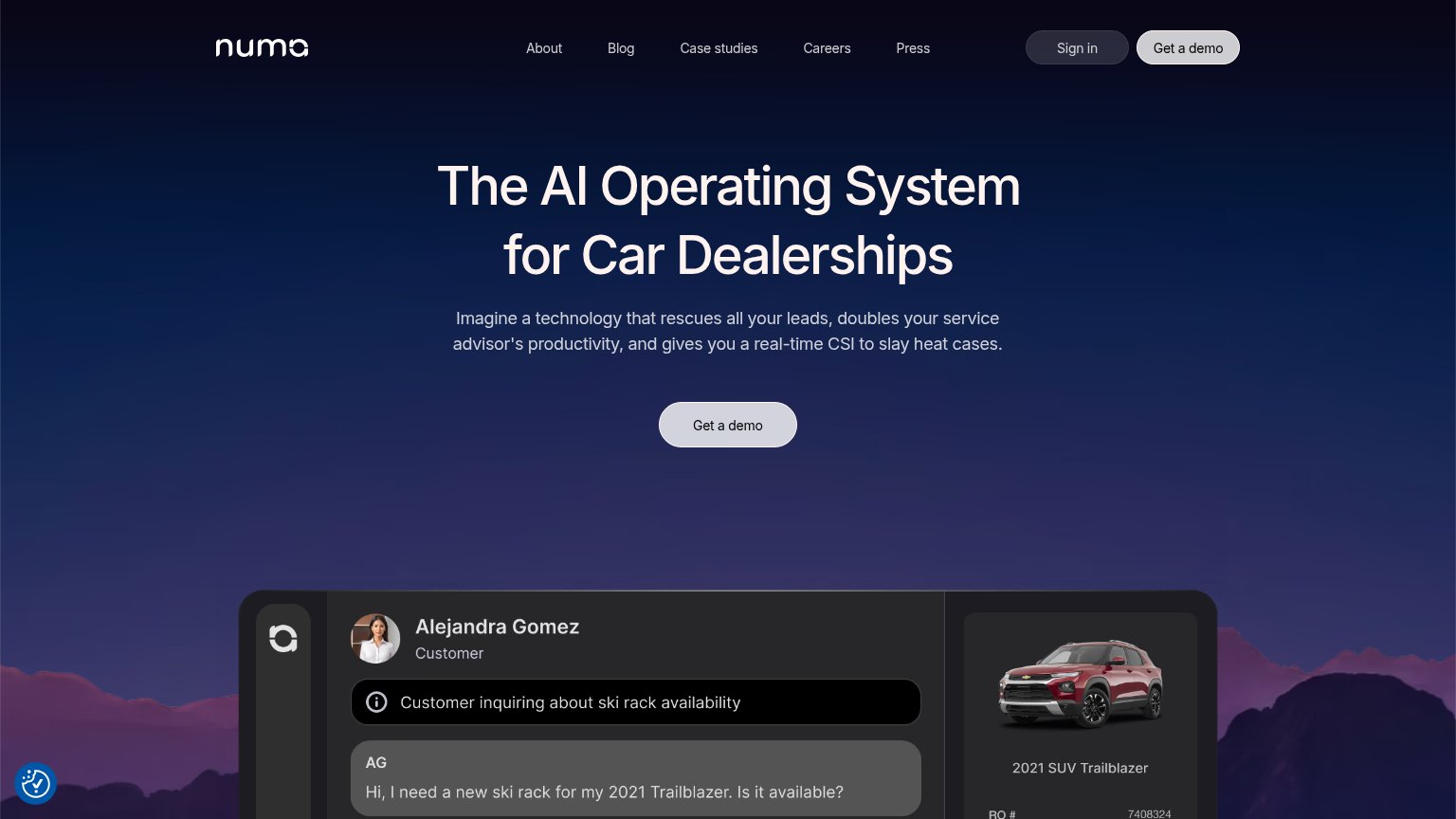
NumaProduct UI showing a real service conversation with vehicle card ('2021 SUV Trailblazer', RO #7408324)

CTA

70Fair

Copy, size, verb, cost-feel — does the primary CTA earn the click?

Riviera
RestoHostin-product action
Slang.ai
Numa

Problems

  • four words, over budget
  • vague payoff — 'it'
  • three labels compete on one fold
  • nav 'Book a Demo' splits the ask

Mobile web

72Fair

The phone experience as a first-class citizen.

Mobile web annotations on the mobile capture1234
  1. Uncollapsed header row — Full desktop header with logo, wrapping Log in link, and BOOK A DEMO box eats the top of the viewport instead of collapsing to a hamburger.
  2. Wrapping Log in link — "Log in" breaks onto two lines, signaling the header was never re-checked on a phone.
  3. Oversized serif headline — The headline wraps to five tall lines, pushing the primary CTA to the bottom edge of the fold.
  4. Competing TALK TO US link — A second action directly under SEE IT IN ACTION splits the tap decision on top of the header's BOOK A DEMO.

Value props

78Fair

Title, subtitle, hero — do they sell the product's true value?

Riviera’s headline sellsEvery guest, answered instantly.AI agents that handle calls, dining orders, and reservations in any language, around the clock. Your staff stays focused on the guests right in front of them.

Working

  • Outcome-led headline, not feature list
  • Subhead names concrete jobs: calls, orders, reservations
  • Staff-focus line hits the emotional payoff

Could improve

  • No numbers or proof points anywhere
  • Hero image decorates, doesn't demonstrate
  • YC badge is the only trust signal

Information hierarchy

84Strong

Does the design help or inhibit what the page is trying to say?

Information hierarchy annotations on the desktop capture123
  1. See It CTA — Ghost outline on a dark photo gives the primary action the least contrast on the fold.
  2. Book a Demo nav — Outlined at the same weight as the hero CTA, splitting attention between two demo actions.
  3. Talk to Us link — Sits inline beside the primary CTA at similar size, diluting the single scan target.

Competitors

inferred from product, audience, and value prop