
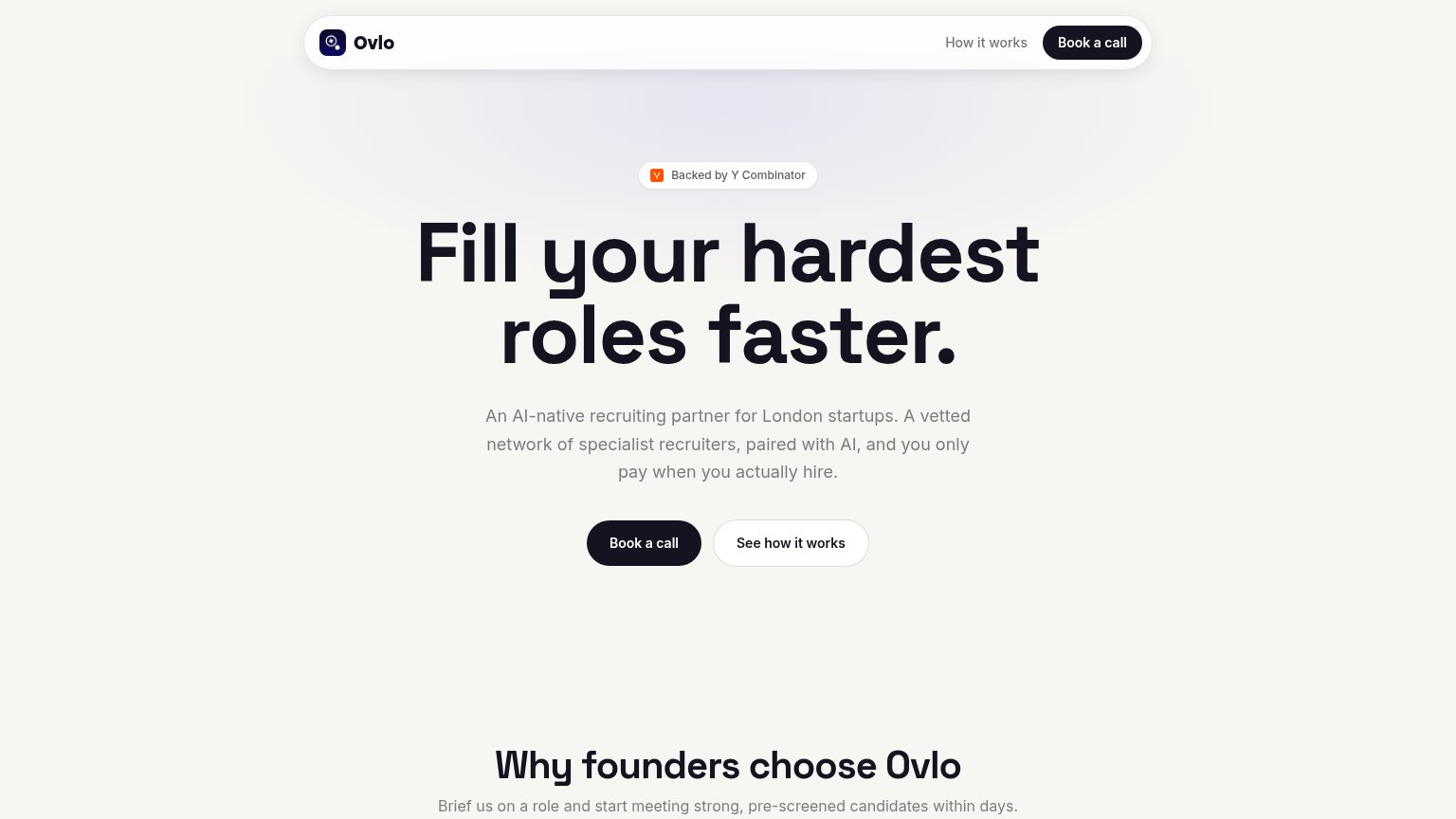
Your landing page’s weakest score is Trust.
How Ovlo ranks
71Growth scoreupdated
category scores
category scoresShowHide
Score over time
Trust
52FairProof that the product is real, competent, and safe to try.
| Trust read | |
|---|---|
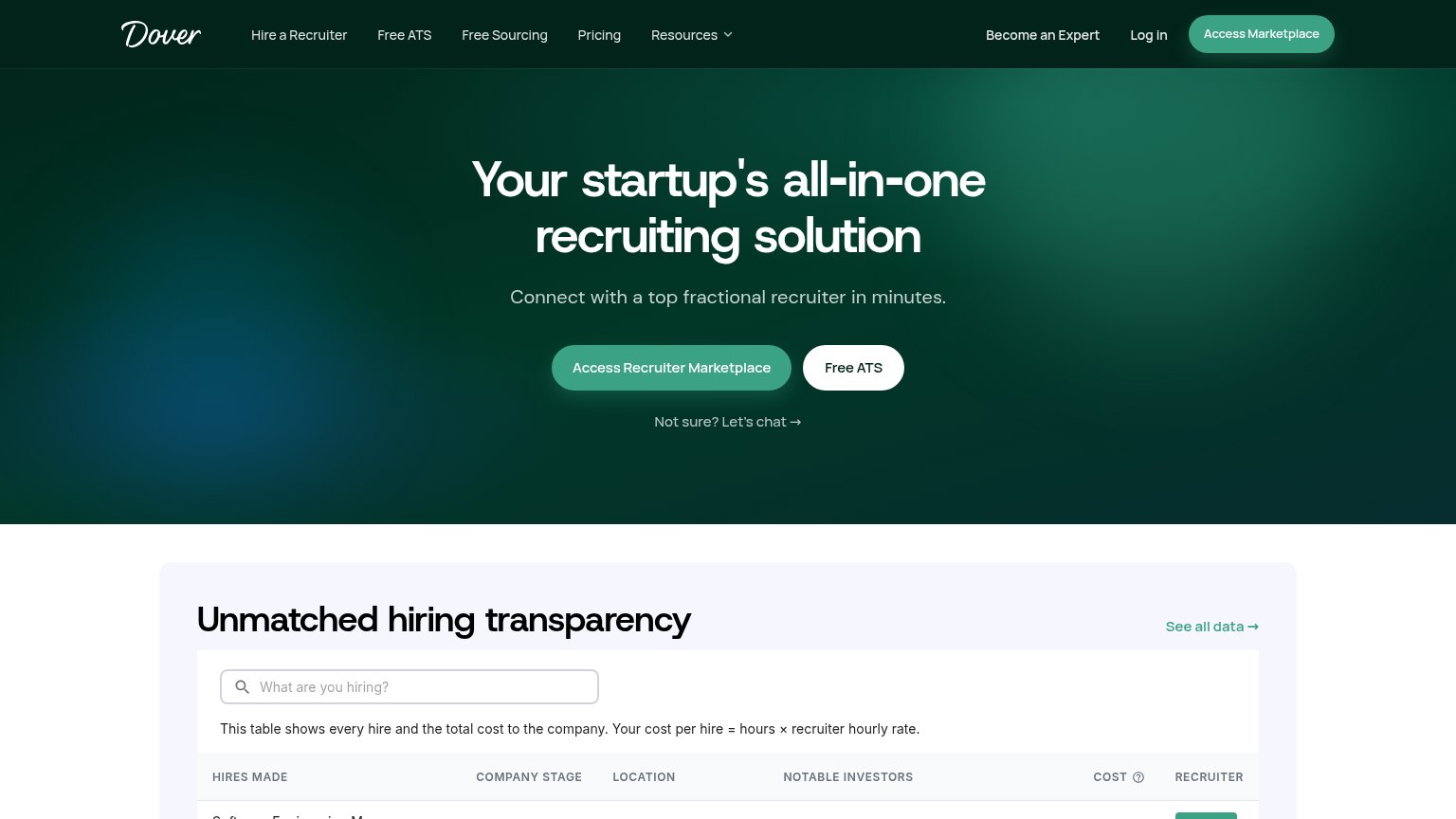
| Ovlo | "Backed by Y Combinator" badge above the hero headline |
| "Unmatched hiring transparency" table stating "This table shows every hire and the total cost to the company" | |
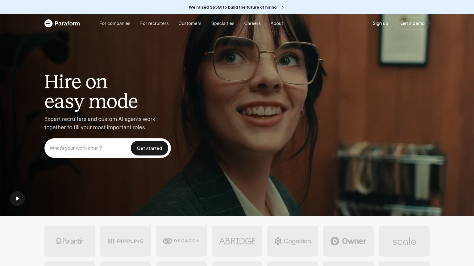
| Customer logo wall featuring Palantir, Rippling, Decagon, Abridge, Cognition, Owner, and Scale | |
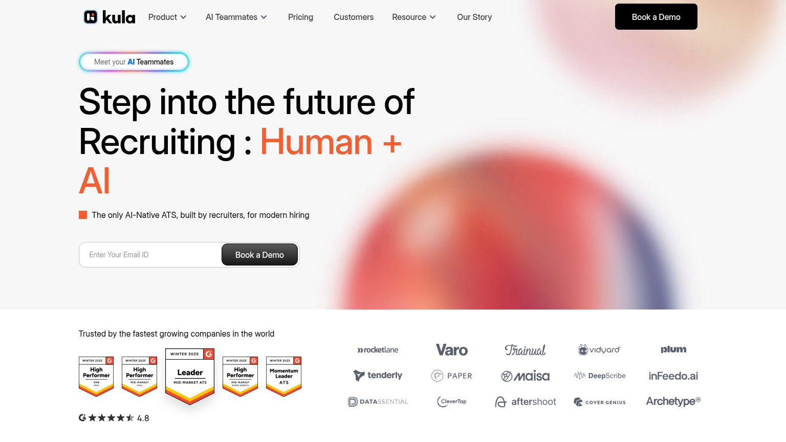
| G2 Winter 2025 badges including "Leader Mid-Market ATS" with 4.8-star rating | |
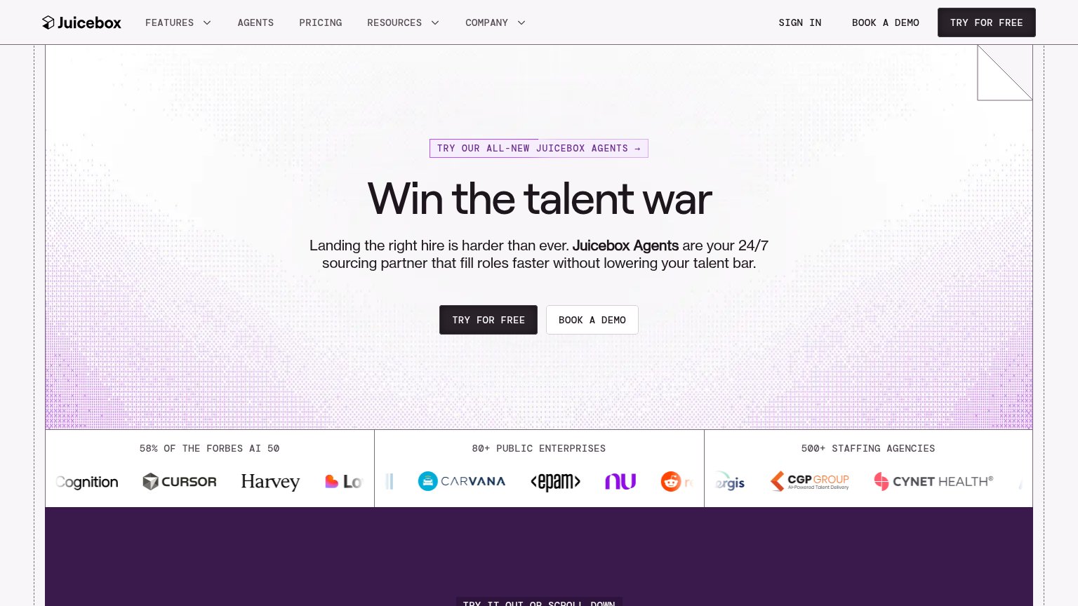
| "58% OF THE FORBES AI 50" logo band with Cursor, Harvey, Notion, Carvana, EPAM logos |
CTA
68FairCopy, size, verb, cost-feel — does the primary CTA earn the click?
Problems
- call feels high-commitment
- ignores pay-on-hire risk reversal
- no payoff named in label
Value props
72FairTitle, subtitle, hero — do they sell the product's true value?
Ovlo’s headline sells
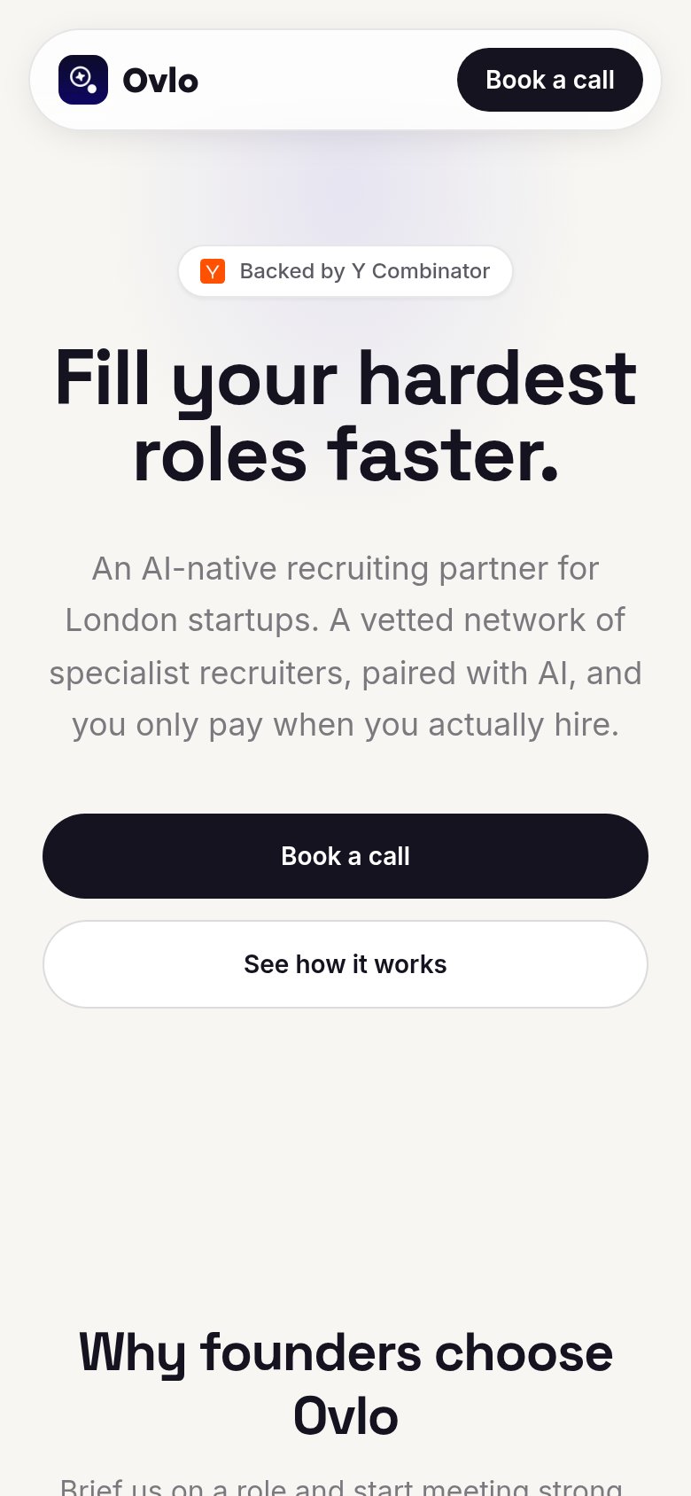
Fill your hardest roles faster.
An AI-native recruiting partner for London startups. A vetted network of specialist recruiters, paired with AI, and you only pay when you actually hire.
Working
- Outcome-first headline on hard hires
- Subhead names audience and mechanism
- Pay-on-hire de-risks the pitch
Could improve
- No numbers — 'faster' is unquantified
- No hero visual demonstrating product
- 'Within days' claim buried below fold
Information hierarchy
76FairDoes the design help or inhibit what the page is trying to say?
123- Duplicate Book a call — Hero "Book a call" repeats the identically styled nav button, splitting the primary action across two equal-weight targets.
- See how it works — Pill-shaped secondary button matches the primary CTA's size and shape, competing for the click at the decision point.
- Y Combinator badge — Small isolated badge floats above the headline and interrupts the scan path before the value prop lands.
Mobile web
88StrongThe phone experience as a first-class citizen.
 1
- Header Book a call — Duplicates the full-width hero CTA just below while the 'How it works' link was dropped entirely from mobile nav.