
Your landing page’s weakest score is CTA.
How Leaping AI ranks
70Growth scoreupdated
category scores
category scoresShowHide
Score over time
CTA
62FairCopy, size, verb, cost-feel — does the primary CTA earn the click?

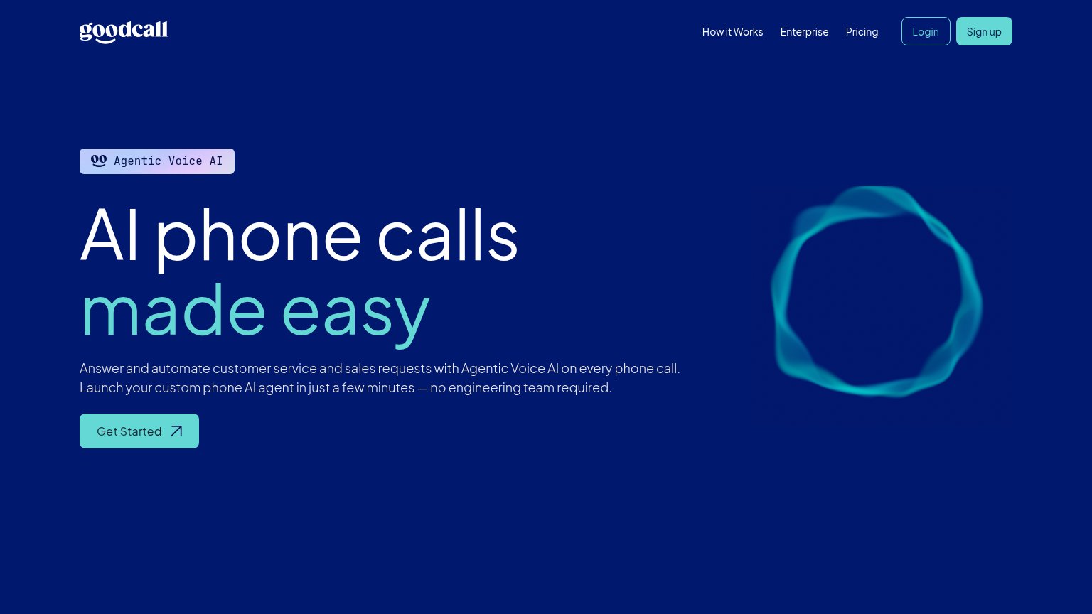
Problems
- demo booking feels costly
- no way to try the voice agent
- small vs. huge headline
- no secondary low-friction path
Value props
64FairTitle, subtitle, hero — do they sell the product's true value?
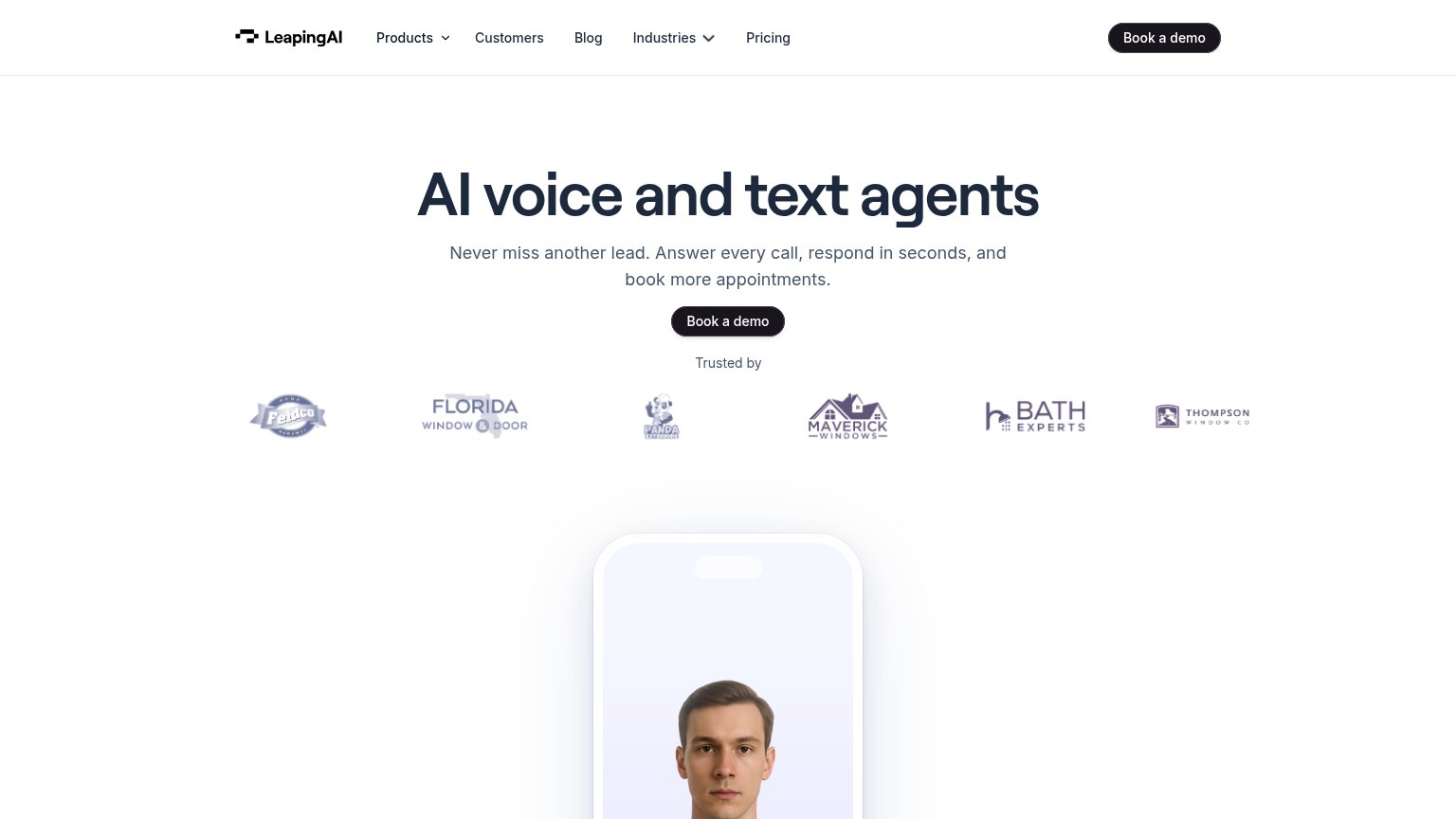
Leaping AI’s headline undersells
AI voice and text agents
Never miss another lead. Answer every call, respond in seconds, and book more appointments.
Working
- Subhead names real outcomes: leads, calls, bookings
- "Never miss another lead" hits a real fear
- ICP-relevant trust logos (windows, bath, exteriors)
Could improve
- H1 is a category label, not a value claim
- No numbers anywhere in the fold
- Hero phone mockup shows a face, not the agent working
Trust
66FairProof that the product is real, competent, and safe to try.
| Trust read | |
|---|---|
| Leaping AI | "Trusted by" logo strip with six named customers (Feldco, Florida Window & Door, Panda Exteriors, Maverick Windows, Bath |
| G2 4.8-star rating badge above the subheadline | |
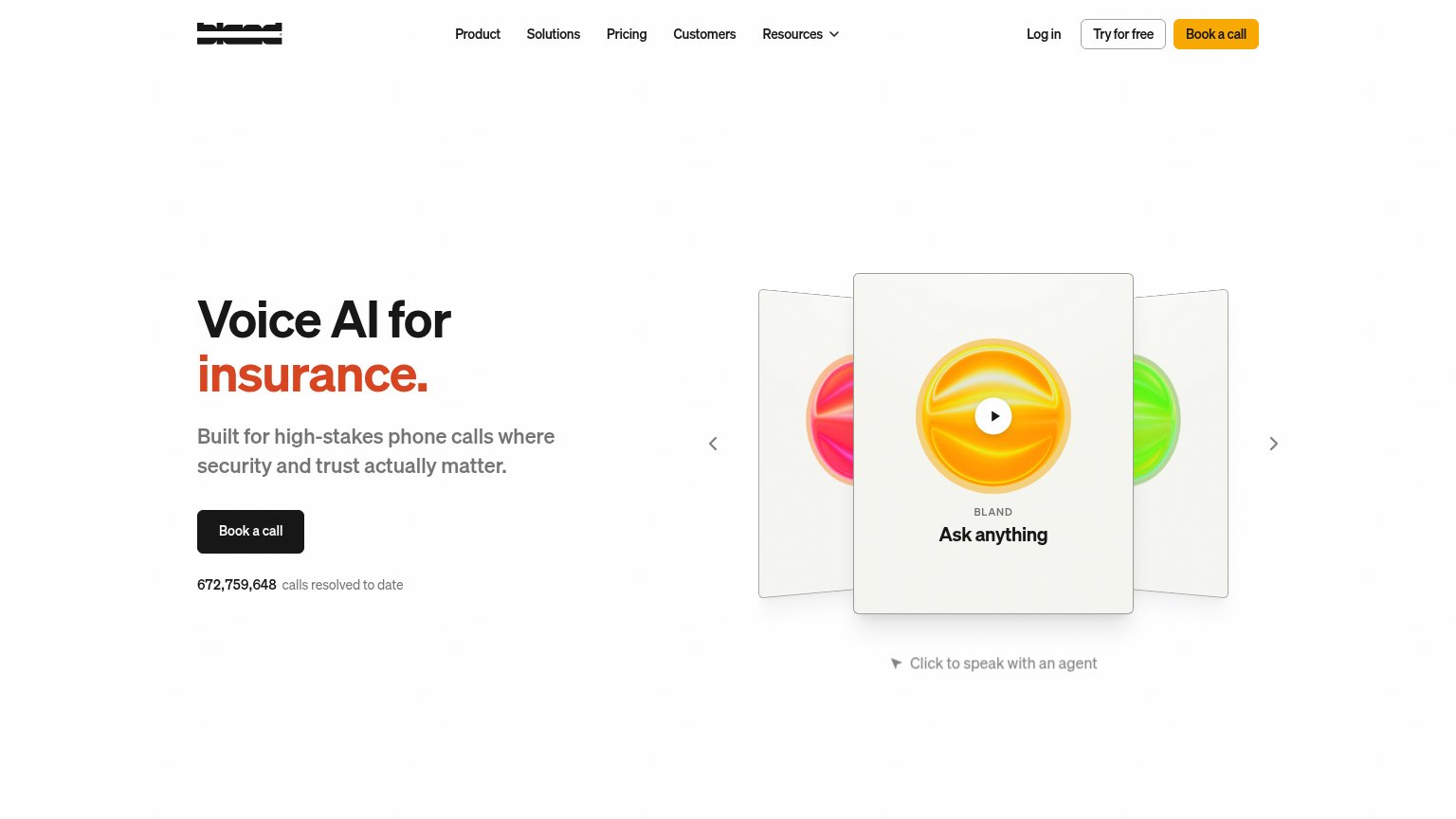
| "672,759,648 calls resolved to date" counter beneath the Book a call CTA | |
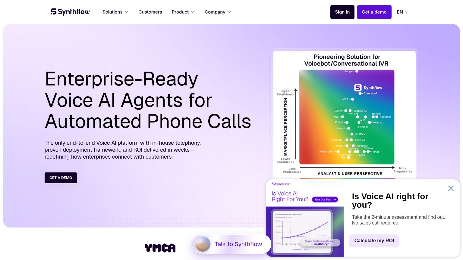
| Analyst quadrant chart "Pioneering Solution for Voicebot/Conversational IVR" positioning Synthflow above named competito | |
| "Born at Google." heading with supporting copy on the mobile capture | |
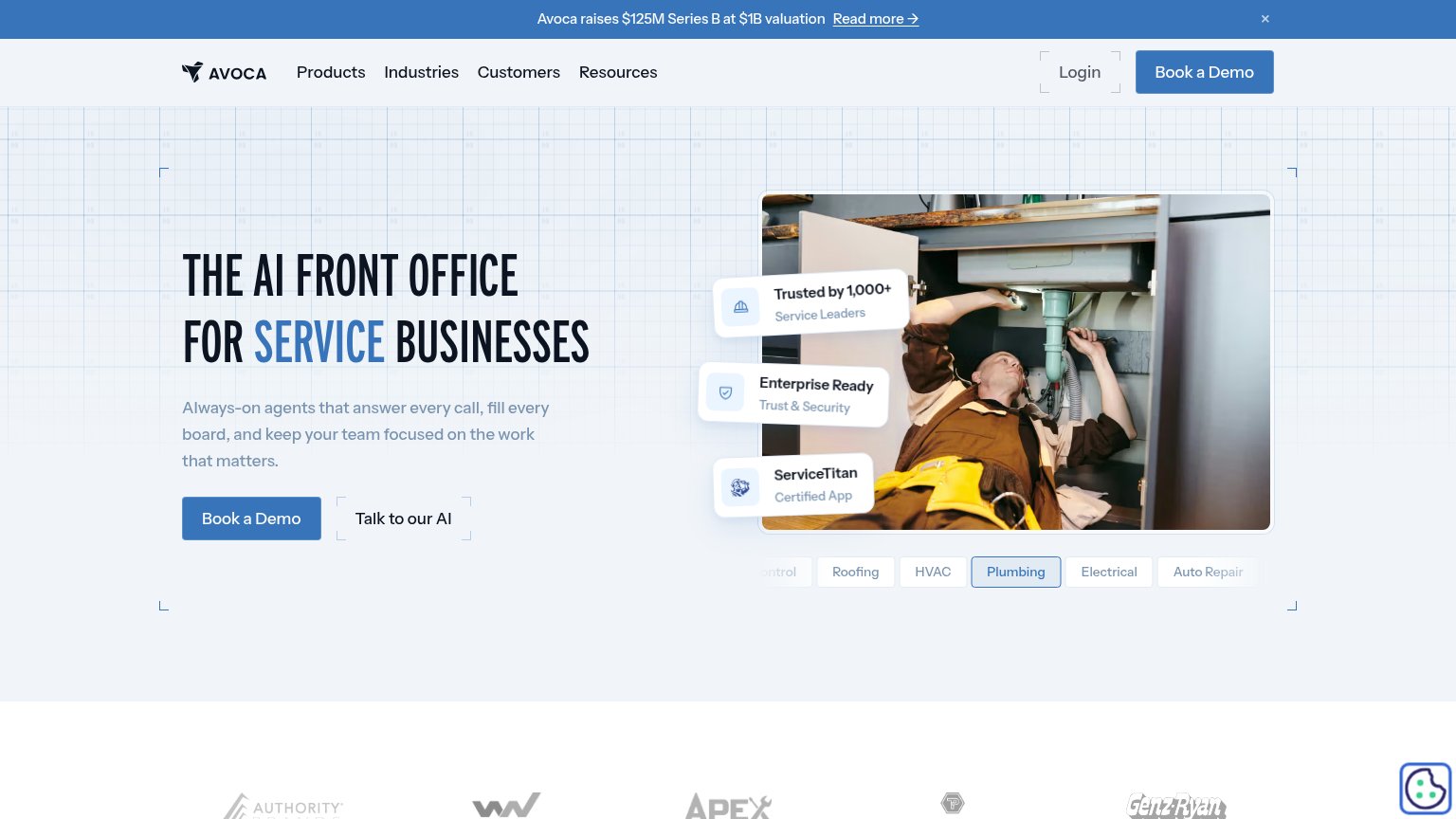
| "Trusted by 1,000+ Service Leaders" badge |
Information hierarchy
78FairDoes the design help or inhibit what the page is trying to say?
1234- Five-link navigation bar — Products, Customers, Blog, Industries, and Pricing all offer exits at equal weight before the demo CTA.
- Phone mockup cut off — The brand's strongest visual — the AI agent's face — sits mostly below the fold, contributing nothing at first glance.
- Faded trust logo row — Grayscale, low-contrast logos are barely legible, weakening the social proof they exist to deliver.
- Duplicate Book a demo — The nav's dark pill duplicates the hero CTA at equal visual weight, splitting the click target.
Mobile web
78FairThe phone experience as a first-class citizen.
 123
- Hero Book a demo — Desktop-proportioned button floating in the column instead of a full-width thumb target.
- Four-line subheadline — Long copy wraps into four lines, pushing trust proof and the phone visual down the fold.
- Duplicate header CTA — Second "Book a demo" in the sticky header competes with the identical hero button.