
Your landing page’s weakest score is Trust.
How Hey Telo ranks
- 1.
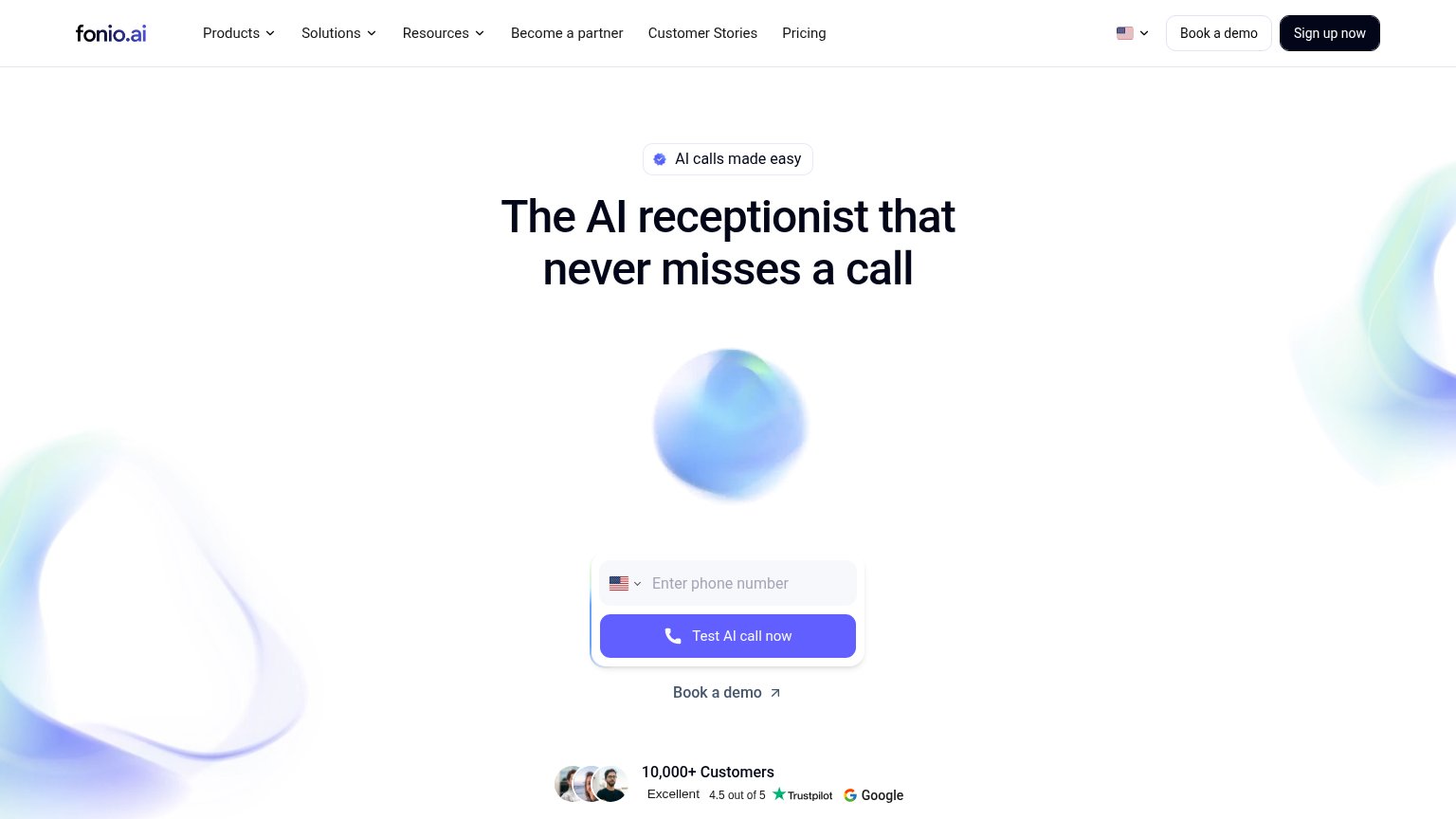
fonio.ai76
- 2.
Hey Telo69
- 3.
Famulor64
- 4.
VITAS53
- 5.
Aaron.ai47
69Growth scoreupdated
category scores
category scoresShowHide
Trust
62FairProof that the product is real, competent, and safe to try.
| Trust read | |
|---|---|
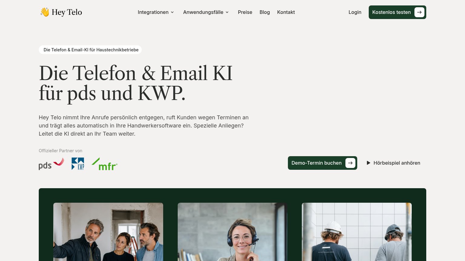
| Hey Telo | "Offizieller Partner von" strip with pds, KWP and mfr logos |
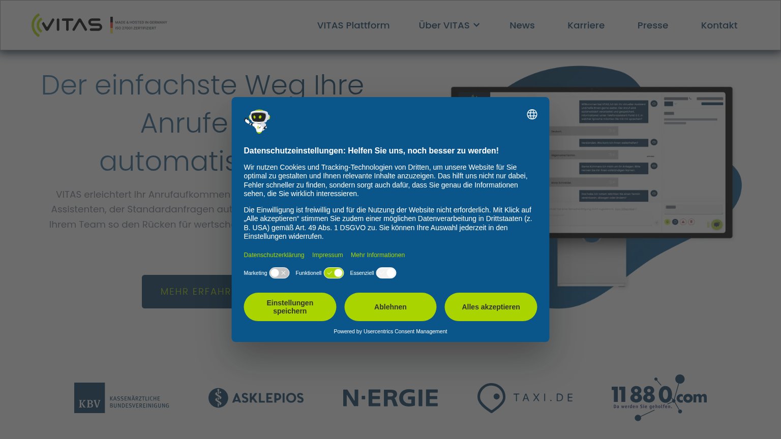
| Customer logo row: KBV, ASKLEPIOS, N-ERGIE, TAXI.DE, 11880.com | |
| "10,000+ Customers" with "Excellent 4.5 out of 5" Trustpilot and Google ratings beneath the hero CTA | |
| implicit context Aaron.ai may benefit from pre-existing familiarity among its target audience. | |
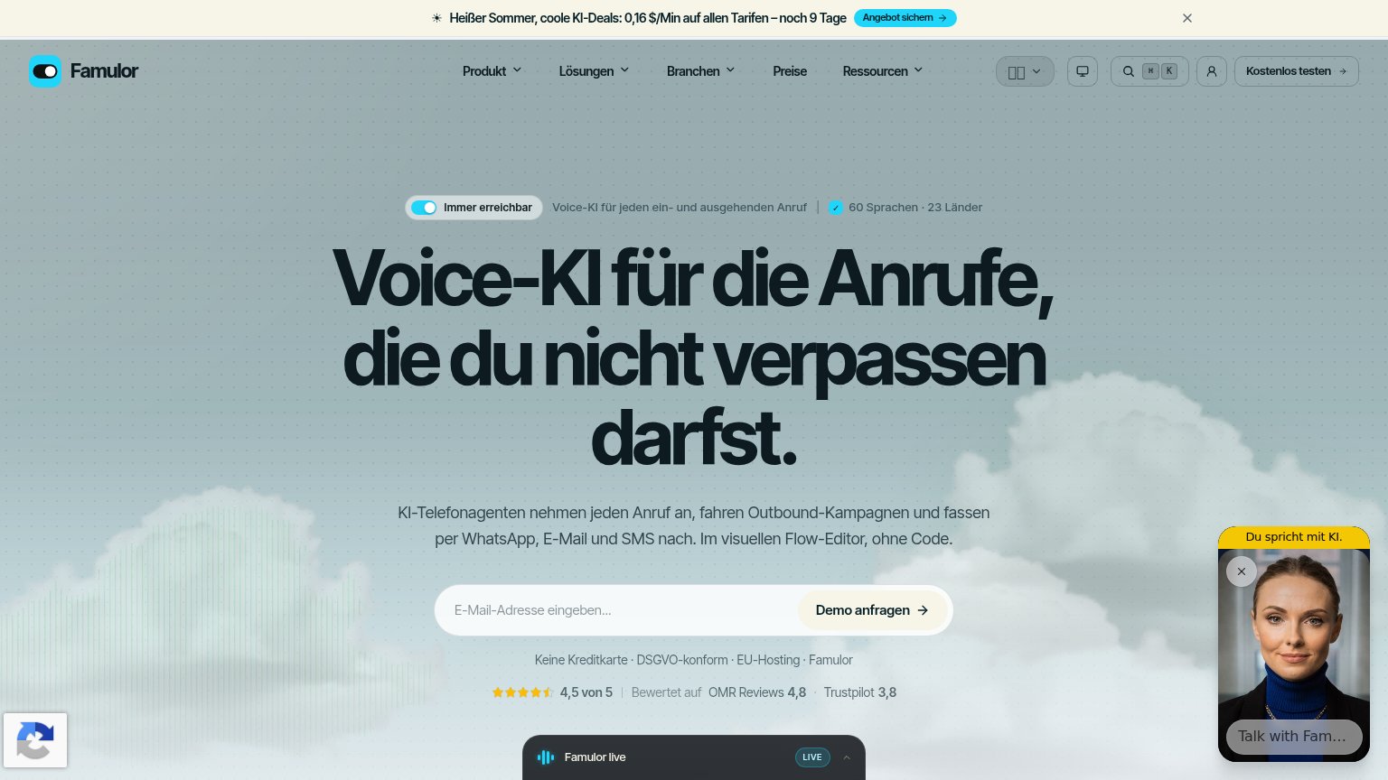
| "Bewertet auf OMR Reviews 4,8 · Trustpilot 3,8" rating strip directly below the demo CTA |
CTA
64FairCopy, size, verb, cost-feel — does the primary CTA earn the click?
Problems
- demo booking feels costly
- nav says 'Kostenlos testen', hero doesn't
- no 'kostenlos' despite free offer
- competing labels split the first click
Value props
72FairTitle, subtitle, hero — do they sell the product's true value?
Hey Telo’s headline sells
Die Telefon & Email KI für pds und KWP.
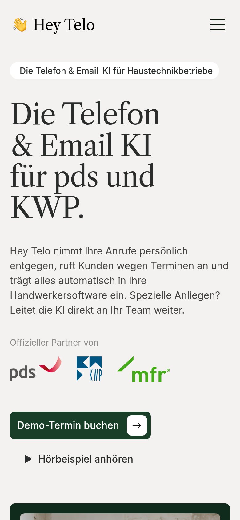
Hey Telo nimmt Ihre Anrufe persönlich entgegen, ruft Kunden wegen Terminen an und trägt alles automatisch in Ihre Handwerkersoftware ein. Spezielle Anliegen? Leitet die KI direkt an Ihr Team weiter.
Working
- Names pds/KWP — instant audience fit
- Subhead lists three concrete actions
- Partner logos back the integration claim
Could improve
- No numbers anywhere in the fold
- No emotional hook for missed-call pain
- Hero photos decorate, don't demonstrate
Mobile web
72FairThe phone experience as a first-class citizen.
 123
- Oversized hero headline — Serif headline wraps into five giant lines and pushes the primary CTA below the first viewport.
- Long body paragraph — Five lines of desktop-length copy stack on the headline and further displace the demo CTA.
- Partner logo row — Three large logos sit between the value copy and the CTA, adding scroll before any action.
Information hierarchy
76FairDoes the design help or inhibit what the page is trying to say?
123- Kostenlos testen button — Styled identically to 'Demo-Termin buchen' below, so two dark pills compete as the primary action.
- Navigation link row — Six exits (Integrationen, Anwendungsfälle, Preise, Blog, Kontakt, Login) leak attention before either CTA.
- Hörbeispiel anhören link — Sits at equal size beside the demo CTA, splitting the single decision moment into two.