
Your landing page’s weakest score is Mobile web.
How Famulor ranks
Mobile web
44PoorThe phone experience as a first-class citizen.
 1234
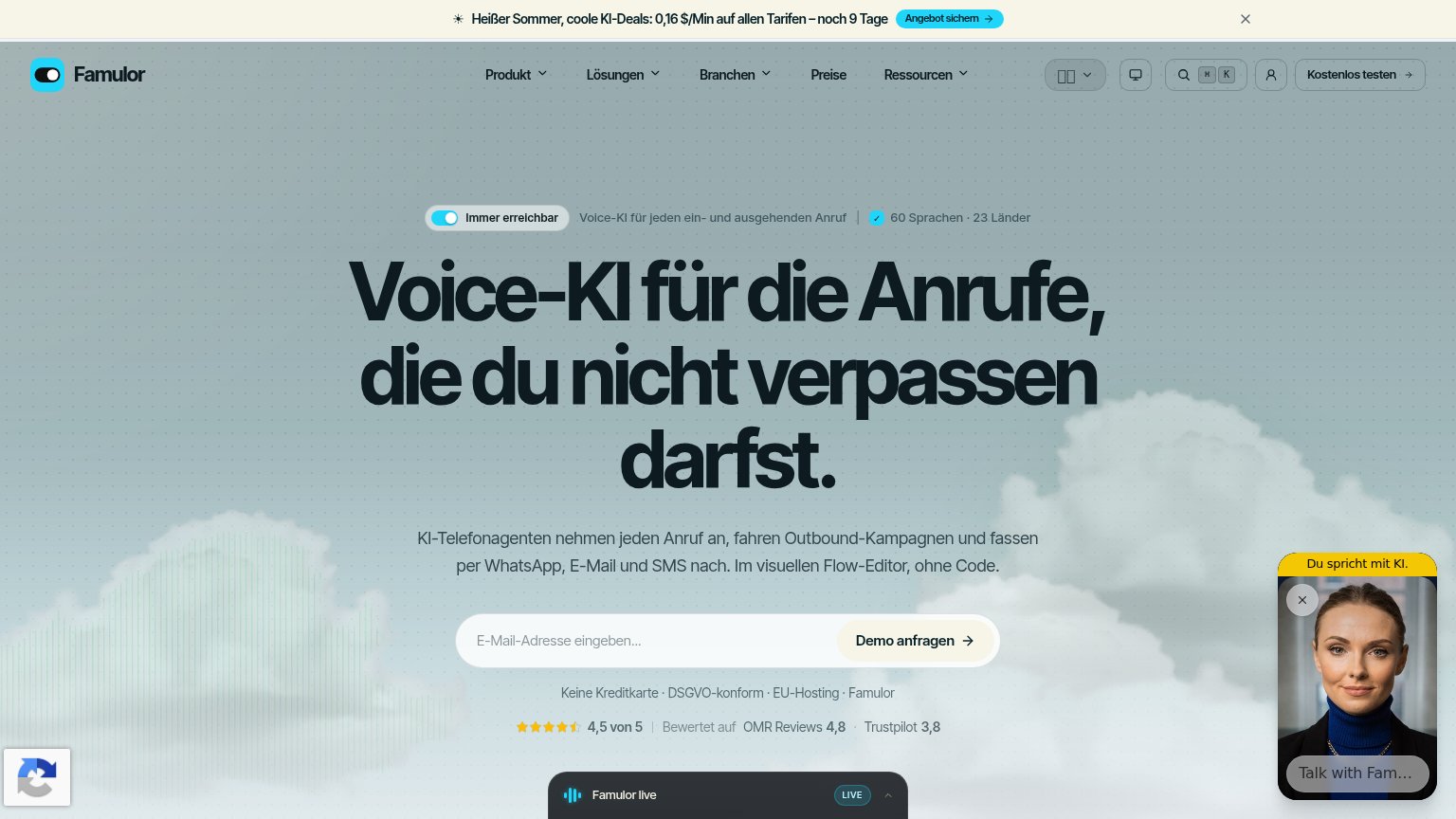
- Demo anfragen button — Bleeds past the right edge with its arrow clipped; the primary tap target is partially off-screen.
- Clipped headline text — "Anrufe" and "verpassen" are cut off at the viewport edge — the page never reflowed for mobile width.
- AI chat widget — Dead blocker covering the ratings row and integration logos; contributes nothing to the funnel.
- reCAPTCHA badge — Floats over the bottom-left content, adding visual clutter near the integration icons.
Trust
64FairProof that the product is real, competent, and safe to try.
| Trust read | |
|---|---|
| Famulor | "Bewertet auf OMR Reviews 4,8 · Trustpilot 3,8" rating strip directly below the demo CTA |
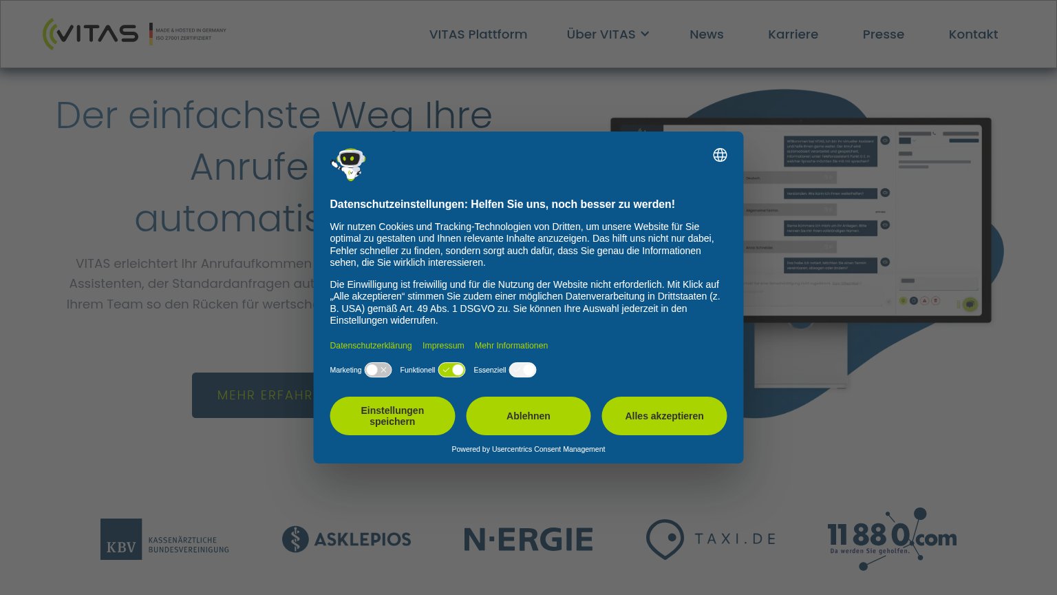
| "Offizieller Partner von" strip with pds, KWP and mfr logos | |
| Customer logo row: KBV, ASKLEPIOS, N-ERGIE, TAXI.DE, 11880.com | |
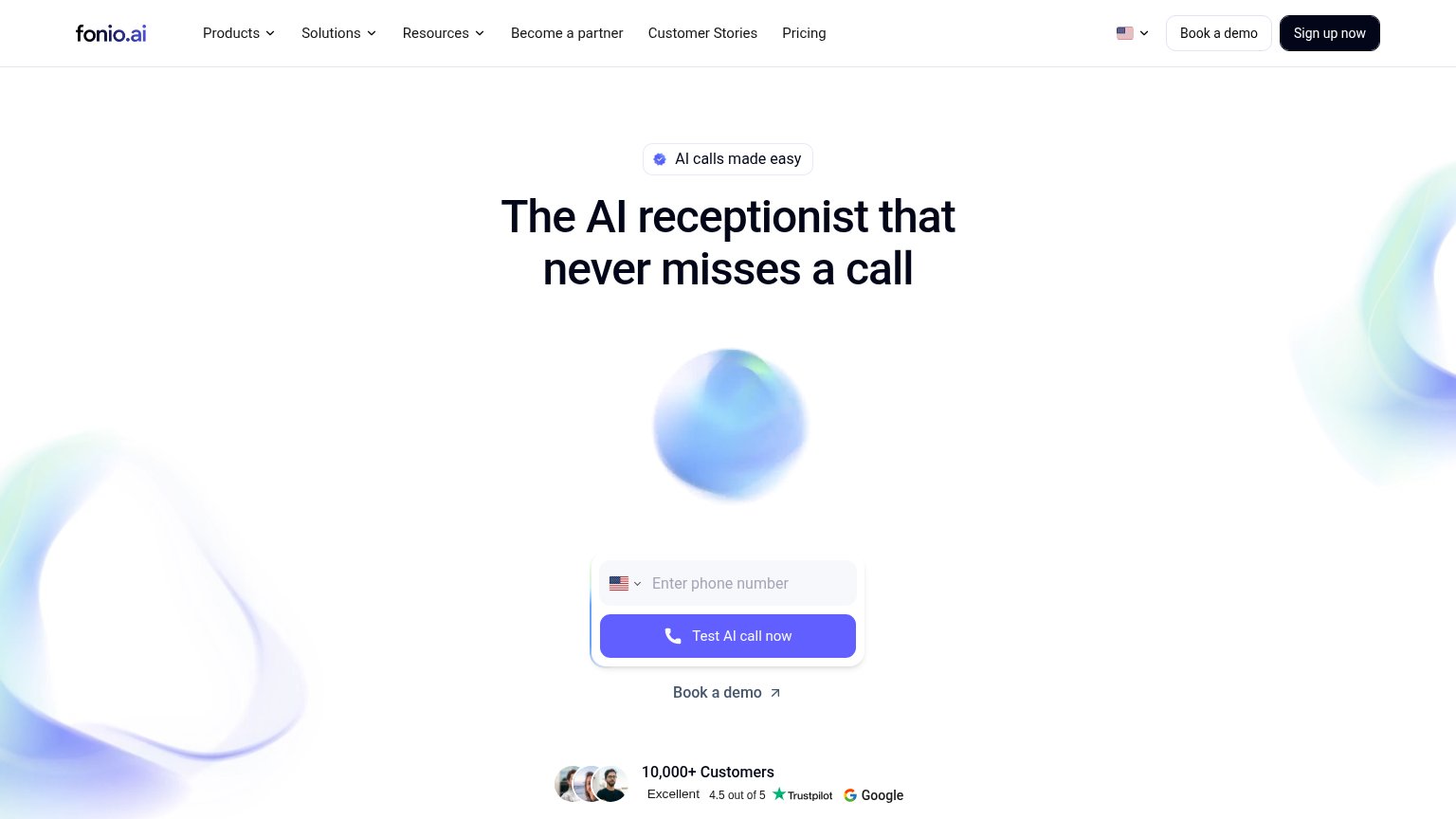
| "10,000+ Customers" with "Excellent 4.5 out of 5" Trustpilot and Google ratings beneath the hero CTA | |
| implicit context Aaron.ai may benefit from pre-existing familiarity among its target audience. |
Information hierarchy
68FairDoes the design help or inhibit what the page is trying to say?
What works
What to improve
CTA
68FairCopy, size, verb, cost-feel — does the primary CTA earn the click?
How Famulor compares
Recommended rewrites
Value props
78FairTitle, subtitle, hero — do they sell the product's true value?
Famulor’s headline
Voice-KI für die Anrufe, die du nicht verpassen darfst.
KI-Telefonagenten nehmen jeden Anruf an, fahren Outbound-Kampagnen und fassen per WhatsApp, E-Mail und SMS nach. Im visuellen Flow-Editor, ohne Code.
Working
Could improve