
Your landing page’s weakest score is Trust.
How HealthKey ranks
- 1.
HealthKey68
- 2.
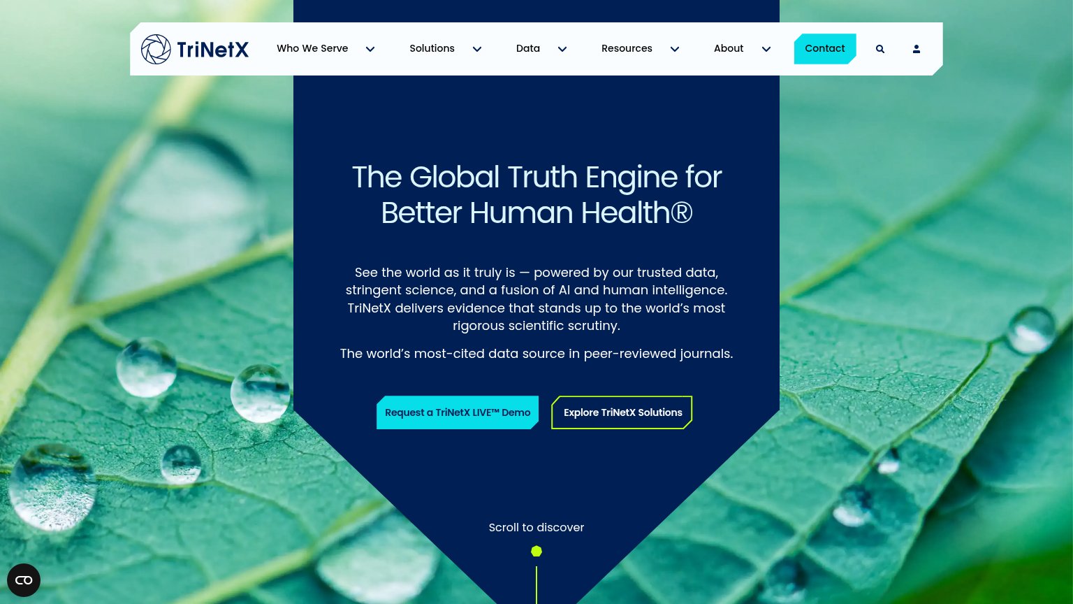
TriNetX62
- 3.
Paradigm54
- 4.
Inato50
68Growth scoreupdated
category scores
category scoresShowHide
Score over time
Trust
56FairProof that the product is real, competent, and safe to try.
| Trust read | |
|---|---|
| HealthKey | Product screenshot of the screening UI citing 'NCT05683691' with dated radiology/pathology evidence per inclusion criter |
| "The world’s most-cited data source in peer-reviewed journals." | |
| "AI Innovation Awards Winner" badge (mobile capture, bottom-right) | |
| No visible trust signal identified. |
CTA
58FairCopy, size, verb, cost-feel — does the primary CTA earn the click?
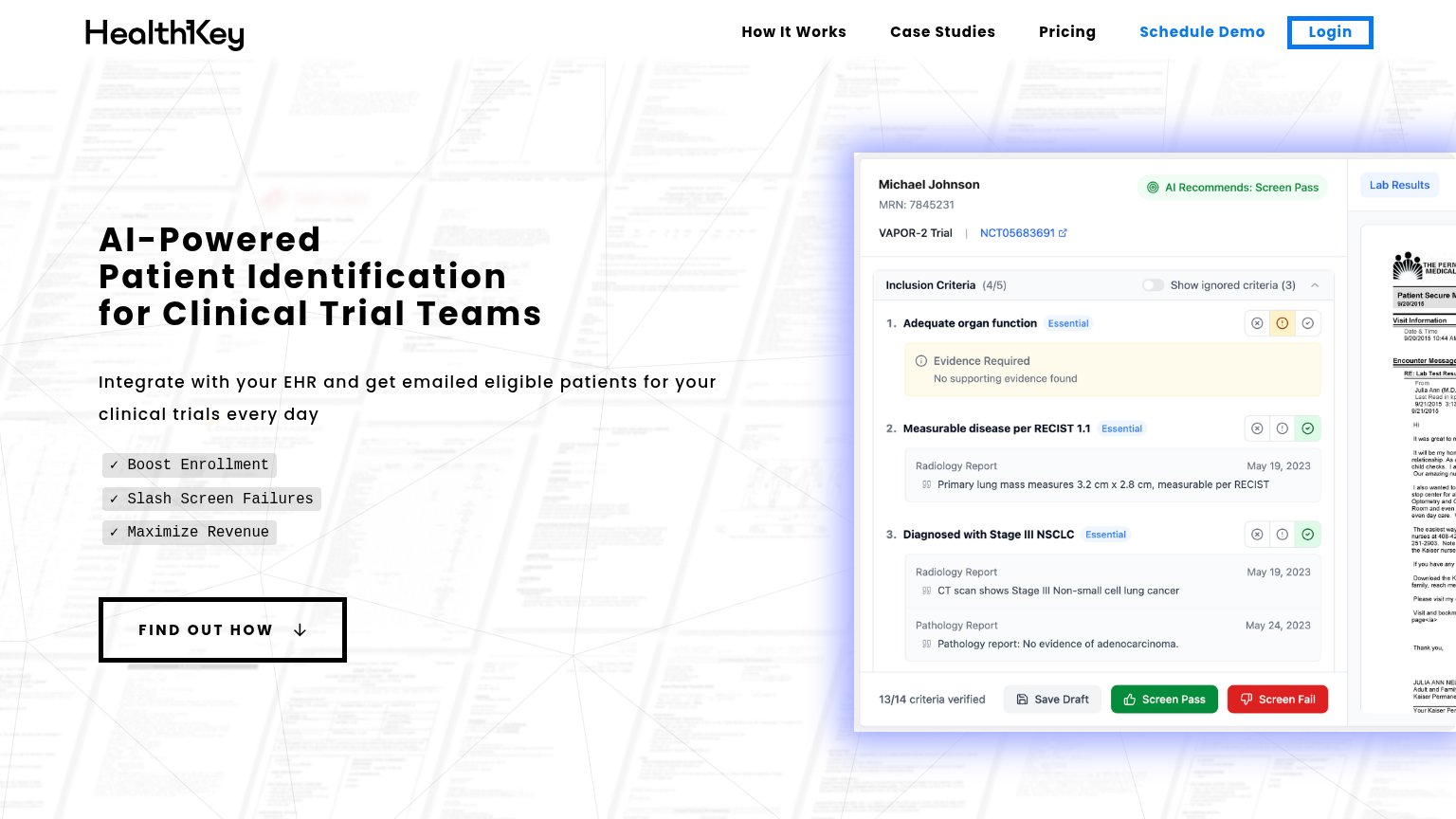
Problems
- only scrolls, no conversion action
- "find out" promises reading, not value
- conflicts with nav's Schedule Demo
- demo CTA styled as weak nav link
Information hierarchy
72FairDoes the design help or inhibit what the page is trying to say?
123- FIND OUT HOW button — The hero CTA is a scroll anchor, not the conversion — 'Schedule Demo' should own this slot.
- Schedule Demo nav link — The highest-intent action is a small blue text link crowded next to a same-size Login button.
- Lab results panel — The right-edge document renders illegible micro-text that adds visual noise without communicating anything.
Value props
74FairTitle, subtitle, hero — do they sell the product's true value?
HealthKey’s headline sells
AI-Powered Patient Identification for Clinical Trial Teams
Integrate with your EHR and get emailed eligible patients for your clinical trials every day
Working
- Names the exact buyer: clinical trial teams
- Subhead states mechanism: EHR in, emails out daily
- Hero screenshot shows real screening workflow
Could improve
- Zero numbers anywhere in the fold
- Badges are generic verb-noun abstractions
- No emotional hook for chart-review pain
Mobile web
78FairThe phone experience as a first-class citizen.
 12
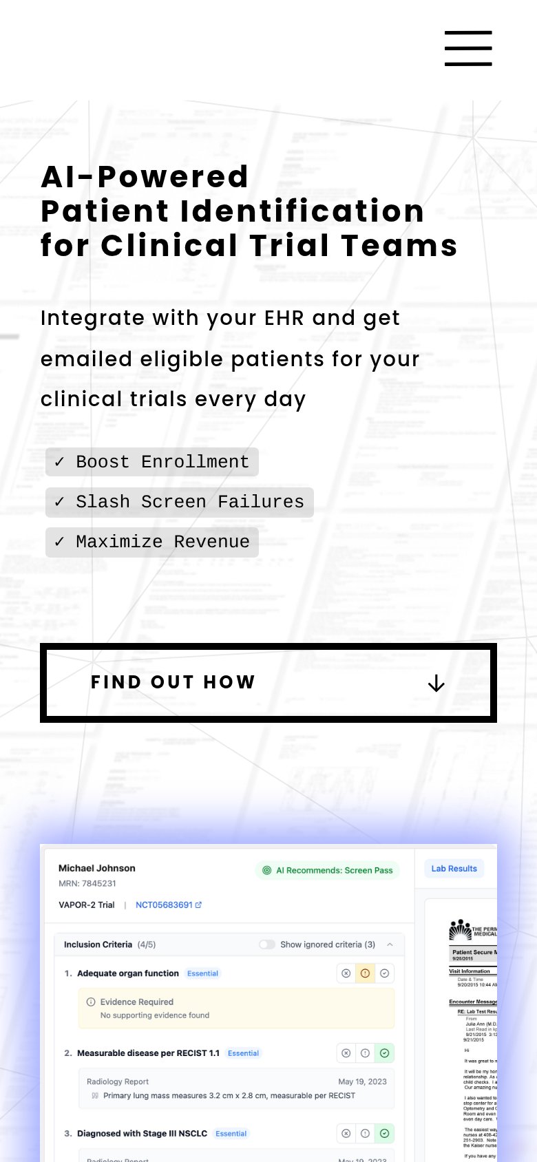
- FIND OUT HOW CTA — The only tappable action is an anchor scroll, not a conversion CTA — 'Schedule Demo' is buried in the hamburger.
- Product screenshot text — The desktop-density criteria UI shrinks to unreadable micro-text on the phone, adding noise without communicating anything.