
Your landing page’s weakest score is Trust.
How Fira ranks
72Growth scoreupdated
category scores
category scoresShowHide
Trust
58FairProof that the product is real, competent, and safe to try.


| Trust read | |
|---|---|
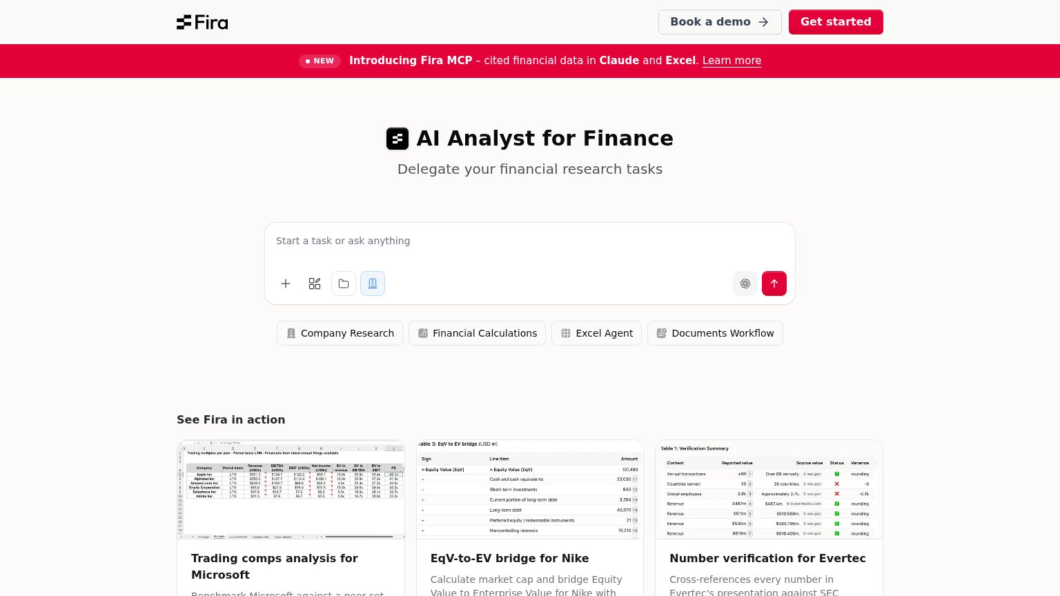
| Fira | "See Fira in action" demo gallery with real spreadsheet output (e.g. "Trading comps analysis for Microsoft") |
| Customer/partner logo strip: Tiger Global, Moelis, Nomura, Société Générale, Rothschild & Co, BNP Paribas, Raymond James | |
| Customer logo row: Morgan Stanley, MetLife, Centerview, OHA (mobile capture) | |
| No visible trust signal identified. | |
| AlphaSense is named the only Leader in The Forrester Wave™: Market and Competitive Intelligence Platforms, Q3 2026 |
Value props
72FairTitle, subtitle, hero — do they sell the product's true value?
Fira’s headline undersells
AI Analyst for Finance
Delegate your financial research tasks
Working
- Names the audience: finance
- Delegate frames the core job
- Real examples prove the claim
Could improve
- No numbers or concrete outcome
- Subhead restates the headline
- No emotional hook or pain named
Information hierarchy
76FairDoes the design help or inhibit what the page is trying to say?
1234- Dual header CTAs — "Book a demo" and "Get started" carry near-equal weight, splitting the visitor's first action decision.
- Announcement banner — Full-width red bar with "Learn more" link outshouts the hero and pulls attention to an exit before the value prop lands.
- Prompt input CTA — The real primary action — the chat input's red arrow — is a small icon with no label, easy to miss versus the header buttons.
- Four suggestion chips — Company Research, Financial Calculations, Excel Agent, and Documents Workflow read as four equal-weight paths with no ranked entry point.
Mobile web
76FairThe phone experience as a first-class citizen.
 123
- Dual header CTAs — "Book a demo" and "Get started" crowd the logo with two competing taps and no collapsed nav.
- MCP promo banner — A second sticky red bar stacks under the header, eating fold height before the hero starts.
- Suggestion chip stack — Four chips wrap into a ragged three-row stack, adding visual noise below the task input.
CTA
78FairCopy, size, verb, cost-feel — does the primary CTA earn the click?

Problems
- icon-only submit, no label
- 'Get started' competes in nav
- unclear if input needs signup