
Your landing page’s weakest score is Trust.
How Paragon ranks
67Growth scoreupdated
category scores
category scoresShowHide
Score over time
Trust
38PoorProof that the product is real, competent, and safe to try.


| Trust read | |
|---|---|
| Paragon | No visible trust signal identified. |
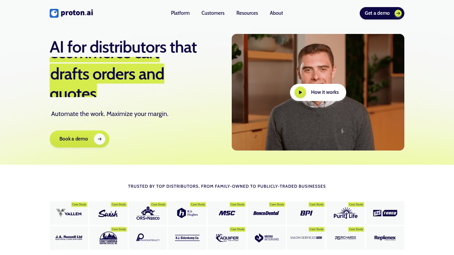
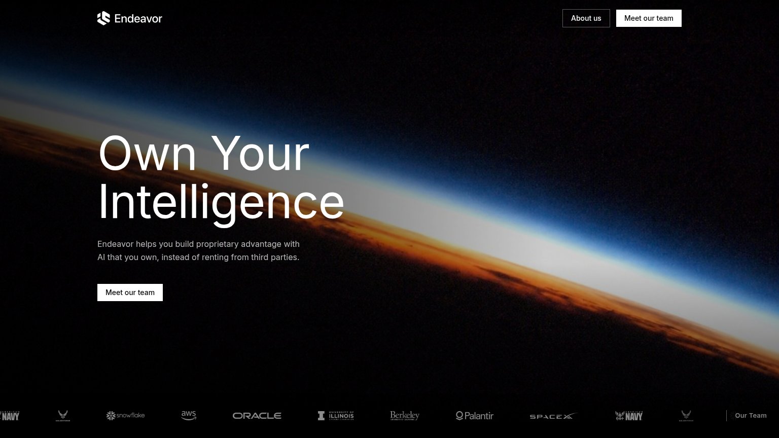
| Logo strip with U.S. Navy, U.S. Air Force, Snowflake, AWS, Oracle, Berkeley, Palantir, SpaceX | |
| "Trusted on 1.5B+ line items a year" badge above the headline | |
| G2 badge strip: "4.9 Rating" with "100+ Testimonials" | |
| Logo wall under "TRUSTED BY TOP DISTRIBUTORS, FROM FAMILY-OWNED TO PUBLICLY-TRADED BUSINESSES" with named customers (Val |
CTA
68FairCopy, size, verb, cost-feel — does the primary CTA earn the click?

Problems
- high-commitment sales-call framing
- no low-friction secondary path
- hero button smaller than headline scale
Value props
68FairTitle, subtitle, hero — do they sell the product's true value?
Paragon’s headline vague
The AI Growth Engine For Industrials
AI agents that automate order processing, customer engagement, and demand forecasting for manufacturers and distributors.
Working
- Subhead names three concrete jobs
- Audience named: manufacturers, distributors
- Clean single-CTA focus
Could improve
- "Growth Engine" is an abstraction stack
- No numbers or proof points in fold
- Hero visual decorates, shows nothing
Mobile web
80StrongThe phone experience as a first-class citizen.
 123
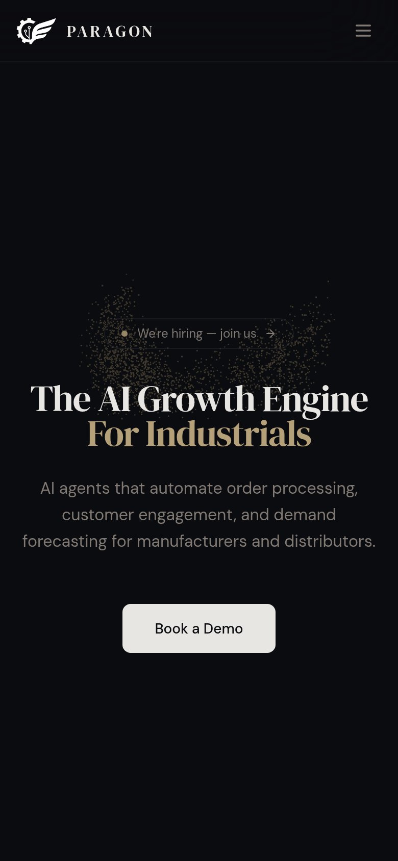
- Book a Demo button — Desktop-proportioned width floats narrow in the phone column instead of near full-bleed.
- Grey subheadline copy — Low-contrast grey on black strains legibility at arm's length.
- We're hiring pill — Faint text and border make the link barely visible against the dark hero.
Information hierarchy
82StrongDoes the design help or inhibit what the page is trying to say?
123- We're hiring badge — A recruiting exit sits directly above the headline in the primary scan path, competing with the value prop and pulling first attention off the conversion story.
- Duplicate Book a Demo — The nav's 'Book a Demo' duplicates the hero button at the same visual weight, splitting the single-action focus of the fold.
- Hero subheadline text — Low-contrast gray on near-black makes the only concrete product explanation the hardest element to read in the fold.