
Your landing page’s weakest score is Information hierarchy.
How Zip Ordering (Luminous) ranks
- 1.
Zip Ordering (Luminous)74
- 2.
Proton.ai74
- 3.
Paragon67
- 4.
Endeavor AI67
- 5.
Conexiom66
74Growth scoreupdated
category scores
category scoresShowHide
Information hierarchy
72FairDoes the design help or inhibit what the page is trying to say?
 123
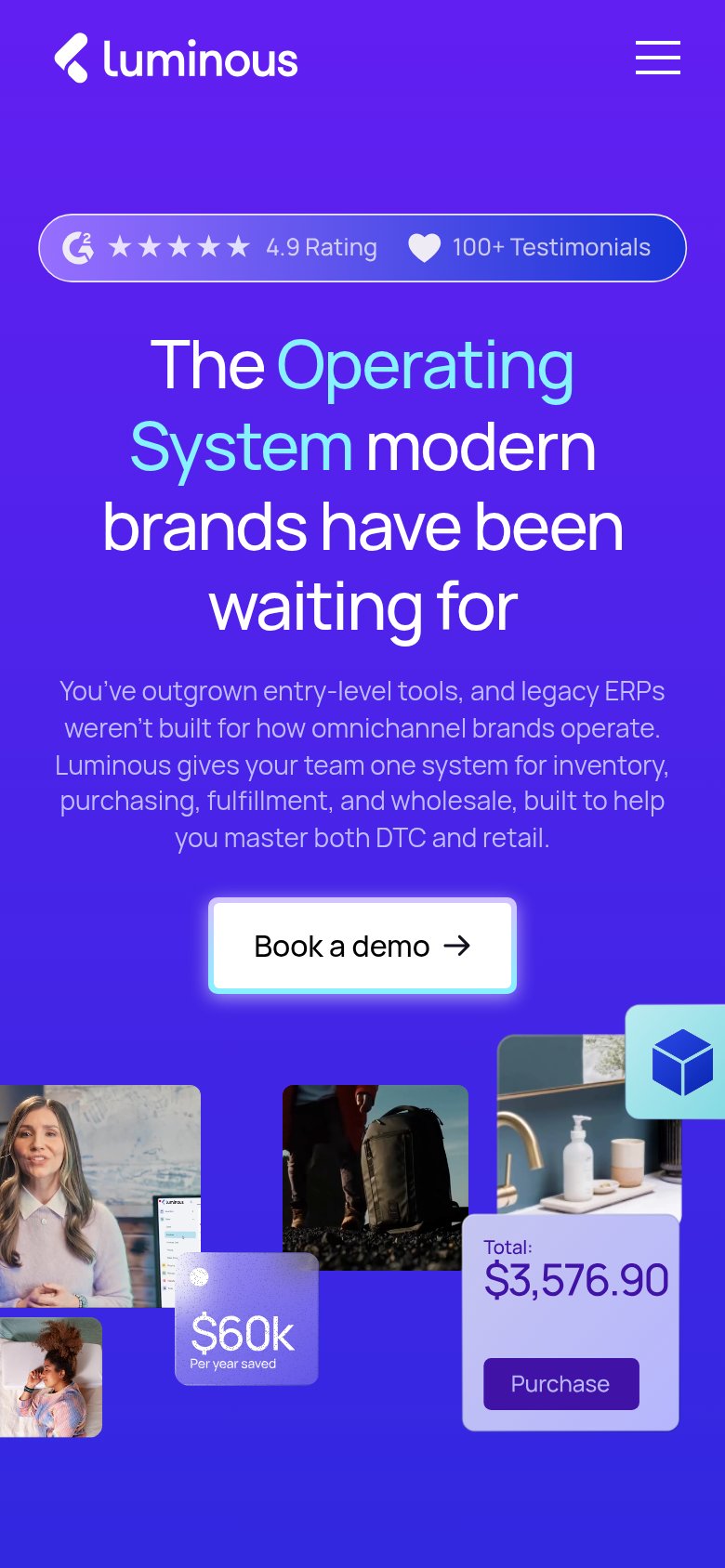
- Purchase button cut off — A second styled 'Purchase' CTA bleeds in at the right edge, competing with 'Book a demo' and reading as a broken crop.
- Six dropdown nav items — Solutions, Features, AI, Pricing, Resources, Company give six equal-weight exits before the visitor reaches the hero CTA.
- Clipped edge cards — The 'Velocity' chart and 'Total: $3,576' cards are cut off mid-element, adding noise without a legible message.
CTA
72FairCopy, size, verb, cost-feel — does the primary CTA earn the click?
Problems
- 'Book' feels costly and committal
- no low-friction secondary path
- no value promised for the click
Value props
72FairTitle, subtitle, hero — do they sell the product's true value?
Zip Ordering (Luminous)’s headline
The Operating System modern brands have been waiting for
You've outgrown entry-level tools, and legacy ERPs weren't built for how omnichannel brands operate. Luminous gives your team one system for inventory, purchasing, fulfillment, and wholesale, built to help you master both DTC and retail.
Working
Could improve
Trust
78FairProof that the product is real, competent, and safe to try.
How Zip Ordering (Luminous) compares
Trust read
Mobile web
78FairThe phone experience as a first-class citizen.
What works
What to improve