
Your landing page’s weakest score is CTA.
How Cedar ranks
74Growth scoreupdated
category scores
category scoresShowHide
Score over time
CTA
66FairCopy, size, verb, cost-feel — does the primary CTA earn the click?

Problems
- demo ask makes click feel costly
- no low-friction alternative CTA
- capitalization varies vs nav label
Value props
68FairTitle, subtitle, hero — do they sell the product's true value?
Cedar’s headline undersells
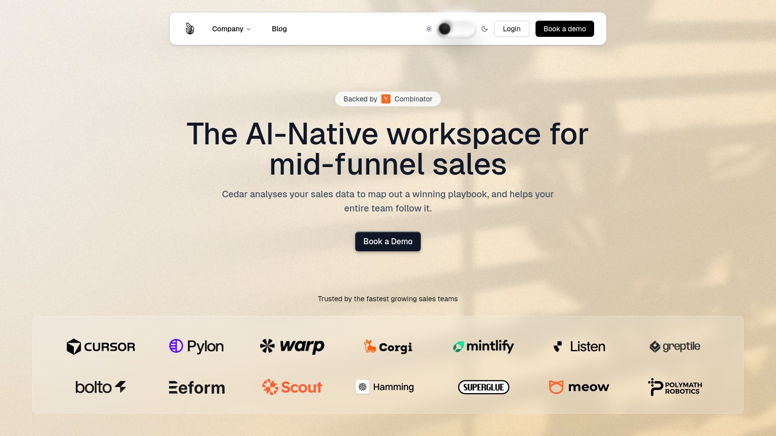
The AI-Native workspace for mid-funnel sales
Cedar analyses your sales data to map out a winning playbook, and helps your entire team follow it.
Working
- Names a sharp audience: mid-funnel sales
- Subhead states a concrete outcome
- Strong logo wall backs the claim
Could improve
- "AI-Native workspace" is category, not value
- No numbers or proof points anywhere
- No hero visual demonstrating the product
Trust
72FairProof that the product is real, competent, and safe to try.
| Trust read | |
|---|---|
| Cedar | Customer logo wall (Cursor, Pylon, Warp, Mintlify, Greptile) under "Trusted by the fastest growing sales teams" |
| Product UI mockup showing "Conversation Data Sources" with Gmail, Slack, and Teams integrations and an opportunity panel | |
| Customer logo strip featuring MongoDB, WSP, Ramp, together.ai, Cloud Software Group, and XBOW | |
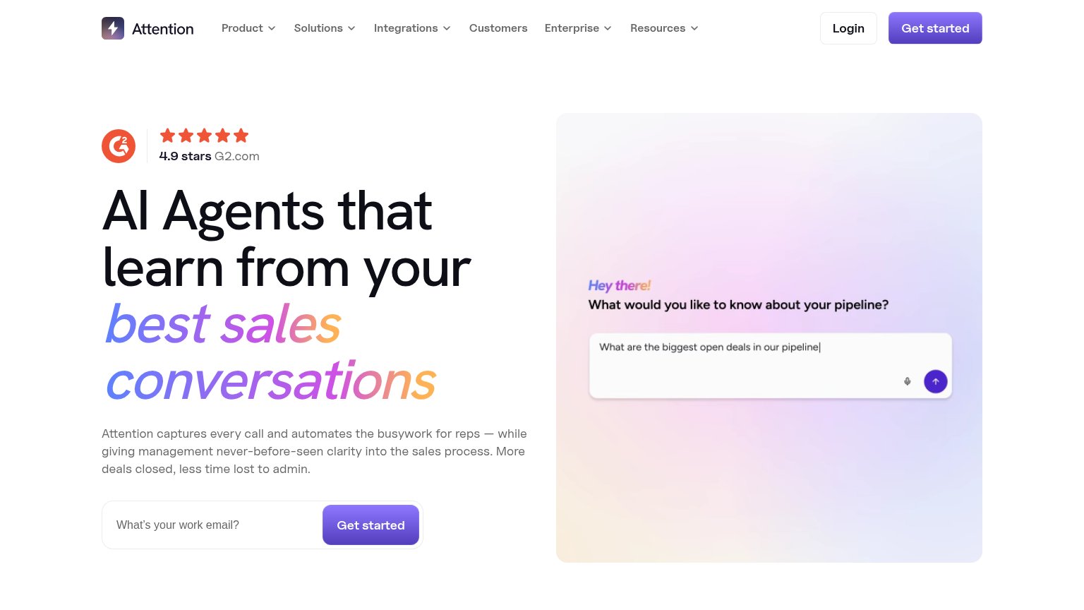
| "4.9 stars G2.com" rating badge in the desktop hero | |
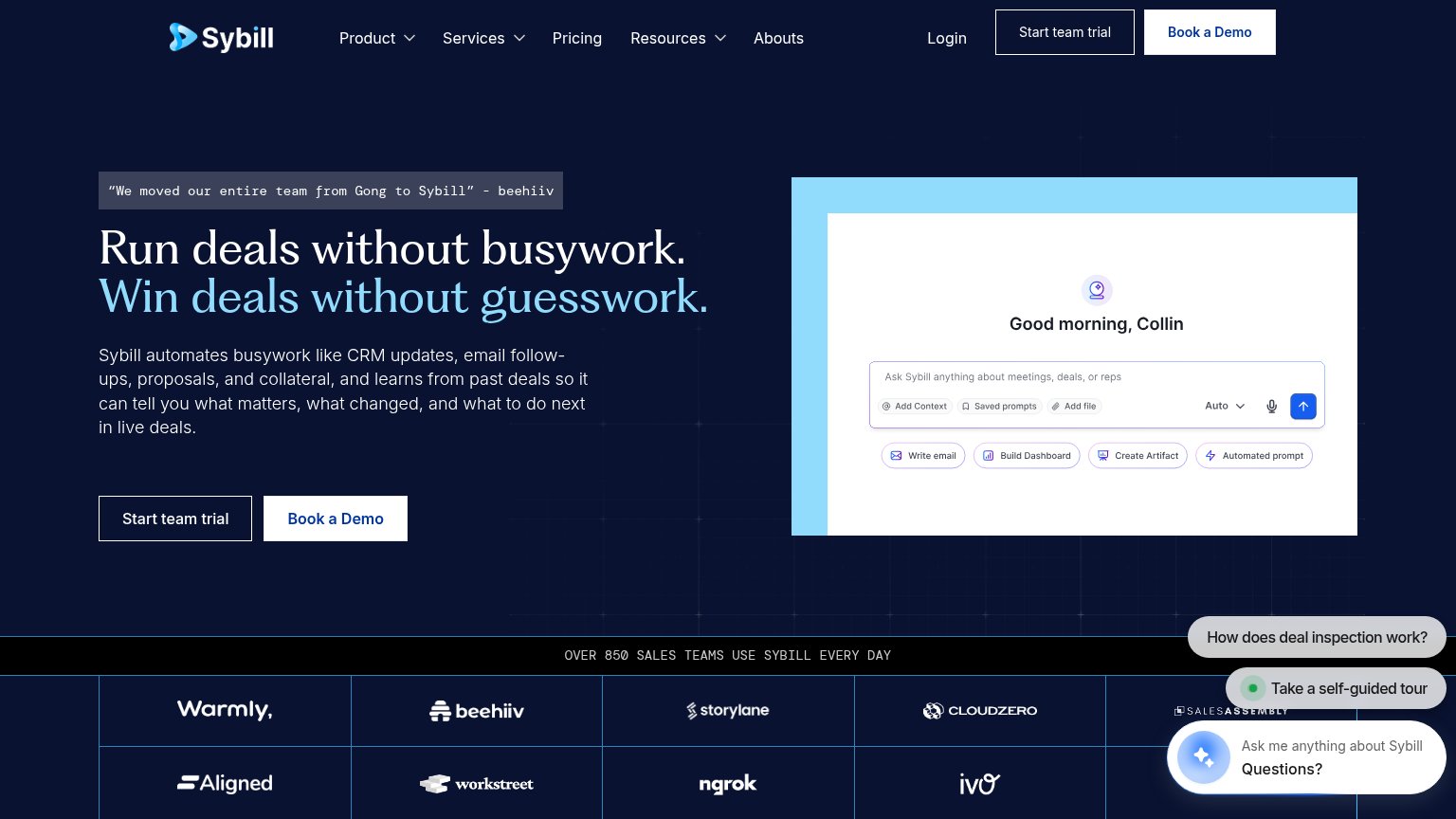
| “We moved our entire team from Gong to Sybill” - beehiiv | |
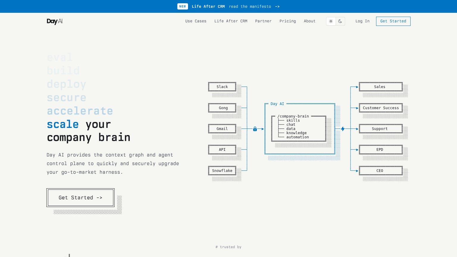
| Integration diagram naming Slack, Gong, Gmail, API, and Snowflake feeding the Day AI /company-brain |
Mobile web
80StrongThe phone experience as a first-class citizen.
 12
- Crowded logo rows — Logos like Cursor, Pylon and warp collide edge-to-edge with no spacing, reading as a broken grid rather than social proof.
- Book a Demo button — Desktop-proportioned button floats narrow in the column instead of stretching near full-bleed for the thumb.
Information hierarchy
86StrongDoes the design help or inhibit what the page is trying to say?
123- Duplicate nav CTA — Second dark "Book a demo" pill matches the hero CTA's weight, splitting the single action into two.
- Theme toggle switch — A large interactive light/dark toggle in the nav invites fiddling instead of conversion.
- Hero CTA footprint — "Book a Demo" is compact and dark-on-dark against the heavy headline; a larger button would anchor the scan path faster.