
Your landing page’s weakest score is CTA.
How WonderTx ranks
46Growth scoreupdated
category scores
category scoresShowHide
Score over time
CTA
32PoorCopy, size, verb, cost-feel — does the primary CTA earn the click?

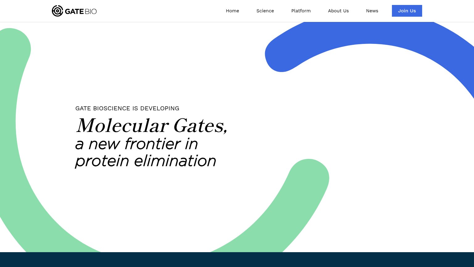
Problems
- no CTA anywhere in the fold
- nav links only: About, Blog
- hero attention has no outlet
Trust
35PoorProof that the product is real, competent, and safe to try.
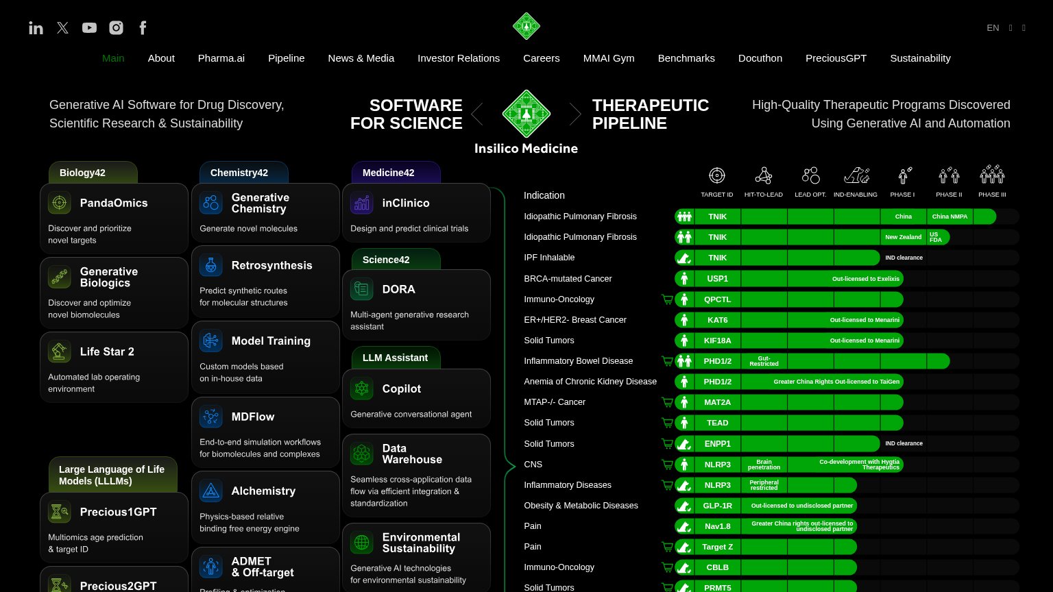
| Trust read | |
|---|---|
| WonderTx | No visible trust signal identified. |
| No visible trust signal identified. | |
| Authentic lab photography of scientists and instruments in the hero collage | |
| Pipeline table rows showing "Out-licensed to Exelixis" and "Out-licensed to Menarini" with Phase I–III progress bars and | |
| No visible trust signal identified. | |
| implicit context Isomorphic Labs may benefit from pre-existing familiarity among its target audience. |
Information hierarchy
52FairDoes the design help or inhibit what the page is trying to say?
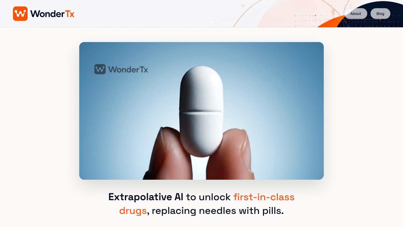 12
- Video card outranks headline — The large media card dominates the fold and pushes the value proposition to the bottom edge, so the message reads second instead of first.
- About and Blog pills — The only clickable elements in the fold are two exit links, so every engaged visitor is routed away from conversion.
Mobile web
52FairThe phone experience as a first-class citizen.
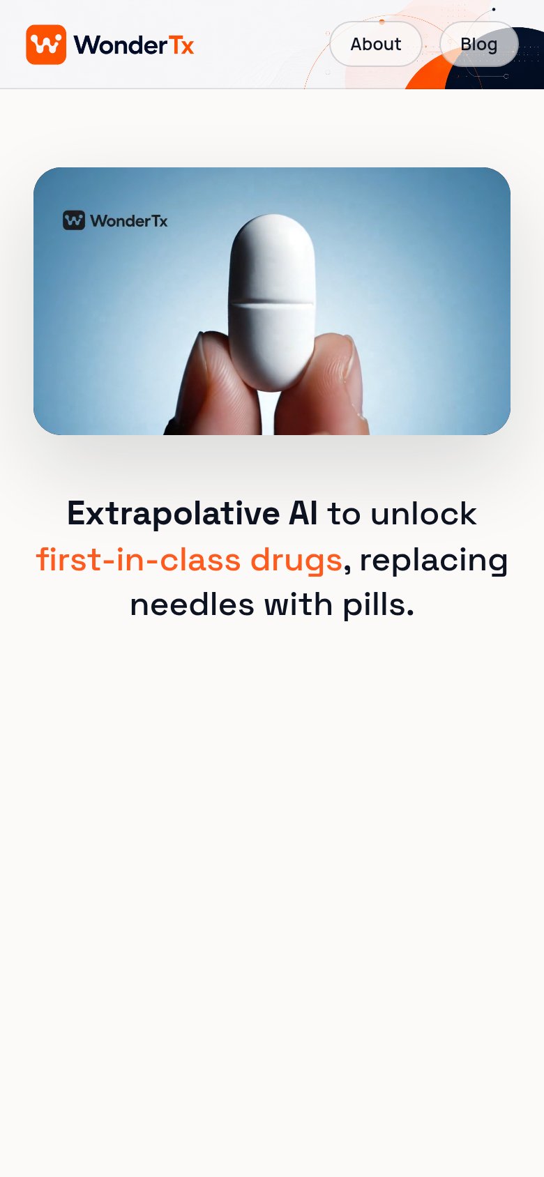 1
- Blog nav button — Blog label sits on the dark hero graphic and half-disappears, and neither nav pill drives conversion.
Value props
58FairTitle, subtitle, hero — do they sell the product's true value?
WonderTx’s headline undersells
Extrapolative AI to unlock first-in-class drugs, replacing needles with pills.
Working
- 'Needles with pills' is vivid and concrete
- Hero image shows the actual deliverable
- Names a clear category outcome
Could improve
- Jargon-first ordering hides the payoff
- No subhead or proof points
- Zero numbers or evidence in the fold