
Your landing page’s weakest score is Trust.
How Verdant ranks
68Growth scoreupdated
category scores
category scoresShowHide
Score over time
Trust
48PoorProof that the product is real, competent, and safe to try.


| Trust read | |
|---|---|
| Verdant | "Backed by Y Combinator" badge under the hero CTA |
| Wall of municipal customer logos (City of Dubuque, Town of Vernon, Union City, CALCOG, Coral Gables) directly below the | |
| "With over a decade of innovation" longevity claim in the hero subheadline | |
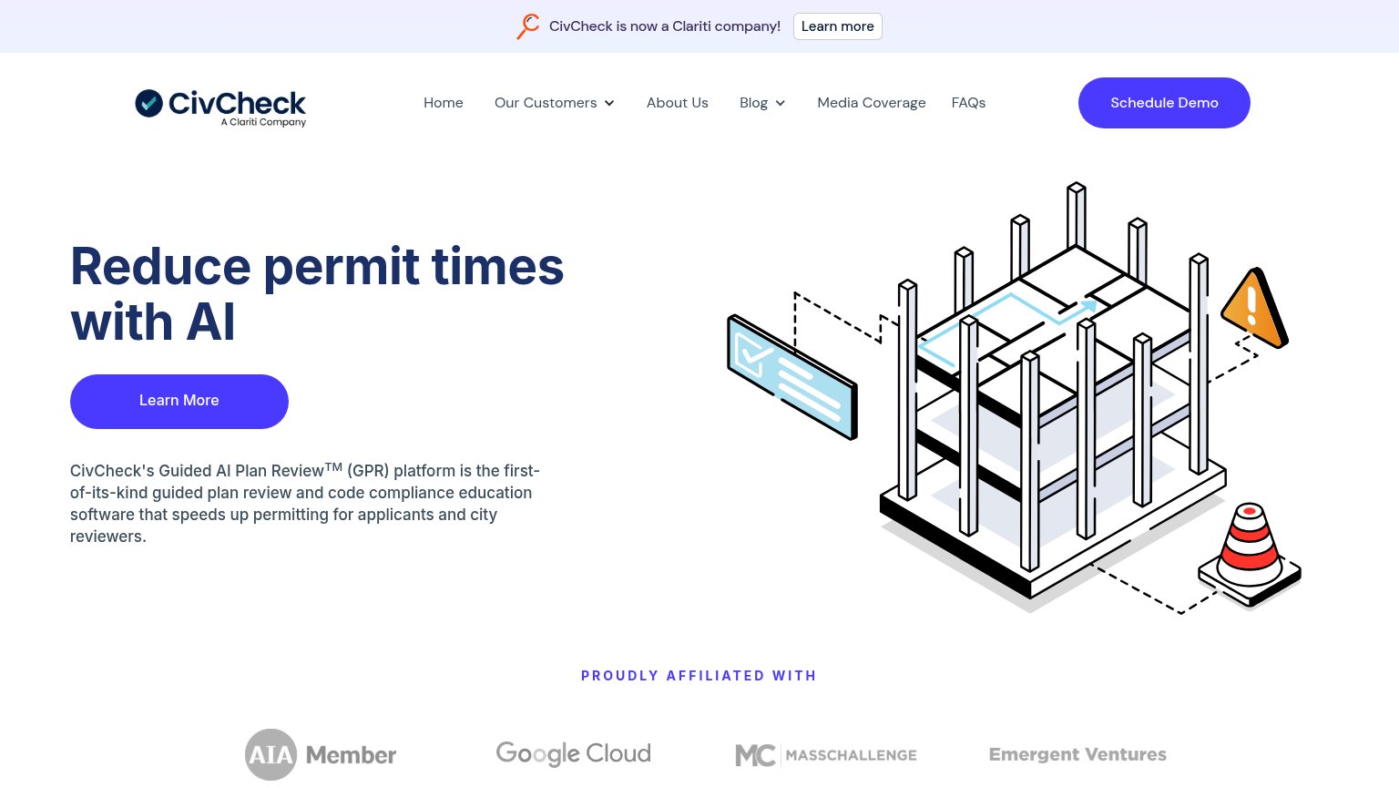
| "PROUDLY AFFILIATED WITH" logo strip (AIA Member, Google Cloud, MassChallenge, Emergent Ventures) | |
| Permit workflow checklist panel showing steps like "Apply for a Tree Permit" and "Building Department Plan Review" |
Value props
62FairTitle, subtitle, hero — do they sell the product's true value?
Verdant’s headline vague
Preparing Government for the Agentic Age.
A system of record built for people and agents, and internal agents that give government the capacity to keep up.
Working
- Names the audience: local government
- Subhead names real category: system of record
- "Capacity to keep up" touches a real pain
Could improve
- "Agentic Age" is a coined abstraction
- Zero numbers or concrete workflows
- Hero art decorates, doesn't demonstrate
CTA
64FairCopy, size, verb, cost-feel — does the primary CTA earn the click?
Problems
- points to reading, not product
- conversion CTA demoted to nav
- 'thesis' feels like homework
- no payoff implied in label
Information hierarchy
84StrongDoes the design help or inhibit what the page is trying to say?
123- Get in touch button — Boxed header CTA rivals "Explore our thesis", splitting the fold's single action into two.
- Header nav links — Four equal-weight links (Thesis, Infrastructure, Progress, About) leak attention before the hero CTA.
- Animation on toggle — Stray low-contrast control in the fold adds an interactive element unrelated to the conversion path.
Mobile web
84StrongThe phone experience as a first-class citizen.
 12
- Explore our thesis button — Desktop-proportioned at roughly half the column width instead of a full-bleed thumb target.
- Serif hero headline — Scales down too little, wrapping into four tall lines that eat about a third of the first viewport.