SidekickYC S26 landing page report.
← Back to YC S26

Your landing page’s weakest score is Trust.

Fix Trust

Score over time

80706050MaintainX 75 on Mar 14 (Wayback)MaintainX 76 on Apr 22 (Wayback)MaintainX 77 on May 4 (Wayback)MaintainX 77 on May 16 (Wayback)MaintainX 73 on May 28 (Wayback)MaintainX 75 on Jun 6 (Wayback)MaintainX 73 on Jul 16 (Live)Limble CMMS 71 on Jul 16 (Live)UpKeep 67 on Mar 11 (Wayback)UpKeep 68 on Mar 19 (Wayback)UpKeep 68 on Apr 13 (Wayback)UpKeep 69 on Apr 25 (Wayback)UpKeep 70 on May 9 (Wayback)UpKeep 68 on May 22 (Wayback)UpKeep 64 on Jul 16 (Live)Augmentir 69 on Apr 4 (Wayback)Augmentir 72 on May 10 (Wayback)Augmentir 65 on Jun 17 (Wayback)Augmentir 70 on Sep 22 (Live)Sidekick 59 on Apr 8 (Wayback)Sidekick 56 on Jun 17 (Wayback)Sidekick 72 on Sep 20 (Live)Apr 8Jun 17Sep 20
Past reportsShow past reportsHide past reports
  1. Sep 20, 202672LiveOverall +16 · Mobile web +34 · Information hierarchy +24Viewing
  2. Jun 17, 202656Overall −3 · Information hierarchy −16 · Trust −14View →
  3. Apr 8, 202659First tracked report — strongest Information hierarchy 74, weakest Mobile web 34View →

Trust

54Fair

Proof that the product is real, competent, and safe to try.

Sidekick
Limble CMMS
MaintainX
UpKeep
Trust read
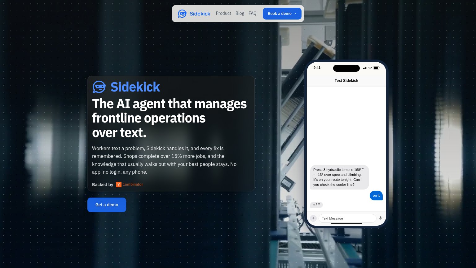
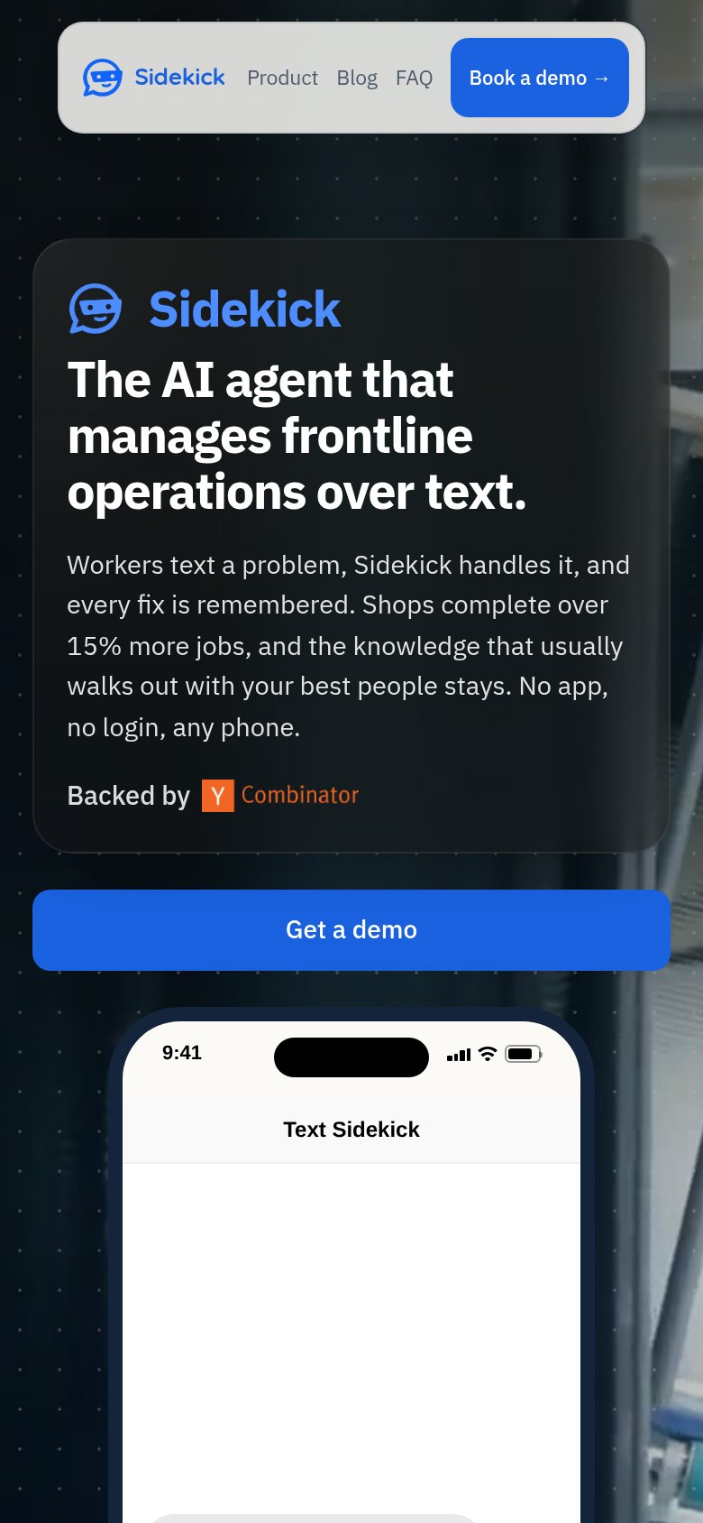
Sidekick"Backed by Y Combinator" badge beneath the hero copy
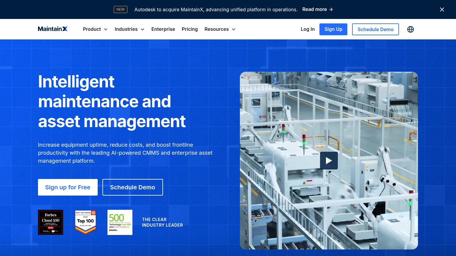
MaintainXForbes Cloud 100 2025, G2 Top 100, and Deloitte Fast 500 award badges
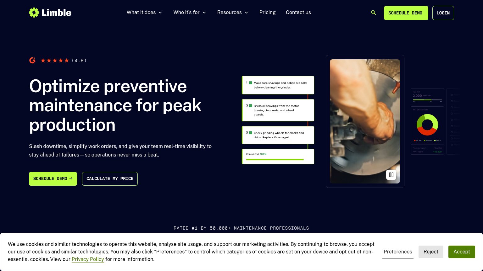
Limble CMMSRATED #1 BY 50,000+ MAINTENANCE PROFESSIONALS
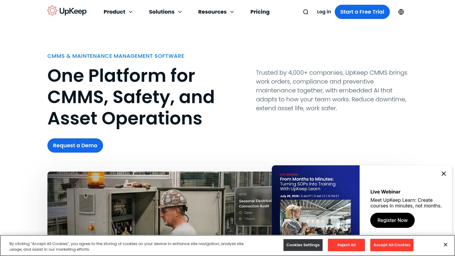
UpKeepTrusted by 4,000+ companies
Augmentir"TRUSTED BY THE WORLD'S LEADING DIGITAL INNOVATORS" logo band header

CTA

72Fair

Copy, size, verb, cost-feel — does the primary CTA earn the click?

Sidekick
MaintainX

Problems

  • two labels for same action
  • demo ask feels sales-heavy
  • no value promised in click

Mobile web

72Fair

The phone experience as a first-class citizen.

Mobile web annotations on the mobile capture123
  1. Uncollapsed nav row — Full desktop link row (Product, Blog, FAQ) crammed beside the logo instead of a hamburger, eating the top of the fold.
  2. Get a demo button — Primary CTA sits at the very bottom edge of the first viewport after the long hero card, easy to miss on shorter screens.
  3. Hero body paragraph — Six lines of desktop-length copy push the CTA down; the fold stacks headline, paragraph, and badge before any action.

Information hierarchy

82Strong

Does the design help or inhibit what the page is trying to say?

Information hierarchy annotations on the desktop capture123
  1. Duplicate demo CTAs — "Book a demo →" in the nav and "Get a demo" in the hero name the same action differently at similar weight, splitting the scan path.
  2. Nav links Product/Blog/FAQ — Three exit links sit directly beside the conversion button, leaking attention before the pitch lands.
  3. Phone mockup message placement — The proof-carrying text exchange sits at the phone's bottom edge, so the mockup reads mostly blank at first glance.

Value props

82Strong

Title, subtitle, hero — do they sell the product's true value?

Sidekick’s headline sellsThe AI agent that manages frontline operations over text.Workers text a problem, Sidekick handles it, and every fix is remembered. Shops complete over 15% more jobs, and the knowledge that usually walks out with your best people stays. No app, no login, any phone.

Working

  • 15% more jobs — real number
  • Phone mockup shows the product working
  • 'No app, no login, any phone' kills friction

Could improve

  • 'manages frontline operations' is abstract
  • Best copy is in subhead, not H1
  • No customer/industry named

Competitors

inferred from product, audience, and value prop