
Your landing page’s weakest score is Trust.
67Growth scoreupdated
category scores
category scoresShowHide
Trust
52FairProof that the product is real, competent, and safe to try.
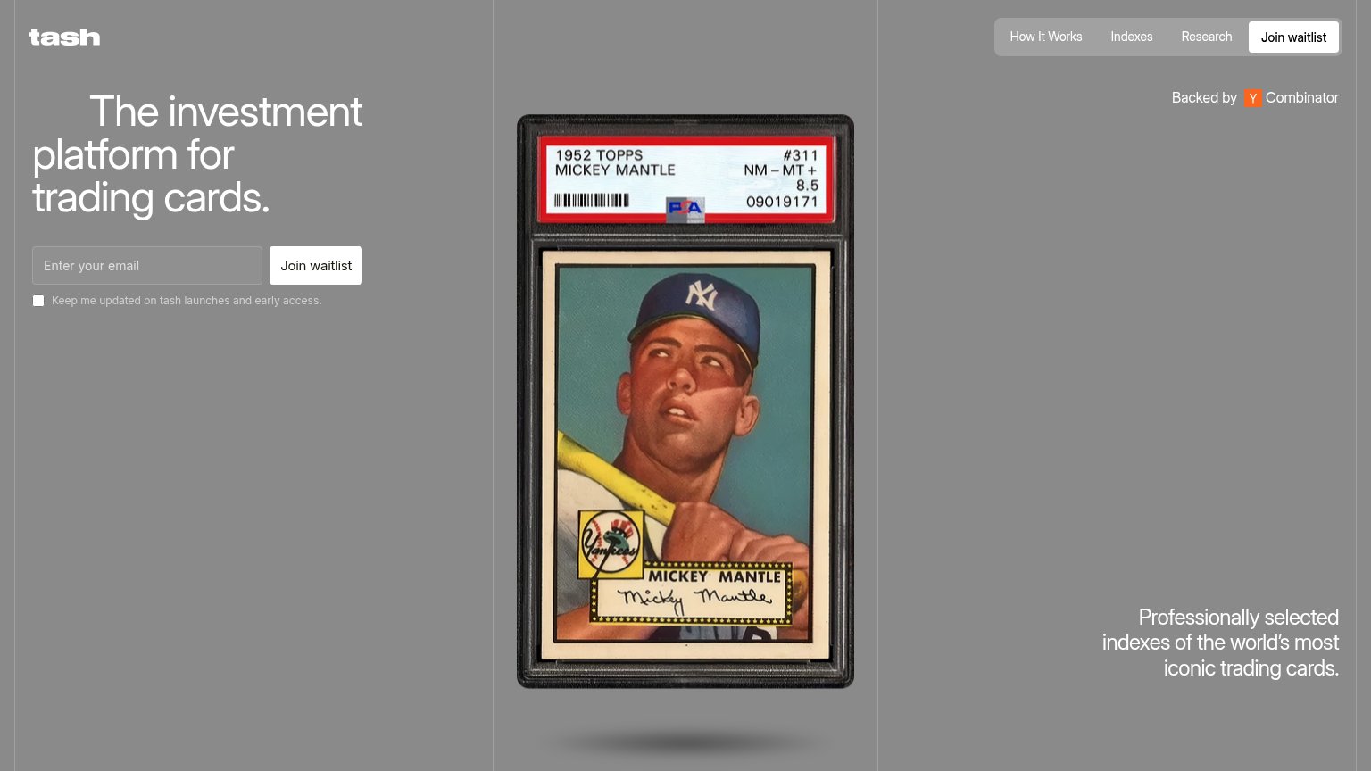
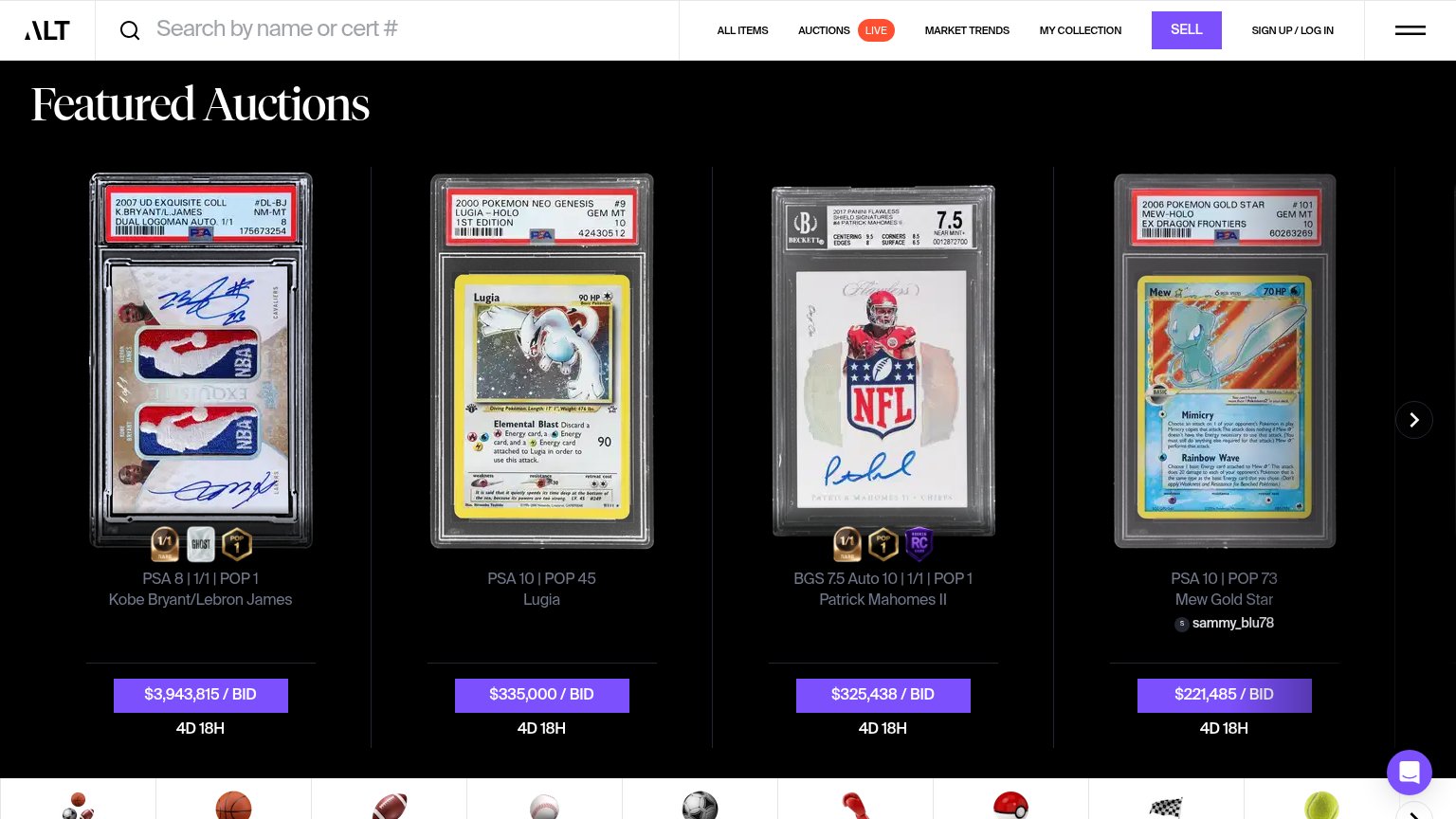
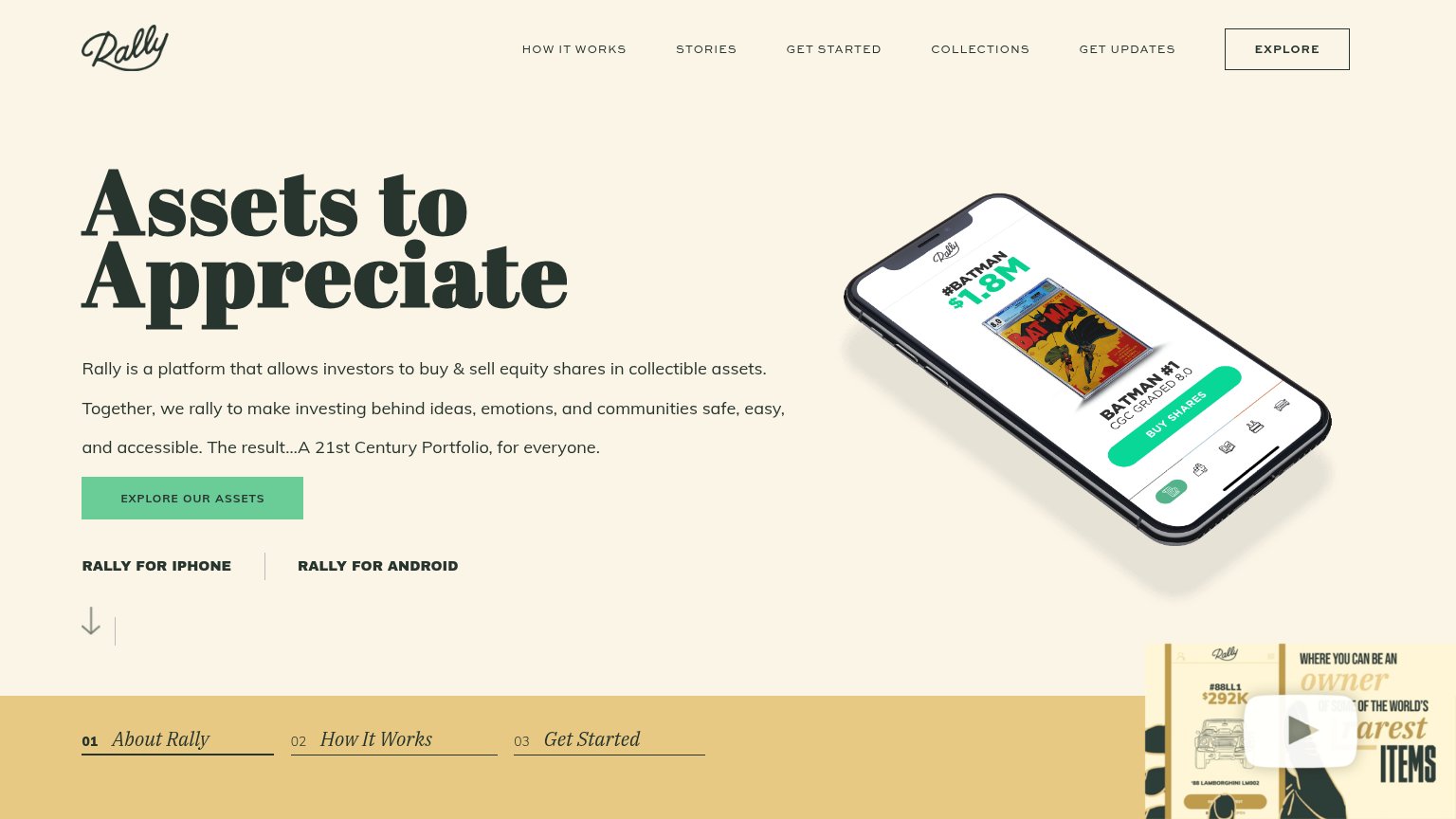
| Trust read | |
|---|---|
| tash | "Backed by Y Combinator" badge |
| PSA/BGS graded card listings with visible cert numbers, e.g. "PSA 8 | 1/1 | POP 1 Kobe Bryant/Lebron James" at "$3,943,8 | |
| No visible trust signal identified. |
Value props
62FairTitle, subtitle, hero — do they sell the product's true value?
tash’s headline sells
The investment platform for trading cards.
Professionally managed indexes of the world's most iconic trading cards.
Working
- Names category and audience instantly
- Hero shows a real graded Mantle card
- YC badge adds instant credibility
Could improve
- No numbers: returns, minimums, index count
- Subhead buried bottom-right on desktop
- No emotional hook for priced-out collectors
CTA
68FairCopy, size, verb, cost-feel — does the primary CTA earn the click?
Problems
- 'waitlist' promises delay, not value
- small button vs. desktop headline
- no payoff stated near the CTA
Information hierarchy
76FairDoes the design help or inhibit what the page is trying to say?
1234- Bottom-right subline — Key value-prop sentence stranded in the far corner, disconnected from the headline it supports.
- Low-contrast headline — White-gray headline on mid-gray background reads washed out and weakens the core message at a glance.
- Nav Join waitlist button — Duplicates the hero CTA at equal visual weight, splitting the single primary action across two targets.
- Gray nav pill — How It Works, Indexes, Research offer three exits before the visitor reaches the email form.
Mobile web
78FairThe phone experience as a first-class citizen.
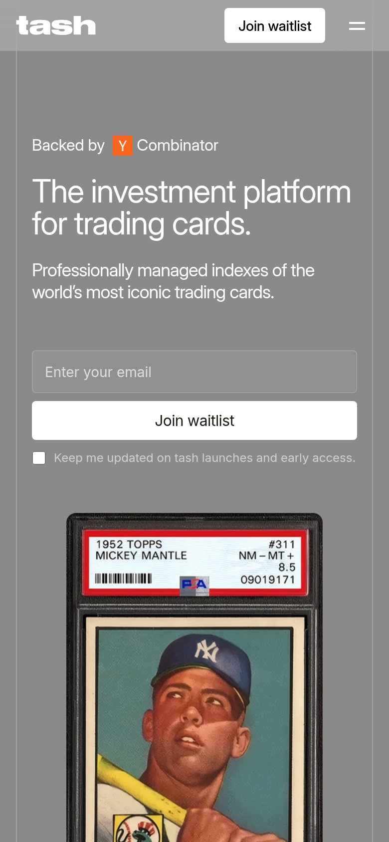 12
- Header Join waitlist — Duplicates the hero's full-width CTA just below, splitting attention and crowding the collapsed nav.
- Consent checkbox label — Low-contrast gray text on gray background is barely legible at arm's length.