
Your landing page’s weakest score is Trust.
How Synapse Semiconductor ranks
- 1.
SiLC Technologies58
- 2.
BrainChip57
- 3.
Synapse Semiconductor38
- 4.
SynSense38
- 5.
Innatera29
38Growth scoreupdated
category scores
category scoresShowHide
Score over time
Trust
28PoorProof that the product is real, competent, and safe to try.

| Trust read | |
|---|---|
| Synapse Semiconductor | No visible trust signal identified. |
| No visible trust signal identified. | |
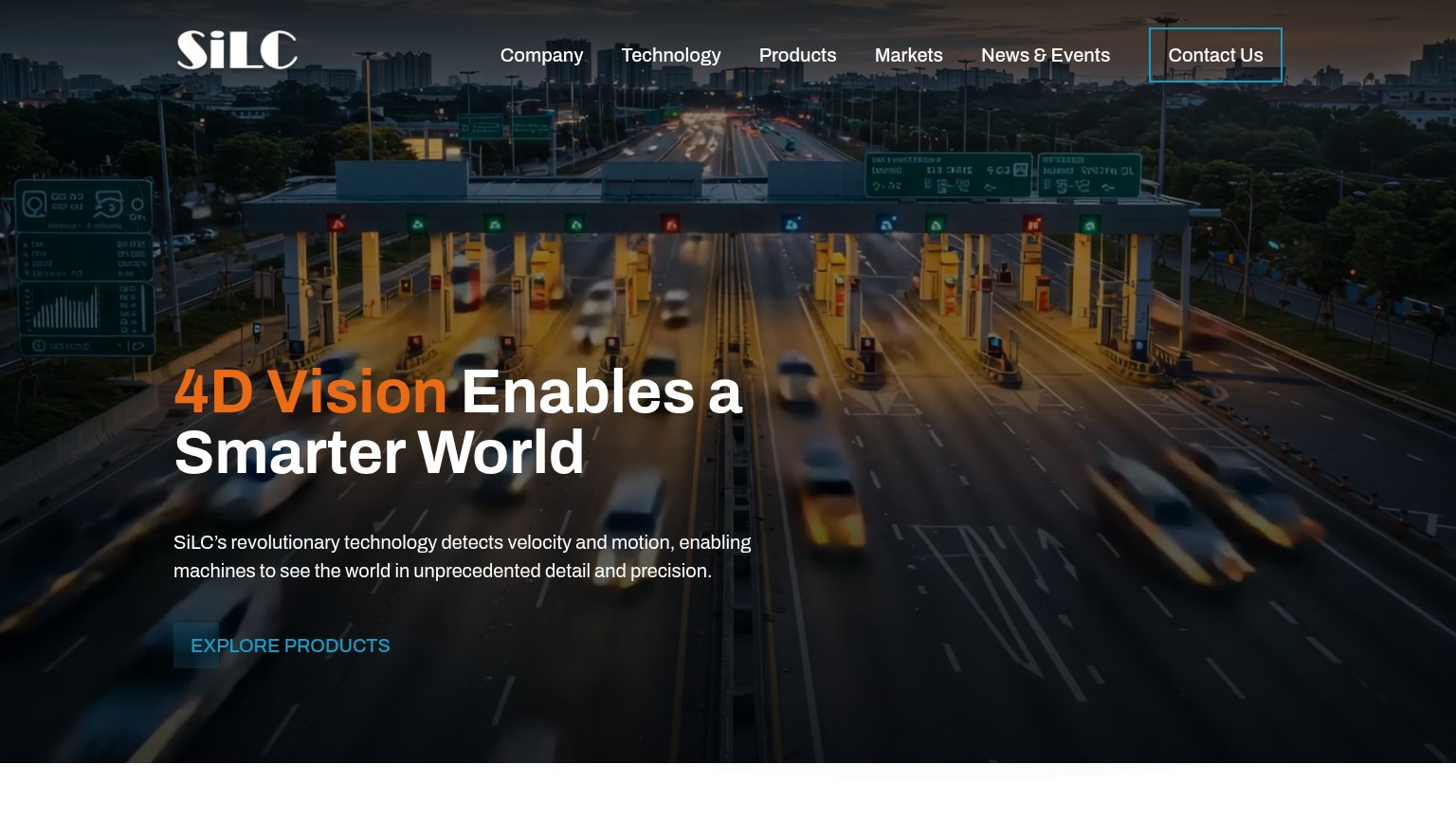
| Investor banner: "Investor Presentation Replay: Click here to watch our Q2 2026 Quarterly Investor Update" | |
| No visible trust signal identified. | |
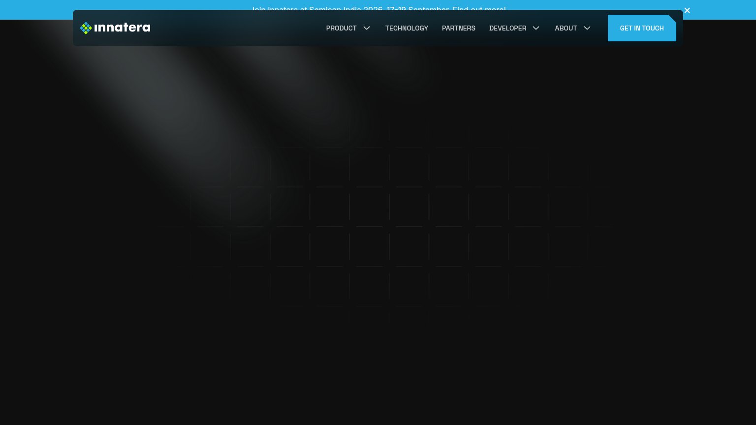
| Announcement bar: "Join Innatera at Semicon India 2026, 17-19 September" |
CTA
30PoorCopy, size, verb, cost-feel — does the primary CTA earn the click?
Problems
- no hero button or in-product action
- 'Contact' is a label, no action verb
- mobile links merge and are unreadable
- low-contrast text link, tiny footprint
Value props
42PoorTitle, subtitle, hero — do they sell the product's true value?
Synapse Semiconductor’s headline vague
We push machines to explore where humans can't go.
Working
- Evocative frontier mission line
- Fire visual matches extreme-env theme
- Short, confident, memorable
Could improve
- Never says it makes semiconductors
- No subhead adds specifics
- No numbers, specs, or proof points
Mobile web
42PoorThe phone experience as a first-class citizen.
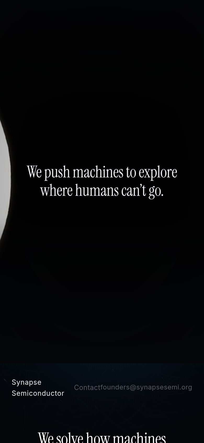 123
- Merged Contact email link — "Contact" and "founders@synapsesemi.org" collide into one run-on string, leaving no clear tap target.
- Hero statement no CTA — The only above-fold content is a tagline with no button or action to tap.
- Clipped section headline — "We solve how machines" is cut mid-sentence at the fold edge, reading as broken.
Information hierarchy
48PoorDoes the design help or inhibit what the page is trying to say?
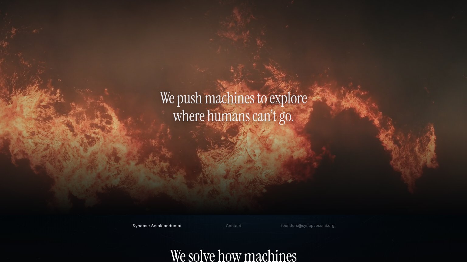 123
- Contact and email links — The two conversion paths are rendered as faint grey text at the same weight as the wordmark, sitting mid-page where the eye skips past them.
- Cut-off second headline — 'We solve how machines' clips at the fold edge with equal weight to the hero headline, creating two competing statements neither of which finishes.
- Hero headline contrast — The thin serif headline sits directly over bright flame highlights, reducing legibility at the exact focal point of the page.
Competitors
inferred from product, audience, and value prop#1SiLC Technologiessilc.com58
#2BrainChipbrainchip.com57
SynSensesynsense.ai38
#5Innaterainnatera.com29
#3Synapse Semiconductor38
#4