
Your landing page’s weakest score is Value props.
How Innatera ranks
29Growth scoreupdated
category scores
category scoresShowHide
Value props
15PoorTitle, subtitle, hero — do they sell the product's true value?
Working
- Clean nav with clear GET IN TOUCH CTA
- Event banner signals industry credibility
Could improve
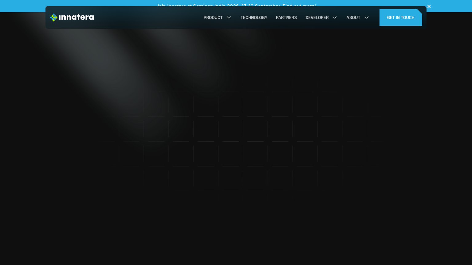
- No headline or subhead in the fold
- Hero area is empty — nothing rendered
- Mobile banner text overlaps the header
Information hierarchy
28PoorDoes the design help or inhibit what the page is trying to say?
 12
- Announcement banner text — Semicon India banner text is clipped behind the floating nav bar, making the only visible copy unreadable.
- Get In Touch button — Primary CTA is orphaned — with no value prop or supporting copy visible, visitors have no reason to click it.
Trust
28PoorProof that the product is real, competent, and safe to try.
How Innatera compares
Trust read
Mobile web
28PoorThe phone experience as a first-class citizen.

What works
What to improve
CTA
44PoorCopy, size, verb, cost-feel — does the primary CTA earn the click?
How Innatera compares
Recommended rewrites