
Your landing page’s weakest score is Trust.
How Skymerse ranks
76Growth scoreupdated
category scores
category scoresShowHide
Score over time
Trust
62FairProof that the product is real, competent, and safe to try.
| Trust read | |
|---|---|
| Skymerse | "Backed by Y Combinator" badge above the hero headline |
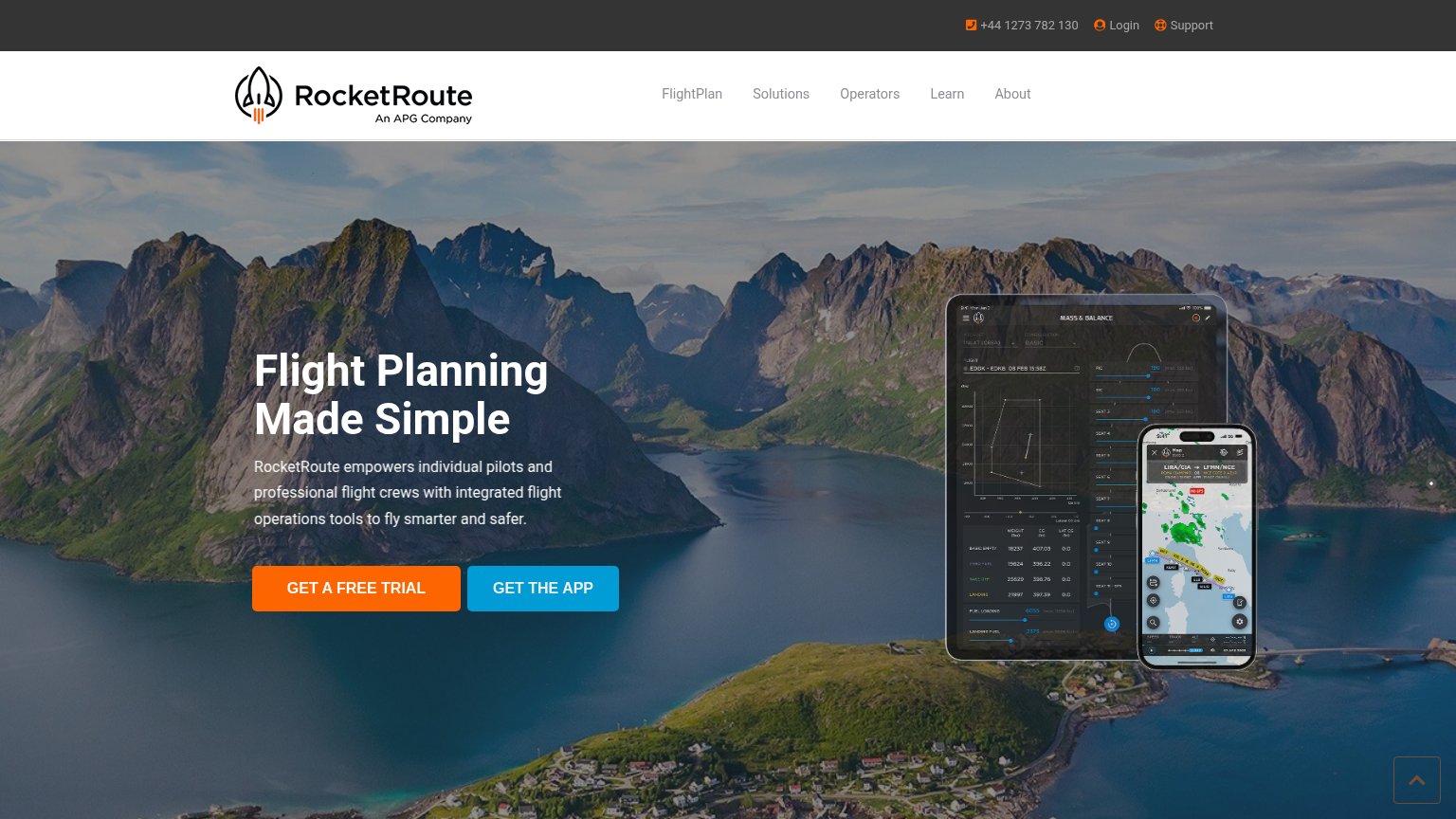
| implicit context ForeFlight Dispatch may benefit from pre-existing familiarity among its target audience. | |
| Detailed "MASS & BALANCE" product UI on tablet with real flight data (EDDK–EDKB) plus phone route map LIRA/CIA → LFMN/NC | |
| Stats bar: "500+ Customers globally", "1989 Year of establishment", "94 CSAT score", "24/7 Support worldwide" | |
| "Come experience the results of over 30 years of trusted flight planning experience." |
CTA
72FairCopy, size, verb, cost-feel — does the primary CTA earn the click?
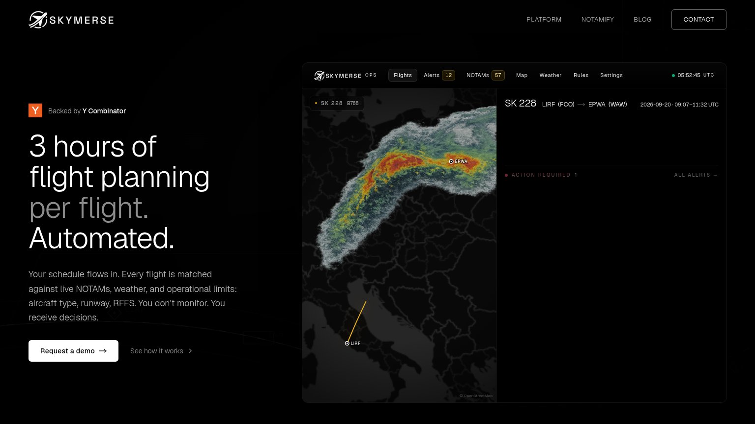
Problems
- 'Request' feels like asking, waiting
- demo gate = sales-call cost-feel
- no product-value payoff in label
Mobile web
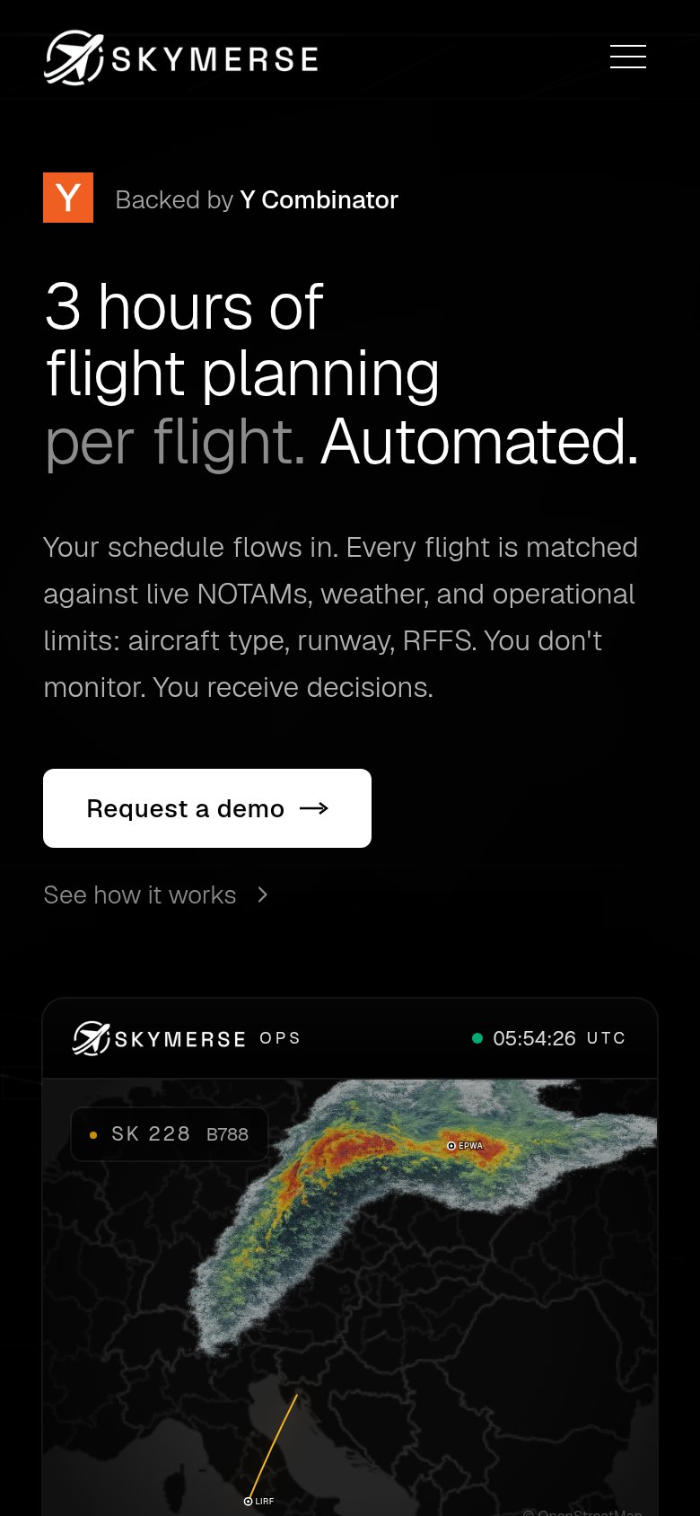
78FairThe phone experience as a first-class citizen.
 123
- Request a demo button — Desktop-proportioned pill at roughly half the column width; should be near full-bleed for thumb reach.
- See how it works — Low-contrast grey link nearly vanishes against the black background, burying the secondary path.
- Ops screenshot labels — Map labels like EPWA and LIRF render far too small to read at phone size.
Information hierarchy
82StrongDoes the design help or inhibit what the page is trying to say?
123- CONTACT nav button — Bordered button styling gives it CTA weight, competing with 'Request a demo' at the top of the scan path.
- Alert detail panel — The dashboard's right panel shows 'ACTION REQUIRED 1' with no visible alert content, blunting the product demo's payoff.
- See how it works — Sits at near-equal size beside the primary CTA, splitting the click at the decision moment.
Value props
84StrongTitle, subtitle, hero — do they sell the product's true value?
Skymerse’s headline sells
3 hours of flight planning per flight. Automated.
Your schedule flows in. Every flight is matched against live NOTAMs, weather, and operational limits: aircraft type, runway, RFFS. You don't monitor. You receive decisions.
Working
- Specific number quantifies the pain
- "Skymerse don't monitor. Skymerse receive decisions."
- Hero shows real ops console, not decoration
Could improve
- Headline can misread as time required
- No customer or scale proof beyond YC badge
- Desktop alert panel is mostly empty