
Your landing page’s weakest score is CTA.
How ForeFlight Dispatch ranks
CTA
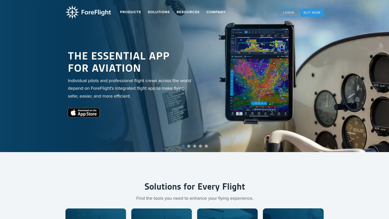
55FairCopy, size, verb, cost-feel — does the primary CTA earn the click?
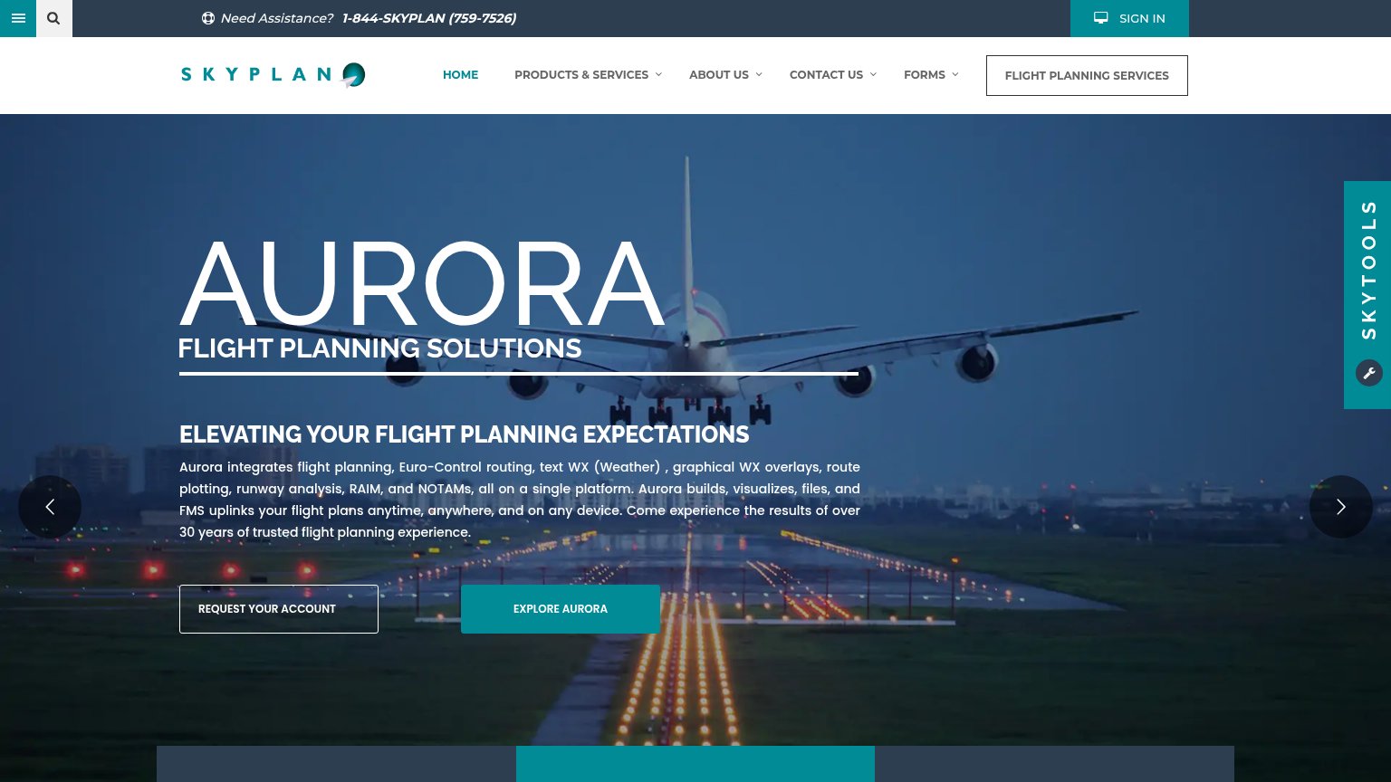
Problems
- click feels costly, not valuable
- no CTA button in the hero itself
- competes with App Store badge
- small footprint vs. hero headline
Trust
58FairProof that the product is real, competent, and safe to try.
| Trust read | |
|---|---|
| ForeFlight Dispatch | implicit context ForeFlight Dispatch may benefit from pre-existing familiarity among its target audience. |
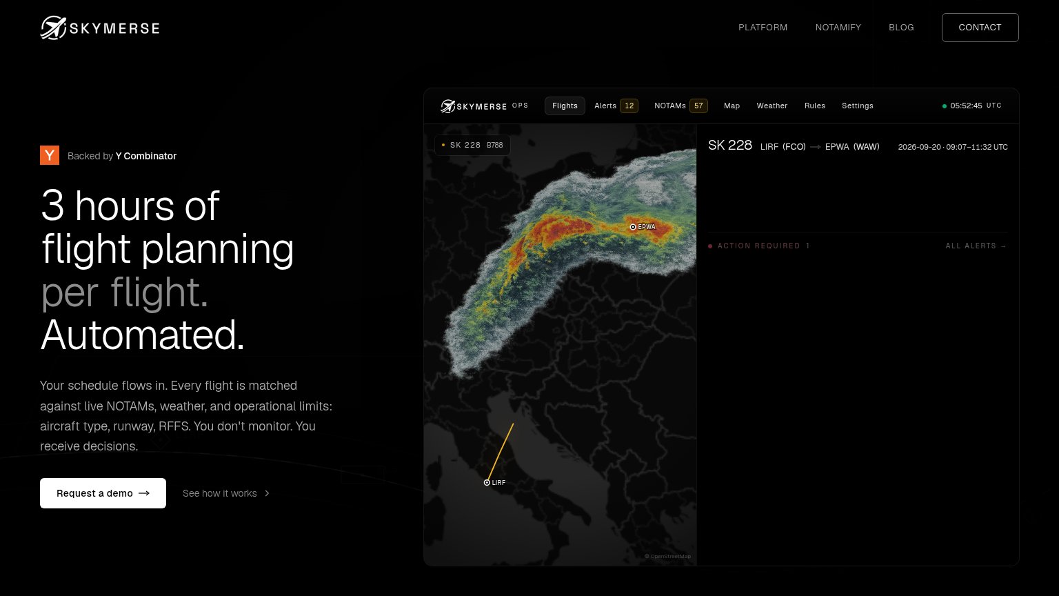
| "Backed by Y Combinator" badge above the hero headline | |
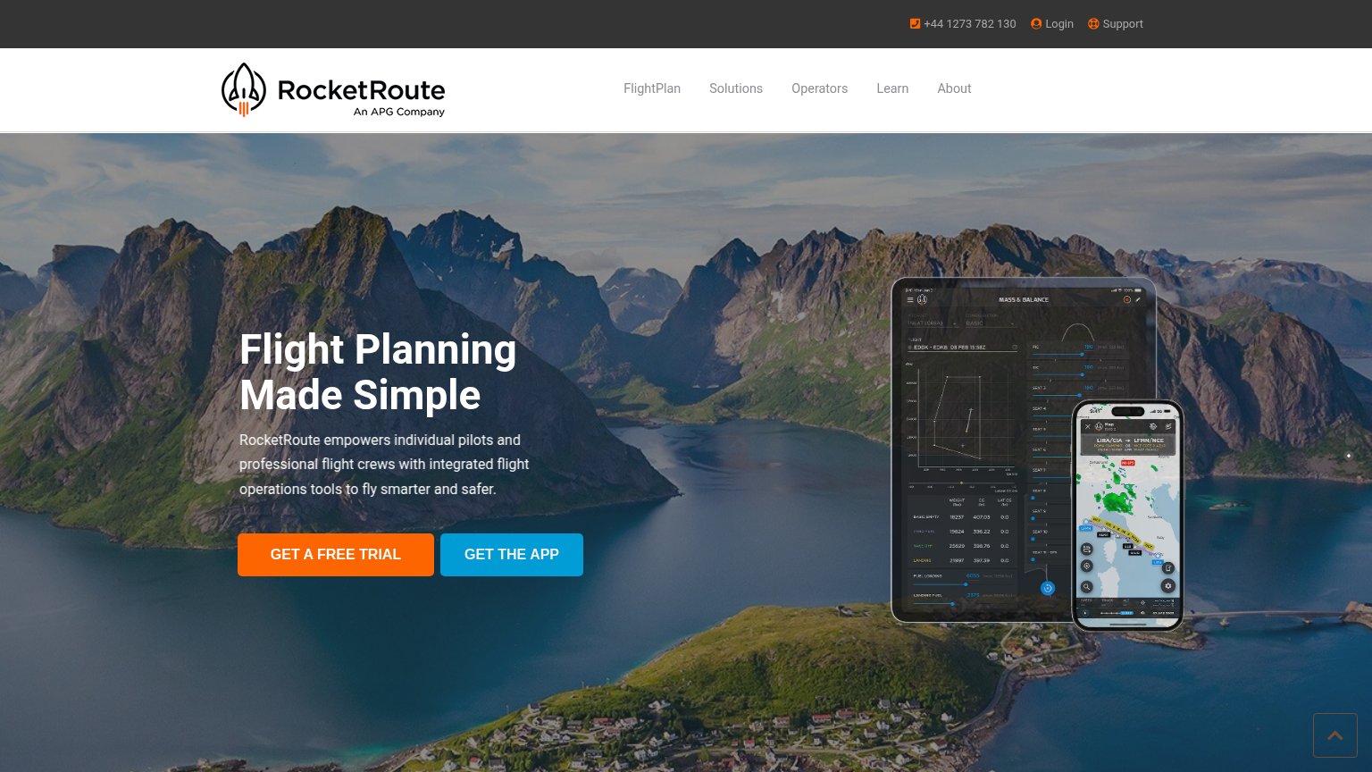
| Detailed "MASS & BALANCE" product UI on tablet with real flight data (EDDK–EDKB) plus phone route map LIRA/CIA → LFMN/NC | |
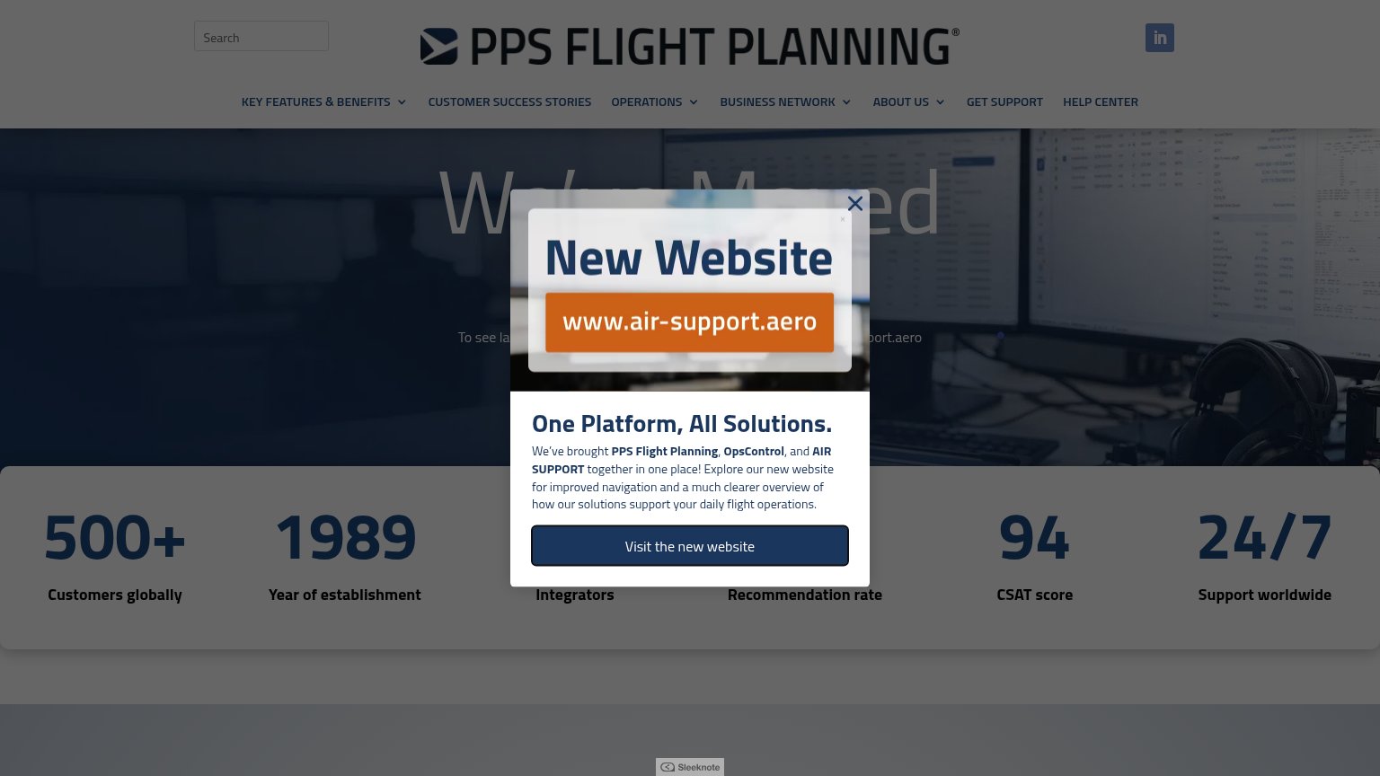
| Stats bar: "500+ Customers globally", "1989 Year of establishment", "94 CSAT score", "24/7 Support worldwide" | |
| "Come experience the results of over 30 years of trusted flight planning experience." |
Information hierarchy
68FairDoes the design help or inhibit what the page is trying to say?
What works
What to improve
Value props
68FairTitle, subtitle, hero — do they sell the product's true value?
ForeFlight Dispatch’s headline
THE ESSENTIAL APP FOR AVIATION
Individual pilots and professional flight crews across the world depend on ForeFlight's integrated flight app to make flying safer, easier, and more efficient.
Working
Could improve
Mobile web
72FairThe phone experience as a first-class citizen.
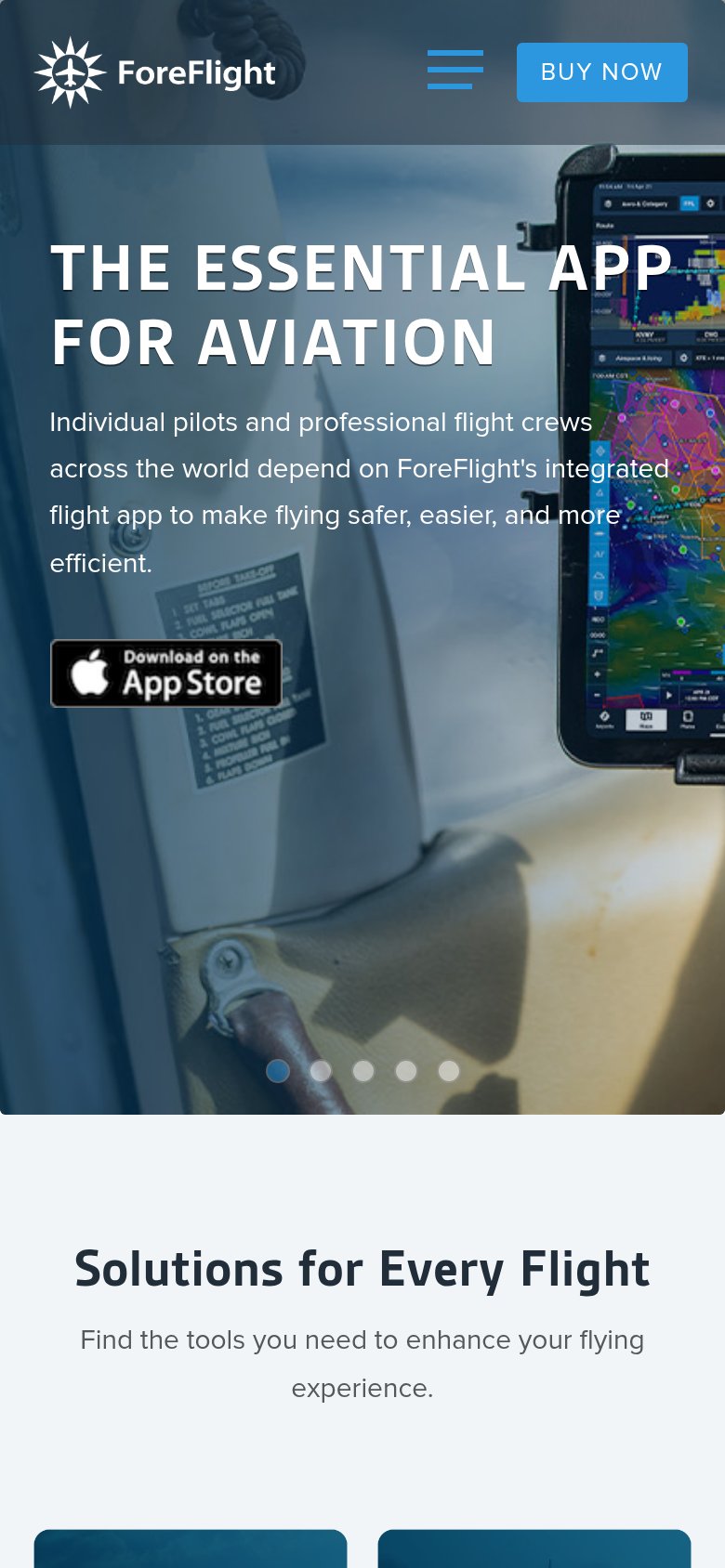
What works
What to improve