
Your landing page’s weakest score is Trust.
How Palette ranks
60Growth scoreupdated
category scores
category scoresShowHide
Score over time
Trust
44PoorProof that the product is real, competent, and safe to try.

| Trust read | |
|---|---|
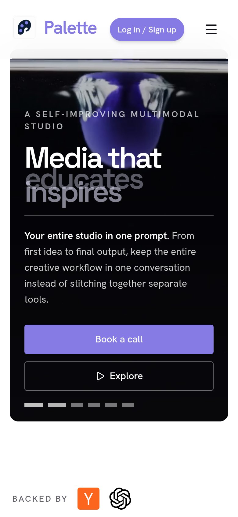
| Palette | "BACKED BY" strip with Y Combinator and OpenAI logos (mobile fold) |
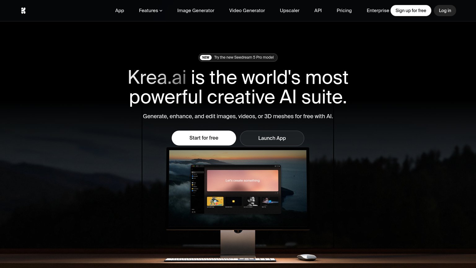
| Product screenshot of the Krea app interface ("Let's create something") on the monitor | |
| "We partner with the world's leading organizations to advance their industries:" logo strip (Amazon logo visible) | |
| implicit context Pika may benefit from pre-existing familiarity among its target audience. | |
| implicit context Luma AI (Dream Machine) may benefit from pre-existing familiarity among its target audience. | |
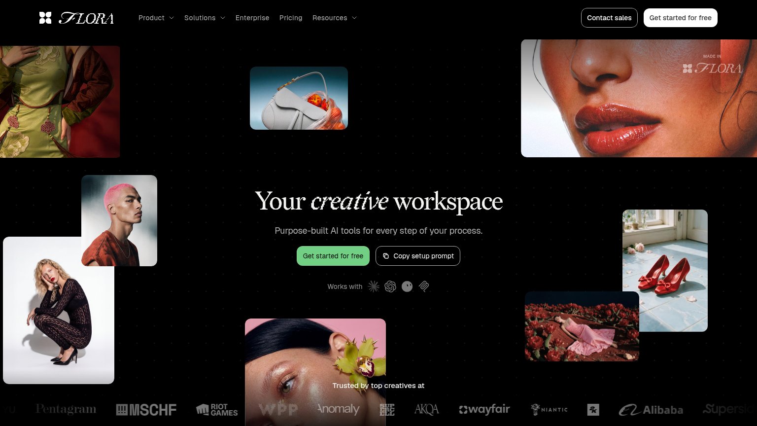
| "Trusted by top creatives at" logo wall (Pentagram, MSCHF, Riot Games, WPP, Wayfair, Niantic, Alibaba) |
CTA
56FairCopy, size, verb, cost-feel — does the primary CTA earn the click?


Problems
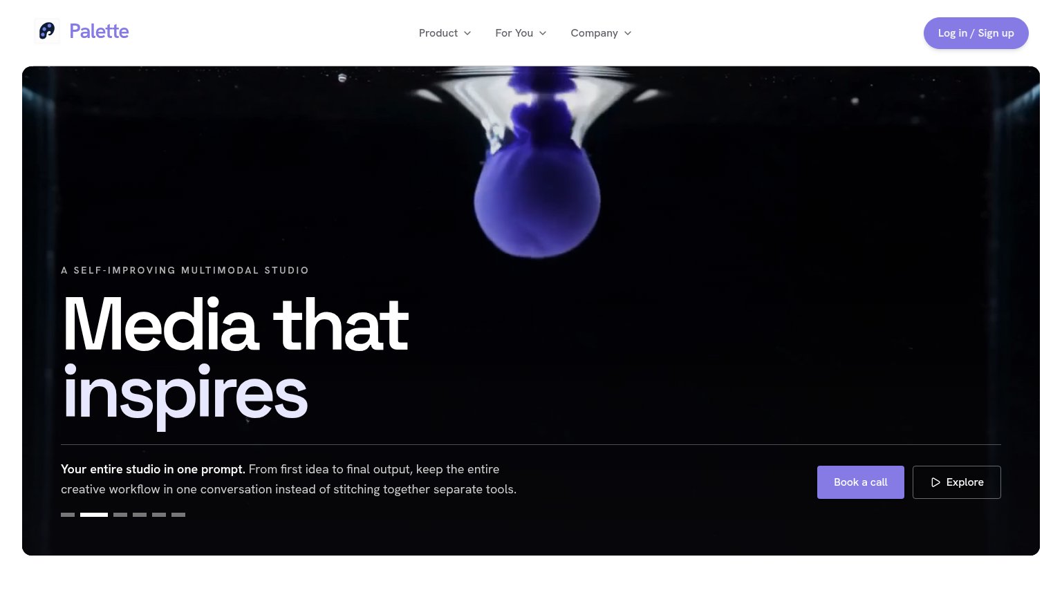
- sales-call click feels costly
- contradicts 'one prompt' self-serve pitch
- 'Explore' is vague, no payoff
- no product entry point in hero
Value props
62FairTitle, subtitle, hero — do they sell the product's true value?
Palette’s headline undersells
Media that inspires
Your entire studio in one prompt. From first idea to final output, keep the entire creative workflow in one conversation instead of stitching together separate tools.
Working
- Subhead names real pain: stitching separate tools
- "One prompt" is a concrete, memorable mechanism
- Eyebrow clarifies category: multimodal studio
Could improve
- H1 is generic; fits any media brand
- No numbers or proof points in the fold
- Hero video decorates, doesn't demo the product
Information hierarchy
68FairDoes the design help or inhibit what the page is trying to say?
1234- Book a call CTA — Primary CTA sits bottom-right outside the headline scan path, small against the full-width dark hero.
- Rotating headline carousel — The value-prop headline cycles (pager dots show 6 slides), so the core message is transient instead of anchored.
- Explore secondary button — Styled at near-equal weight beside 'Book a call', splitting attention at the decision moment.
- Log in / Sign up pill — The brightest purple element in the fold is a nav utility, outshining the actual conversion CTA.
Mobile web
72FairThe phone experience as a first-class citizen.
123- Overlapping headline words — "educates" and "inspires" render stacked on top of each other, making the hero headline unreadable.
- Book a call CTA — Primary CTA sits below the first viewport on most phones; visitors must scroll past a long paragraph to reach it.
- Header login pill — The "Log in / Sign up" pill crowds the collapsed header and competes with the hamburger for the first tap.