
Your landing page’s weakest score is Trust.
How OpenVector ranks
- 1.
Voxel5173
- 2.
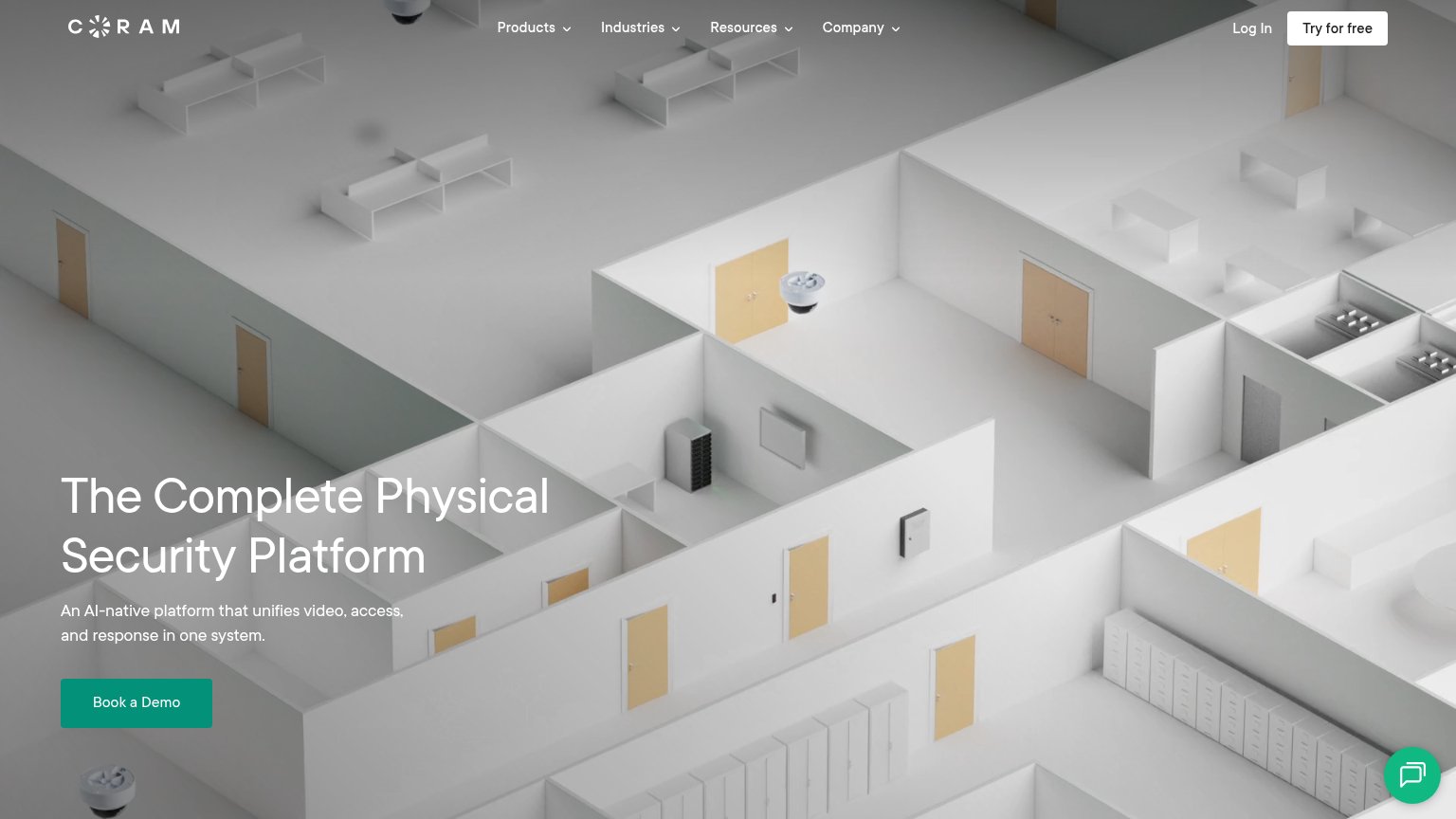
Coram AI65
- 3.
OpenVector62
- 4.
Chooch61
- 5.
Ambient.ai55
62Growth scoreupdated
category scores
category scoresShowHide
Score over time
Trust
38PoorProof that the product is real, competent, and safe to try.

| Trust read | |
|---|---|
| OpenVector | No visible trust signal identified. |
| No visible trust signal identified. | |
| No visible trust signal identified. | |
| "25% Fewer rush orders / 40% Higher inventory accuracy / 95% Stockout Reduction" metrics bar | |
| Customer logo strip showing Porsche, Alcon, GM, and Medtronic (mobile capture) |
CTA
58FairCopy, size, verb, cost-feel — does the primary CTA earn the click?



Problems
- 'Explore' promises no payoff
- label restates brand, not value
- competes with 'Book a demo' in nav
- no product entry point above fold
Value props
58FairTitle, subtitle, hero — do they sell the product's true value?
OpenVector’s headline undersells
Vision Language Action Systems for the Physical World.
Connect your cameras to the way you work. OpenVector turns what they see into actions in your business software.
Working
- Subhead states a clear mechanism
- Cameras-to-actions is a concrete idea
- No inflated buzzword stack
Could improve
- Headline is jargon-first category label
- No numbers, integrations, or proof
- Hero art decorates, shows nothing
Information hierarchy
72FairDoes the design help or inhibit what the page is trying to say?
12- Hollow bracket graphic — The hero visual renders as two empty brackets instead of the voxel cube seen on mobile, reading broken and communicating nothing about the product.
- Seven-item nav row — Seven links including two dropdowns give attention seven exits before the primary CTA.
Mobile web
82StrongThe phone experience as a first-class citizen.
 12
- Explore OpenVector button — Button sits at roughly half column width instead of near-full-bleed, shrinking the tap target on a phone.
- Menu label plus icon — The word "Menu" duplicates the hamburger icon beside it, adding redundant header clutter.