
Your landing page’s weakest score is Trust.
How Moving Atoms ranks
65Growth scoreupdated
category scores
category scoresShowHide
Score over time
Trust
52FairProof that the product is real, competent, and safe to try.
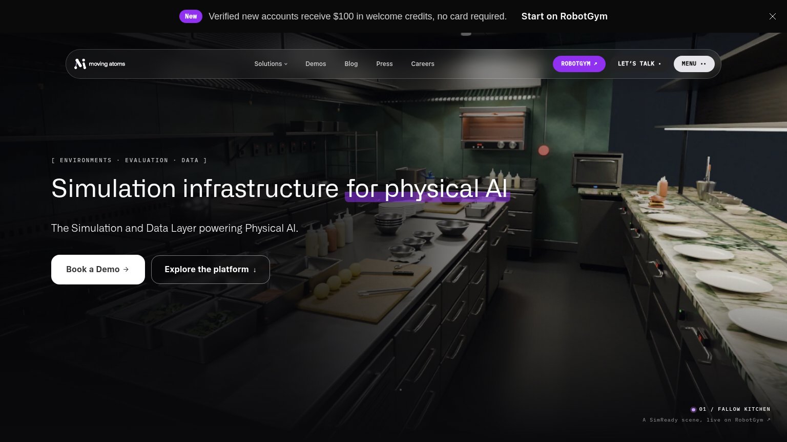
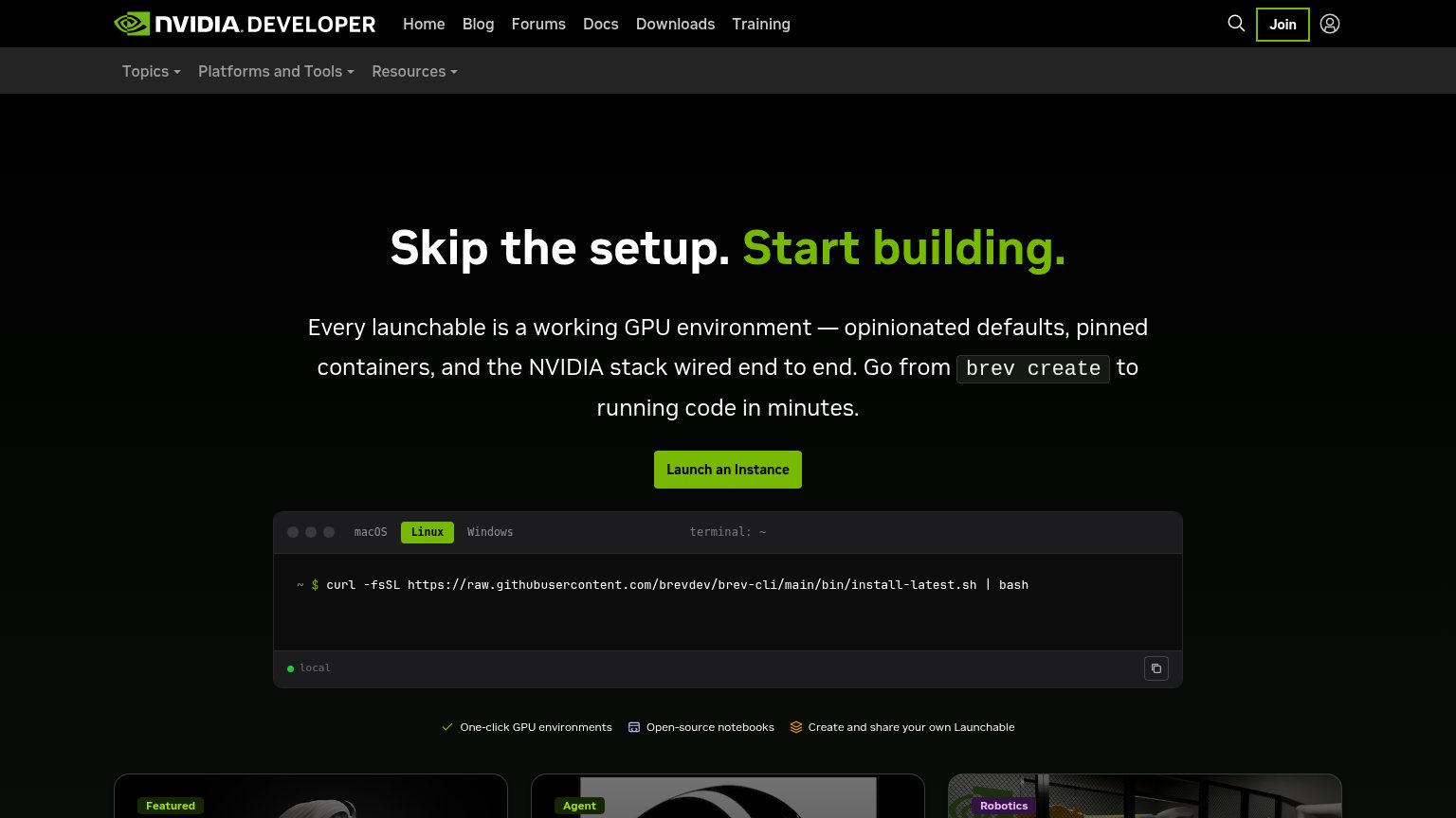

| Trust read | |
|---|---|
| Moving Atoms | "01 / FALLOW KITCHEN — A SimReady scene, live on RobotGym" hero showing an actual simulated environment |
| Terminal widget with real install command "curl -fsSL https://raw.githubusercontent.com/brevdev/brev-cli/main/bin/instal | |
| implicit context Scale AI (Physical AI) may benefit from pre-existing familiarity among its target audience. | |
| No visible trust signal identified. | |
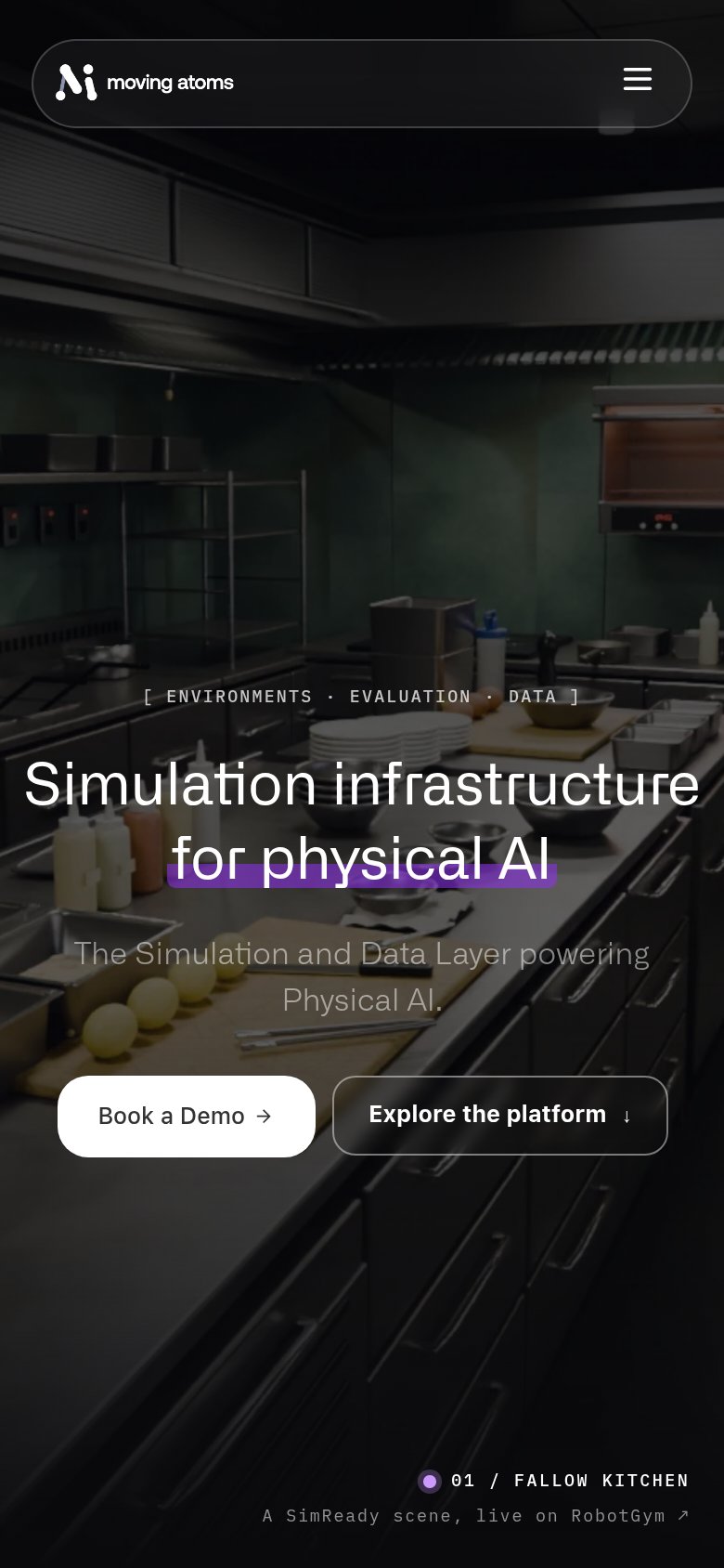
| Detection overlay labeled "60% Synthetic / 40% Real" on the mobile hero image | |
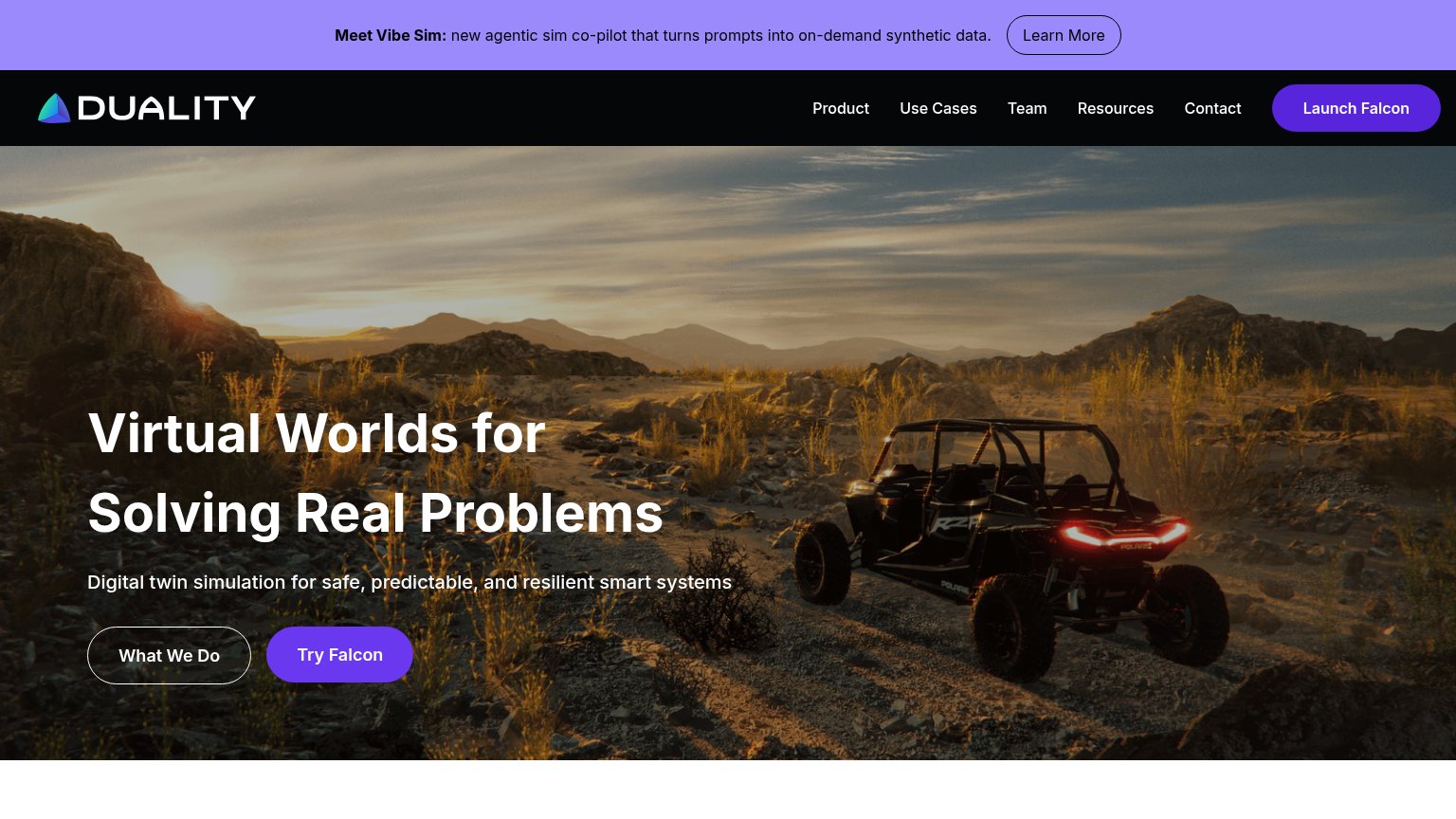
| "One country. Thousands of autonomous trucks. A new era for intelligent infrastructure begins now." paired with the HUMA |
Value props
58FairTitle, subtitle, hero — do they sell the product's true value?
Moving Atoms’s headline vague
Simulation infrastructure for physical AI
The Simulation and Data Layer powering Physical AI.
Working
- Hero image shows a real SimReady scene
- Eyebrow lists actual deliverables
- $100 credits banner adds specificity
Could improve
- Subhead just restates the headline
- No numbers, outcomes, or proof points
- Assumes reader knows 'physical AI'
CTA
62FairCopy, size, verb, cost-feel — does the primary CTA earn the click?

Problems
- high-cost sales ask, not product
- free $100 offer hidden in banner
- three competing CTAs in fold
- no 'free' despite free credits
Information hierarchy
72FairDoes the design help or inhibit what the page is trying to say?
1234- ROBOTGYM purple pill — Highest-saturation button in the fold, outranking 'Book a Demo' and pulling clicks to a second destination.
- RobotGym promo banner — Full-width top banner with 'Start on RobotGym' link adds a competing conversion path before the hero is read.
- Five-link nav row — Solutions, Demos, Blog, Press, Careers plus LET'S TALK and MENU create nine exits above the fold.
- Explore the platform button — Sized and styled near-equal to 'Book a Demo', splitting the primary action's weight.
Mobile web
80StrongThe phone experience as a first-class citizen.
 123
- Side-by-side CTA pair — Two buttons split the column, shrinking "Book a Demo" below thumb-first width instead of stacking full-bleed.
- Low-contrast grey subhead — Grey text over a mid-tone kitchen photo is hard to read at arm's length.
- Faint eyebrow label — "[ ENVIRONMENTS · EVALUATION · DATA ]" nearly disappears into the busy background imagery.