
Your landing page’s weakest score is Value props.
How Most Robotic ranks
64Growth scoreupdated
category scores
category scoresShowHide
Score over time
Value props
48PoorTitle, subtitle, hero — do they sell the product's true value?
Most Robotic’s headline vague
A robotics research lab pushing what's possible with physical AI
Working
- YC badge lends credibility
- Names the category clearly
- Clean, confident tone
Could improve
- No subhead adds specifics
- "Pushing what's possible" is empty
- Hero art decorates, doesn't demo
Trust
48PoorProof that the product is real, competent, and safe to try.

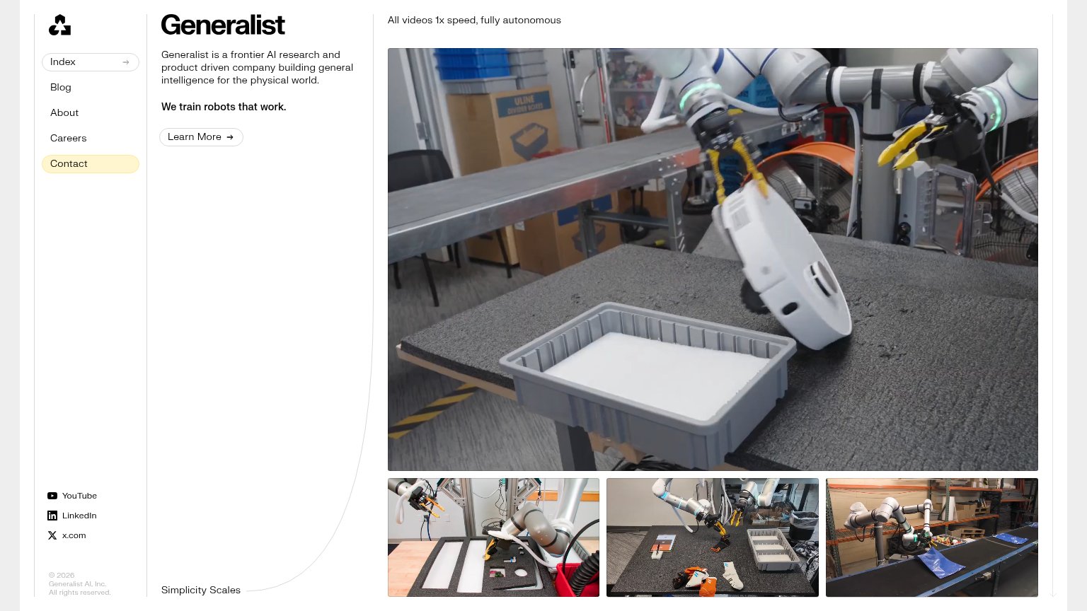
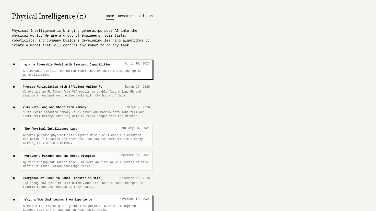
| Trust read | |
|---|---|
| Most Robotic | "Backed by Y Combinator" badge above the headline |
| Dated research timeline, e.g. "π0.7: a Steerable Model with Emergent Capabilities — April 16, 2026" | |
| No visible trust signal identified. | |
| "All videos 1x speed, fully autonomous" caption over real robot demo footage | |
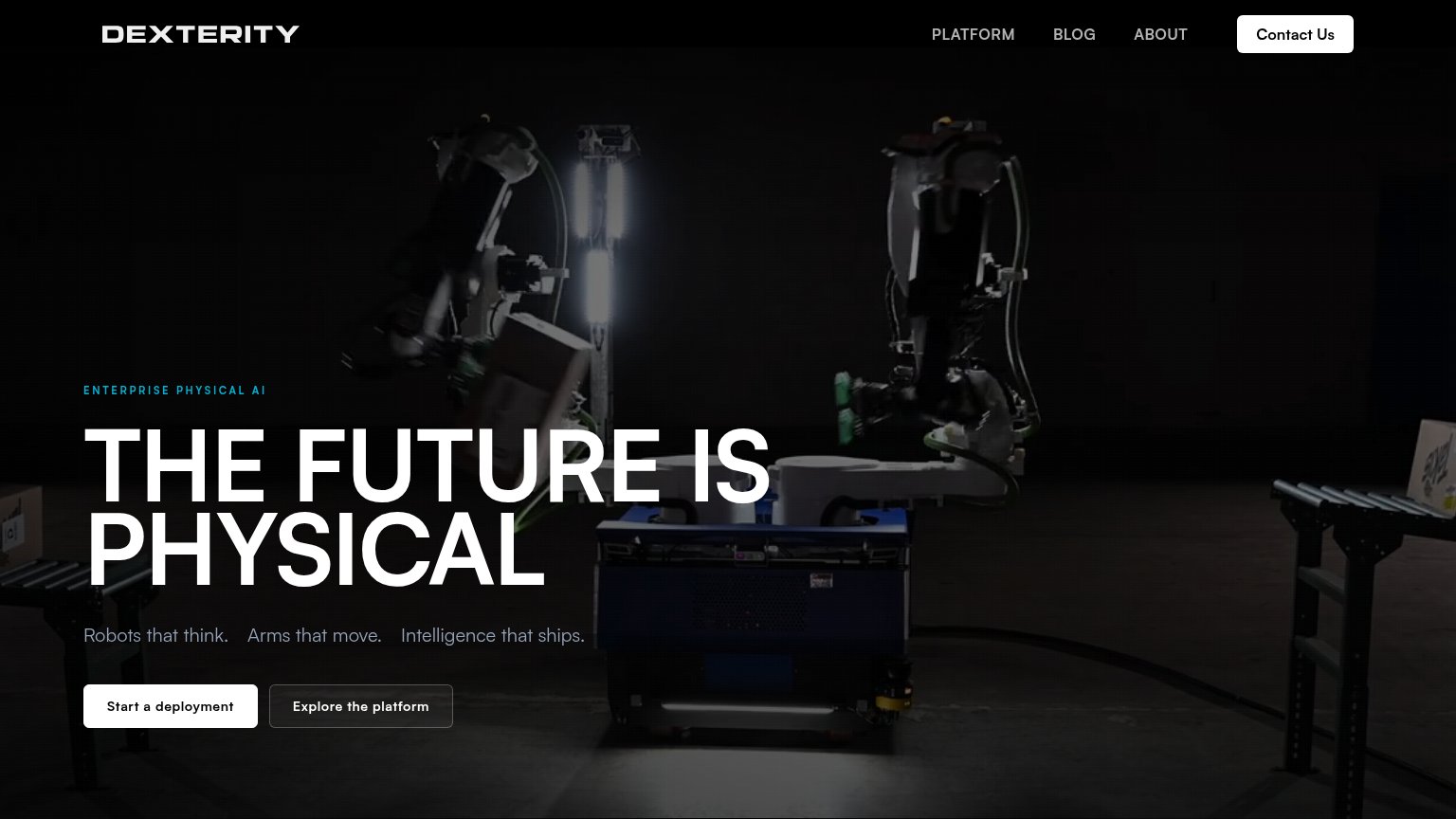
| Hero photography of the NEO robot in three colorways | |
| No visible trust signal identified. |
CTA
68FairCopy, size, verb, cost-feel — does the primary CTA earn the click?

Problems
- contact ask feels costly
- no payoff named for the click
- generic label, no product tie-in
Mobile web
72FairThe phone experience as a first-class citizen.
 123
- Stacked nav row — Nav doesn't collapse — 'about' and 'get in touch →' wrap into a second header row instead of a hamburger.
- Half-width primary CTA — 'get in touch' stays desktop-proportioned instead of going full-bleed for the thumb.
- Duplicate CTA pair — 'about us ↓' matches the primary button's size and weight, splitting attention from the coral CTA.
Information hierarchy
84StrongDoes the design help or inhibit what the page is trying to say?
123- about us button — Same size and shape as the primary CTA, splitting attention at the decision point.
- nav get in touch — Duplicates the hero CTA in a different outlined style, diluting the single action's weight.
- coral get in touch — Small footprint relative to the oversized headline; the eye lands on it last, not first.