
Your landing page’s weakest score is Value props.
How Moonshot ranks
- 1.
Genspark61
- 2.
Perplexity Comet60
- 3.
Moonshot56
- 4.
Manus56
56Growth scoreupdated
category scores
category scoresShowHide
Score over time
Value props
22PoorTitle, subtitle, hero — do they sell the product's true value?
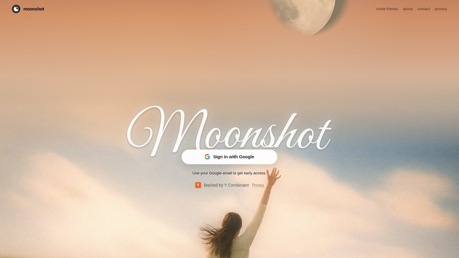
Moonshot’s headline vague
Moonshot
Use your Google email to get early access.
Working
- Single focused CTA with zero clutter
- YC badge adds a trust signal
- Evocative, memorable brand mood
Could improve
- No statement of what Moonshot does
- Subhead is an instruction, not value
- Hero image decorates, demonstrates nothing
Trust
44PoorProof that the product is real, competent, and safe to try.
| Trust read | |
|---|---|
| Moonshot | "Backed by Y Combinator" badge under the sign-in button |
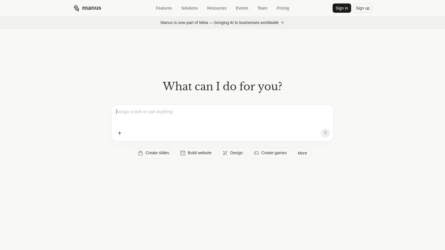
| Banner: "Manus is now part of Meta — bringing AI to businesses worldwide" | |
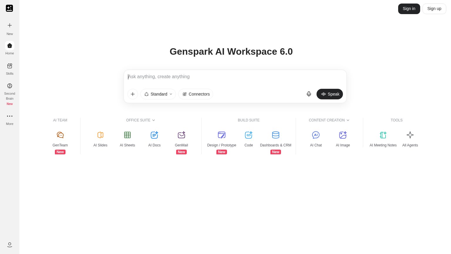
| Live product UI: working prompt bar with feature suite (AI Slides, AI Sheets, GenMail, Dashboards & CRM) | |
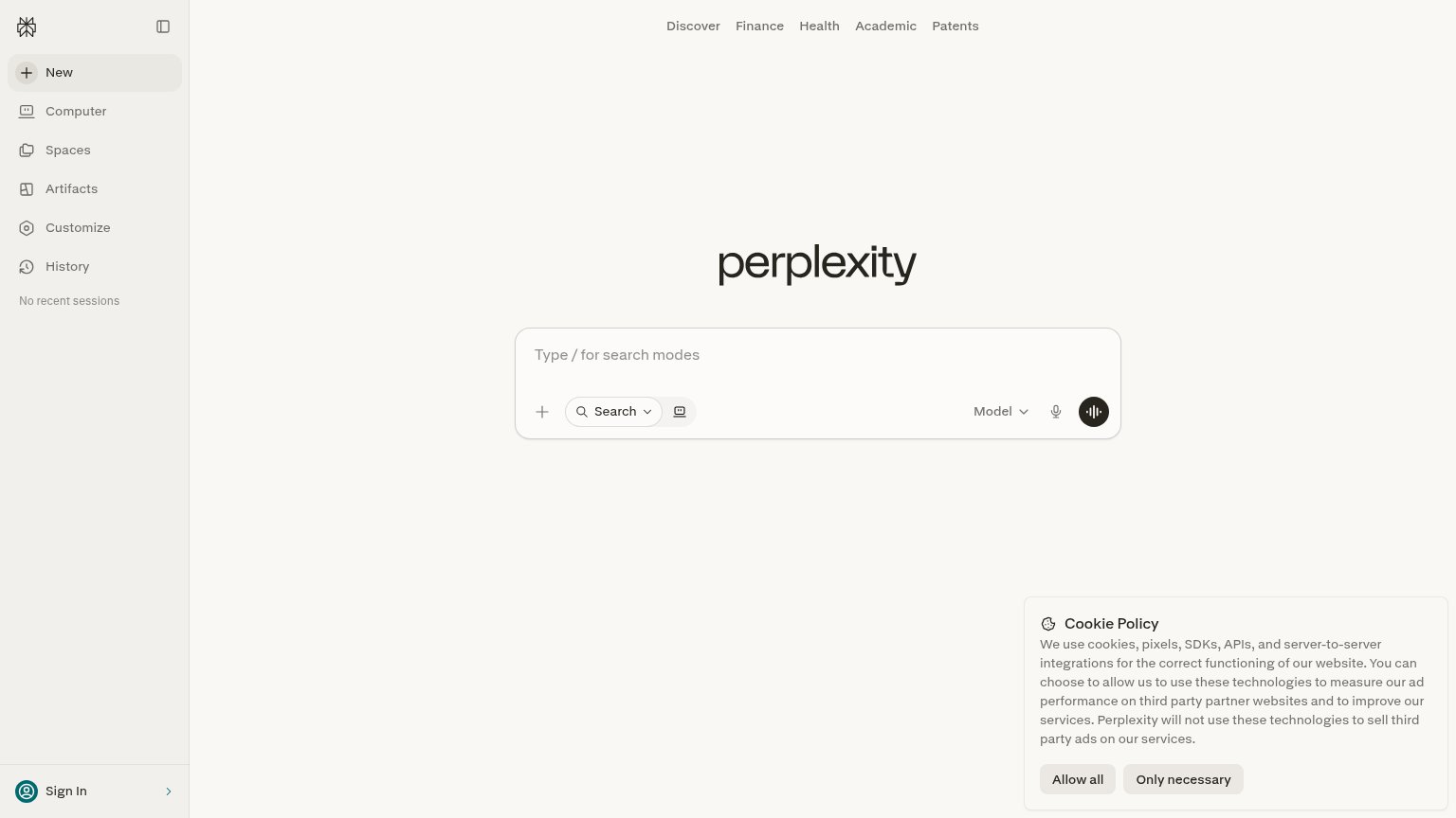
| implicit context Perplexity Comet may benefit from pre-existing familiarity among its target audience. |
CTA
62FairCopy, size, verb, cost-feel — does the primary CTA earn the click?
Problems
- 'Sign in' feels like account cost
- no product value named on page
- 4 words, auth mechanics not payoff
Information hierarchy
68FairDoes the design help or inhibit what the page is trying to say?
1234- Script logotype headline — The ornate script 'Moonshot' is the fold's only value-prop text — it names the brand but tells visitors nothing about what the product does.
- Nav exit links — Four same-weight links (invite friends, about, contact, privacy) sit in the scan path and leak attention before the sign-in CTA.
- Early-access subtext — 'Use Moonshot's Google email to get early access' is the only functional explanation and it sits in small, low-contrast text below the CTA.
- Duplicate privacy link — A second underlined 'Privacy' link next to the YC badge repeats the nav item and adds another exit beside the CTA.
Mobile web
82StrongThe phone experience as a first-class citizen.
 12
- Script logotype hero — The decorative script "Moonshot" wordmark states no value proposition, so the fold sells nothing before the CTA.
- Full desktop header logo — The header carries the logo but the desktop nav links (invite friends, about, contact, privacy) disappear entirely on mobile with no menu replacement.