
Your landing page’s weakest score is Trust.
How Mochi ranks
70Growth scoreupdated
category scores
category scoresShowHide
Score over time
Trust
56FairProof that the product is real, competent, and safe to try.
| Trust read | |
|---|---|
| Mochi | Populated "TOP 10 TODAY" ranked catalog rail with real titles and genres |
| No visible trust signal identified. | |
| implicit context ReelShort may benefit from pre-existing familiarity among its target audience. | |
| "Most Popular" row showing seven real drama title posters (e.g. "Loved Twice by the Hockey Star") | |
| "Most Trending" grid of real titles with cover art, genre tags, and synopses (e.g. "Not His ATM, I'm The Wolf Queen") |
Value props
58FairTitle, subtitle, hero — do they sell the product's true value?
Mochi’s headline vague
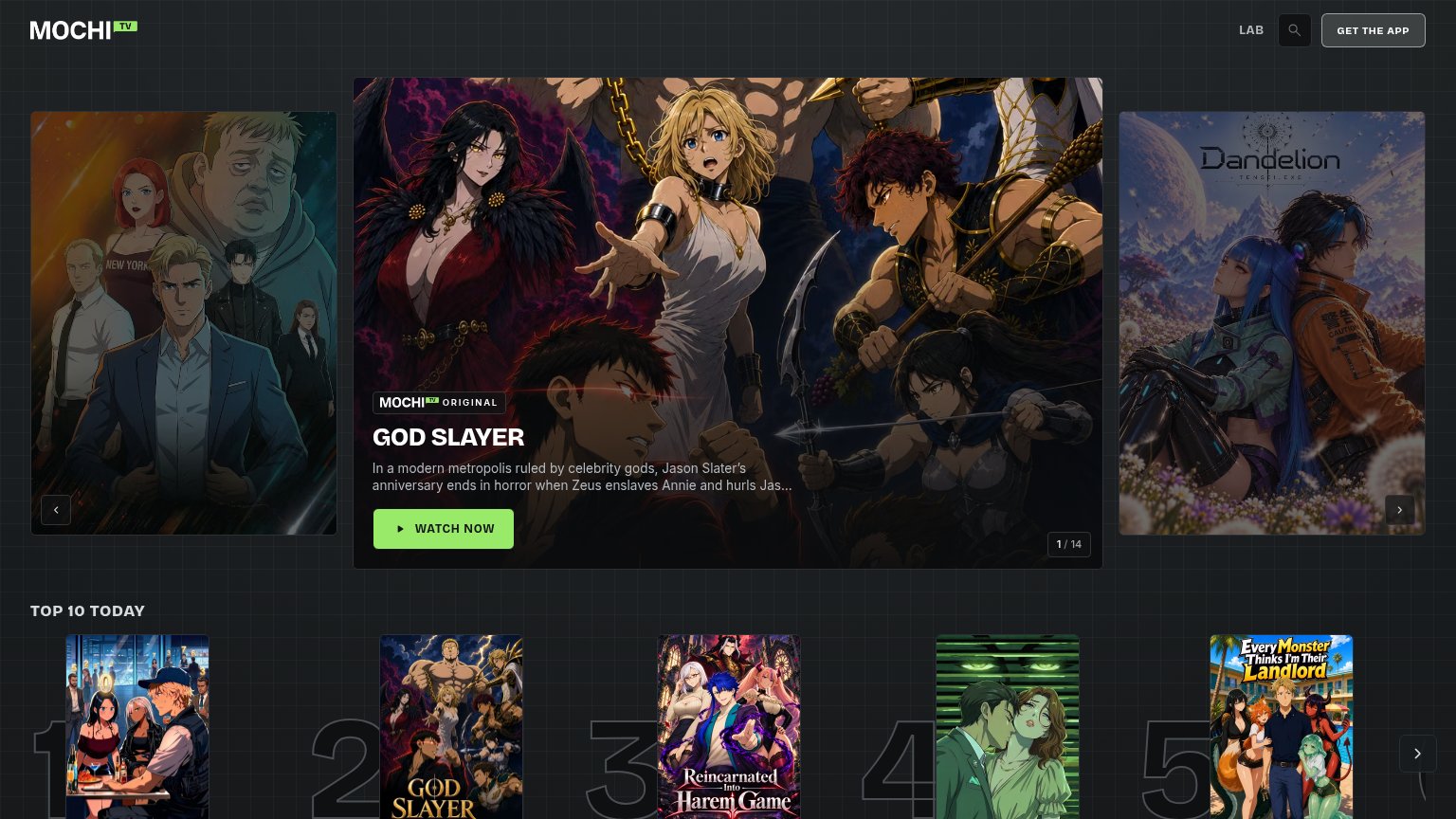
GOD SLAYER
In a modern metropolis ruled by celebrity gods, Jason Slater's anniversary ends in horror when Zeus enslaves Annie and hurls Jas...
Working
- Content-first hero shows real catalog
- 'MOCHI TV ORIGINAL' badge signals exclusives
- 'WATCH NOW' CTA promises instant outcome
Could improve
- No line saying what Mochi is
- No pricing or 'free' signal
- Synopsis truncated mid-sentence
Information hierarchy
72FairDoes the design help or inhibit what the page is trying to say?
 123
- 1 / 14 counter — A 14-slide rotating hero means the value message changes before it lands; mobile already shows a different slide.
- Top 10 row — Oversized rank numerals and five posters crowd the fold at hero-level weight, splitting attention from the primary action.
- GET THE APP button — Bordered header CTA competes with WATCH NOW and routes attention away before the hero is read.
CTA
78FairCopy, size, verb, cost-feel — does the primary CTA earn the click?
Problems
- no cost signal on the click
- competes with 'GET THE APP' in nav
- carousel rotates the CTA's target
Mobile web
86StrongThe phone experience as a first-class citizen.
 12
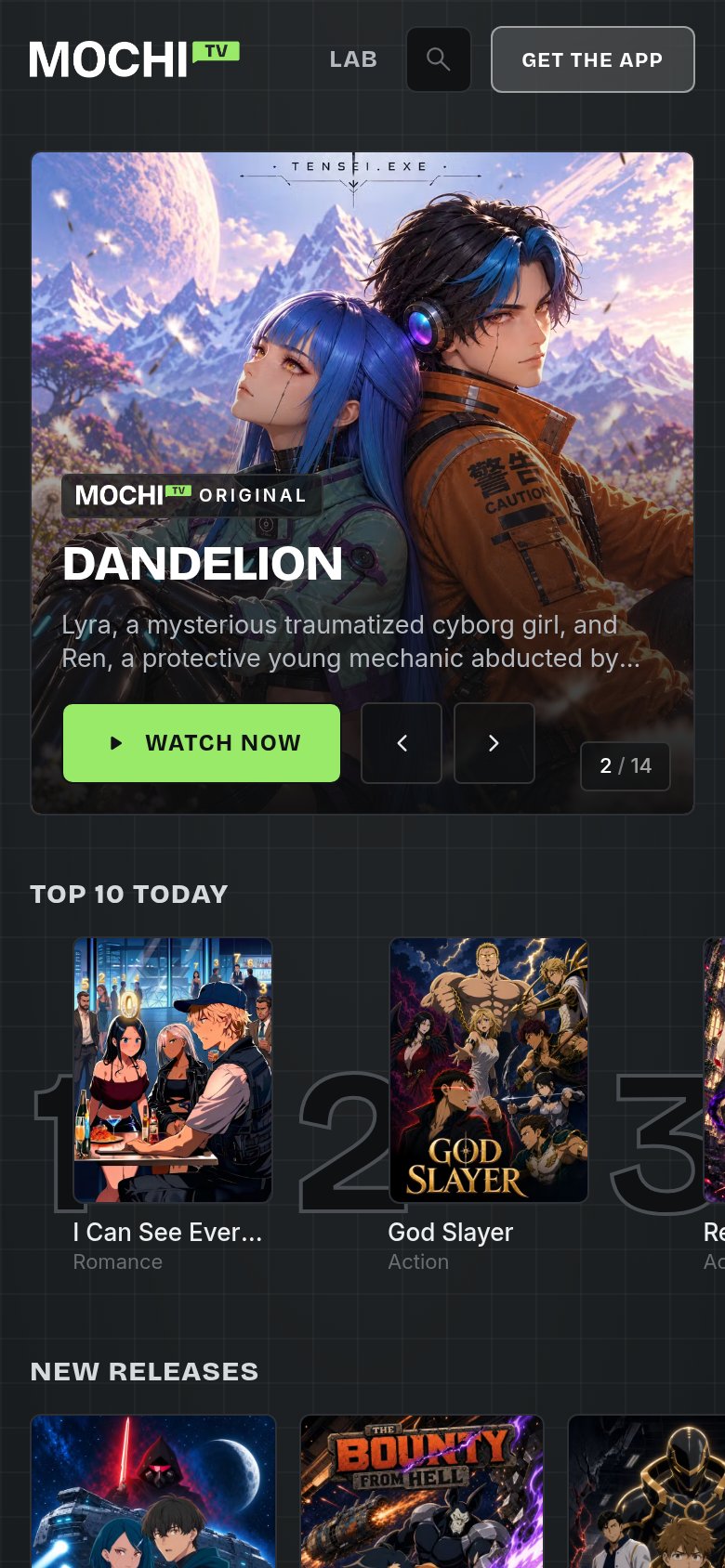
- WATCH NOW row — Two carousel chevrons crowd the primary CTA's row and cap its width short of full-bleed.
- Truncated Top 10 title — "I Can See Ever..." cuts off mid-title, hiding what the ranked show actually is.