
Your landing page’s weakest score is Trust.
How CarSignal ranks
73Growth scoreupdated
category scores
category scoresShowHide
Score over time
Trust
52FairProof that the product is real, competent, and safe to try.
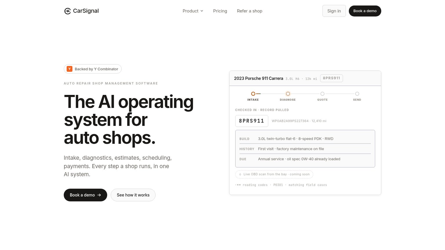
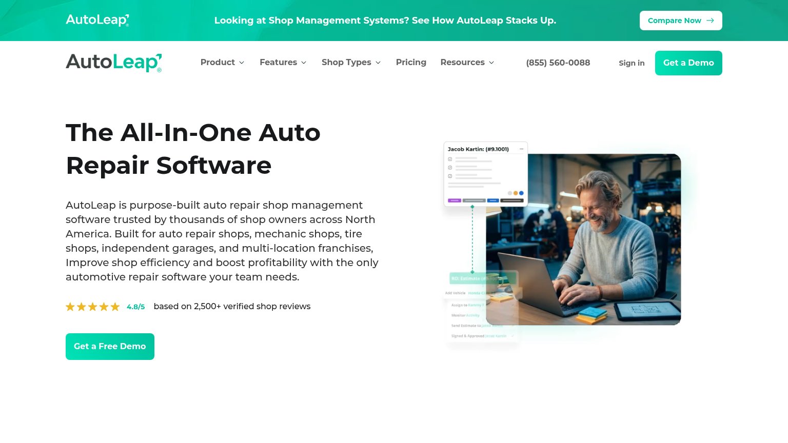
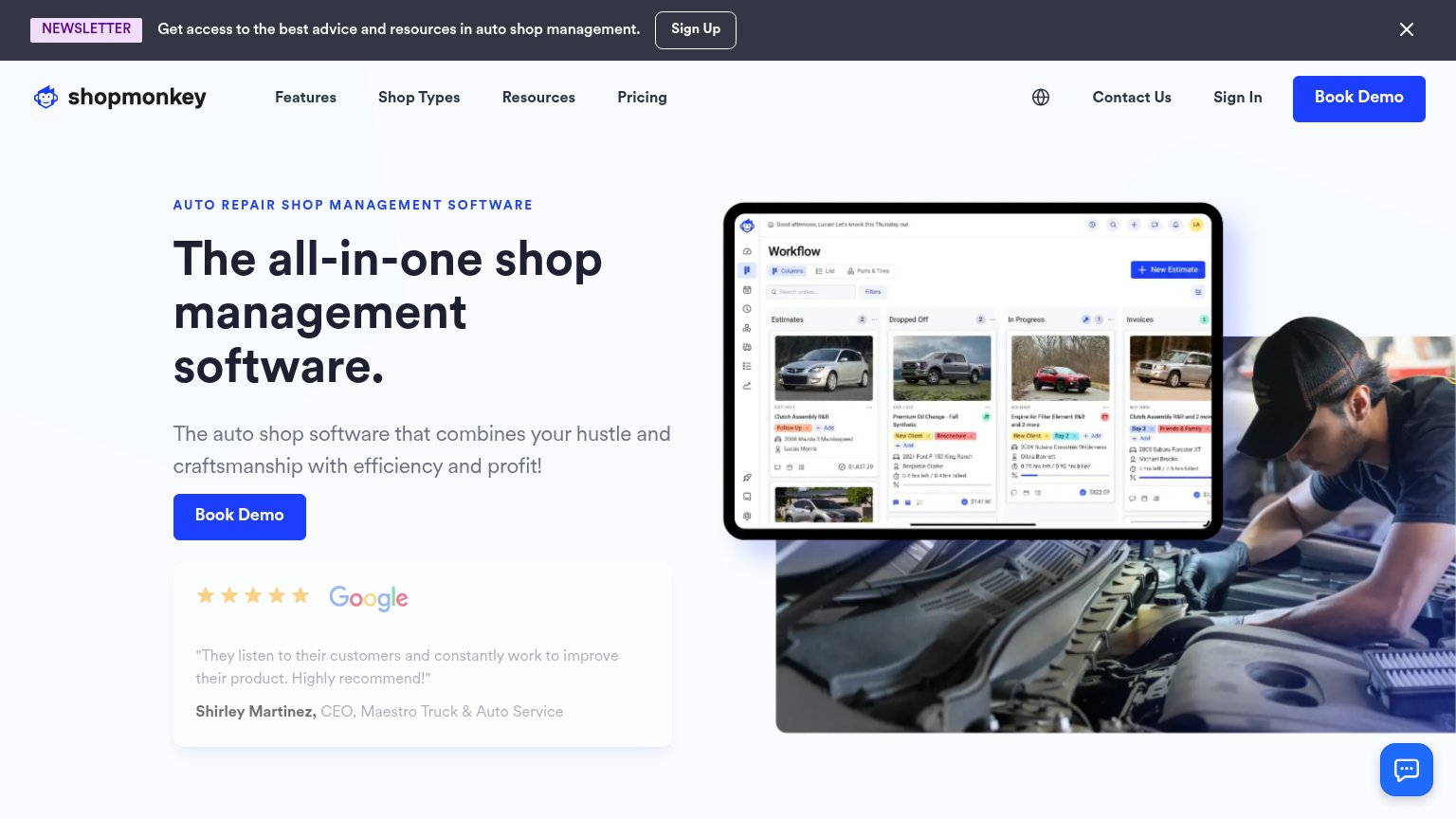
| Trust read | |
|---|---|
| CarSignal | "Backed by Y Combinator" badge above the headline |
| 5-star Google review card: "They listen to their customers and constantly work to improve their product. Highly recommen | |
| Mobile hero product screenshot of the Job Board UI showing real repair orders and totals | |
| 4.8/5 based on 2,500+ verified shop reviews | |
| No visible trust signal identified. | |
| No visible trust signal identified. |
CTA
68FairCopy, size, verb, cost-feel — does the primary CTA earn the click?
Problems
- demo click feels costly/committal
- no value payoff in the label
- secondary CTA feels cheaper to click
Value props
76FairTitle, subtitle, hero — do they sell the product's true value?
CarSignal’s headline sells
The AI operating system for auto shops.
Intake, diagnostics, estimates, scheduling, payments. Every step a shop runs, in one AI system.
Working
- Names audience and category plainly
- Subhead lists five concrete workflows
- Hero demo shows real diagnosis, not decor
Could improve
- No quantified outcome or benefit
- Copy is affectless — no owner pain named
- "AI operating system" leans buzzwordy
Information hierarchy
82StrongDoes the design help or inhibit what the page is trying to say?
123- Duplicate header demo CTA — Same black pill weight as the hero "Book a demo", splitting attention between two identical primary buttons.
- Four-link nav row — Product, Pricing, Refer a shop, and Sign in give five exits before the visitor reaches the hero CTA.
- See how it works button — Outlined pill sits at near-equal size beside the primary CTA, diluting the single action the fold wants.
Mobile web
86StrongThe phone experience as a first-class citizen.
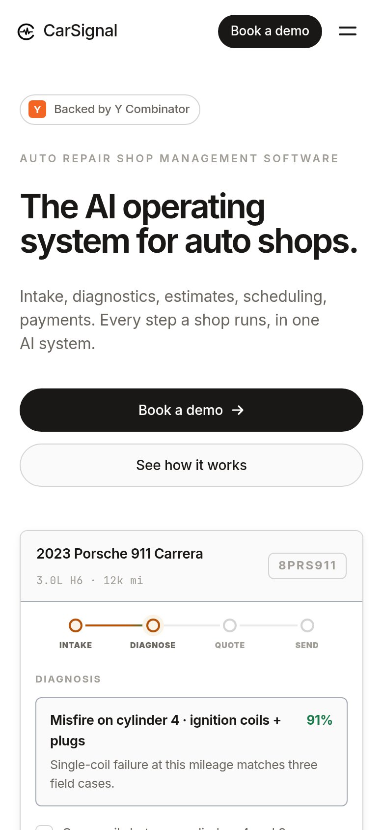
No specific callouts
CarSignal's mobile fold is disciplined: one message ("The AI operating system for auto shops."), a readable three-line subhead, and a full-width black "Book a demo →" button that is visible and tappable in the first viewport, backed by a secondary "See how it works" pill. The nav collapses cleanly to logo, a compact "Book a demo" pill, and a hamburger, so the header takes minimal vertical space, and no pop-ups, cookie banners, or chat bubbles obstruct anything. The one crowding cost is the header duplicating the hero's "Book a demo" CTA — two identical actions inches apart add redundancy without new intent — and the Porsche 911 product demo card is cut off mid-viewport, starting a second dense message before the first resolves. Trimming the duplicate header CTA is the biggest lever left.