
Your landing page’s weakest score is Trust.
How Applied Electrodynamics, Inc. ranks
- 1.
Vayyar (Walabot DIY)66
- 2.
Applied Electrodynamics, Inc.61
- 3.
Franklin Sensors54
- 4.
Bosch Wall Scanners (D-tect line)54
61Growth scoreupdated
category scores
category scoresShowHide
Trust
45PoorProof that the product is real, competent, and safe to try.

| Trust read | |
|---|---|
| Applied Electrodynamics, Inc. | "Backed by Y Combinator" badge in the header |
| "SAFE PURCHASE 30-DAY MONEY BACK GUARANTEE" under the BUY NOW button | |
| Mobile hero photo of a worker using a Franklin stud finder on real drywall | |
| implicit context Bosch Wall Scanners (D-tect line) may benefit from pre-existing familiarity among its target audience. |
Mobile web
58FairThe phone experience as a first-class citizen.
 123
- Preorder Now button — Desktop-proportioned pill instead of a full-width thumb-friendly mobile CTA.
- Backed by Y badge — Wraps to a second header row, truncates 'Combinator', and eats fold height without converting.
- Subhead copy defect — Missing space in 'superpower.See' reads as broken text on the primary value statement.
Value props
62FairTitle, subtitle, hero — do they sell the product's true value?
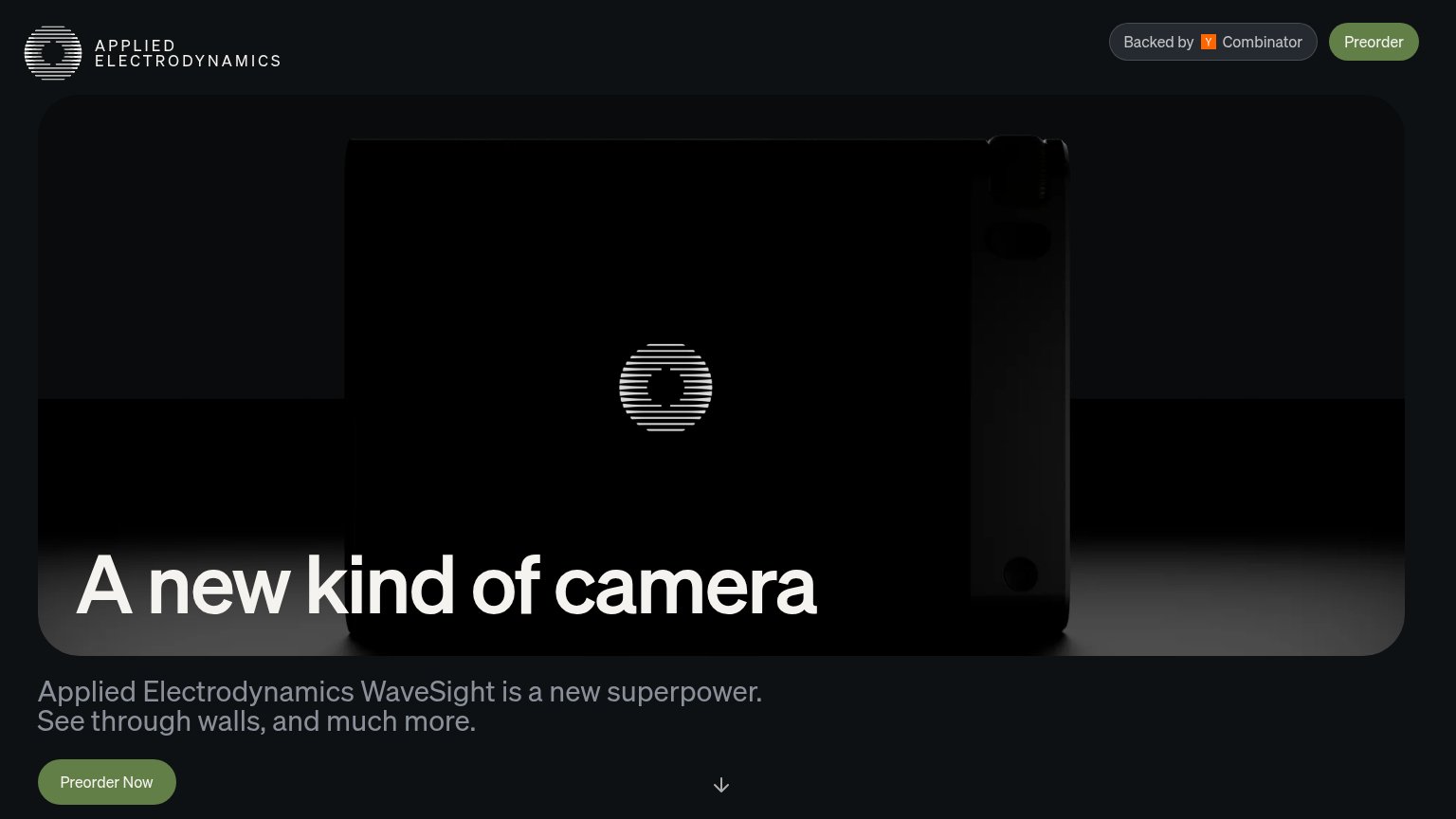
Applied Electrodynamics, Inc.’s headline undersells
A new kind of camera
Applied Electrodynamics WaveSight is a new superpower. See through walls, and much more.
Working
- 'See through walls' is concrete and visceral
- 'A new superpower' hits an emotional note
- Mystery headline builds curiosity
Could improve
- Headline hides the true capability
- No numbers, specs, or proof points
- Hero image is dark, shows nothing working
CTA
66FairCopy, size, verb, cost-feel — does the primary CTA earn the click?
Problems
- purchase-level commitment, no price
- button small vs. giant headline
- labels differ: 'Preorder' vs 'Now'
- low contrast olive on dark page
Information hierarchy
76FairDoes the design help or inhibit what the page is trying to say?
123- Header Preorder button — Same-weight duplicate of the hero's Preorder Now splits the primary action's visual authority.
- Preorder Now button — Muted olive-on-black styling is too low contrast for the one action the page wants; it fails the one-second find test.
- Subtitle text block — The core explanation 'See through walls' is rendered in dim gray, far subordinate to a headline that names no benefit.
Competitors
inferred from product, audience, and value prop#1Vayyar (Walabot DIY)walabot.com66
Franklin Sensorsfranklinsensors.com54
#4Bosch Wall Scanners (D-tect line)boschtools.com54
#2Applied Electrodynamics, Inc.61
#3