
Your landing page’s weakest score is Trust.
How Agent FM ranks
76Growth scoreupdated
category scores
category scoresShowHide
Score over time
Trust
52FairProof that the product is real, competent, and safe to try.
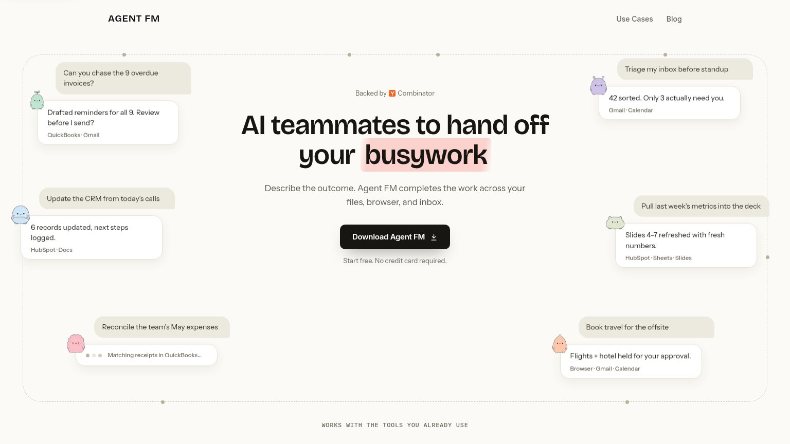
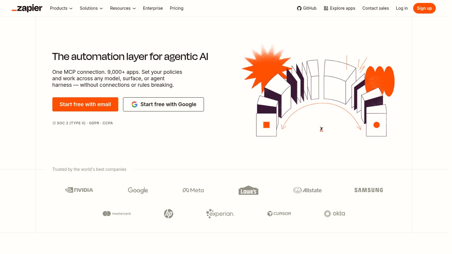
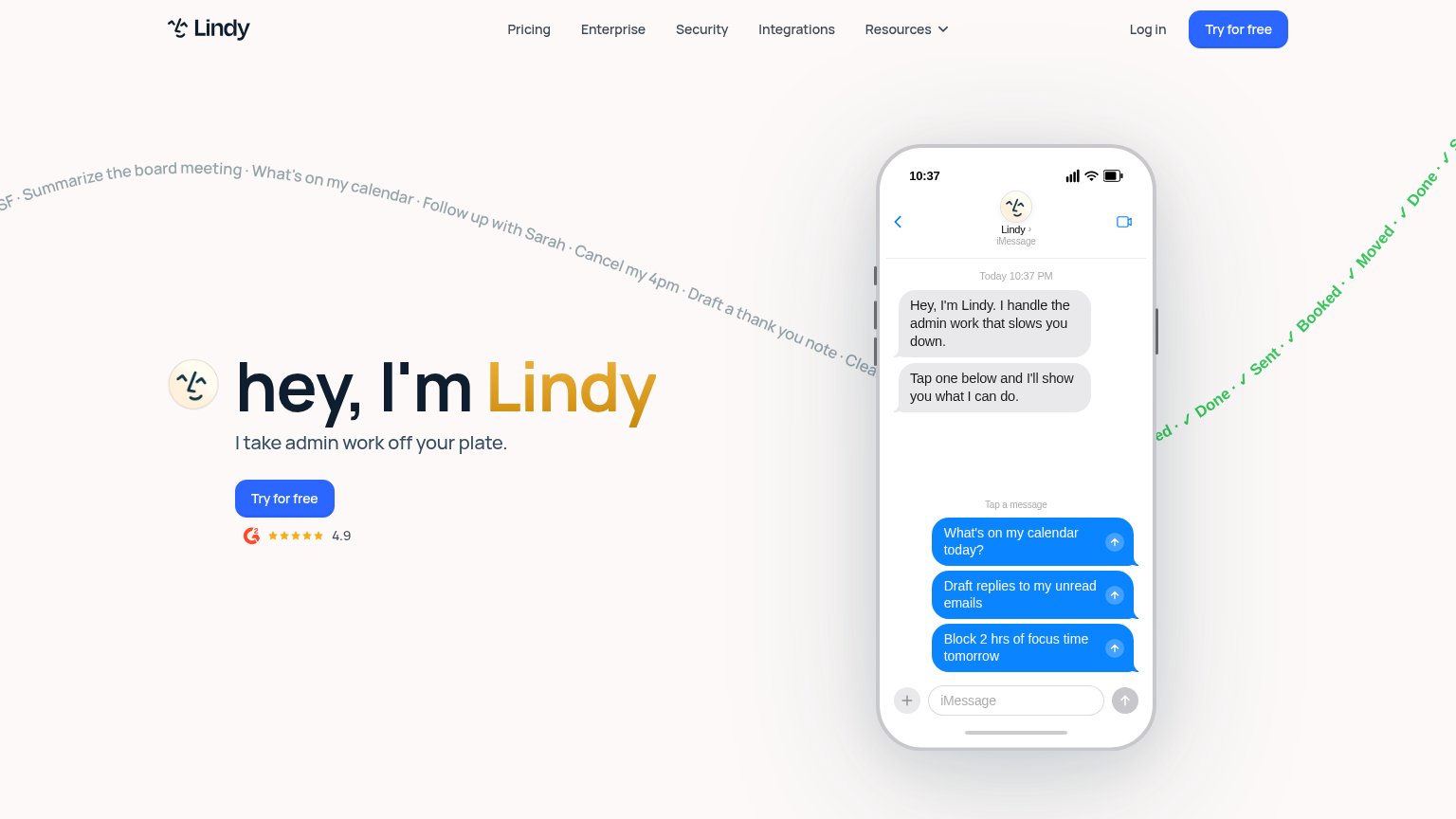
| Trust read | |
|---|---|
| Agent FM | "Backed by Y Combinator" badge above the headline |
| G2 badge with 4.9 star rating below the "Try for free" CTA | |
| "Trusted by the world's best companies" logo wall (NVIDIA, Google, Meta, Lowe's, Allstate, Samsung, Mastercard, HP, Expe | |
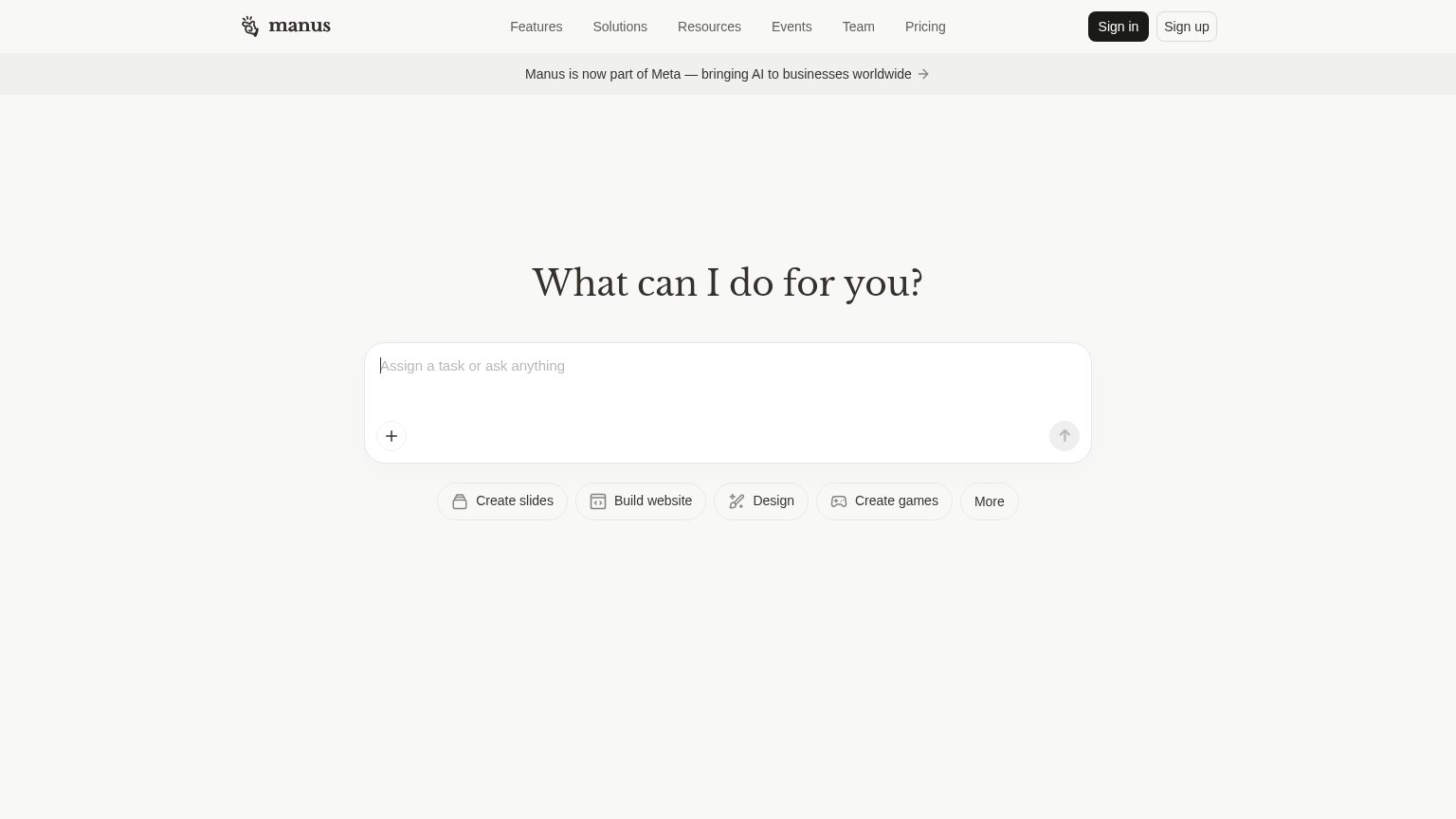
| Specific shutdown timeline: "shutting down on August 15, 2026 for free users and September 14, 2026 for paying customers | |
| No visible trust signal identified. | |
| Banner: "Manus is now part of Meta — bringing AI to businesses worldwide" |
CTA
72FairCopy, size, verb, cost-feel — does the primary CTA earn the click?
Problems
- no 'free' despite free offer below
- download feels heavier than a click
- labels differ desktop vs mobile
Value props
84StrongTitle, subtitle, hero — do they sell the product's true value?
Agent FM’s headline sells
AI teammates to hand off your busywork
Describe the outcome. Agent FM completes the work across your files, browser, and inbox.
Working
- Vignettes show real tasks with numbers
- Subhead names files, browser, inbox
- "Hand off busywork" is a clear outcome
Could improve
- No quantified time-saved claim in hero
- Hero copy lacks emotional payoff
- "AI teammates" leans on category jargon
Information hierarchy
86StrongDoes the design help or inhibit what the page is trying to say?
1- In-progress expense bubble — The 'Matching receipts in QuickBooks…' loading bubble adds a sixth vignette without a resolved payoff, pure extra density.
Mobile web
88StrongThe phone experience as a first-class citizen.
No specific callouts
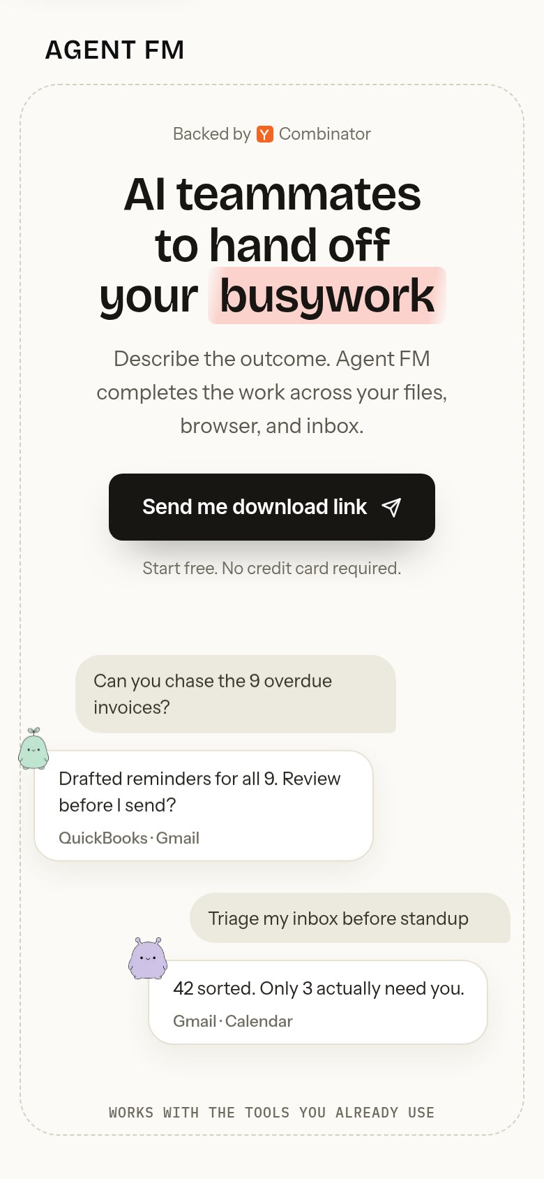
Agent FM's mobile fold is disciplined: one headline ("AI teammates to hand off Agent FM's busywork"), one supporting line, and a near-full-width "Send me download link" CTA visible and tappable well inside the first viewport — the mobile capture even swaps the desktop "Download Agent FM" for a phone-appropriate email-link action, a rare piece of deliberate mobile thinking. The floating chat bubbles that surround the desktop hero are stacked below the CTA instead of crowding it, so nothing competes with the tap. Type scales cleanly — the headline holds three lines and body copy reads comfortably — though the nav is reduced by simply dropping "Use Cases" and "Blog" entirely rather than collapsing them into a menu, which removes secondary paths for visitors who want proof before converting. Adding a hamburger that restores those links is the one change that would lift the score further.