TraceYC S25 landing page report.
← Back to YC S25

Your landing page’s weakest score is Mobile web.

Fix Mobile web

Score over time

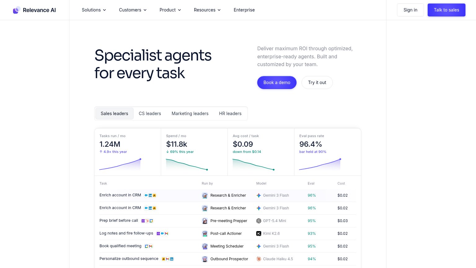
90807060504030Relevance AI 64 on Apr 12 (Wayback)Relevance AI 66 on Apr 21 (Wayback)Relevance AI 69 on May 7 (Wayback)Relevance AI 72 on May 19 (Wayback)Relevance AI 70 on Jun 2 (Wayback)Relevance AI 71 on Jun 18 (Wayback)Relevance AI 70 on Jul 28 (Live)Lindy 79 on Jul 17 (Live)Lindy 82 on Aug 20 (Wayback)Lindy 78 on Aug 28 (Wayback)Lindy 81 on Sep 17 (Wayback)Zapier (AI Agents) 77 on Apr 22 (Wayback)Zapier (AI Agents) 81 on May 6 (Wayback)Zapier (AI Agents) 77 on Jun 3 (Wayback)Zapier (AI Agents) 78 on Jul 2 (Wayback)Zapier (AI Agents) 78 on Jul 15 (Wayback)Zapier (AI Agents) 80 on Aug 14 (Live)Dust 65 on May 5 (Wayback)Dust 62 on May 21 (Wayback)Dust 62 on Jul 6 (Wayback)Dust 66 on Jul 17 (Live)Dust 63 on Aug 5 (Wayback)Dust 62 on Aug 29 (Wayback)Dust 58 on Oct 3 (Wayback)Beam AI 74 on Mar 17 (Wayback)Beam AI 72 on Apr 14 (Wayback)Beam AI 71 on May 14 (Wayback)Beam AI 76 on Jul 28 (Live)Trace 56 on Mar 27 (Wayback)Trace 63 on Apr 22 (Wayback)Trace 54 on Jun 16 (Wayback)Trace 51 on Jul 11 (Wayback)Trace 37 on Sep 9 (Wayback)Trace 61 on Sep 22 (Live)Mar 27Apr 22Jun 16Jul 11Sep 9Sep 22
Past reportsShow past reportsHide past reports
  1. Sep 22, 202661LiveOverall +24 · Information hierarchy +38 · Value props +36Viewing
  2. Sep 9, 202637Overall −14 · Information hierarchy −38 · Value props −30View →
  3. Jul 11, 202651Overall −3 · Trust −12 · Value props −6View →
  4. Jun 16, 202654Overall −9 · Mobile web −36 · Trust −8View →
  5. Apr 22, 202663Overall +7 · Mobile web +28 · CTA +4View →
  6. Mar 27, 202656First tracked report — strongest Information hierarchy 76, weakest Mobile web 30View →

Mobile web

48Poor

The phone experience as a first-class citizen.

Mobile web annotations on the mobile capture1234
  1. Narrow content column — Page renders in a quarter-width strip instead of filling the phone viewport — a broken responsive breakpoint.
  2. Get In Touch button — Primary CTA keeps desktop proportions; small tap target instead of a full-width thumb-friendly button (repeated in every section below).
  3. Cropped product screenshot — Onboarding screenshot is cut off mid-content by the narrow column, hiding tabs and task details.
  4. Tiny body copy — Paragraph text scales down to squint-small sizes in the compressed column, hurting arm's-length readability.

CTA

58Fair

Copy, size, verb, cost-feel — does the primary CTA earn the click?

Trace
Lindy
Zapier (AI Agents)
Beam AI
Dust
Relevance AI

Problems

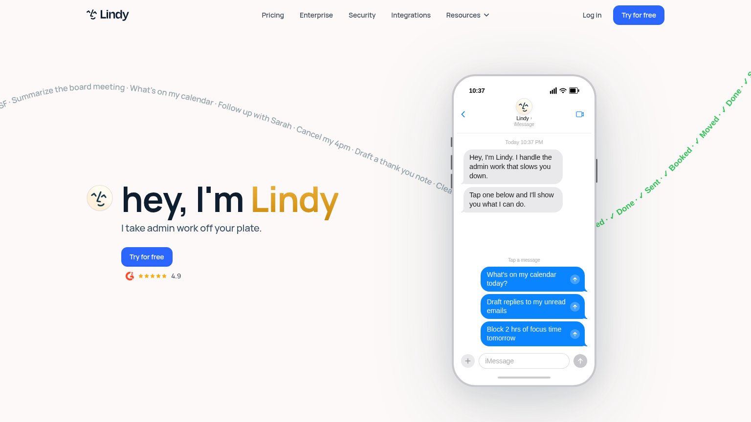
  • click feels like a sales meeting
  • nav says 'Get Started', hero differs
  • no product value in the copy
  • small footprint vs huge headline

Value props

58Fair

Title, subtitle, hero — do they sell the product's true value?

Trace’s headline vagueAI orchestration layer for modern teamsAn operational layer that understands how your company works — aligning AI agents and human judgment across departments to unlock leverage at scale.

Working

  • Names the category clearly
  • Human + AI framing hints at real angle
  • Logo wall adds credibility

Could improve

  • "Unlock leverage at scale" is filler
  • No numbers or concrete outcomes
  • Desktop hero art shows nothing

Trust

66Fair

Proof that the product is real, competent, and safe to try.

Trace
Zapier (AI Agents)
Trust read
TraceProduct Hunt "#1 Product of the Month" badge alongside Launch YC (1038 upvotes) in the mobile fold
Relevance AINo visible trust signal identified.
LindyG2 badge with 4.9 star rating below the "Try for free" CTA
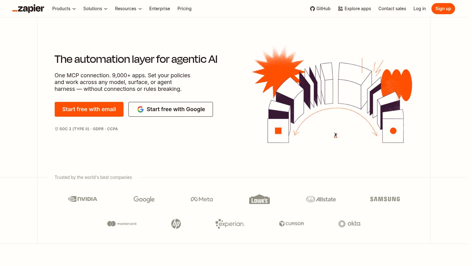
Zapier (AI Agents)"Trusted by the world's best companies" logo wall (NVIDIA, Google, Meta, Lowe's, Allstate, Samsung, Mastercard, HP, Expe
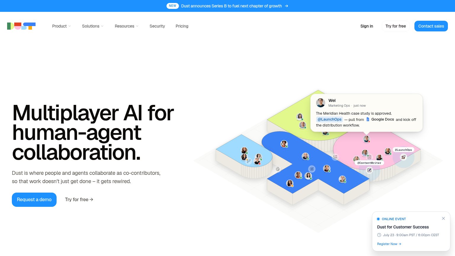
DustNo visible trust signal identified.
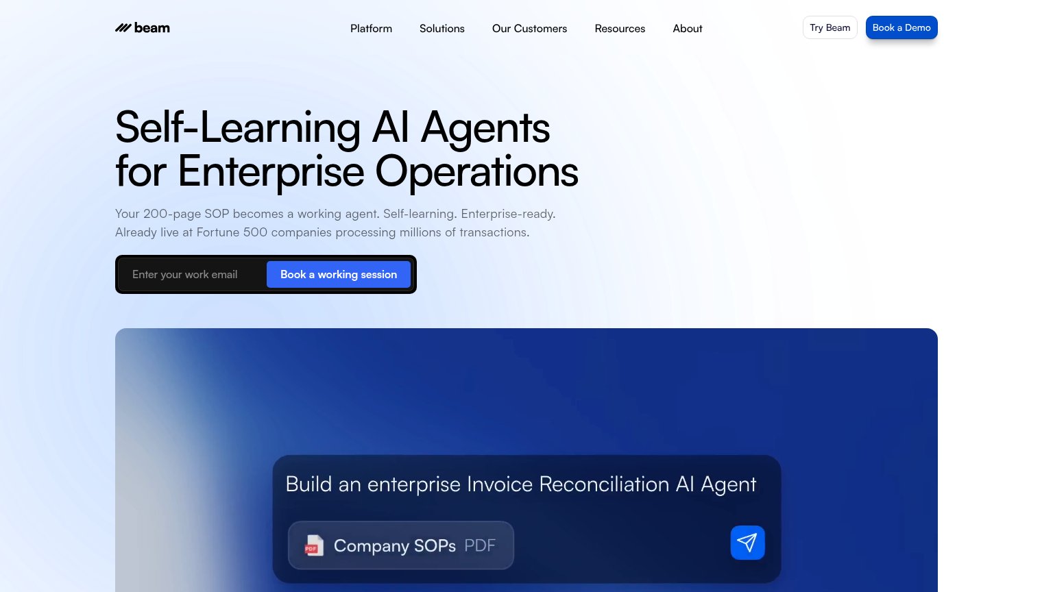
Beam AINo visible trust signal identified.

Information hierarchy

76Fair

Does the design help or inhibit what the page is trying to say?

Information hierarchy annotations on the desktop capture123
  1. Dual CTA labels — Nav says "Get Started" while the hero says "Get In Touch" — two competing primary actions with different promises split the scan path.
  2. Get In Touch button — Small dark button with a low-commitment contact label reads weaker than the nav's "Get Started", muting the fold's single conversion point.
  3. ASCII hero artwork — The abstract dot-matrix graphic occupies ~40% of the fold but communicates nothing about orchestration, competing with the headline for attention.