
Your landing page’s weakest score is Trust.
How Panoptive ranks
65Growth scoreupdated
category scores
category scoresShowHide
Score over time
Trust
38PoorProof that the product is real, competent, and safe to try.
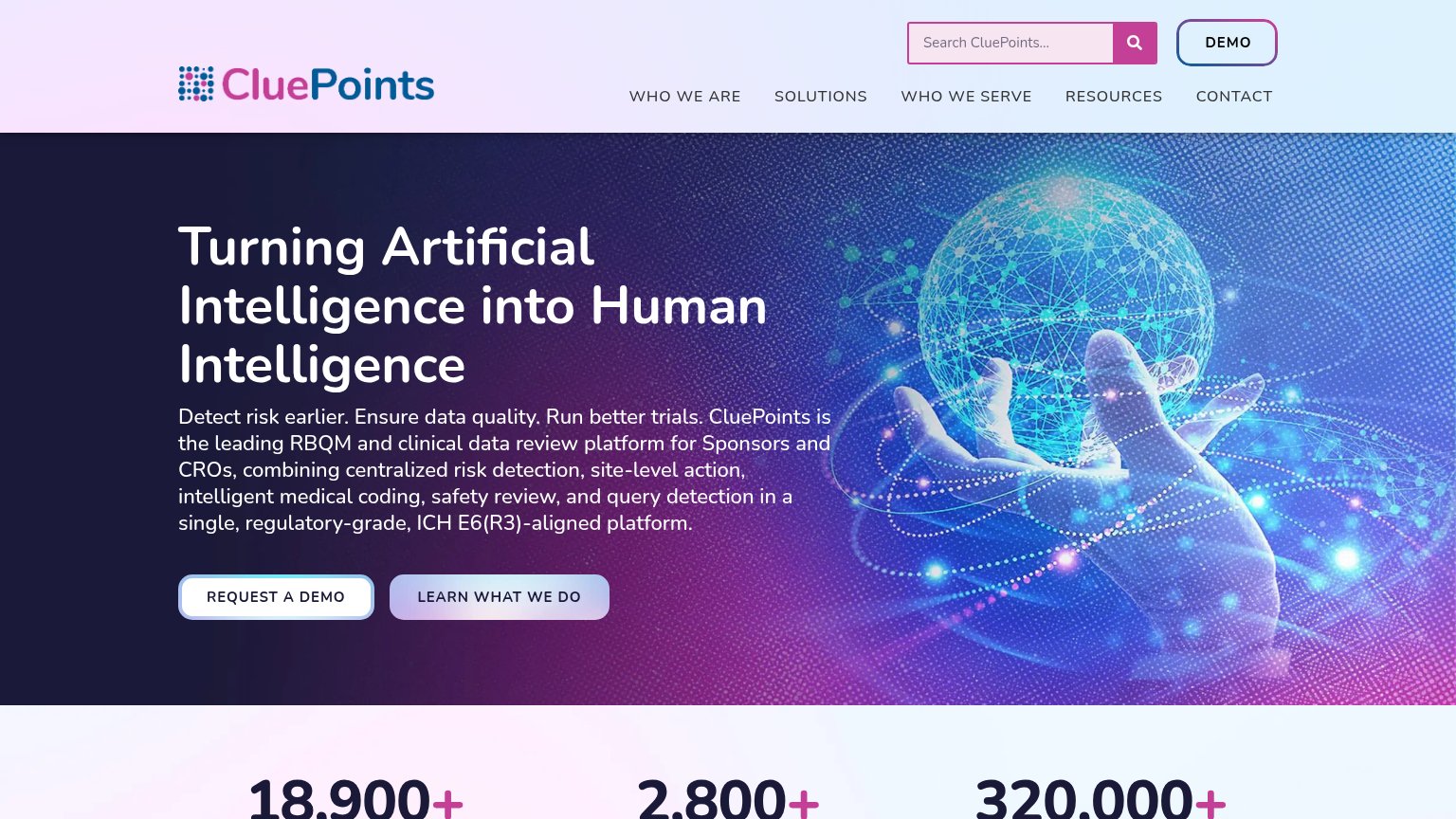


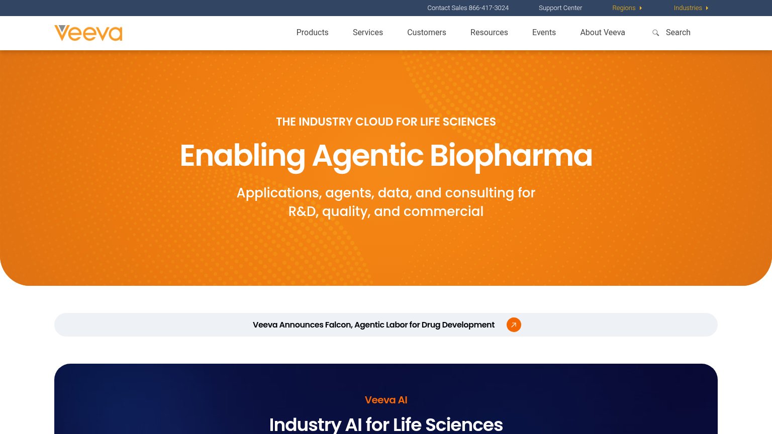
| Trust read | |
|---|---|
| Panoptive | No visible trust signal identified. |
| Stats bar showing "18,900+", "2,800+", "320,000+" below the hero | |
| No visible trust signal identified. | |
| "Saama Wins “AI-based Life Sciences Solution of the Year” Award in 2026 AI Breakthrough Awards" banner | |
| Webinar card citing "expert discussion with Worldwide Clinical Trials" (mobile) | |
| Announcement banner: "Veeva Announces Falcon, Agentic Labor for Drug Development" |
Mobile web
68FairThe phone experience as a first-class citizen.
 123
- Primary CTA below fold — "Start a pilot" sits ~1100px down the viewport, pushed near or past the first screen edge on shorter phones.
- Stacked hero messages — Headline, four-line subhead, and a bolded second tagline compete before the visitor reaches any action.
- Start a pilot button — Desktop-proportioned width instead of a full-bleed, thumb-friendly bar; twinned with an equal-weight "See how it works" below it.
CTA
72FairCopy, size, verb, cost-feel — does the primary CTA earn the click?
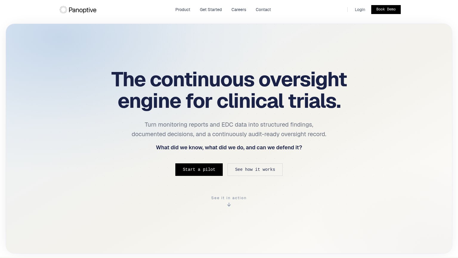
Problems
- 'pilot' implies sales-heavy commitment
- competes with nav 'Book Demo' label
- no visible zero-cost entry point
Value props
72FairTitle, subtitle, hero — do they sell the product's true value?
Panoptive’s headline sells
The continuous oversight engine for clinical trials.
Turn monitoring reports and EDC data into structured findings, documented decisions, and a continuously audit-ready oversight record.
Working
- Concrete domain nouns: EDC, findings, audit-ready
- "Can we defend it?" hits real audit anxiety
- Clear audience: clinical trial oversight teams
Could improve
- No numbers or proof points in the fold
- Hero decorates; never shows the product
- "Engine" is abstract without a visual
Information hierarchy
76FairDoes the design help or inhibit what the page is trying to say?
1234- Book Demo nav button — Second black filled button competes with 'Start a pilot' for the primary action — two conversion asks split intent.
- See how it works button — Same size and adjacency as the primary CTA; equal-weight pairing halves the pull of 'Start a pilot'.
- Nav link row — Product, Get Started, Careers, Contact plus Login — five exits sit above the CTA before the pitch lands.
- Get Started nav link — Ambiguous third conversion path duplicating the hero CTA's job with no visual hierarchy between them.