
Your landing page’s weakest score is Value props.
How Panels ranks
- 1.
Vapi78
- 2.
Bland AI76
- 3.
Retell AI74
- 4.
Panels36
36Growth scoreupdated
category scores
category scoresShowHide
Score over time
Value props
28PoorTitle, subtitle, hero — do they sell the product's true value?
Panels’s headline vague
We power the next generation of Voice AI
Working
- Names the Voice AI category
- Short and legible on both viewports
Could improve
- No hint of what Panels does
- No subhead, proof, or numbers
- Gradient hero shows nothing
CTA
30PoorCopy, size, verb, cost-feel — does the primary CTA earn the click?
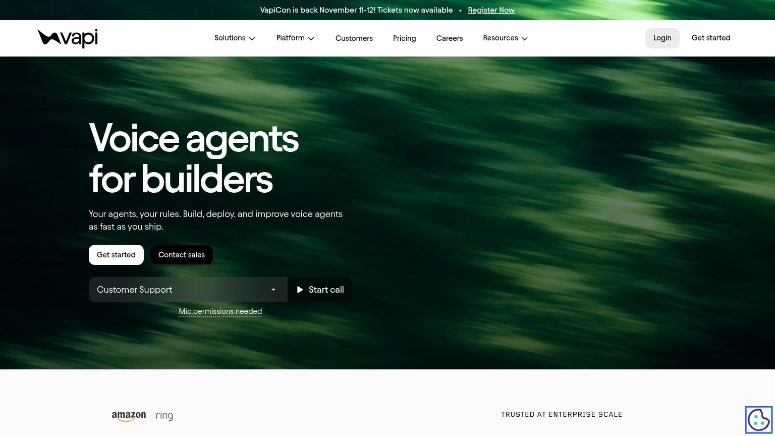

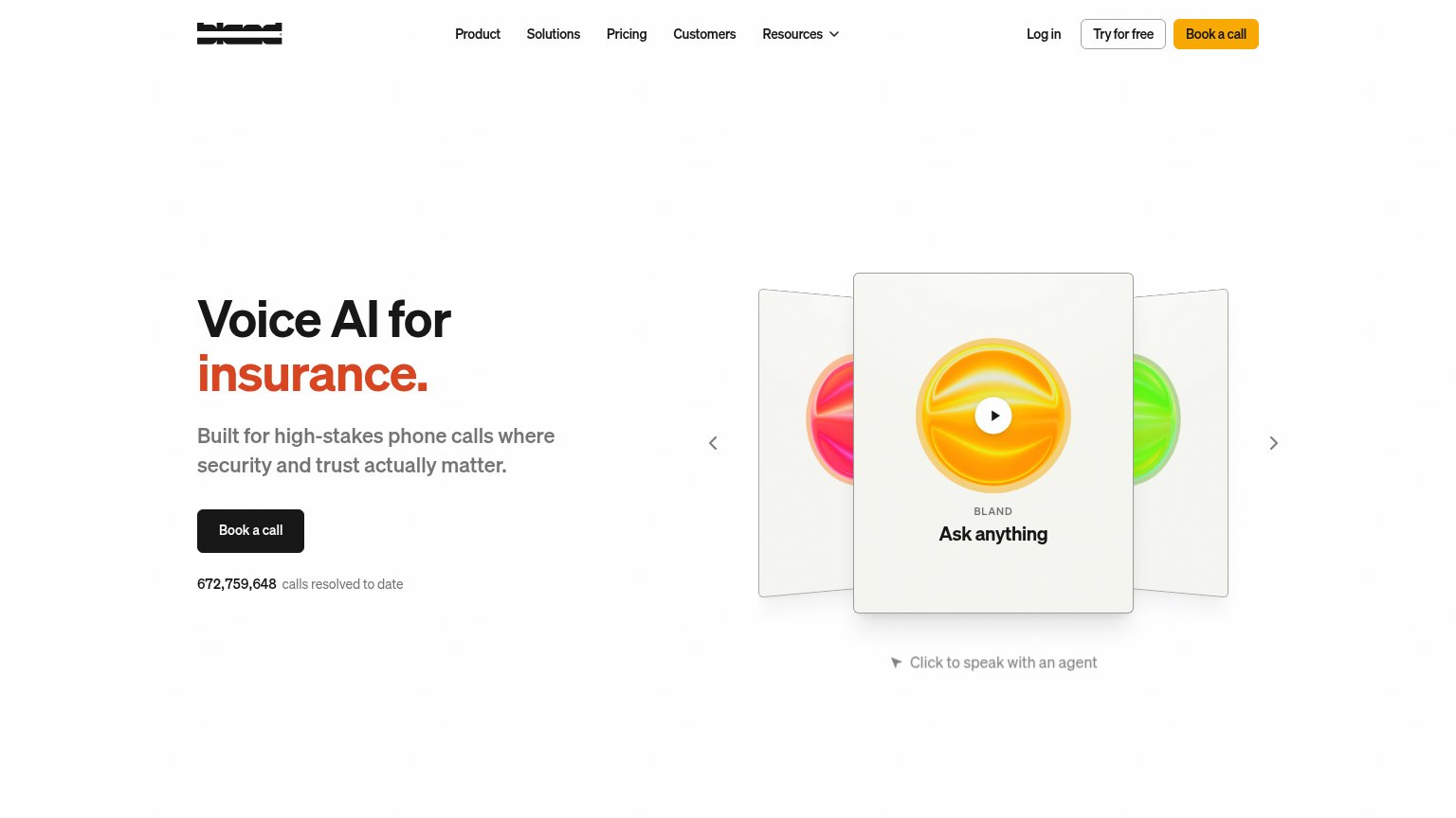
Problems
- no CTA anywhere in the fold
- nav has only Home and Contact
- mobile fold is headline-only
- no next step after headline
Trust
30PoorProof that the product is real, competent, and safe to try.
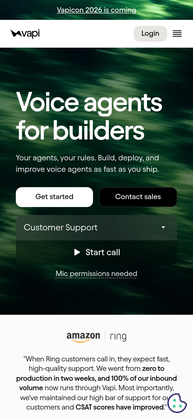
| Trust read | |
|---|---|
| Panels | No visible trust signal identified. |
| Ring testimonial: "We went from zero to production in two weeks, and 100% of our inbound volume now runs through Vapi" b | |
| G2 4.8-star rating badge above the subheadline | |
| "672,759,648 calls resolved to date" counter beneath the Book a call CTA |
Information hierarchy
42PoorDoes the design help or inhibit what the page is trying to say?
 12
- Hero headline contrast — "next generation" fades into the pink-blue gradient at nearly the same luminance, making the core phrase hard to read.
- Home/Contact nav links — The only clickable elements above the fold are exits — with no CTA present, all attention leaks to these two links.
Mobile web
48PoorThe phone experience as a first-class citizen.
 123
- Hero headline block — No CTA accompanies the headline — the entire mobile fold offers nothing to tap.
- Panels wordmark — Dark serif logo nearly vanishes against the dusky gradient background.
- Hamburger menu icon — Thin low-contrast lines make the only interactive element easy to miss.