
Your landing page’s weakest score is Trust.
How Paloma ranks
- 1.
Basis (Build with Basis)68
- 2.
Paloma61
61Growth scoreupdated
category scores
category scoresShowHide
Trust
38PoorProof that the product is real, competent, and safe to try.

| Trust read | |
|---|---|
| Paloma | No visible trust signal identified. |
| "$700M+" / "60+" / "2023" transaction stats band with the named deal "Navajo Power Home — SALE OF ITCS" |
Value props
58FairTitle, subtitle, hero — do they sell the product's true value?
Paloma’s headline vague
Purpose-built software for companies that make real things
The tools your operations team would build themselves, if they had the engineers. We're those engineers.
Working
- Subhead names a real pain: no engineers
- Clear audience: physical-goods companies
- Confident, distinct voice
Could improve
- Headline names no outcome or benefit
- Hero photo shows scenery, not the product
- Zero numbers or proof points in fold
Mobile web
62FairThe phone experience as a first-class citizen.
 123
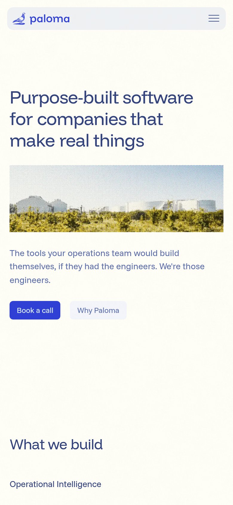
- Book a call button — Primary CTA sits below the first viewport and is desktop-sized, not full-bleed for thumbs.
- Hero factory image — Full-width image plus long subhead pushes the only CTA out of the first screen.
- Why Paloma button — Low-contrast secondary button crowds the primary CTA on the same row, splitting the tap target.
CTA
72FairCopy, size, verb, cost-feel — does the primary CTA earn the click?
Problems
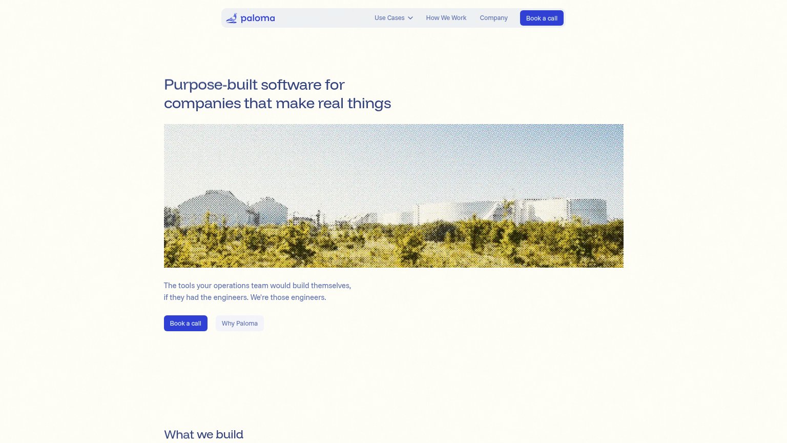
- click feels costly — sales call
- no low-commitment alternative path
- modest footprint vs headline
Information hierarchy
76FairDoes the design help or inhibit what the page is trying to say?
123- Subheadline below hero image — The value line 'The tools Paloma's operations team would build themselves' sits 550px down, beneath the image, so the promise is separated from the headline that sets it up.
- Duplicate Book a call — Two 'Book a call' buttons in one fold (nav and hero) split the primary action; the nav copy competes at equal weight with the hero CTA.
- Hero factory image — The dithered industrial photo is the largest element in the fold and outranks both the headline above and the CTA below it in the scan path.