
Your landing page’s weakest score is Information hierarchy.
How Modelence ranks
- 1.
Replit82
- 2.
Modelence76
- 3.
v0 by Vercel74
- 4.
Bolt.new73
- 5.
Create37
76Growth scoreupdated
category scores
category scoresShowHide
Score over time
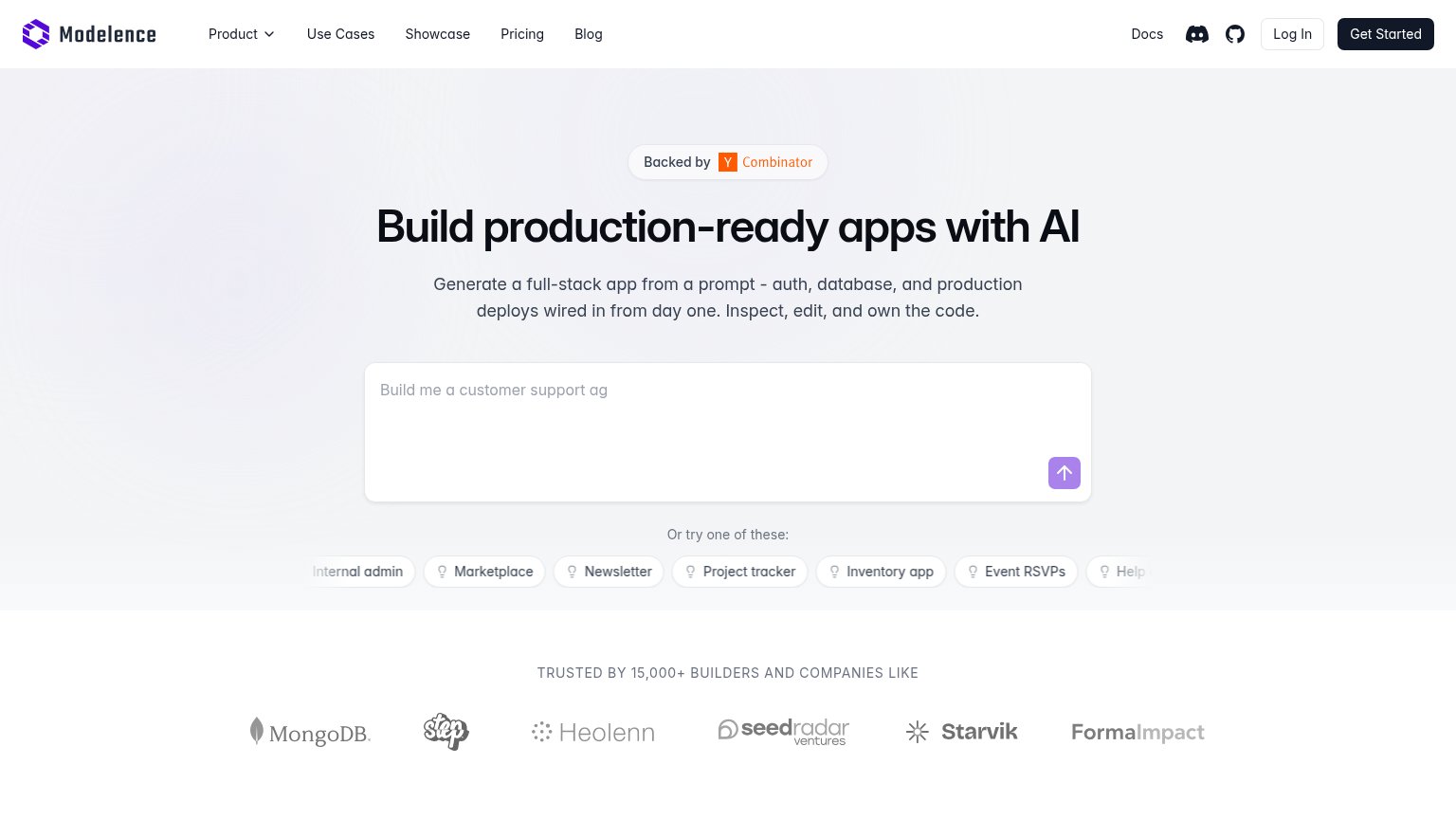
Information hierarchy
72FairDoes the design help or inhibit what the page is trying to say?
 123
- Header nav links — Nine equal-weight exits (Product, Use Cases, Showcase, Pricing, Blog, Docs, Discord, GitHub, Log In) compete with the prompt box before a visitor types anything.
- Prompt submit arrow — The primary action is a small pale-purple icon button inside the textarea — low contrast and no label, easy to miss on first scan.
- Suggestion chip row — Chips are cut off at both edges ("Internal admin", "Help…"), signaling an auto-scrolling carousel that adds motion and truncated text under the CTA.
Trust
72FairProof that the product is real, competent, and safe to try.
| Trust read | |
|---|---|
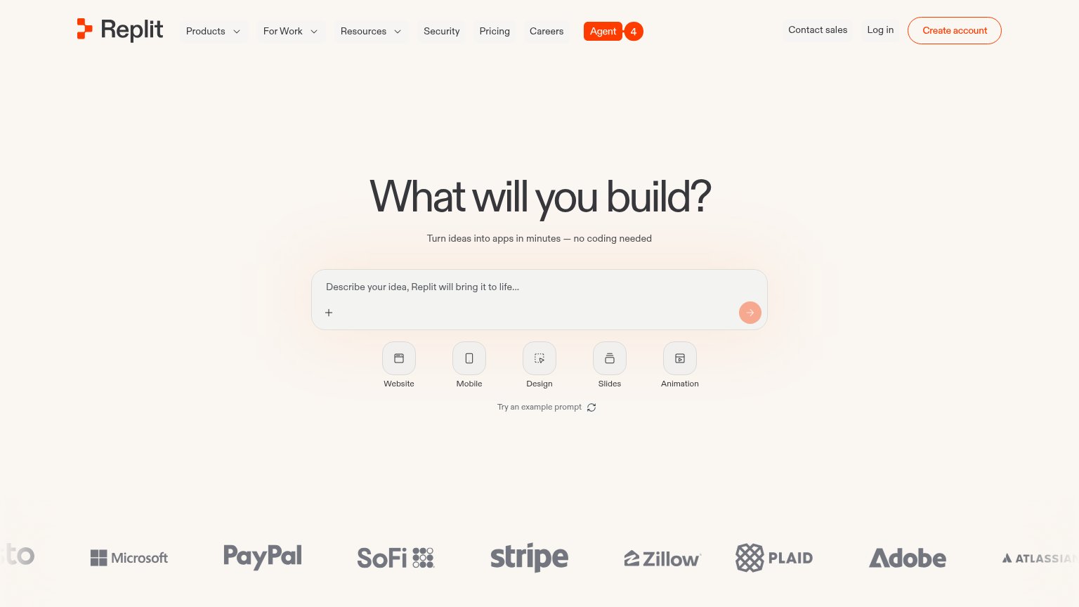
| Modelence | "TRUSTED BY 15,000+ BUILDERS AND COMPANIES LIKE" logo strip with MongoDB logo |
| Functional AI prompt box with Figma and GitHub import options showing real product entry points | |
| Customer logo wall featuring Microsoft, PayPal, SoFi, Stripe, Zillow, Plaid, Adobe, and Atlassian | |
| Template gallery with real community usage counts — "Image Generation Playground · 6.6K · 734" | |
| No visible trust signal identified. |
CTA
78FairCopy, size, verb, cost-feel — does the primary CTA earn the click?

Problems
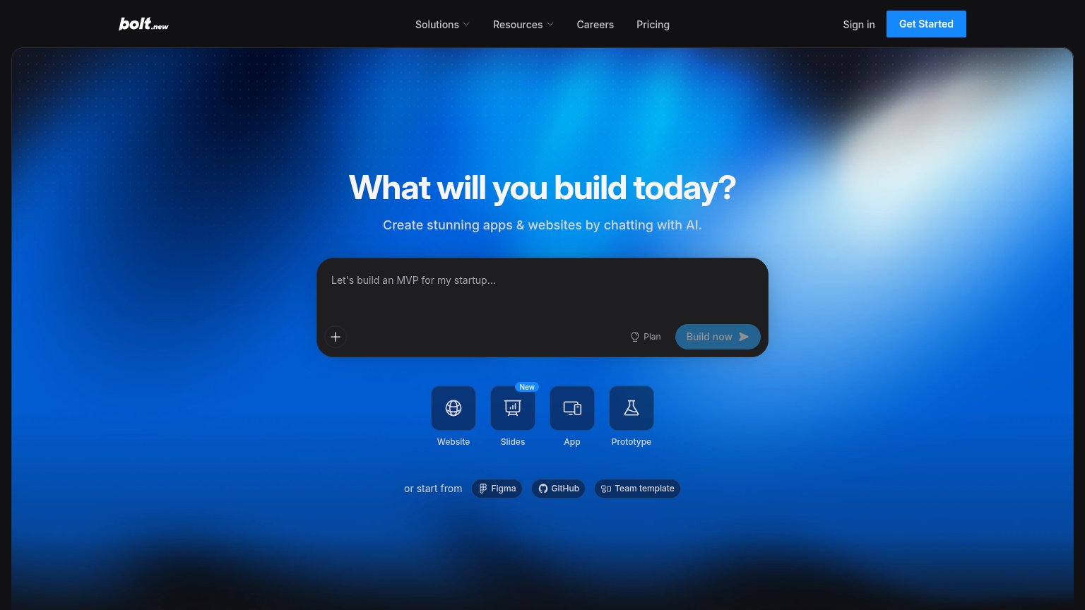
- icon-only arrow submit, no label
- unclear if prompt hits signup wall
- nav 'Get Started' competes generically
Value props
78FairTitle, subtitle, hero — do they sell the product's true value?
Modelence’s headline sells
Build production-ready apps with AI
Generate a full-stack app from a prompt - auth, database, and production deploys wired in from day one. Inspect, edit, and own the code.
Working
- 'Production-ready' is a real differentiator
- Subhead lists concrete stack pieces
- 'Own the code' defuses lock-in fear
Could improve
- No speed or outcome numbers
- Hero shows input box, not result
- Headline echoes rival AI builders
Mobile web
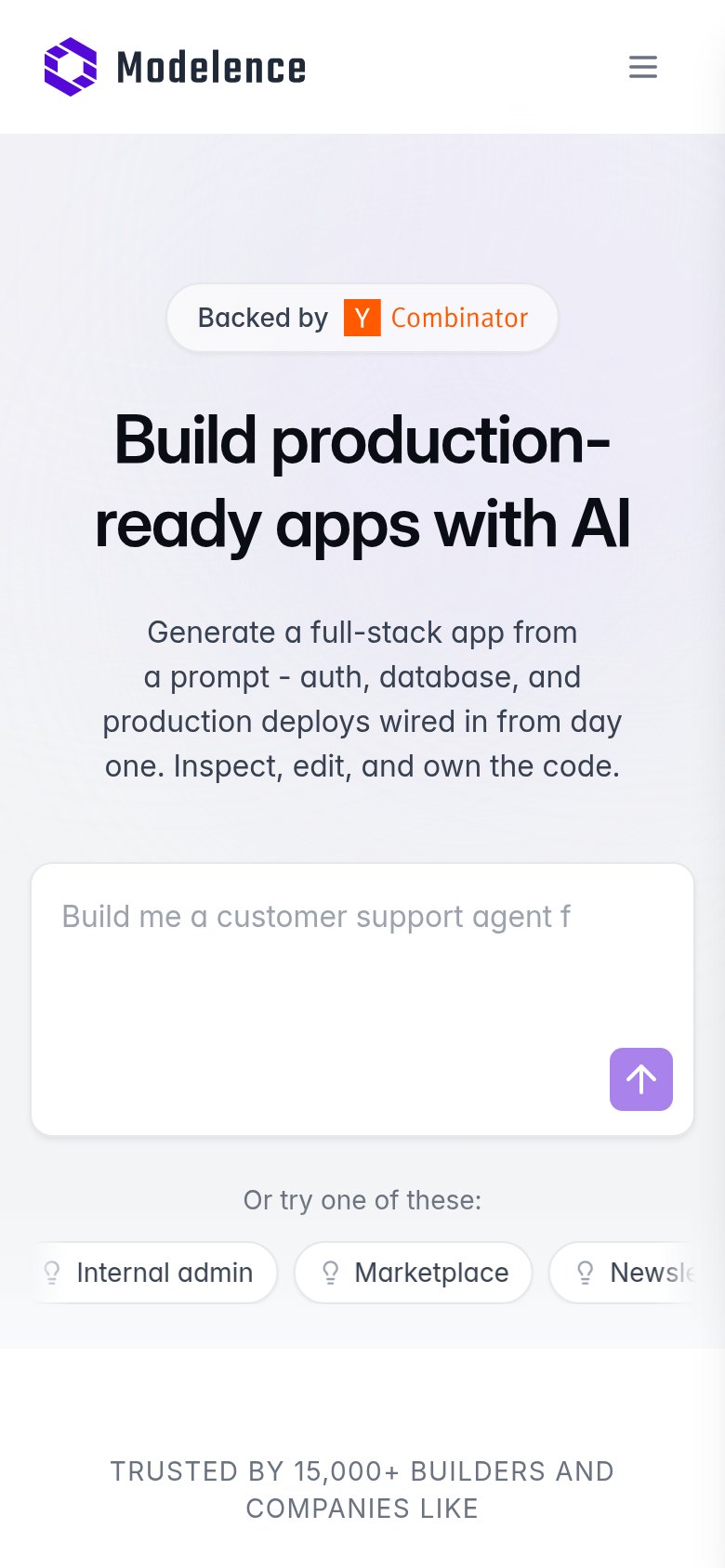
78FairThe phone experience as a first-class citizen.
 123
- Small arrow submit icon — The only visible submit control is an unlabeled icon in the input corner, not a thumb-friendly labeled button.
- Hidden header CTAs — Desktop's Get Started and Log In buttons collapse fully into the hamburger, removing a persistent conversion path.
- Truncated suggestion chip — The third example chip clips mid-word ("Newsle…") with no visible scroll affordance.