
Your landing page’s weakest score is Value props.
How Locata ranks
71Growth scoreupdated
category scores
category scoresShowHide
Score over time
Value props
58FairTitle, subtitle, hero — do they sell the product's true value?
Locata’s headline undersells
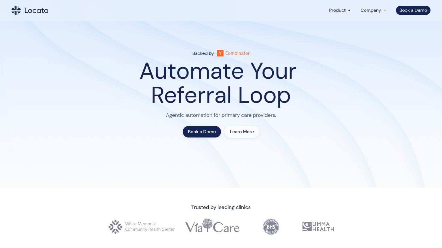
Automate Your Referral Loop
Agentic automation for primary care providers.
Working
- Names a specific workflow: referrals
- Targets primary care providers clearly
- Clinic logos add credible proof
Could improve
- 'Agentic' is jargon, not an outcome
- No numbers or concrete results
- Empty hero — no product shown
Trust
68FairProof that the product is real, competent, and safe to try.
| Trust read | |
|---|---|
| Locata | "Trusted by leading clinics" logo strip (White Memorial, ViaCare, BHS, UMMA Health) |
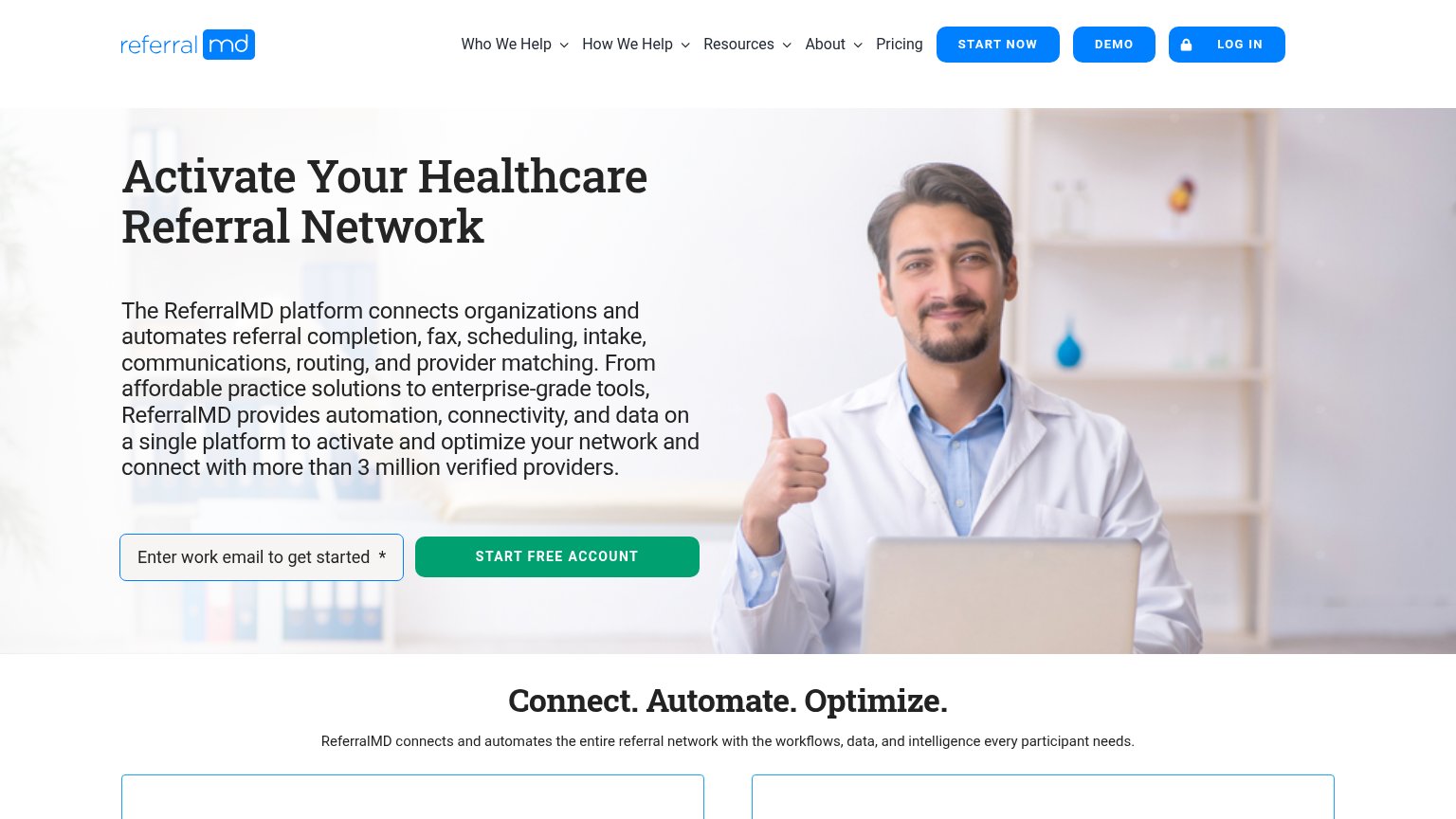
| "connect with more than 3 million verified providers" | |
| Care Orchestration Hub product screenshot with "4 AI agents · 12 sites · 18,442 patients" and metrics like "94.2% work h | |
| No visible trust signal identified. | |
| No visible trust signal identified. |
CTA
72FairCopy, size, verb, cost-feel — does the primary CTA earn the click?
Problems
- click feels costly — sales meeting
- no self-serve or low-commit path
- no header language echo
Information hierarchy
78FairDoes the design help or inhibit what the page is trying to say?
12- Duplicate Book a Demo — Nav button matches the hero CTA's dark style at equal weight, splitting attention between two identical actions.
- Hero Book a Demo — Undersized against the giant headline; the primary action reads as an afterthought below the copy.
Mobile web
80StrongThe phone experience as a first-class citizen.
 1
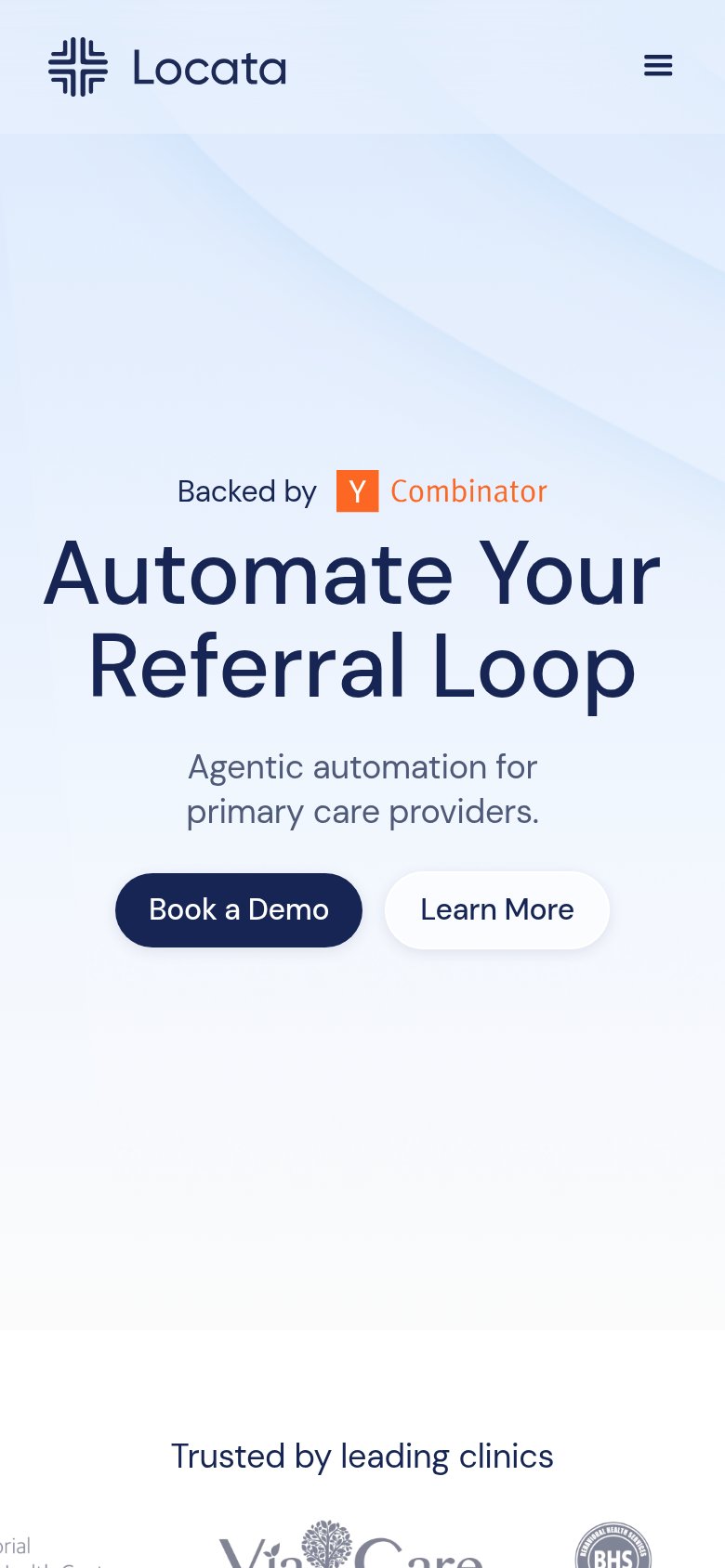
- Book a Demo button — Desktop-proportioned half-width button; on mobile it should be near full-bleed for an easy thumb tap.
Competitors
inferred from product, audience, and value prop#1 Locata71
#2