
Your landing page’s weakest score is Trust.
How ReferralMD ranks
Trust
44PoorProof that the product is real, competent, and safe to try.

| Trust read | |
|---|---|
| ReferralMD | "connect with more than 3 million verified providers" |
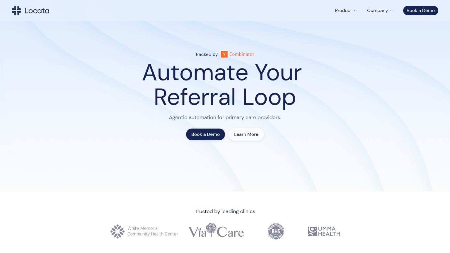
| "Trusted by leading clinics" logo strip (White Memorial, ViaCare, BHS, UMMA Health) | |
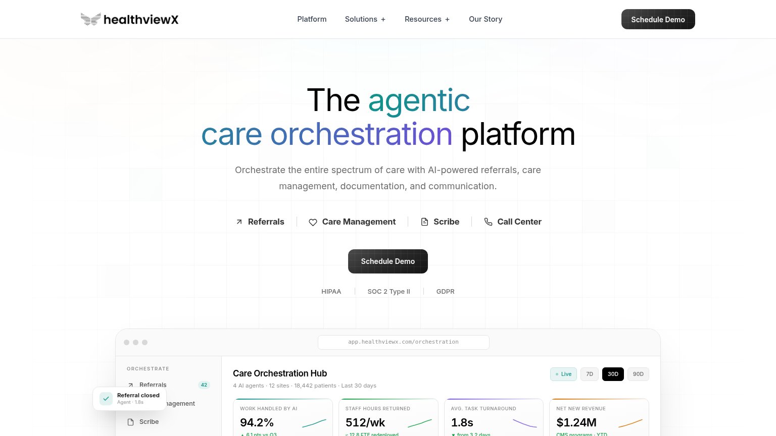
| Care Orchestration Hub product screenshot with "4 AI agents · 12 sites · 18,442 patients" and metrics like "94.2% work h | |
| No visible trust signal identified. | |
| No visible trust signal identified. |
Mobile web
48PoorThe phone experience as a first-class citizen.
 123
- Oversized hero paragraph — Full desktop copy block at inflated type fills the entire fold and pushes the signup CTA off-screen.
- CTA cut off — The primary email/signup control appears only as a sliver at the bottom edge, not tappable in the first viewport.
- Wrapping START NOW pill — Header CTA label breaks onto two lines, making the button look broken and cramped.
Value props
62FairTitle, subtitle, hero — do they sell the product's true value?
ReferralMD’s headline
Activate Your Healthcare Referral Network
The ReferralMD platform connects organizations and automates referral completion, fax, scheduling, intake, communications, routing, and provider matching. From affordable practice solutions to enterprise-grade tools, ReferralMD provides aut
Working
Could improve
Information hierarchy
66FairDoes the design help or inhibit what the page is trying to say?
What works
What to improve
CTA
78FairCopy, size, verb, cost-feel — does the primary CTA earn the click?
How ReferralMD compares
Recommended rewrites