Past reportsShow past reportsHide past reports
- Sep 22, 202674LiveOverall +3 · Trust +20 · Value props −10Viewing
- Jul 6, 202671First tracked report — strongest Value props 88, weakest Trust 52View →

Your landing page’s weakest score is CTA.
How Lanesurf ranks
category scores
Copy, size, verb, cost-feel — does the primary CTA earn the click?
Problems
Proof that the product is real, competent, and safe to try.
| Trust read | |
|---|---|
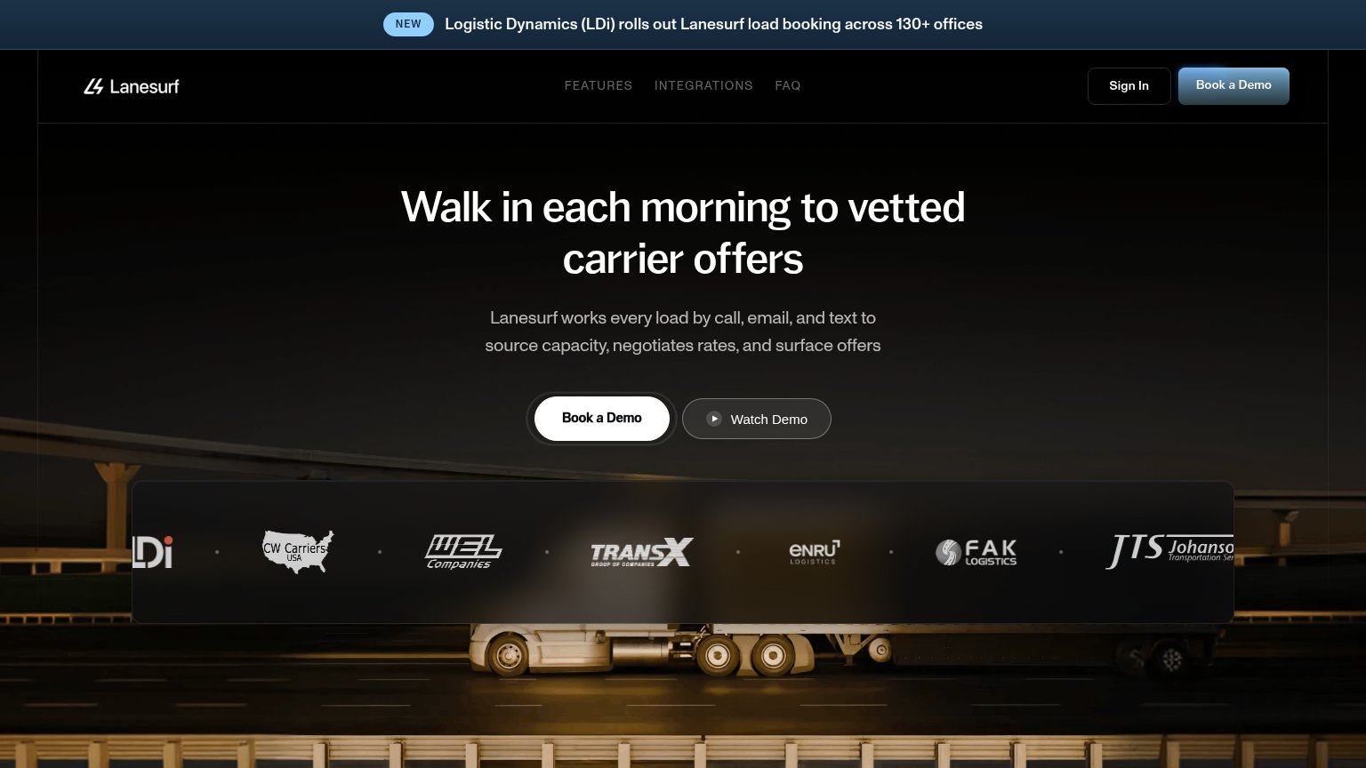
| Lanesurf | "Logistic Dynamics (LDi) rolls out Lanesurf load booking across 130+ offices" announcement banner |
| "HAPPYROBOT RAISES ITS SERIES C TO PUT AI WORKERS TO WORK ACROSS THE REAL ECONOMY" announcement banner | |
| "FleetWorks + SONAR: live market data in every AI conversation" partnership banner | |
| "TRUSTED BY INDUSTRY LEADERS OF ALL SIZES" logo band with ArcBest, Echo, Evans, NFI, Sunset, and Kingsgate | |
| 'Control Tower' product dashboard showing 'Incoming Emails (Daily)' chart and 'Emails processed last 30 days' panel | |
| Product UI demo showing load building (FL Jacksonville → MA Boston) with McLeod, Tai, Revenova, DAT integration logos |
The phone experience as a first-class citizen.
 123
Does the design help or inhibit what the page is trying to say?
1234Title, subtitle, hero — do they sell the product's true value?
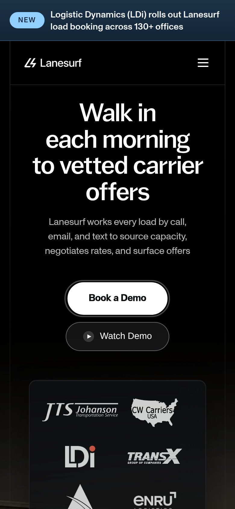
Walk in each morning to vetted carrier offers
Lanesurf works every load by call, email, and text to source capacity, negotiates rates, and surface offers
Working
Could improve
You need a lazyweb account to add your product, do a growth audit, create backlog and more
Sign me in to my Lazyweb report hub. Fetch https://www.lazyweb.com/hub/agent/sign-in.md and follow its instructions exactly. If you can't fetch URLs, tell me and I'll paste the instructions instead.
Lazyweb MCP
Step 1 of 2 · your login
Where should we send your reports? This email becomes your login on lazyweb.com — everything your agent makes lands in your workspace.
That doesn't look like an email — check it and try again.
No password, no spam — one workspace link now, then your agent command.
Step 2 of 2 · your agent
Paste this into your agent. Claude Code, Codex, Cursor, or another MCP-capable agent opens the link and sets itself up. Data access is plan-dependent.
Generating your agent command...
Free account
We’ll add Lanesurf as your product and bring this score into your workspace. You can change it later in Settings.