
Your landing page’s weakest score is Value props.
How Imprezia ranks
75Growth scoreupdated
category scores
category scoresShowHide
Score over time
Value props
68FairTitle, subtitle, hero — do they sell the product's true value?
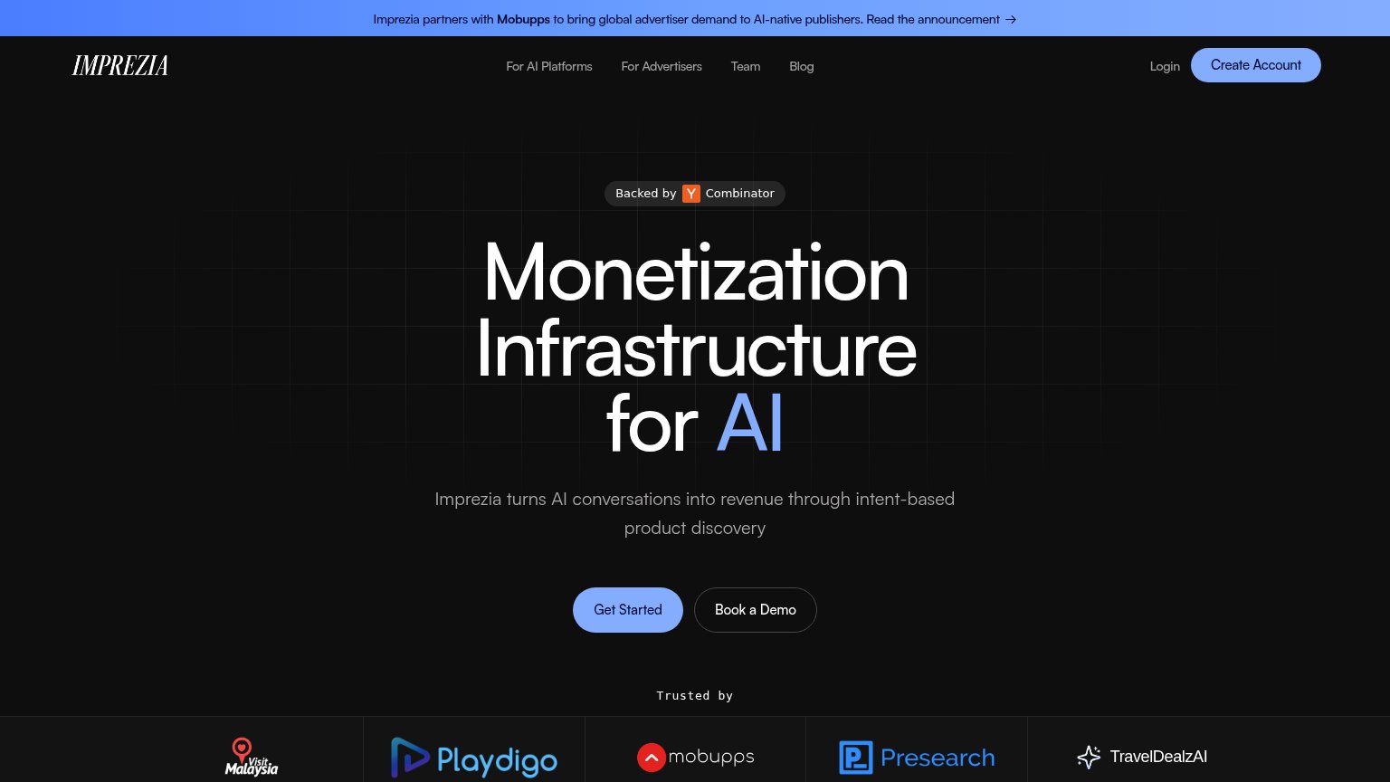
Imprezia’s headline sells
Monetization Infrastructure for AI
Imprezia turns AI conversations into revenue through intent-based product discovery
Working
- Subhead names the real mechanism
- YC badge + logo bar add credibility
- No inflated abstraction stack
Could improve
- Zero numbers or proof metrics in fold
- 'Infrastructure' is cold and affectless
- Desktop hero shows no product in action
CTA
72FairCopy, size, verb, cost-feel — does the primary CTA earn the click?
Problems
- generic label, no headline echo
- competes with nav 'Create Account'
- no payoff or value in copy
Trust
76FairProof that the product is real, competent, and safe to try.
| Trust read | |
|---|---|
| Imprezia | "Trusted by" logo strip (Visit Malaysia, Playdigo, Mobupps, Presearch, TravelDealzAI) plus "Backed by Y Combinator" badg |
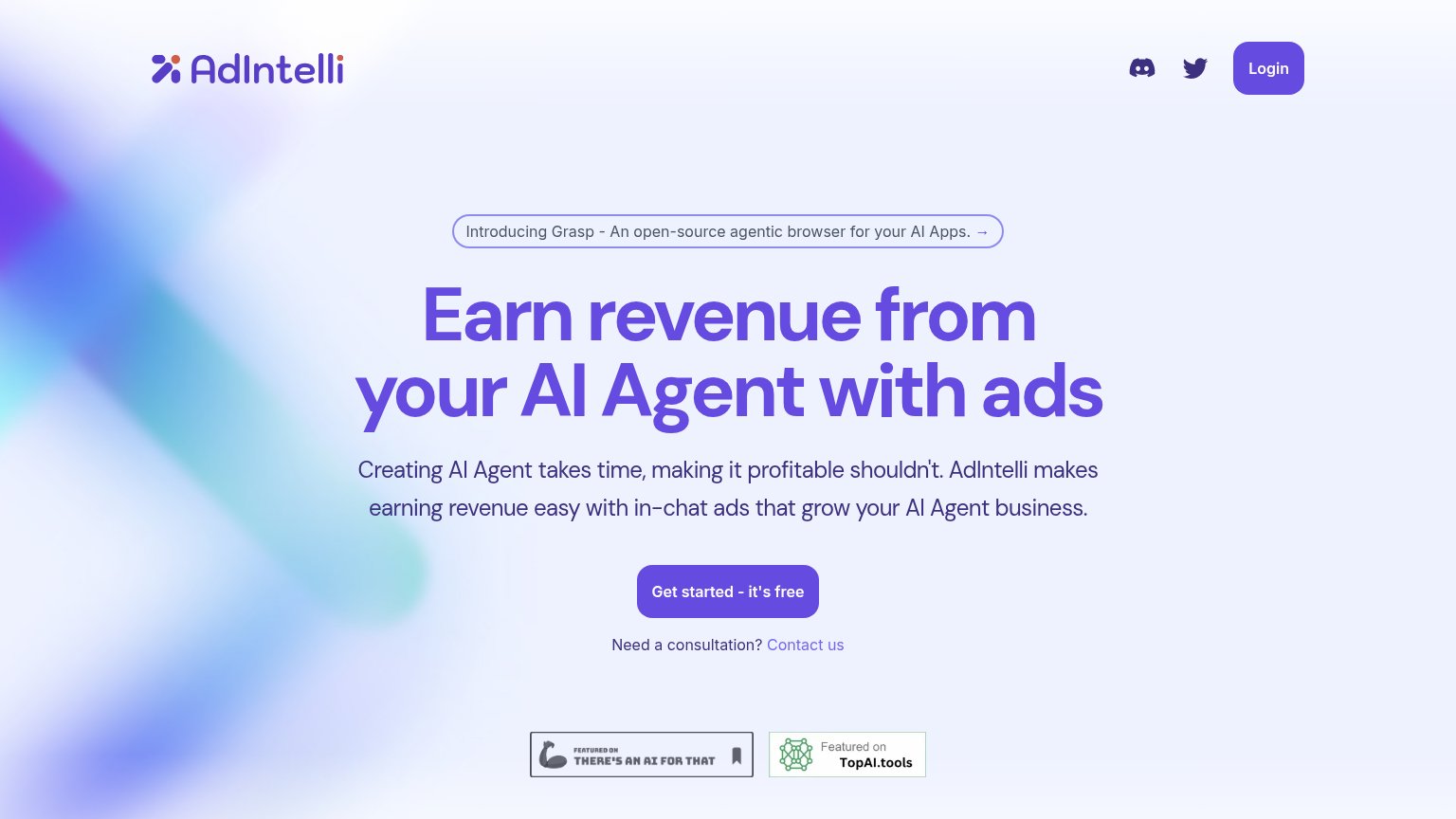
| No visible trust signal identified. | |
| "$20.5M Series A led by Theory Ventures" announcement banner | |
| "Featured on TopAI.tools" and "Featured on THERE'S AN AI FOR THAT" badges | |
| Press logo strip featuring Axios, Quartz, Inc., and Adweek |
Information hierarchy
78FairDoes the design help or inhibit what the page is trying to say?
123- Partnership announcement banner — Bright blue banner outranks the hero in contrast and pushes an outbound 'Read the announcement' link as the first thing scanned.
- Book a Demo button — Sits at nearly the same size and adjacency as Get Started, splitting the single conversion moment into two equal choices.
- Nav link row — Four nav links plus Login give five above-the-fold exits before the visitor reaches the hero CTA.
Mobile web
82StrongThe phone experience as a first-class citizen.
 123
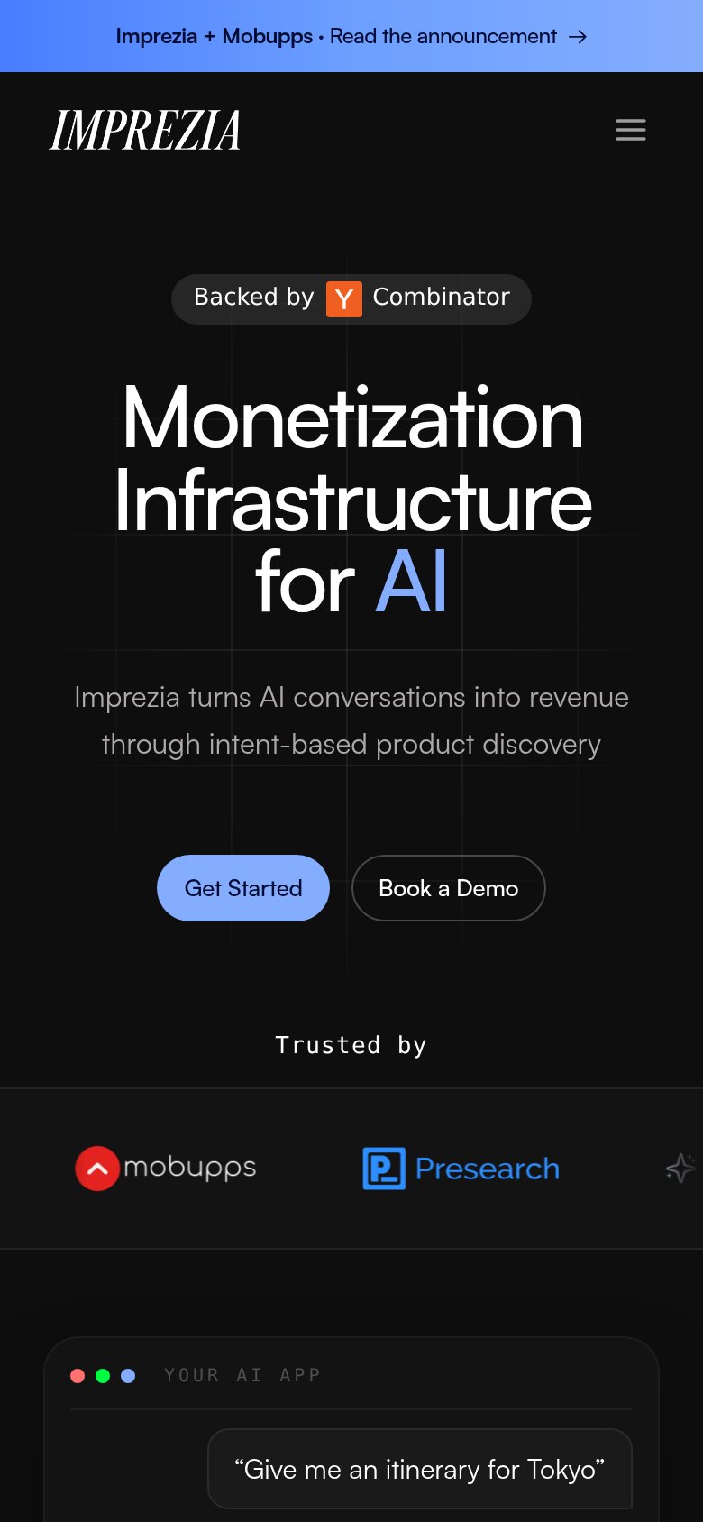
- Get Started button — Desktop-proportioned pill floating small in the phone column instead of a full-width, thumb-friendly primary CTA.
- Side-by-side CTA pair — "Get Started" and "Book a Demo" share equal visual weight, splitting the tap decision instead of establishing one primary action.
- Announcement banner — Bright partnership bar sits above the logo and adds a competing tap before the hero's value statement.