
Your landing page’s weakest score is Trust.
How ContextFort ranks
69Growth scoreupdated
category scores
category scoresShowHide
Score over time
Trust
58FairProof that the product is real, competent, and safe to try.
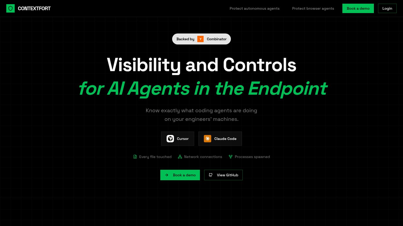
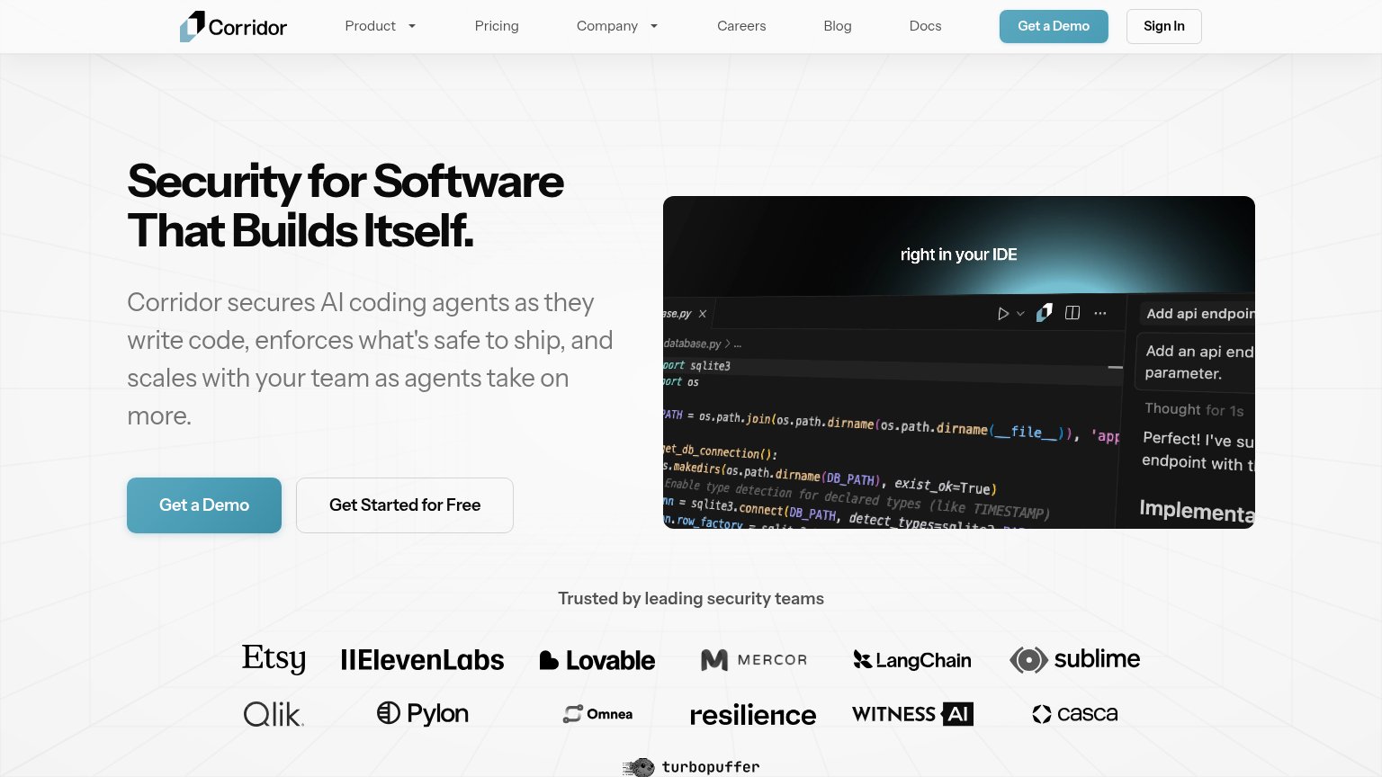
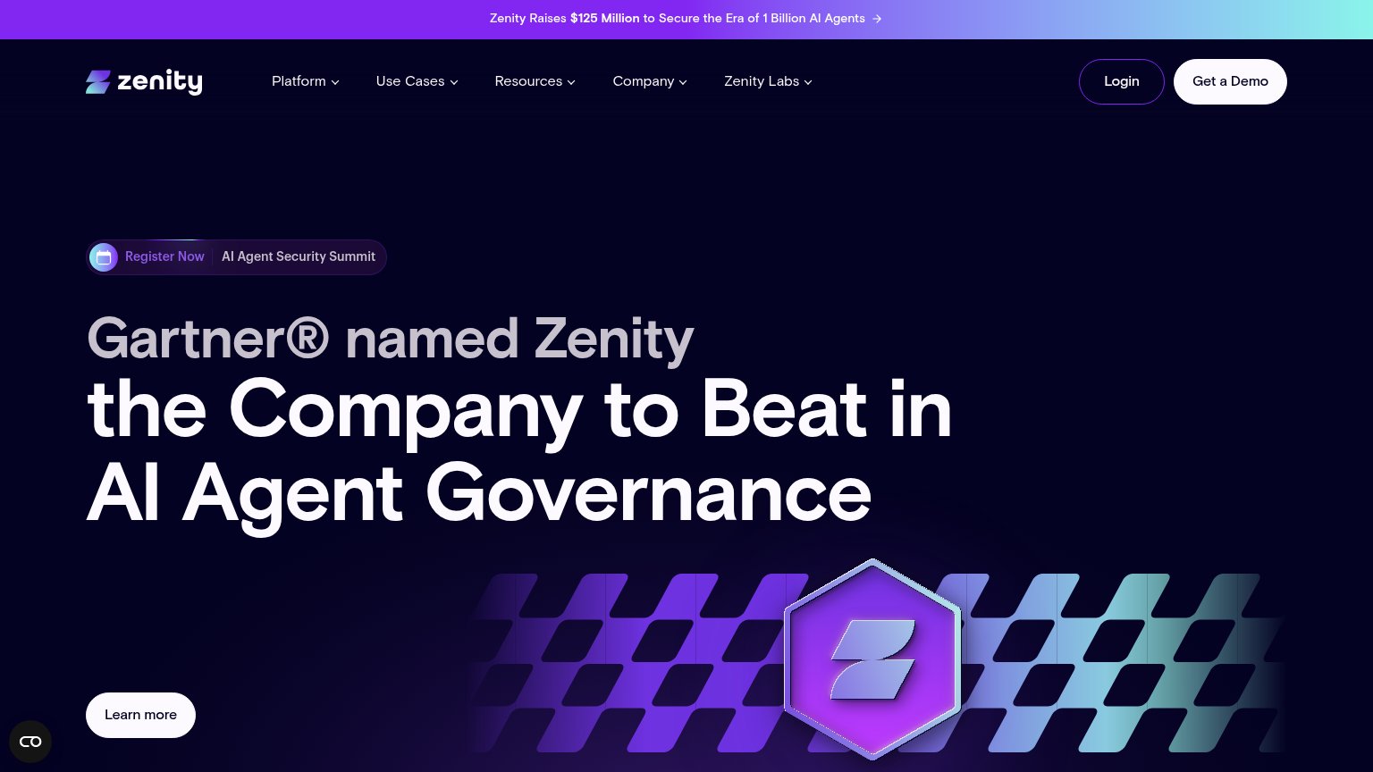
| Trust read | |
|---|---|
| ContextFort | "Backed by Y Combinator" badge |
| Customer logo wall (Etsy, ElevenLabs, Lovable, LangChain, Qlik) under "Trusted by leading security teams" | |
| "Snyk Acquires Invariant Labs to Accelerate Agentic AI Security Innovation" banner with "A snyk Company" logo mark | |
| Gartner® named Zenity the Company to Beat in AI Agent Governance | |
| SentinelOne | Prompt Security co-branded header lockup | |
| Subhead specificity: "We detect shadow AI, block data exfiltration, and stop destructive commands like rm -rf." |
Mobile web
68FairThe phone experience as a first-class citizen.
 123
- Clipped green headline — "for AI Agents in t" overflows the viewport and cuts off the key phrase "the Endpoint".
- Book a demo CTA — Primary CTA sits below the first mobile viewport, pushed down by the headline and feature stack.
- Feature label row — Three tiny gray labels wrap into cramped two-line columns that read poorly at phone size.
CTA
72FairCopy, size, verb, cost-feel — does the primary CTA earn the click?
Problems
- demo click feels costly, sales-gated
- no self-serve path despite GitHub repo
- payoff of the demo not stated
Value props
72FairTitle, subtitle, hero — do they sell the product's true value?
ContextFort’s headline sells
Visibility and Controls for AI Agents in the Endpoint
Know exactly what coding agents are doing on your engineers' machines.
Working
- Subhead names audience and fear precisely
- Cursor/Claude Code badges anchor the claim
- Proof chips list concrete monitored signals
Could improve
- No numbers or quantified outcomes anywhere
- No product screenshot proving "visibility"
- Mobile headline clips: "for AI Agents in t"
Information hierarchy
76FairDoes the design help or inhibit what the page is trying to say?
1234- Green italic headline line — Second headline line "for AI Agents in the Endpoint" overflows and clips on mobile, cutting the value prop mid-word.
- Duplicate Book a demo — Nav "Book a demo" duplicates the hero CTA at equal green weight, splitting the click between two identical targets.
- Cursor / Claude badges — Two dark badge chips sit between the subhead and the CTA row with no caption explaining what they are, interrupting the scan path to the action.
- View GitHub button — Secondary GitHub button matches the primary CTA's size and sits beside it, pulling technical visitors off-site before booking.