
Your landing page’s weakest score is CTA.
How Corridor ranks
77Growth scoreupdated
category scores
category scoresShowHide
CTA
72FairCopy, size, verb, cost-feel — does the primary CTA earn the click?
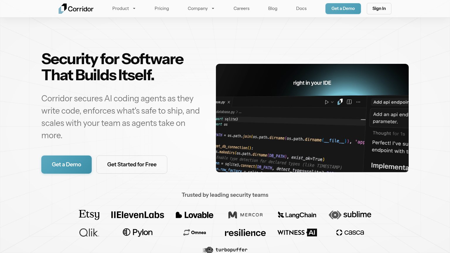
Problems
- demo ask outranks free self-serve
- no 'free' despite free tier
- demo click feels like a meeting
Information hierarchy
76FairDoes the design help or inhibit what the page is trying to say?
123- Seven-link nav bar — Product, Pricing, Company, Careers, Blog, Docs, and Sign In give attention seven exits before the demo CTA.
- Cropped IDE screenshot — Right edge cuts off its own copy ('Add api endpoin...', 'Implementa...'), making the product visual read broken.
- Get Started button — Same size and adjacency as 'Get a Demo', splitting the fold's one action into two equal choices.
Value props
76FairTitle, subtitle, hero — do they sell the product's true value?
Corridor’s headline
Security for Software That Builds Itself.
Corridor secures AI coding agents as they write code, enforces what's safe to ship, and scales with your team as agents take on more.
Working
Could improve
Trust
78FairProof that the product is real, competent, and safe to try.
How Corridor compares
Trust read
Mobile web
84StrongThe phone experience as a first-class citizen.
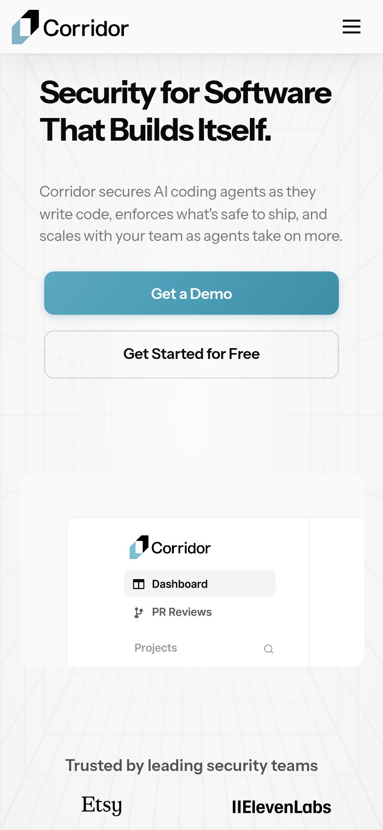
What works
What to improve