cocreateYC S25 landing page report.
← Back to YC S25

Your landing page’s weakest score is Trust.

How cocreate ranks

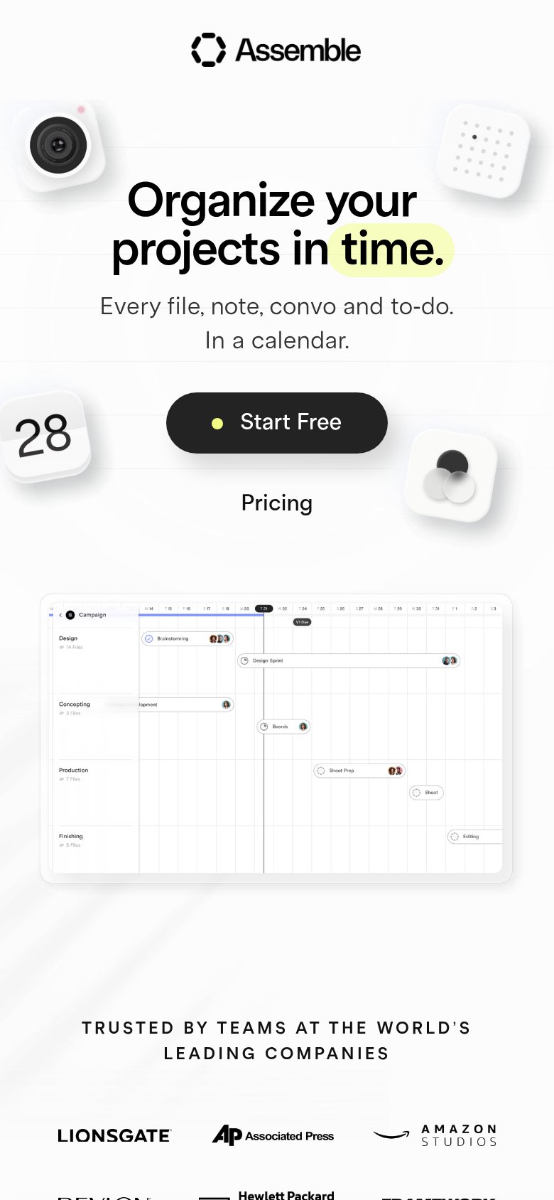
  1. 1.Assemble79
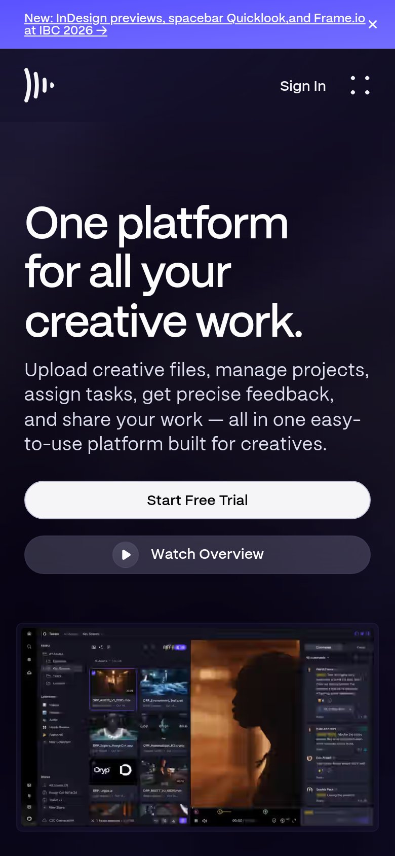
  2. 2.Frame.io76
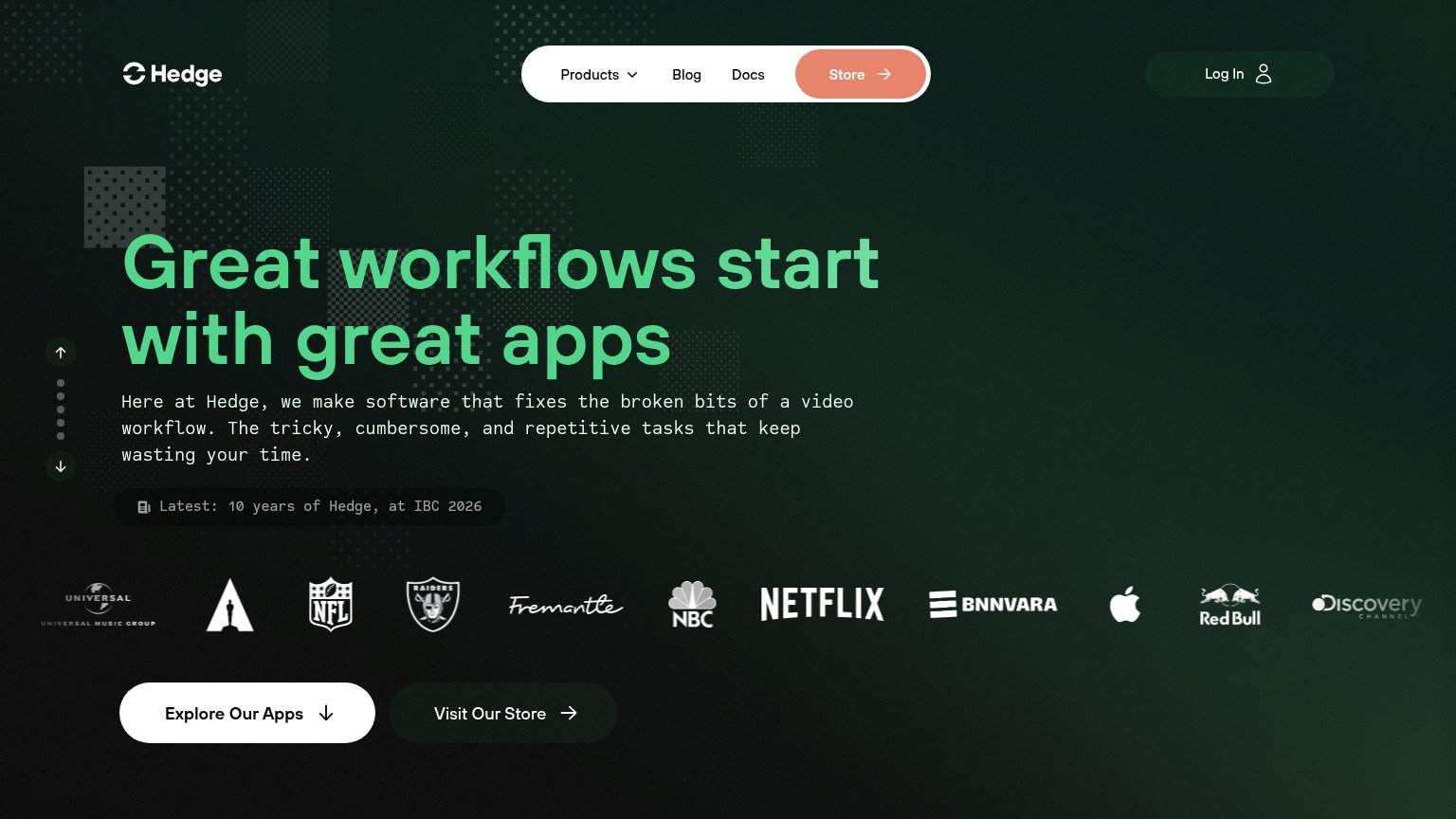
  3. 3.Postlab (Hedge)66
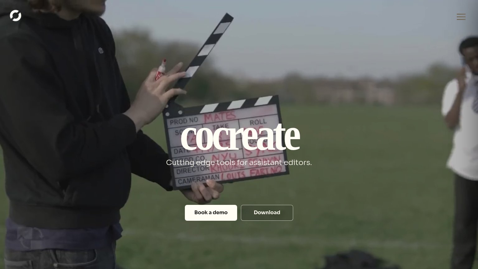
  4. 4.cocreate61
Fix Trust

Score over time

9080706050Postlab (Hedge) 61 on May 2 (Wayback)Postlab (Hedge) 63 on Jul 27 (Wayback)Postlab (Hedge) 63 on Aug 27 (Wayback)Postlab (Hedge) 66 on Sep 22 (Live)Assemble 79 on Sep 22 (Live)Frame.io 76 on Sep 22 (Live)cocreate 67 on Jun 12 (Wayback)cocreate 61 on Jul 22 (Wayback)cocreate 58 on Aug 21 (Wayback)cocreate 54 on Sep 21 (Wayback)cocreate 61 on Sep 22 (Live)Jun 12Jul 22Aug 21Sep 21Sep 22
Past reportsShow past reportsHide past reports
  1. Sep 22, 202661LiveOverall +7 · Mobile web +28 · Information hierarchy +6Viewing
  2. Sep 21, 202654Overall −4 · Mobile web −18 · Trust −8View →
  3. Aug 21, 202658Overall −3 · Mobile web −12 · Value props −6View →
  4. Jul 22, 202661Overall −6 · Value props −22 · Information hierarchy −10View →
  5. Jun 12, 202667First tracked report — strongest Information hierarchy 82, weakest Trust 34View →

Trust

35Poor

Proof that the product is real, competent, and safe to try.

Assemble
Postlab (Hedge)
Frame.io
Trust read
cocreateNo visible trust signal identified.
Postlab (Hedge)Customer logo wall featuring Netflix, NBC, NFL, Apple, Red Bull, Universal Music Group, and Discovery Channel
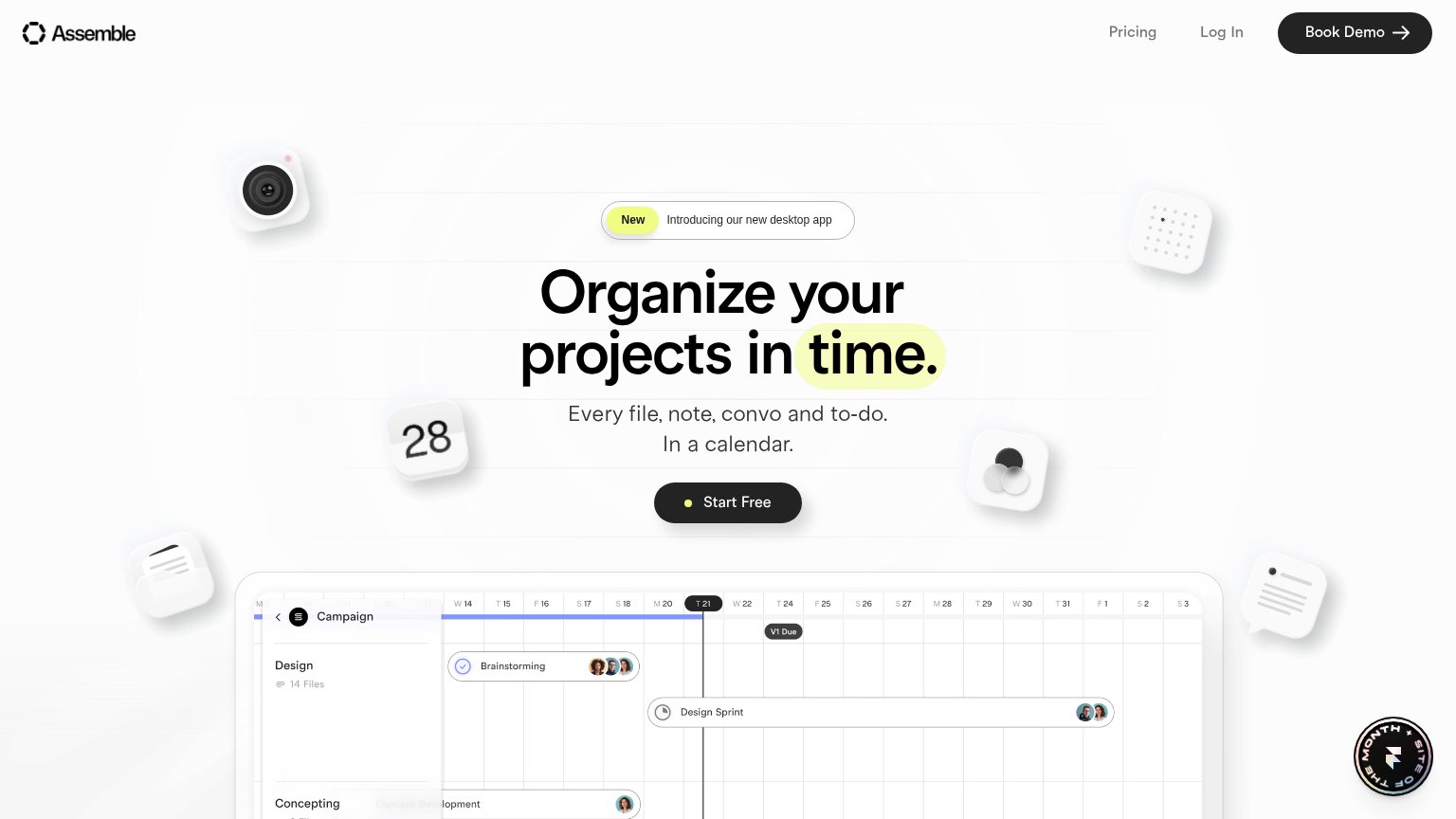
Assemble"Trusted by teams at the world's leading companies" logo wall with Lionsgate, Associated Press, Amazon Studios, and Hewl
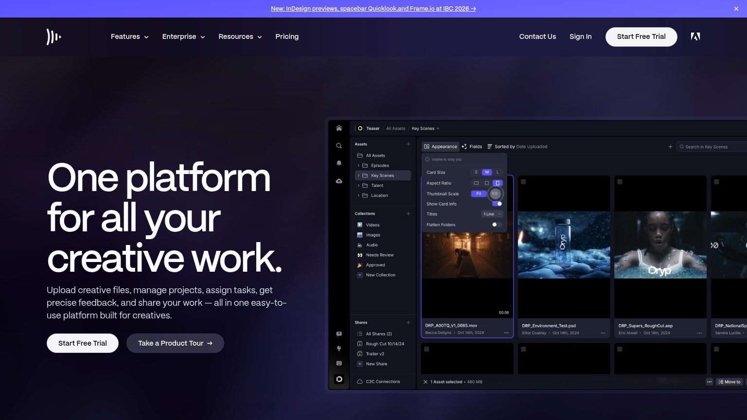
Frame.ioDetailed real product UI screenshot showing asset library with named files ("DRP_A00TQ_V1_0085.mov"), folders, and appea

Value props

48Poor

Title, subtitle, hero — do they sell the product's true value?

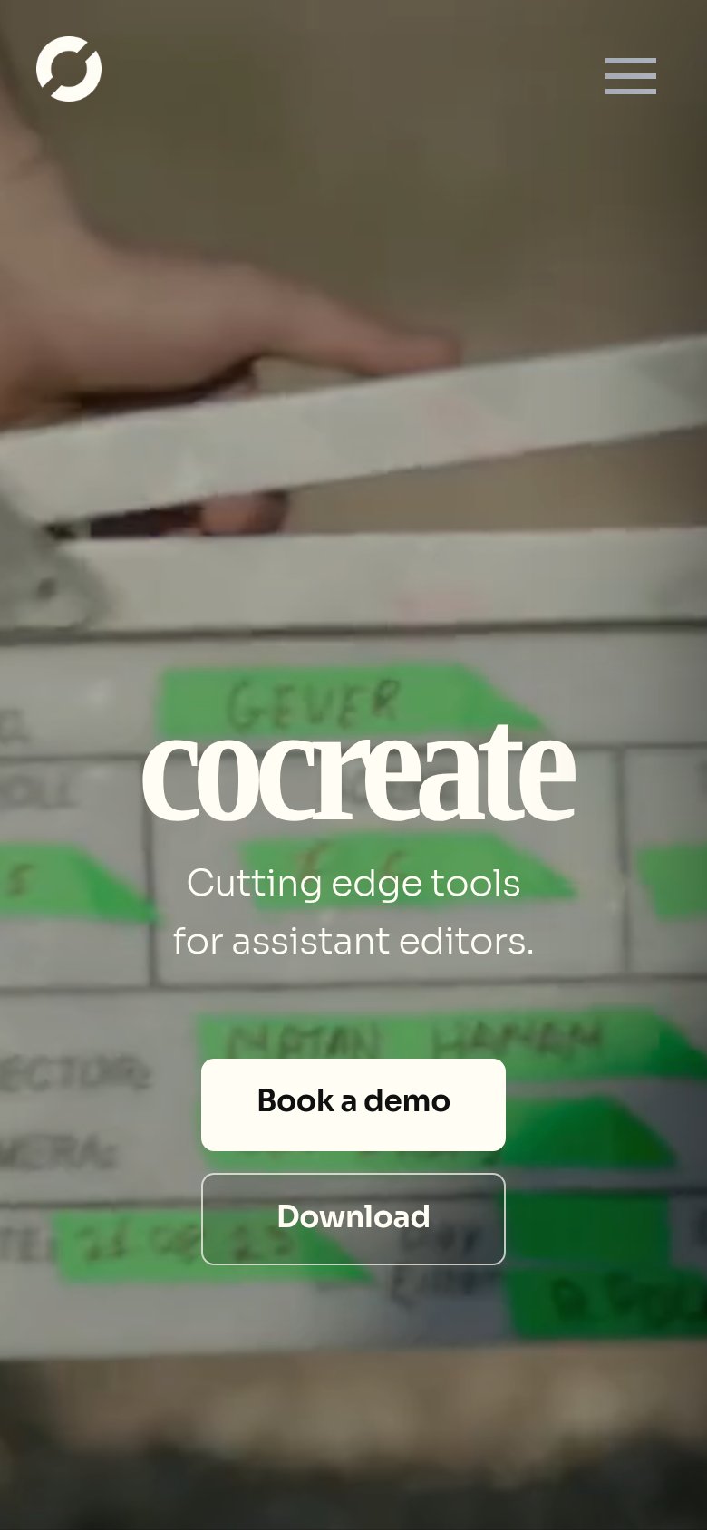
cocreate’s headline vaguecocreateCutting edge tools for assistant editors.

Working

  • Names a precise audience: assistant editors
  • Film-set imagery signals the industry
  • Clean, uncluttered hero with clear CTAs

Could improve

  • Headline is just the brand name
  • No outcome or task named — "tools" is empty
  • No numbers, proof, or product shown

CTA

62Fair

Copy, size, verb, cost-feel — does the primary CTA earn the click?

cocreate
Assemble
Frame.io
Postlab (Hedge)

Problems

  • demo click feels costly, sales-gated
  • cheaper 'Download' demoted to ghost
  • two equal CTAs split intent

Information hierarchy

78Fair

Does the design help or inhibit what the page is trying to say?

Information hierarchy annotations on the desktop capture123
  1. Book a demo / Download — Two same-size buttons at equal visual weight split the single conversion action.
  2. Subtitle over clapperboard — "Cutting edge tools for assistant editors" is thin white text sitting on a busy mid-tone video frame, hurting legibility.
  3. Hamburger menu icon — Low-contrast grey icon on a light sky region is nearly invisible, hiding the only navigation.

Mobile web

80Strong

The phone experience as a first-class citizen.

Mobile web annotations on the mobile capture123
  1. Hero text contrast — White subhead sits on light clapperboard footage with no scrim, hurting legibility.
  2. Book a demo button — Desktop-width pill instead of a full-bleed thumb-friendly mobile CTA.
  3. Download button — Second stacked CTA competes with Book a demo and splits the tap decision.

Competitors

inferred from product, audience, and value prop