
Your landing page’s weakest score is Value props.
How Postlab (Hedge) ranks
- 1.
Assemble79
- 2.
Frame.io76
- 3.
Postlab (Hedge)66
- 4.
cocreate61
66Growth scoreupdated
category scores
category scoresShowHide
Value props
58FairTitle, subtitle, hero — do they sell the product's true value?
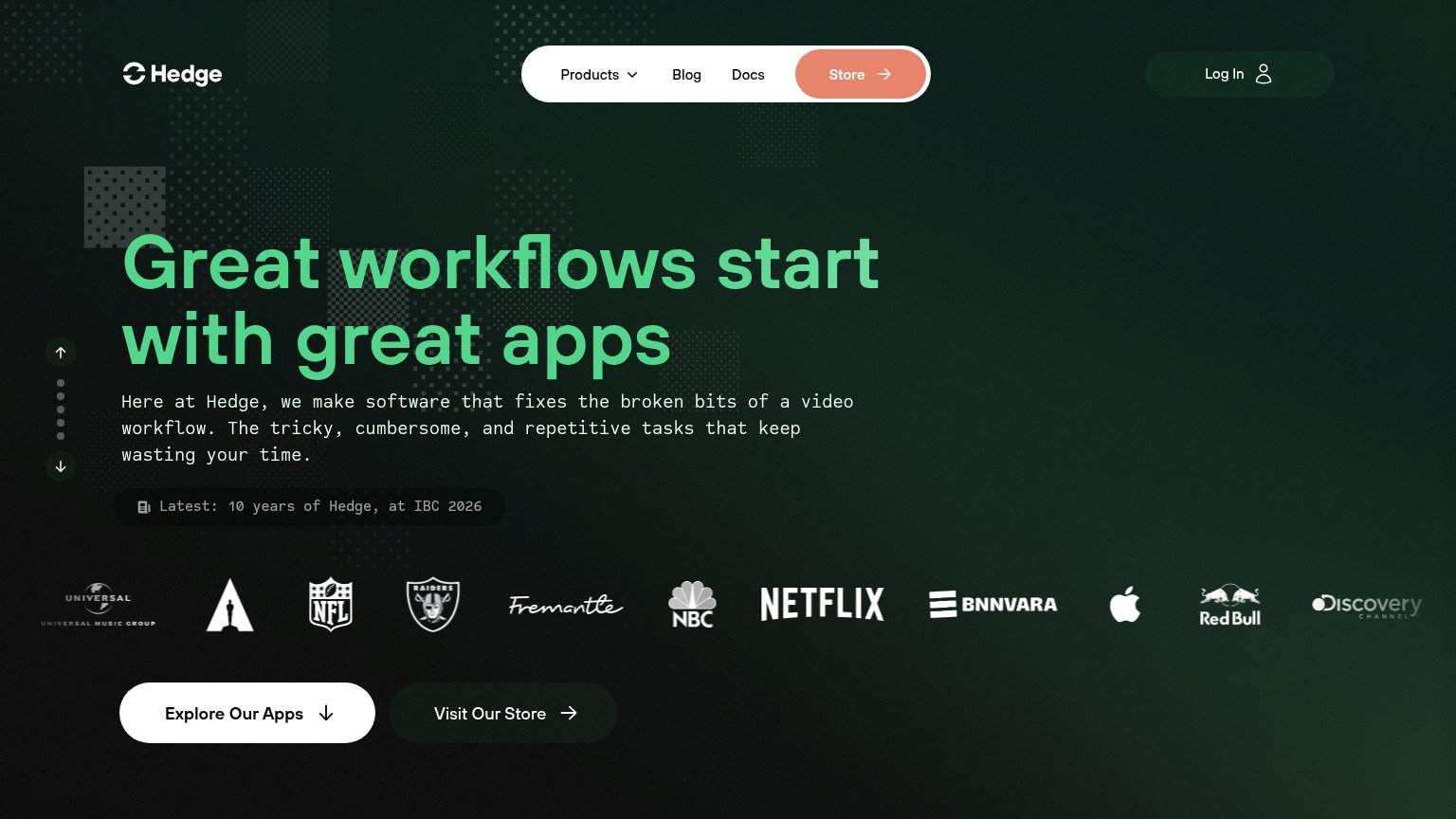
Postlab (Hedge)’s headline vague
Great workflows start with great apps
Here at Hedge, we make software that fixes the broken bits of a video workflow. The tricky, cumbersome, and repetitive tasks that keep wasting your time.
Working
- Subhead names video workflow pain
- Elite logo bar: Netflix, NBC, NFL
- Emotional hook: 'wasting Postlab (Hedge)'s time'
Could improve
- H1 is a generic aphorism
- No numbers or specifics anywhere
- No product visual, only decoration
Mobile web
62FairThe phone experience as a first-class citizen.
 1234
- Oversized wrapping headline — Headline wraps into four huge lines, eating most of the fold and pushing the CTAs down.
- Clipped secondary CTA — "Visit Our Store" is cut off at the viewport edge, signaling the primary action barely made the fold.
- IBC news banner — The "Latest: 10 years of Hedge" strip wraps to two lines and adds a competing message above the CTAs.
- Long body paragraph — Five lines of monospaced copy crowd the fold and delay the visitor's path to the button.
CTA
68FairCopy, size, verb, cost-feel — does the primary CTA earn the click?
How Postlab (Hedge) compares
Recommended rewrites
Trust
68FairProof that the product is real, competent, and safe to try.
How Postlab (Hedge) compares
Trust read
Information hierarchy
72FairDoes the design help or inhibit what the page is trying to say?
What works
What to improve