CloseraYC S25 landing page report.
← Back to YC S25

Score over time

100806040200Constructor 77 on Feb 22 (Wayback)Constructor 74 on Mar 11 (Wayback)Constructor 72 on Jul 28 (Live)Algonomy 57 on Apr 16 (Wayback)Algonomy 56 on Apr 24 (Wayback)Algonomy 59 on May 1 (Wayback)Algonomy 58 on Jun 22 (Wayback)Algonomy 56 on Sep 22 (Live)Nosto 69 on Apr 9 (Wayback)Nosto 71 on May 7 (Wayback)Nosto 70 on May 17 (Wayback)Nosto 69 on Jun 14 (Wayback)Nosto 69 on Jul 22 (Wayback)Nosto 69 on Aug 17 (Wayback)Nosto 73 on Sep 20 (Live)Zeta Global (Lily AI alternative) — actually: Lily AI 71 on Sep 15 (Wayback)Zeta Global (Lily AI alternative) — actually: Lily AI 68 on Sep 22 (Live)Closera 69 on Apr 13 (Wayback)Closera 43 on May 14 (Wayback)Closera 25 on Jun 12 (Wayback)Closera 27 on Sep 9 (Wayback)Closera 74 on Sep 22 (Live)Apr 13May 14Jun 12Sep 9Sep 22
Past reportsShow past reportsHide past reports
  1. Sep 22, 202674LiveOverall +47 · Value props +57 · Information hierarchy +56Viewing
  2. Sep 9, 202627Overall +2 · Trust +8 · Information hierarchy −3View →
  3. Jun 12, 202625Overall −18 · CTA −36 · Information hierarchy −27View →
  4. May 14, 202643Overall −26 · Value props −46 · Information hierarchy −30View →
  5. Apr 13, 202669First tracked report — strongest Information hierarchy 82, weakest Trust 52View →

Trust

58Fair

Proof that the product is real, competent, and safe to try.

Closera
Nosto
Trust read
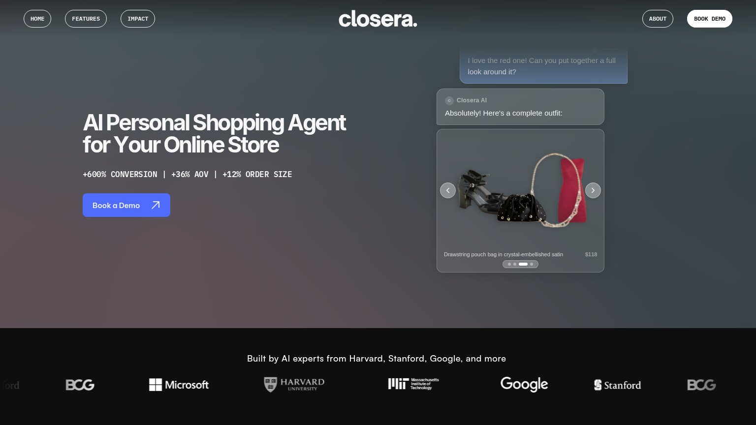
CloseraHero product demo: Closera AI chat assembling an outfit with priced items ("Drawstring pouch bag in crystal-embellished
ConstructorNo visible trust signal identified.
Algonomy"Algonomy (formerly RichRelevance and Manthan) is now part of ADA" announcement bar
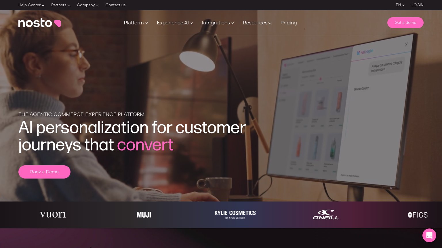
NostoCustomer logo strip: Vuori, MUJI, Kylie Cosmetics, O'Neill, FIGS
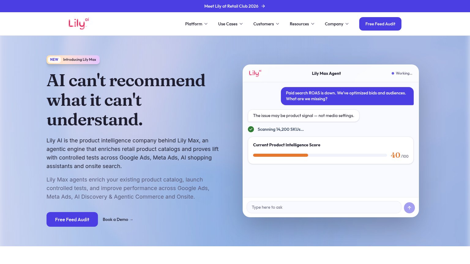
Zeta Global (Lily AI alternative) — actually: Lily AINo visible trust signal identified.

CTA

72Fair

Copy, size, verb, cost-feel — does the primary CTA earn the click?

Closera
Zeta Global (Lily AI alternative) — actually: Lily AI

Problems

  • demo booking feels costly
  • no low-friction alternative path
  • hero demo isn't interactive

Information hierarchy

78Fair

Does the design help or inhibit what the page is trying to say?

Information hierarchy annotations on the desktop capture1234
  1. Duplicate BOOK DEMO button — White header CTA repeats the hero's Book a Demo, splitting one action across two competing buttons.
  2. Left nav link cluster — Home, Features, Impact pills offer three exits before the visitor reaches the primary CTA.
  3. Metrics proof line — The +600% CONVERSION line renders in small low-contrast monospace, underselling the strongest claim on the page.
  4. Chat bubble cropped — The shopper's message is clipped by the header, muddying the demo's read as a conversation.

Mobile web

78Fair

The phone experience as a first-class citizen.

Mobile web annotations on the mobile capture123
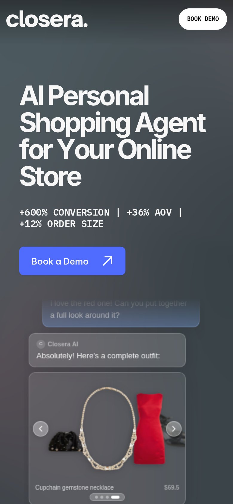
  1. Book a Demo button — Half-width desktop-proportioned button; should be near full-bleed for the thumb.
  2. Stats stat line — Pipe-separated monospace stats wrap awkwardly and read as desktop copy on mobile.
  3. Clipped chat bubble — Customer message is cut off mid-sentence, making the demo look broken.

Value props

82Strong

Title, subtitle, hero — do they sell the product's true value?

Closera’s headline sellsAI Personal Shopping Agent for Your Online Store+600% CONVERSION | +36% AOV | +12% ORDER SIZE

Working

  • Three hard outcome metrics in the subhead
  • Hero chat demo shows the product working
  • Headline names product and buyer instantly

Could improve

  • +600% claim lacks source, strains belief
  • No emotional hook for merchant pain
  • Metric bar reads terse, no context/timeframe