
Your landing page’s weakest score is Value props.
How CLODO ranks
71Growth scoreupdated
category scores
category scoresShowHide
Score over time
Value props
62FairTitle, subtitle, hero — do they sell the product's true value?
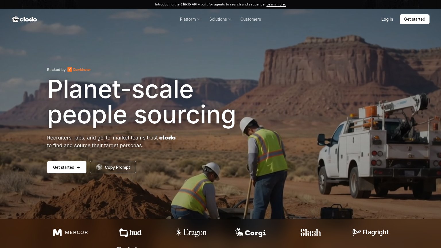
CLODO’s headline vague
Planet-scale people sourcing
Recruiters, labs, and go-to-market teams trust clodo to find and source their target personas.
Working
- Names three real buyer segments in subhead
- Strong logo wall and YC badge above fold
- "Copy Prompt" CTA hints at agent-native use
Could improve
- No numbers: profile count, coverage, or speed
- "Planet-scale" is abstraction, not outcome
- Hero image decorates; doesn't show product
Trust
62FairProof that the product is real, competent, and safe to try.
| Trust read | |
|---|---|
| CLODO | Customer logo wall (Mercor, hud, Eragon, Corgi, Slash, Flagright) |
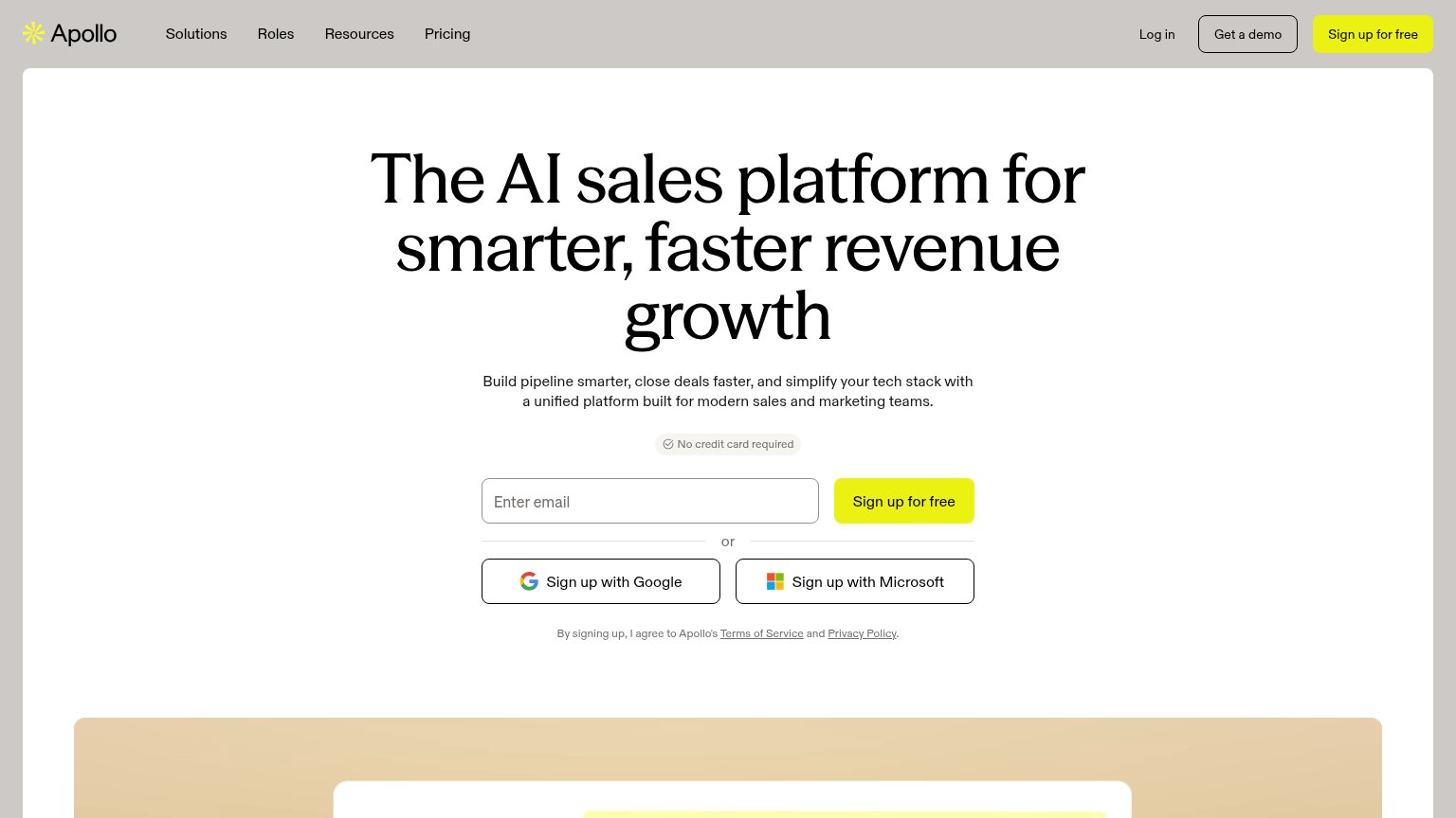
| No visible trust signal identified. | |
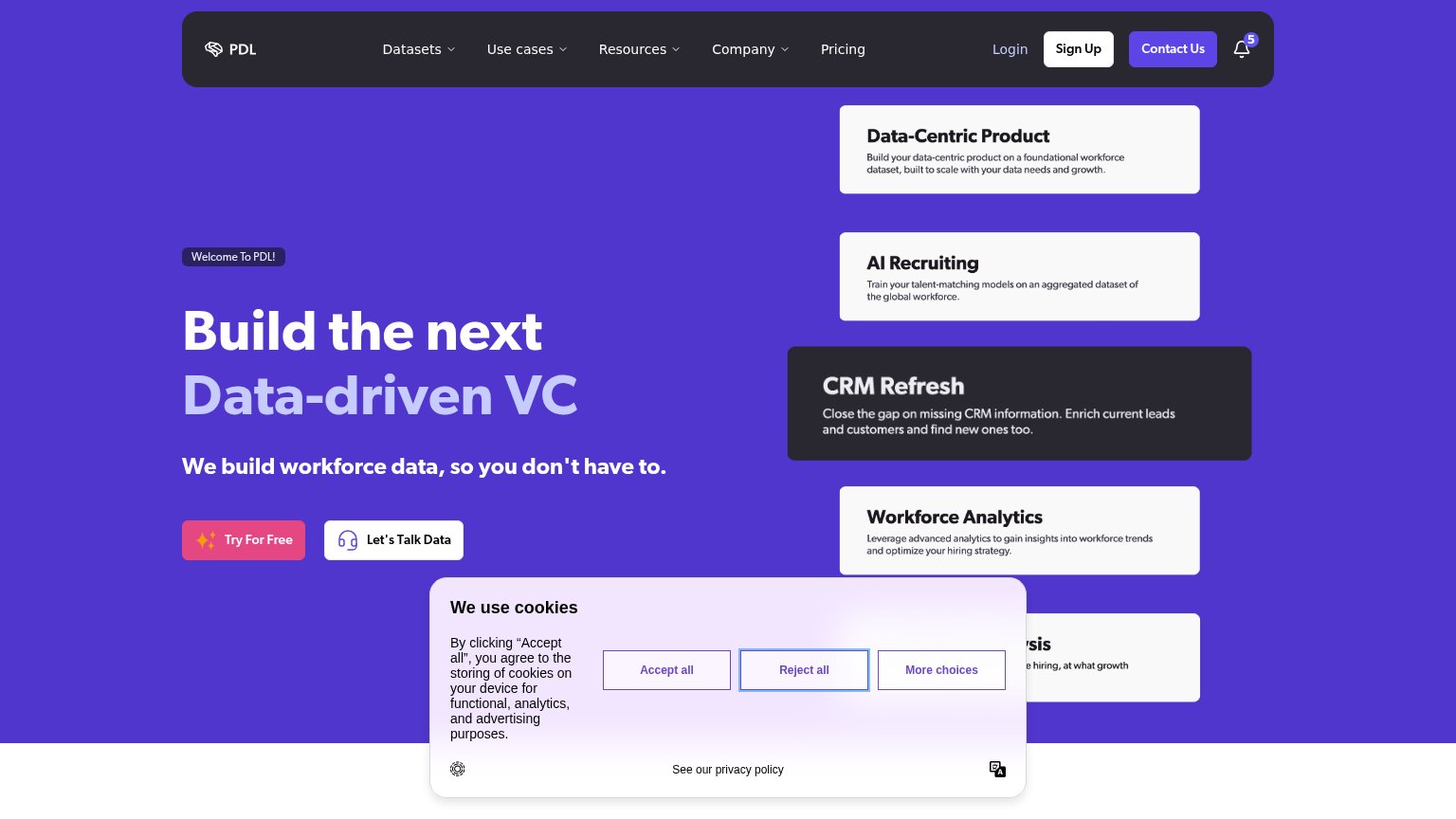
| The "Companies" and "People" enrichment cards showing real field schemas with a populated Stripe entry and Patrick Colli | |
| No credit card required | |
| "Trusted by data teams since 2016" badge above the headline | |
| "We hit $10M ARR! $600k to $10m in 1.5 years. Our entire GTM is powered by our own APIs." announcement bar |
CTA
70FairCopy, size, verb, cost-feel — does the primary CTA earn the click?


Problems
- generic — no payoff named
- doesn't echo headline promise
- secondary CTA near-equal weight
Information hierarchy
78FairDoes the design help or inhibit what the page is trying to say?
123- Copy Prompt button — Sits at near-equal weight beside the primary Get started, splitting the one action into two.
- Announcement banner link — "Learn more" is the first tappable element on the page and pulls attention off the conversion path.
- Nav Get started — Duplicates the hero CTA in the same viewport, diluting which button is the primary action.
Mobile web
82StrongThe phone experience as a first-class citizen.
 1
- Split CTA row — "Get started" shares the row with "Copy Prompt" at equal weight instead of owning a full-width, thumb-friendly button.