
Your landing page’s weakest score is Trust.
How shotwell.ai ranks
- 1.
Encord74
- 2.
shotwell.ai68
- 3.
Sama68
- 4.
Labelbox66
- 5.
Scale AI61
- 6.
iMerit55
68Growth scoreupdated
category scores
category scoresShowHide
Score over time
Trust
52FairProof that the product is real, competent, and safe to try.
| Trust read | |
|---|---|
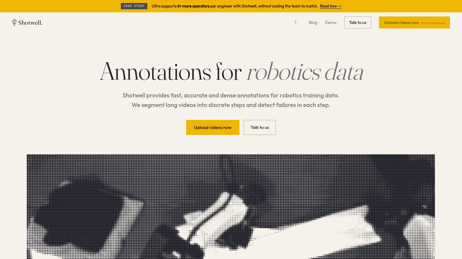
| shotwell.ai | "Ultra supports 6× more operators per engineer with Shotwell, without scaling the team to match." case study banner |
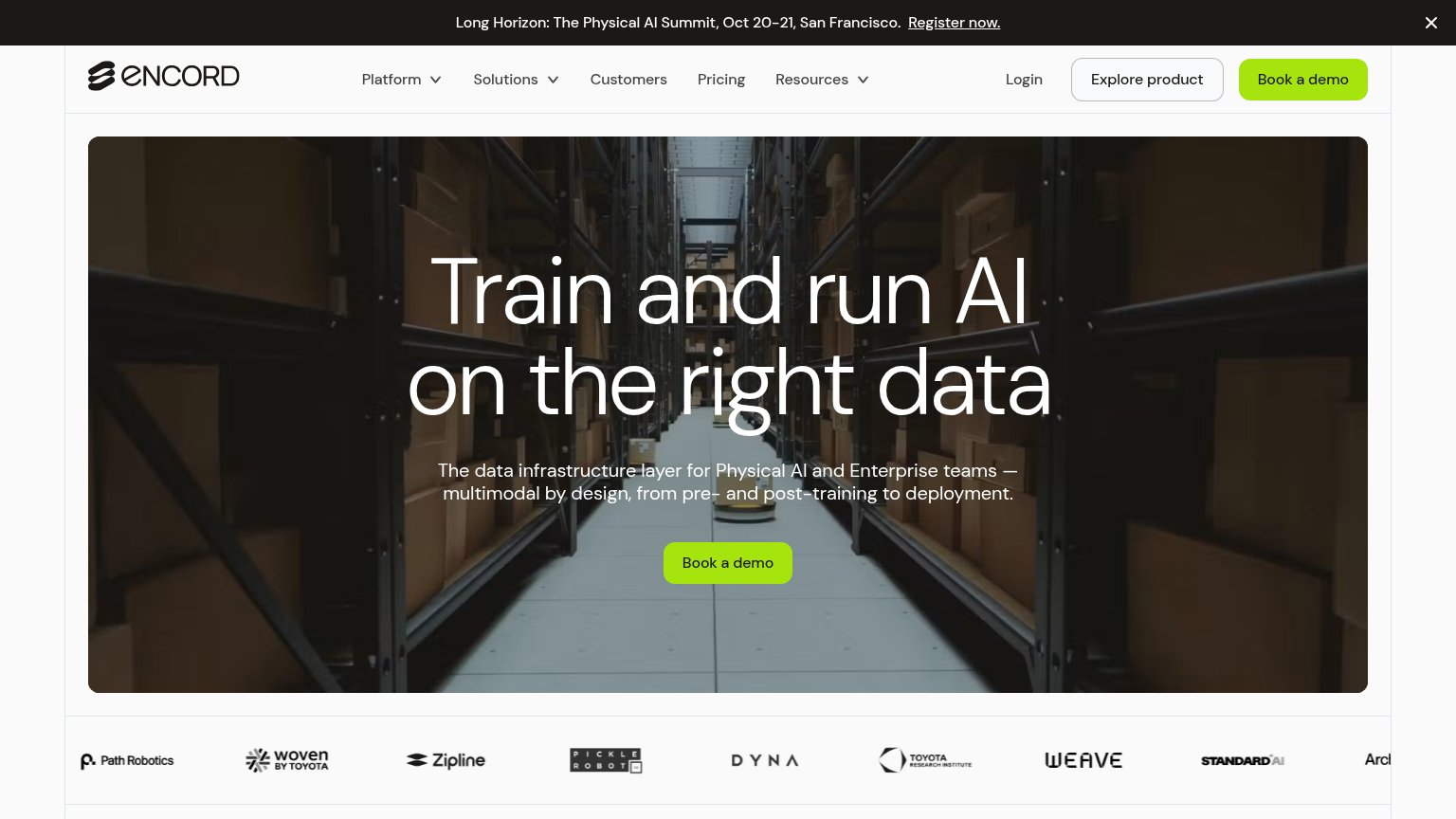
| Customer logo strip below the hero: Path Robotics, Woven by Toyota, Zipline, Pickle Robot, Toyota Research Institute, We | |
| implicit context Scale AI may benefit from pre-existing familiarity among its target audience. | |
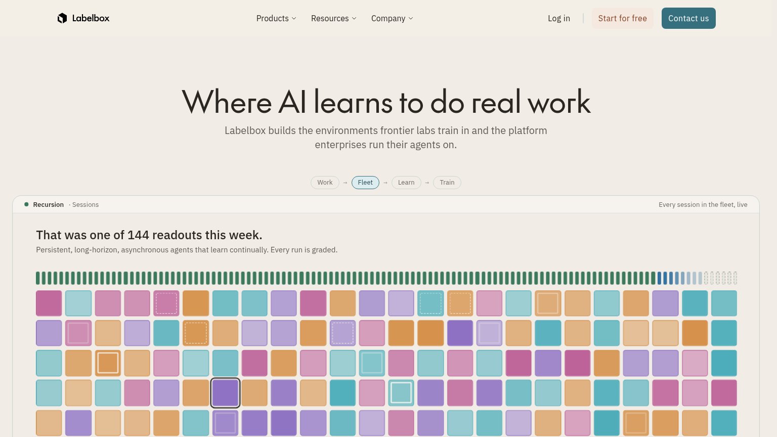
| Live product panel: "That was one of 144 readouts this week" with "Every session in the fleet, live" | |
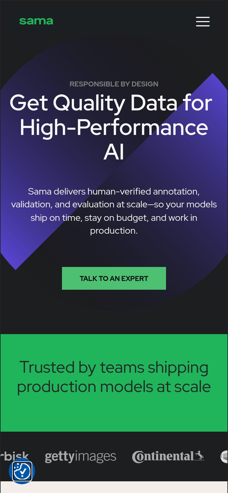
| "Trusted by teams shipping production models at scale" logo strip with Getty Images and Continental | |
| "EXL ACQUIRES iMERIT" headline with EXL + iMerit logos |
Mobile web
52FairThe phone experience as a first-class citizen.
 1234
- Promo banner block — The case-study banner expands to four wrapped lines and eats roughly the top 15% of the viewport before the brand even appears.
- Uncollapsed nav row — Blog, Demo, theme toggle, and two CTA buttons remain a full desktop row with awkwardly wrapped button labels instead of a hamburger.
- Upload videos button — The nav's 'Upload videos now' label wraps onto two lines, signaling the desktop button was never resized for a phone column.
- Primary CTA pair — The 'Upload videos now' / 'Talk to us' buttons sit below the fold, pushed out of the first viewport by the banner and uncollapsed nav.
Information hierarchy
78FairDoes the design help or inhibit what the page is trying to say?
123- Case study banner — Full-width brand-yellow strip outranks the headline and sends first attention to a 'Read how' blog exit.
- Nav duplicate CTAs — 'Talk to us' and 'Upload videos now' repeat the hero buttons at equal weight, splitting the single conversion path.
- Banner shares CTA yellow — The announcement bar uses the same yellow as the primary button, diluting the color's ability to flag the one action.
CTA
78FairCopy, size, verb, cost-feel — does the primary CTA earn the click?
Problems
- upload feels committal, no low-cost cue
- no price/trial signal near button
- hero button smaller than header banner
Value props
78FairTitle, subtitle, hero — do they sell the product's true value?
shotwell.ai’s headline sells
Annotations for robotics data
Shotwell provides fast, accurate and dense annotations for robotics training data. We segment long videos into discrete steps and detect failures in each step.
Working
- Names exact niche and buyer in 5 words
- Subhead explains real mechanics
- 6× case study and 24 hr proof in fold
Could improve
- No numbers in hero copy itself
- 'Fast, accurate, dense' unquantified
- Hero image decorates, doesn't demo